Geospatial Student Spotlight: Caitlyn Jeri Linehan

Academic Institution:

Lehman College, City University of New York (CUNY)                              Bronx, NY
Department of Earth, Environmental, and Geospatial Sciences
MSc Geographic Information Science  (June 2021)

Trinity College                                                                                            Hartford, CT
B.S. Environmental Science  (May 2019)

Research Focus:

Linehan’s graduate research focused on studying future urban sprawl in the metropolitan area of Nashville, Tennessee (Davidson County).  As part of this work, she applied the SLEUTH (Slope, Land cover, Exclusion, Urban growth, Transport and Hill shade) Model which utilizes several commonly accessible geospatial datasets including
USGS Shuttle Radar Topography Mission (SRTM), National Land Cover Database (NLCD), U.S. Census Bureau road files, and Digital Elevation Models.  Additional geospatial data was added from local sources.

Developed by Dr. Keith C. Clarke at UC-Santa Barbara, SLEUTH is categorized as a “cellular automata (CA) model” and is open source and available for download.   It models urban growth based on cells (5km x 5km, 30m x 30m, etc.) which support the geographic  unit of analysis.  The model suggests that changes in the geographic construct of any specific cell normally mimics and is a result of similar changes in neighboring cells.  Clarke was faculty at Hunter College in NYC 1982-1986.

Historical imagery and vector data of the datasets identified above of Davidson County for 2001, 2006, 2011, and 2016 were collected and used to calibrate the SLEUTH model to simulate urban growth for the period of 2017-2040. The urban area for 2016 was 119.81 square miles and from the SLEUTH model is said to increase to 121.90 square miles for 2040. The urbanization rate during the historical time period (2001-2016) is 11.11% but the SLEUTH model predicts a  much slower urbanization rate during the simulated time period (2017-2040) of 1.59%.  This study shows the SLEUTH model can be beneficial in modeling future urban growth but also suggests a need to model more accurately development within intra-urban areas as well as vertical urbanization within already densely urban regions.   Here is a great 10-minute YouTube presentation describing the study and for those interested in more detailed information, here is a copy of Linehan’s thesis.

While the population of Nashville and Davidson County is expected to grow over the next 20 years, most of the growth is anticipated in already developed areas minimizing urban sprawl.

Selected Additional Geospatial Projects:

New Yorkers for Parks

As an intern for the New Yorkers for Parks, Linehan created Open Space Profiles on parks and open space citywide, broken down by each NYC community board district. From open space quality and access to demographic and health information, the Profiles offer a summary for all 59 NYC community districts. This product enables elected officials, candidates, and community groups alike can use to better understand and convey open space issues in their communities.

Many interesting facts are presented in the profiles. For example, 33% of New Yorkers do not have a park within a five minute walk and 48 of 59 districts have less than 10 percent of city-owned parkland within their district. More data can be found here.

Best Places to Breath in New York City

That map for the land use regression having to do with PM2.5 (particulate matter) concentrations in NYC was done as a class assignment. The purpose of this map was that there is air monitors all over NYC. Using data air monitoring stations across New York City, Linehan used an ordinary least squares regression to test the associations between the dependent variable PM2.5 (particulate matter) measurements and the independent variables (major truck routes and population density). The result from this regression was estimated PM2.5 data which was used to interpolate a surface which shows the estimated PM2.5 values across NYC. The map in the lower right shows that the suggested and safe PM2.5 values is 12 micrograms per cubic meter according to the U.S. National Ambient Air Quality Standards. Only isolated locations in south Brooklyn and Queens and a few areas in Staten Island actually have an acceptable PM2.5 value according to this study.  Data used in the study was from U.S. EPA, New York State DOT and U.S.Census.

With the focus on using data from citywide air monitoring stations, Linehan’s project identified only a select number of areas across the city that met acceptable air quality standards.  This poster can be downloaded here.

Accessibility and Connectivity of Bike Paths in the Bronx, New York

Another one of Linehan’s class projects focused on applying a network analysis on the accessibility of a low stress bike network in the Bronx to access select facilities which promote well being such as parks, recreation centers, and libraries.  It is well established people that engage in physical activity can greatly reduce the risk of different diseases as well as reducing stress and anxiety.  To this end, biking is a great form of physical activity that provides these benefits though a deterrent to urban biking in areas such as the Bronx, is a lack of a connected bike path.

Her findings, which are included in the poster below, finds that though only a small proportion of Bronx residents do not have access to a park entrance via a bike portal, it is estimated a disproportional percent (89%) do not have access to recreational centers and 53% lacking bike access to libraries.  Central to the analysis is applying “Level of Traffic Stress” (LTS) coefficients to each road segment.  A copy of the poster below can be downloaded here.

Safe and readily available bike networks are important factors in providing access to urban cultural and community facilities.  This poster can be downloaded here.

Summary:

The Lehman GISc Program emphasizes “real-world” applications of geotechnologies and geospatial analysis to solve problems and improve conditions focusing on New York City as a “living laboratory.”  The program continues to grow and providing trained and well educated graduates to organizations and governments across the metropolitan area.

Linehan will be continuing her graduate education by beginning her doctoral work at the University of California – Santa Barbara which was one of the original three universities associated with the The National Center for Geographic Information and Analysis (NCGIA).   Formed in 1988,  NCGIA also includes the University of  Buffalo and the University of Maine.

 Contact:

Caitlyn Jeri Linehan
Graduate Student
Lehman College, City University of New York (CUNY)
Department of Earth, Environmental, and Geospatial Sciences
CAITLYN.LINEHAN@lc.cuny.edu
CaitlynLinehan@ucsb.edu

Dr. Yuri Gorokhovich
Associate Professor
Lehman College, City University of New York (CUNY)
Department of Earth, Environmental, and Geospatial Sciences
yuri.gorokhovich@lehman.cuny.edu

SPEED 2.0: Authoritative Environmental Remediation Mapping in New York City

Application Includes the use of both Open Source Software and Open Data Content

A lot of great geospatial projects and content are coming out of the NYC OpenData ecosystem.  In the same space  throughout the city is the deployment of applications and viewers using open source software.  One such app is the Searchable Property Environmental E-Database SPEED 2.0, built on top of CARTO and published by the Mayor’s Office of Environmental Remediation (OER).  I was introduced to the application via an online presentation organized by GISMO in March of this year.

SPEED 2.0 is an impressive collection of local/city, state, and federal geospatial datasets wrapped into one application for the purpose of helping individuals identify environmental issues – both current and past – on and/or adjacent to specific properties in New York City.  It is a sister application to the NYC Office of Environmental Remediation’s Environmental Project Information Center (EPIC) that provides information about the cleanup of brownfield sites across the city.

Individual parcels can be buffered by either 250’ or 500’ to show the proximity of adjacent parcels with current or past environmental issues, permitting, or contamination issues. Access to pertinent metadata is readily available.

Background

According to Lee Ilan, Chief of Planning in the Mayor’s Office of Environmental Remediation, the first version of SPEED was launched in 2009 as a web map with limited functionality and developed with PostGIS.  It was launched in support of the newly created office’s focus on the cleanup of brownfields across the city.  However, support for the initial application waned over the next several years with minimal new content added.  Post – SuperStorm Sandy provided new funding through the U.S. Housing and Urban Development (HUD) Community Development Block Grant Disaster Recovery Program which OER secured and offered the opportunity for a major rewrite and update of the original application. SPEED 2.0 was designed by their vendor Applied Geographics (AppGeo) to be a cloud-based application.  Originally the application was managed by the vendor but since December 2020, OER has assumed managing the app in the Google Cloud on their own.

The application also includes advanced search functions. For example, in the left-hand column using the filter options, I was able to identify only those OER projects in FEMA 100-year floodplains. Query is rendered in the map viewer.

Carto software is helpful by providing a very modern user interface that generates layers which are compatible with Leaflet”, notes OER’s IT Director Maksim Kleban.  “It makes the transition from uploading our layers, and turning them into fully functional, interactive maps seamless.”  AppGeo proposed the use of CARTO to OER which has since found the software to be user friendly and simple to use with standalone online applications. Carto is licensed annually for the amount of space and resources needed for the SPEED application and works very similar to any other cloud solution, like Amazon Web Services, Microsoft Azure (AWS), or Google Cloud.

Currently there are about 50-55 datasets included in the SPEED viewer right now. The large majority are OER datasets which are updated automatically by syncing with data from external agencies’ datasets on Open Data, or from OER’s internal data sources.  Generally, they each have an independent update schedule which is also automated.   The data is managed mostly by automatic updates on OER’s server which communicates directly to Carto through an API. For layers which are not on an automatic update schedule, OER uses either a custom-designed interface or manually uploads data into Carto’s online platform.

User can search the SPEED database using a standardized address, common place names such as Bryant Park or Madison Square Garden (btw – even “MSG”!) or borough, block and lot (BBL) numbers.  The application also includes mark-up, feature transparency, and sharing tools,  great HELP documentation and easy access to metadata (as illustrated in the first image above) which is very helpful given the bevy of similar datasets from local, state and federal datasets accessible in the app.  Historical aerial photography from 1996, 1951, and 1924 enables users to identify previous land cover which can be an indicator of the presence of historic fill.  A “Sensitive Receptors layer includes the locations of facilities (schools, parks, libraries, health care, etc) where occupants are more susceptible to the effects of environmental contamination.

It continues to be a work in progress” says Ilan, “in the future we would like to also have functionalities for registered users. We also would like to add more analysis capabilities where new layers can be easily integrated with advanced search features”. 

SPEED 2.0 Featured on NYC Open Data Week

For the first time ever, OER participated in NYC Open Data Week in early March.  For those looking for a deeper dive into SPEED 2.0, use the link below to listen to Lee’s presentation.

Contact:

Ms. Lee Ilan
Chief of Planning
NYC Mayor’s Office of Environmental Remediation
lilan@cityhall.nyc.gov

Taking a Peek Under the Hood: New York State GIS Association

How’s Your Regional GIS Association Group Doing? Biden’s Infrastructure Plan. And Dude, What’s Up with Senate Bill S1466?

Its mud season in the Adirondacks so outdoor activities are kinda slow in the North Country.  Not much on the trails and the black flies loom.  Similarly is the blog content, scrounging around for new material and the like.  Couple articles in development hoping to pull together over the next couple months.  Some cool stuff coming out of NYC.  Seemed like a good time to pull together some topics and issues I’ve been staring at for a while.  Much of it related, for the most part, to the NYS GIS Association.

New York State GIS Association Regional Groups

The end of last fall I started a conversation with a GIS colleague who was responsible coordinating meetings for a local/regional GIS user group. An honorable task given the amount of time and effort which goes into doing so – often solo or with only one or two other folks.  Our conversation focused on a combination of declining attendance and participation throughout the region albeit at the time this may have been more of factor of COVID.  The play book almost the same everywhere:  virtually no in-person meetings, Zoom fatigue, and/or in general everyone completely pre-occupied with the pandemic.  All of this adding to the challenge of working with others to develop and propose meeting themes which would/could focus on something other than COVID.  And as we all know, much easier said than done over the past 16 months.

Curbing my own personal thoughts and opinions about where the profession is headed in this space across the Empire State – fodder for another article and another day – I put together a short 10-question Google forms questionnaire which was sent to the 15 regional coordinators listed on the Association’s Regional Coordination Committee web page.

Response rate was actually very good as I received responses from 14 of the 15 individuals I sent surveys to.  One of the 14 opted not to complete the survey leaving only one coordinator not responding.   Selected questions are listed below for which I’ve included summary results.   A spreadsheet containing all questions and and responses by all respondents can be downloaded here.  For the purposes of this article I removed the name of the Regional User Group so responses could not be linked to a specific person or group.

Taking a look at some of the questions and grouped responses:

1. When was the last time your Regional Group met?

2.  Was the last meeting in-person or online?

3.  Whether in-person or online, how many people participated in the last meeting?

4.  How many people are involved in helping coordinate and administer your user group activities (i.e., scheduling meetings and speakers, establishing agendas, maintaining email lists, maintaining any kind of user group website, etc) as of March 2021?

5.  Any thoughts as to whether or not your Regional User Group will go back to in-person meetings once the COVID pandemic has generally passed?

6.  Are any future Regional Group Meetings scheduled?

(Note:  During preparation of this article one Regional Group announced a Fall 2021 in-person meeting

7.   Is the membership of your User Group mainly composed of government workers or from private sector/industry?

8.  When User Group Meetings are held, do the topics and content of discussion focus on local/regional geospatial issues or more on statewide GIS issues?

Synopsis

Given the high percentage of the number of regional coordinators who responded to the survey (14 of 15; one responding to me but not completing the survey) the information gathered should be considered reflective of the current activities and engagement of the regional groups.  Admittedly the survey was really only 10 questions and completed during our time of  COVID, thus one could argue that some of the organizational issues which the Association is facing is similar to other organizations due to the pandemic.

That said, couple immediate takeaways on the pulse of the Association’s regional groups:

While the pie chart shows nearly 54% (7 of 13) of the groups haven’t met in over 12 months, overall its probably closer to 60% as I suspect the two groups which did not respond to the survey have not met during the same time period as well.  One of those for sure.  Sixty percent is significant.

Closely related is the question about whether or not coordinators anticipate getting back to “in-person” meetings after the pandemic has passed.  Seemingly more relevant, however, was the issue of “re-energizing” the group first (61% or 8 of 13 responding).  My guess it’s safe to assume the other two survey non-respondents are in the same space or mindset – and the percentage goes to a whopping 66% – 10 of 15.  75% of those responding indicated the next meeting wasn’t even planned and again, if you throw in the non-respondents to this questions it goes to over 80%.

A noticeable feeling of malaise?  Seems like enough to give the Regional Coordination Committee Co-Chairs something to think about.

Findings to other questions which included, for the most part, anticipated results such as:

  • Meetings taking place (independent of how long ago) were about half in-person and half-online)
  • Numbers of people participating in meetings (in-person or online)
  • As we all have painfully come to know, normally a handful of people (in many cases only 1-2) individuals coordinating the group and meetings
  • Probably didn’t ask the question properly, but nonetheless it appears the groups are split about 50-50 on private/industry sector vs. government individuals; and
  • Meeting agendas/discussion tends to focus about 50-50 on local/regional issues vs. statewide issues

Biden’s Infrastructure Bill

I included the question about meeting content (local level vs. state level) to get a sense of the discussion as to who/what may be directing the narrative.  Why, you say?  How about Biden’s $2.3B Infrastructure Plan.  Rarely has so much federal money been allocated which links itself to local and regional GIS programs.  Roads, buildings and utilities, bridges, public transit, water and sewer systems, disaster resiliency, public schools, and much much more.  Large amounts of geographic features and systems best managed at the local level.  And with local resources.  If not local and regional governments themselves then with trusted consultants and business partners.  Engineering consultants with broad and capable geospatial capacity.

Yes, the time for local and regional geospatial programs to proactively and reach out to state organizations such as the NYS Association of Towns, NYS Association of Counties, ot NYS Conference of Mayors to work towards making sure this new funding sources are secured for local use and application in the geospatial space..  As well as enhancing collaborations and efforts with professional organizations such as the New York State Society of Professional Engineers and New York State Association of Professional Land Surveyors which have an established presence in Albany.

Of course state assets are in play with regard to this funding, but local and regional geospatial programs, in May 2021, cannot afford to sit on the sidelines to wait and later find out distribution of this new federal funding is going to state programs first and being left to fight for the remaining scraps. And/or left to some funding distribution formula which included no local and regional geospatial programs input.

Time now for local and regional GIS/geospatial programs and organizations to mobilize on this funding opportunity.

Senate Bill S1466

Hello, McFly? Anybody home?  Anybody watching and monitoring anything with regard to the state legislature and legislation which is connected  to the Empire State geospatial space?  In the big scheme of things, S1466 probably doesn’t amount to much but it does seem something is amiss in the broader context when the words Geographic Information Systems Mapping Technology are used in describing any proposed New York statewide legislation and it goes completely under the radar screen without review and input from the statewide geospatial community. Can’t say absolutely no discussion because something, on some level, some people, somewhere, were talking and exchanging information to frame the legislation.  Was the Association part of that discussion?  Or maybe your Geospatial Advisory Committee?

And a bigger head scratcher is connecting the state GIS office with “strategic planning and municipal study assistance”.   Specifically the proposed legislation reads, in part:

“The usage of available floor space within a given political subdivision
is a critical detail. Evaluation of floor space usage allows the local
area to understand how buildings are being used, and evaluate whether
new zoning or construction plans are needed to stimulate activity in
certain sectors. However, conducting a study through questionnaires and
or geographic information mapping (GIS) technology is difficult and
costly for local entities. On the other hand, the Office of Information
Technology Services already maintains statewide GIS information and can
readily adapt that material for more specific purposes.”

This legislation would allow towns, villages, cities, and counties to
request GIS and study assistance from OITS to undertake a review of
floor space usage. Such assistance could include specific GIS maps,
online questionnaires, and other technological methods that would assist
the conducting of such studies.

Maybe I need to get out more.  Granted, if passed, the whole process of ITS of getting involved presumably wouldn’t happen unless requested locally, though it is interesting to see this office ready to provide these professional services.  Also, interesting it hasn’t ruffled a few feathers in the professional planning and GIS consultant communities as well.  NYS Association of Regional Councils?

Almost two years ago I made reference to a similar geospatial community asleep at the wheel legislative moment with regard to Senate Bill 9061 involving Google Maps.  Have there been similar pieces of legislation?  In absence of full-time staff – including an Executive Director who can operate in the Albany space – its almost an impossible task on staying on top of pending legislation proposed by others.  To say the least of identifying sponsors and proposing legislation for the benefit of the industry and membership.

One way or another, the legislative space is where the Association needs to expand and build capacity.   Thus far it hasn’t been easy and will continue to be difficult to do so.


10 Questions: Peter Carlo

From my level, it’s a rare occurrence any more running into someone in the geospatial field when I can make reference to Arc/INFO and AML (ARC Macro Language) without him or her giving me a big blank stare. A testament to how long we have both been around.    One of those individuals is Peter Carlo, who works for the New York City Department of Parks and Recreation in the forestry division having worked in the geospatial field for over thirty years.  Yes, learning the ropes at the dawn of GIS with command line Arc/INFO and one of the most senior GIS professionals in the vast New York City government GIS user community.  I was fortunate to catch up with him recently to discuss some of the highlights of his long career in the Big Apple.

eSpatiallyNewYork: Maybe a little of your background and where you are originally from?

Carlo:  I was born in the northern Bronx.  In my early years, the family moved to southern Vermont.  After graduating high school I briefly attended Castleton College in Rutland, VT, though eventually returned to New York City to attend Lehman College in the early 1990’s and enrolled in the geography department.  Since then I’ve lived in a couple places in the metro-NYC area but now live with my family on Long Island.

eSpatiallyNewYork:  What is your current responsibility(s) with NYC Parks Department?

Carlo: I am currently the GIS Supervisor at NYC Parks I.T. division.  Our team is made up of  six GIS specialist and our primary goal is to administer the Parks GIS central geodatabase and to support geospatial projects throughout the Agency.  These projects range from configuring Survey123 mobile data efforts to writing data ETL’s (extract/transfer/load) to our central data warehouse.

eSpatiallyNewYork: So geography at Lehman College in the early 1990s.  Where did it go from there?

Carlo: Yes, I really found the passion for GIS technology at Lehman College.  In 1991 or so I had the opportunity to build an ESRI “enterprise” GIS at the GIS lab at Lehman.  Everything from backend data to an ARC/INFO front end access.  I found a passion in setting up hardware and software solutions while configuring components like digitizing tables and then spending hours digitizing contour maps of the Bronx geology.

Soon after graduation from Lehman, I was hired by the NYC Parks Department Forestry Division and started working on the (first) 1995 street tree survey dataset, which was done by associating a tree location with an street address.  At that time, the Parks Departments Forestry offices where located in each of the five boroughs and were managing their own tree data in a disk operating system (DOS) program called Tree Manager.  I also worked with the Parks I.T. Division to setup the our first central geodatabase using SQL Server and ArcSDE.  Working with Lehman College interns we were able to map out all park athletic facilities, playgrounds and comfort stations.  This data still serves as the foundation for the Parks geodatabase.  (Editor Note:  An entirely different read on its own is the effort behind the New York City Street Survey program.  The most recent 2015 tree survey, which is coordinated by NYC Parks,  inventoried nearly 700,000 trees in the five boroughs.  Read here for more details.) 

eSpatiallyNewYork: In this capacity what are some of your current projects?

Carlo: We are currently working with our Forestry division to deploy an interagency Survey123 application that will be used during storm events.  It will be the second version of this solution.  The application will stream 311 hazardous tree request (like tree downs and limb downs) to potentially over 300 field inspectors made up of Parks, FDNY and DSNY staff to name a few. A large part of our work is making our GIS data interoperable with legacy software/data solutions.  We also participate in integrating spatial data and functions into new business and software solutions.

eSpatiallyNewYork:  Do you have a “favorite” GIS project you’ve worked on while in the NYC Parks department?

Carlo:  I would say working (about 10 years ago) on Forestry’s first mobile storm response application.  It was called Storm Mobile.  It worked on the thick IBM Toughbook tablets utilizing wireless and GPS technology, 311 integration and data from the 2005 Tree Census. That was all new stuff for us and everything worked just fine.  I made some lifelong friends during that experience and learned so much.  A majority of our mobile application use smart phones and tablets with AGPS.  However, there are some teams that use Trimble units when needed.

eSpatiallyNewYork: NYC Parks Department is an ESRI shop – what about other software programs, hardware components in your office?

Carlo:  We are using Infor EAM (Enterprise Asset Management) for a work order management software.  This is highly integrated with our central GIS database.  We also have a new group of data scientists who are utilizing open source GIS tools at a high level. Currently the Agency has over 200 ArcGIS Desktop Pro installation, Multiple SQL/SDE central data repositories and an internal data warehouse that serves as a point of access.  A lot of our ArcGIS Desktop/Pro users utilize extensions such as Spatial Analysis, Workflow Manager and Geostatistical Analyst.  We are also using Cyclomedia Street Smart and Pictometry oblique photos.

Parks is currently on a path to migrate over to a more web GIS approach to spatial data access.  We’ve been moving over to Enterprise ArcGIS 10.8 by utilizing ArcGIS Server and ArcGIS portal to build web apps, Survey123 and Collector solutions.  Around the ArcGIS Online (AGOL) framework.  This has allowed us to streamline workflows and make GIS data more accessible to non-GIS specialists.  Overall, spatial data has increasingly become more integrated throughout the Department data footprint – it is just going to continue to grow.

eSpatiallyNewYork: What other NYC departments do you work the most closely with in GIS/geospatial efforts?

Carlo: The Parks Department works closely with many of the other City Agency GIS units.  We often share data with NYPD, FDNY, OEM and DoITT.  I think interagency data and resource sharing is the next big thing for all NYC Government GIS units.  I finally imagine a central GIS data portal coming together, where all city agencies can upload standardized data that could serve as a central data store for Agencies System of records. It’s kind of the next step from the Open Data portal.  Beyond the geospatial perspective the Parks Department maintains an impressive list of partners in doing work with throughout the city system..

eSpatiallyNewYork: What’s the next big “geospatial thing” in NYC Parks?

Carlo:  I would say that it is data interoperability, web GIS and the move to cloud solutions.  For my team it’s going to be about quickly standing up “no code” data collection and analytical tools that will empower end users (subject matter experts) without them having to be GIS experts.

eSpatiallyNewYork:  Are you involved on any level contributing to the NYC Open Data portal?

Carlo: My specific unit isn’t directly involved in publishing to the portal but NYC Parks as a whole contributes significantly.  Right now I believe there are close to 100 NYC Parks datasets available.

eSpatiallyNewYork: Yankees or Mets?

Carlo:  BIG TIME YANKEE FAN!  I remember watching the Yankees during the Bronx Zoo era!

Contact:

Peter Carlo
GIS Supervisor
NYC Parks I.T. division
peter.carlo@parks.nyc.gov
https://www.nycgovparks.org/services/forestry

Geospatial Student Spotlight: Ge (Jeff) Pu

Academic Institution:

SUNY College of Environmental Science and Forestry
Department of Environmental Resources Engineering
Ph.D Environmental Resource Engineering (Dec 2020)

Drexel University
Department of Civil and Environmental Engineering
B.S. & M.S. Environmental Engineering

Research Focus:

Ge’s doctoral research focused on monitoring riparian vegetation conditions overtime and quantifying correlations to selected water quality variables. In addition, he focused on quantifying the impact of riparian vegetation presence on river channel boundary changes. Such riparian vegetation environments have a significant role in filtering contamination and maintaining water quality in riverine and stream systems. His research involved the use of high spatial resolution aerial photos to detect and delineate riparian vegetation status. Riparian ecosystems across New York State remain under stress from climate change, agricultural practices and urbanization.

Study Area and Background:

Ge’s study areas included the Genesee River which originates in Gold, PA flowing north to Rochester, NY and ultimately into Lake Ontario.   Land cover in the study area is dominated predominately by agriculture and forest, with smaller amounts of developed land, including a mixture of residential, commercial, transportation, and other non-developed lands.  Various parts of the Genesee River are currently listed as impaired on Section 303 (d) of the Federal Clean Water Act based on the presence of various pollutants, which includes phosphorus, sedimentation, oxygen demand, and pathogens.  Riparian buffers along the Genesee River play a significant role in improving the overall condition of the river and help combat many of the water quality related problems through filtering various contaminations, trapping sedimentation and ultimately improving river water quality.

The Mount Morris gravity dam on the Genesee River was utilized as a separation point when comparing the results of riparian vegetation indices. This separation formed a logical break since upstream of the dam the channel follows its natural path, whereas flow downstream of the dam is regulated by the dam instead of natural flow regimes.  An interactive web map of the study area is here.

The Genesee River watershed stretches from Lake Ontario in the north to Northern Pennsylvania in the south.

Data and Software:

 Data:  Central to Pu’s research was the use of the Google Earth Engine (GEE) which includes two freely accessible image programs: (1) United States Department of Agriculture National Agriculture Imagery Program (NAIP) imagery, and (2) Landsat products.  The NAIP images are airborne color-infrared orthorectified images acquired at 1 meter ground sampling distance. This fine spatial resolution enables interpolation of detailed information on the boundaries of river channels and riparian vegetation. The NAIP program collects imagery on a regular basis, with images of the study area available from 2003–2015. GEE provides access to Landsat 5 and 8 8-day Normalized Difference Vegetation Index (NDVI) and Enhanced Vegetation Index (EVI) composites.                                                     

Other geospatial datasets also utilized included USGS water quality data, and (2) National Oceanic and Atmospheric Administration (NOAA) weather data. Downstream water quality data was collected by the USGS in the Genesee River at the Ford Street Bridge in Rochester, NY and downloaded through the USGS Water Data for the Nation.  Parameters collected include water temperature, specific conductivity, pH, turbidity and dissolved oxygen.  Daily weather data is collected by the National Oceanic and Atmospheric Administration (NOAA) at three airports within the watershed: Greater Rochester International Airport, Cattaraugus County Olean Airport, and Dansville Municipal Airport. Weather parameters recorded include daily mean precipitation and daily cumulative air temperature. Weather parameters across the three stations were averaged to eliminate micro climate effects. Water flow/gauge data provided by the U.S. Army Corps of Engineers.

 Software:  Data was examined and processed in a variety of desktop software packages and cloud platform including, as previously identified, Google Earth Engine as well as  ArcMap, QGIS and R.

 Project Findings:

This project developed a new method to extract multi-temporal riparian vegetation indices directly from satellite image composites which included five major steps: (1) Identifying the channel boundary, (2) creating a buffer around the channel, (3) classifying land cover within the riparian buffer, (4) converting pixel-based vegetation buffers to polygons, and (5) generating final riparian buffer boundaries.

Pu’s Genesee River riparian mapping was based on GEE’s multi-petabyte catalog of satellite imagery and geospatial datasets which are available for scientists, researchers, and developers to detect changes, map trends, and quantify differences on the Earth’s surface.

The project utilized GEE for both image processing and spatial analysis processes, along with some usage of QGIS.  GEE was found to provide an efficient means to perform environmental data monitoring because it eliminates the processing time and effort involved with downloading, sorting, and combining datasets in order to perform the calculations and other processes necessary to obtain time series vegetation index data calculations.

Findings indicate that downstream water temperature and dissolved oxygen have moderate to strong correlation to riparian vegetation index (magnitude of Spearman’s correlation coefficient generally above 0.5), while other water quality parameters do not. Water temperature was positively correlated with the vegetation index values, while dissolved oxygen was negatively correlated. There were no significant differences in terms of correlation between the two sections of the river.

Analyzing nearly a decade of imagery covering the Genesee River footprint, Pu’s research shows the meandering of both the main river channel and at major river bends both of which impact adjacent riparian habitats.

Overall, the study developed a new method to rapidly extract time series of riparian vegetation indices directly from satellite image composites.  In delineating the main channel of the Genesee River and mapping riparian vegetation within 90 meters of the channel the research observed the expected annual trends, where the index rises in the summer season while falling in the winter season.

Findings will be useful to riparian stakeholders and managers to conduct informed riparian vegetation management and restoration. Delineating riparian vegetation extent from higher resolution imagery allows one to identify riparian zones that have significant riparian removal or channel variations and to prioritize restoration sites considering both spatial and temporal scales. Results drawn from Pu’s research has been and will continue to be presented at local and international conferences for improving current riparian management approaches.

A more complete and detailed document on Pu’s research containing further discussion/analysis, statistics and graphs, and summary details can be downloaded here.

Google Earth Engine (GEE):

 Jeff’s extensive use of GEE as part of this doctoral work led to additional work which was primarily funded through AmericaView and SUNY-ESF.  Funded primarily through a grant from the U.S. Geological Survey, Ameriview is a consortium comprised of university-led, state-based consortia working together to sustain a network of state and local remote sensing scientists, educators, analysts, and technicians.   The state’s AmericanView affiliate is New York View   (NYView) which is administered through the Department of Environmental Resources Engineering (ERE) at SUNY-ESF.  The NYView academic consortium includes the State University of New York (SUNY) College of Environmental Science and Forestry (ESF), the Institute for Resource Information Sciences (IRIS) at Cornell University, SUNY Fredonia, and SUNY Plattsburgh.

Through this NYView project, Jeff developed a series of 16 free-to-access Google Earth Engine online training videos (available on YouTube) for the beginner to advanced which demonstrate applications to support teaching, research, and outreach in remote sensing and image processing.  GEE is a cloud-based platform that combines a catalog of satellite imagery and geospatial datasets with planetary-scale analysis capabilities. This platform is available for academic, non-profit, business, and government users to analyze and visualize the Earth’s surface.  He was able to also work closely with the Google Earth Engine development team which provided access for development and programming assistance.  A one-page summary of the NYView 2019-2020 Mini-Grant project can be downloaded here.

Summary:

Jeff is currently preparing for a postdoctoral research position. He hopes to become a professor in the future based on his of research and associated work in academia.  His research interests continue to evolve in the realm of water resource engineering with a focus of utilizing the latest technologies to help solve water resource challenges across both urban and rural environments.

Contact:

Ge (Jeff) Pu
State University of New York – College of Environmental Research and Forestry
Department of Environmental Resource Engineering
gpu100@syr.edu

Dr. Lindi Quackenbush
Associate Professor
State University of New York – College of Environmental Research and Forestry
Department of Environmental Resource Engineering
ljquack@esf.edu


Celebrating – and Visualizing – New York State Scenic Byways

Recent national designation highlights impressive Scenic Byways inventory across the Empire State

With little fanfare in January, the Federal Highway Administration, through the National Scenic Byways Program (NSBP), added the Palisades Parkway Scenic Byway to its list of New York State “national” designated Scenic Byways.  The Palisades designation – northern and southern most boundaries highlighted in the image below –  brings the Empire State’s National Scenic Byways total to four joining the Great Lakes Seaway Trail, Lakes to Locks Passage, and the Mohawk Towpath Byway.  These four combine for nearly 700 miles of nationally – designated scenic byways across the state.

The new nationally designated Palisades Parkway Scenic Byway, part of the State’s Scenic Byways program, originates in the south at the New York/New Jersey boundary heading north approximately 26.5 miles to just west of the Bear Mountain Bridge.

The designation augments the established New York State Scenic Byways program which includes both the federal and state designated scenic byways.  Administered through NYS Department of Transportation, the State’s Scenic Byway program was created in Highway Law (HAY 349-aa-dd) in 1995 authorizing the Commissioner of the NYSDOT to establish the scenic byways program and to coordinate the activities of state agencies, local governments and not-for-profit organizations.  Prior to the establishment of the state Scenic Byway program, the NYS Department of Environmental Conservation had a scenic roads program under Article 49 of the Environmental Conservation Law.  Those roads, along with all state parkways (listed in the regulations of the Commissioner of the Office of Parks, Recreation and Historic Preservation pursuant to Section 13.03 of Parks, Recreation and Historic Preservation Law) were incorporated into the Scenic Byway program under HAY 349-dd (k) and (l).

HAY 349-bb defines a “Scenic Byway” as a transportation route and adjacent area of particular scenic, historic, recreational, cultural or archeological characteristics which is managed to protect such characteristics and to encourage economic development through tourism and recreation.  Today, the State’s program includes the four national and 26 state designations.  A list of all designations the program is available here which includes a link to a thumbnail graphic of each byway.

State Scenic Byways Map

The January designation gave me reason to revisit a favorite piece of cartography I’ve been eyeing and wanting to write about for quite some time.  It’s a map on the Scenic Byways web page which speaks to the art of a well and purposely designed hardcopy map.  Increasingly lost as part of our insatiable appetite for interactive online mapping as the primary “cartographic” end product. Substituting the web viewer for what once was the primary GIS desktop objective:  The map.

Descriptive information and an individual map of each byway is found on the Scenic Byways homepage.

The map was created by staff in the Landscape Architecture Bureau (LAB) in the Department of Transportation. According to Christine Colley, Senior Landscape Architect and Scenic Byway Coordinator, its original creator was Marcy Sammons – who now works for another state agency.  Map revisions – to update routes and add new routes not previously included in the original map – is now the responsibility of Alexandra von Bieberstein.  Both staff are landscape architects whose background clearly contributed to the “feel” and overall simplistic cartographic design of the map. Symbology – colors, fonts, labels and shields – are all appropriately selected.   The state boundary clearly defined with green/gray green underlying base map colors which accentuates the colors representing the statewide byways. Even the limited use of selected hydrologic features – providing more context to the map than anything – as well as the limited amount of place names adds to the visual appeal of the map.  All map components combined to perfectly convey the statewide scenic byways story.

Colley notes “The map is created using ArcMap (LAB currently using version 10.7.1  although the original map may have been created using an earlier different version) and then then exported into Adobe Illustrator for editing and providing more detailed graphic enhancements.”

In absence of online mapping applications, Colley also adds that Scenic Byways staff respond to “map a specific Scenic Byway or to key locations on the Scenic Byway.  Staff also assists the public – using Google Maps to create a route – in navigating through the state to enable travelers to” requests by sending the public Google Maps “routes” from their location to:

  • Avoid parkways (which are limited access – no trucks, trailers or RVs on the parkways)
  • Encounter the most scenic route
  • Encounter the most scenic byways

For a myriad of reasons, hardcopy maps will continue to be an important product of the geospatial profession and a very special skillset to maintain.  The utility and importance of the traditional map has even been noted in online geospatial blogs and media publications in recent months.  Just last month there was an article in USA Today entitled ““Move aside, Google Maps, Apple Maps and GPS:  Why people still love their paper maps

If you haven’t had a chance, download the map and take a look.  Pan around, zoom in to larger scales and take a spin around the state.

Enjoy the views.

Contact:

Christine Colley, RLA
Scenic Byway Coordinator
Senior Landscape Architect
New York State Department of Transportation
Office of the Environment
50 Wolf Rd, POD 4-1, Albany, NY  12232
518-485-9313 | christine.colley@dot.ny.gov
www.DOT.NY.gov

Geospatial Business Spotlight: VHB

Location:                      Albany, New York (30+ locations along the East Coast)

Website:                       www.vhb.com  &  www.vhb.com/albany

Employees:                 180 New York State / 1,600 Nationwide

Established:                1979

The Company

VHB’s 1,600 professionals include engineers, scientists, planners, and designers partner with public and private clients in the transportation, real estate, institutional, and energy markets, as well as federal, state, and local governments. With locations along the East Coast, including five regionally in  Albany, Hauppauge, New York City, White Plains, and Newark, VHB is dedicated to improving mobility, enhancing communities, and balancing development and infrastructure needs with environmental stewardship.

VHB’s integrated services approach leverages a robust line of applied technologies the firm has developed through experience and cooperation with clients and partners. Whether it’s utilizing geospatial technology to pinpoint demographics to enhance decision making or keeping critical projects moving forward by utilizing Big Data, VHB’s team is dedicated to uncovering innovative solutions that benefit the communities they serve.

The following sections cover a few of these technologies, but for more information, please visit VHB’s Applied Technology website.

Geospatial Products and Services:

VHB celebrates a long history with the GIS community, integrating lessons learned and best practices to each new opportunity. As an Esri Business Partner for more than 20 years, and part of Esri’s Business Partner Advantage Program (BPAP) which provides access to Esri’s developers and technical staff, VHB is positioned to understand Esri technology at the highest levels and receive treatment for technical issues and targeted assistance. Additionally, VHB is certified as one of Esri’s ArcGIS Online Specialty partners, which symbolizes the company’s extensive experience in creatively implementing ArcGIS Online/Portal technology within any organization.

Services that are offered by VHB’s GIS consultants include:

Planning Services

  • GIS Strategic Planning
  • GIS Needs
  • Assessments GIS
  • Business Planning
  • ROI Studies
  • GIS Audits

Application Development

  • GIS Web Development
  • Mobile Application Development
  • Spatial Enablement
  • System Integration: BI, CRM, document management, permitting, asset management, etc

Support

  • On-Call Support
  • Technical Training
  • Maintenance of Data of Systems Created
  • Hosting of Web and Mobile Applications

System Design

  • Requirements Analysis
  • GIS System Architecture

Correlating GIS Mapping With Data for Healthy Communities

VHB’s innovative Healthy Mobility Model utilizes GIS mapping powered by ESRI to establish a baseline health risk assessment within a designated area by correlating census and published health data with land use, urban design, and mobility data. This assessment, or community health profile, eliminates intensive and time-consuming surveying while identifying and prioritizing improvements.

With the Healthy Mobility Model, municipalities can easily distinguish alternative scenarios and identify factors with the strongest relationships to building better health outcomes while tracking improvements over time. These quantitative results within a given profile help decision-makers think more holistically and support sustainable solutions that consider social, environmental, and economic impacts.

This VHB application combines six census track level disease risk variables to calculate an overall “Healthy Mobility” score. Based on the 2018 data in the application, this Long Island census tract had an overall “Average” risk.

Decoding Parcel Data to Understand Sites

VHB has been creating web-based parcel viewers for county and local government agencies within New York State for more than 15 years.  As internet technology and Esri’s solutions changed over the years, their experienced applied technologists have constantly evolved applications to remain state-of-the-art. The core components of all systems include a suite of GIS functionality and a robust user interface that gives users extensive tools for accessing and manipulating parcel data, including searching for parcel buffers, generating assessor’s lists, and accessing assessment information. Many sites also include custom functionality such as the creation of a parcel flyer, the calculation of wetland acreage, and the displaying of documents from other systems.

VHB has implemented numerous web-based parcel viewer applications for local and county governments within New York State, including:

VHB property/parcel viewers integrate a variety of spatial datasets from local, county and state data sources. The applications provide a range of functionality at the parcel level.

Leveraging Big Data and Traffic Analysis to Keep Projects Moving

Collecting traffic data is a critical piece of advancing transportation projects. Intersect, VHB’s latest technology-driven innovation, revolutionizes the way traffic volumes at urban, suburban, or rural intersections are quantified during typical and atypical circumstances. As a transportation planning tool, Intersect combines big data analytics and traditional traffic analysis to identify traffic data at intersections more efficiently than ever before, without the need for traditional manual or electronic counts.

By leveraging big data and traffic analysis through an innovative four-step process, Intersect keeps critical projects, and Departments of Transportation initiatives, moving forward.

Turning Data into Action

Since no municipality is exactly alike, collecting data on buildings can be an incredible challenge, especially when these results are needed quickly and efficiently.

VHB’s Cultural Information Resource System (CRIS) was developed for the New York State Historic Preservation Office (SHPO) as a web-based resource information system to catalogue and manage the agency’s huge range of programs and assets. CRIS records and manages data concerning the cultural resources within the State and gives both SHPO and their partner agencies a platform to submit, review and process wide varieties of historic preservation projects—effectively eliminating bottlenecks during a review process. CRIS also eliminates nearly all physical paperwork to help streamline record-keeping.

In the wake of Superstorm Sandy in 2015, VHB launched CRIS Trekker as a mobile-friendly enhancement to CRIS to help SHPO assess the condition of historic buildings and resources within the areas affected by the storm. CRIS Trekker captures real-time data in the field utilizing an easy-to-use interface that allows users to simply fill out a form, take a photo with their device, and submit digitally. The enhanced flexibility makes submitting, storing, analyzing, and managing incoming building surveys faster and more efficient.

In early 2020, VHB launched CRIS Trekker 2.0, a complete re-engineering of CRIS Trekker based on the latest Esri GIS platform. In the field, CRIS Trekker 2.0 has been critical in keeping technicians safe and allowing building surveys to continue.

The combination of CRIS and CRIS Trekker 2.0 has provided SHPO with an integrated digital platform to enable the continued review and processing of incoming projects without interruption during the COVID-19 pandemic.

Improving Mobility & Safety in Communities

VHB designed the enterprise-level Highway Crash Geocoding & Safety Management Systems to help state transportation agency clients improve mobility and communication within the communities they serve. This future-focused technology manages the safety of community streets and roadways, streamlines workflows and processes, and helps agencies (like those listed below) deploy responses with enhanced speed and accuracy.

For NYSDOT, VHB is developing a new, customized suite of applications collectively called the Crash Location and Engineering Analysis Repository (CLEAR) system. CLEAR provides a series of modules for geocoding, editing, and managing crash data while providing tools for conducting the six-step safety management process to improve roadway safety and reduce the number of crashes, injuries, and fatalities within the state.

The CLEAR internal facing password-protected application provides NYSDOT staff a suite of tools to analyze statewide passenger and truck vehicle accident location data. Similar to all of VHB browser-based geospatial tools, the application is built on top of ESRI ArcGIS Online technology.

Managing Assets for Streamlined Capital Planning

 VHB’s Smart Asset Management and Inventory System (SAM IS) helps clients keep track of their inventory of physical assets, inspections, and maintenance so that capital planning can proceed without a hitch. The system is built on Esri’s ArcGIS Online platform and designed it to be intuitive and scalable so that whatever the need, clients can track and manage assets without over-spending valuable capital. Since it is cloud-based, SAM IS offers broad accessibility to anyone within an organization with basic Internet access. SAM IS dashboards also readily provide the information needed to help make more informed decisions and deliver projects faster, safer, and more efficiently. Available nationwide, both the City of Albany, NY, and the County of Westchester, NY, currently subscribe to SAM IS.

The VHB SAMIS application provides a wide range of functionality to clients including access to mapped infrastructure features, statistics, dashboards, and an interface connection to mobile data collection efforts.

Contact:

Steve Anderson, GISP
Director, VHB Applied Technologies
sanderson@vhb.com

Editor acknowledges the contribution of Elizabeth Arabadjis in preparation of this article

Cruising Empire State Data Portals for Geospatial Content

Expanding Suite of Online Portals Offer Data For All Types of GIS Users

Ever since the federal government launched Data.gov in May 2009 and President Barack Obama issuing an executive order in May 2013 establishing the Open Data Policy, as well as   Governor Andrew M. Cuomo signing Executive Order 95 (“Using Technology to Promote Transparency, Improve Government Performance and Enhance Citizen Engagement”) in March of the same year, governments at all levels across the country have responded in creating an array of online data portals with the intent of making data free and easily accessible.  Available and open to everyone including nonprofits, application developers, researchers and academia, business and industry, service industries, the geospatial community and everything in-between. Such portals purpose and intent is to promote government transparency, reduce data request and distribution costs, fuel business development and job growth, and drive innovation.  Open data portals are particularly useful in times of crisis or major incident when multiple agencies require access to the same data and/or may be limited in context of  data sharing agreements either ad hoc or formal.

Current Empire State Data Portal Offerings

Today, geospatial data portals across the Empire State have a variety of aliases including Open, Gateway, Hub, even the old school Clearinghouse title.  For the purpose of this article we’ll take a look at a range of the current publically available sites focusing on current content and some of the general functionality as it relates to the GIS/geospatial user. Sites included are those currently available in New York City, state government, and at the county and municipal.  It is by no means inclusive of all the sites across the state though for the ones itemized below, take a drive and see what you find.

 Map Services vs. Files

Accessing, or consuming, geospatial content has changed significantly since the early years of data sharing.  The term “open data” was barely in the geospatial vernacular in old school GIS with many sites providing access to data which was governed by formal data sharing agreements and/or requiring some kind of organizational membership.  Offering file-based downloads to support, which at the time, was a heavy-client software-based world of GIS computing.

While file-based downloads from the myriad of portals across the Empire State are more than adequate for most users of the sites, GIS/geospatial users often have software enhanced capabilities to consume large volumes of data content in both client and browser applications via map services.   Consuming web services is now even an option within certain versions of AutoCAD which greatly expands the use of government authored and published geospatial content.

Given the option of having to take the time to download numerous individual files vs. consuming one map service with many data layers and picking only the data layers needed – the choice is often pretty obvious.  As such, data portals which offer geospatial content as a service (or by extension developer tools to provide similar functionality) increasingly have added value to the GIS/geospatial user.

New York State Government

HEALTH.DATA.NY.GOV & DATA.NY.GOV

Launched approximately around the same time in 2013,  these two portals provide lots of file based content for the GIS/geospatial community.  Built on top of Socrata software (Tyler Technologies) the two sites differ only in content. DATA.NY.GOV serving more as a generalized repository for state agencies (and selected local governments) and HEALTH.DATA.NY.GOV focusing specifically on public health related datasets.  Creating an user account (if needed) provides developers and publishers to identical tools and documentation to each site including customization options, database connections and API endpoints, metadata documentation, visualization tools, and more..  Both portals as part of the broader Open NY initiative.

While centralized data access and data visualization (charts, dashboards, etc) have always been a primary Socrata focus, the software also includes a basic toolkit  to map and render datasets which include coordinate geometry.  Both sites also include the ability to download datasets in a variety of formats including KML, KMZ, Shapefile, and GeoJSON which can be used by a wide range of GIS software platforms.

Users of DATA.NY.GOV site need to be aware this site ALSO includes content from other statewide Socrata sites (HEALTH.DATA.NY.GOV, NYC Open Data, and  Open Data Buffalo) so it is important to use the filtering function in the lower left corner of the page after the initial data theme/category has been selected.  For example, in the image below, after selecting the “Transportation” category, the application returns 521 records – which includes those meeting the same criteria from the other three statewide Socrata sites. (And in this category many from the NYC Socrata library.)   After filtering for “This site only” (DATA.NY.GOV) the application returns just 251 records.  A small nuance but filtering does help if the search is specific to certain jurisdictional or geographic footprints.  Also, when searching for state agency data across the available statewide portals, users will begin to see that some agency data is published and available on more than one portal.  For example, some state agency data can be found on  DATA.NY.GOV, CUGIR, and the state Clearinghouse.

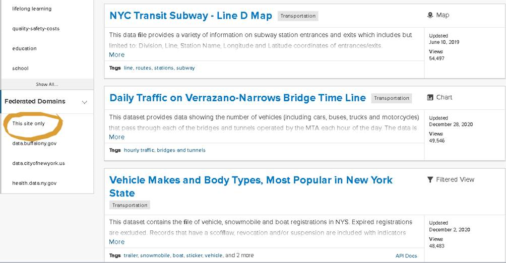
The filtering function on DATA.NY.GOV limits the search to specific domains

Plenty of geospatial data in both of these state portals albeit as the GIS community has come to know during the COVID-19 pandemic, address or large scale data is hard come by in the public health space.  Respectfully a whole other discussion and until there are fundamental changes in how public health data is published, it will be difficult for non-public health agencies, advocacy groups, or the general public to access such data at units of geography smaller than the county level.  Or sometimes if one is lucky, finding some at the zip code level.

For additional information on how to export Socrata data to other formats and/or platforms see this help document.  Also, Koop software is an Open Geospatial ETL Engine which enables users to leave geospatial data where it lives and transform it into a variety of formats including GeoJSON, CSV, KML, a Shapefile, or Feature Service dynamically.

There is apparently ongoing work/research within the state GIS offices with regard to both mapping NY Open data using the Socrata JavaScript API as well as enabling the Socrata platform to use the NYS GIS Program Office geocoder.  If successful, such efforts will greatly expand the Socrata data portals for the geospatial community.

NY Department of State Geographic Information Gateway

Launched in 2015, the Gateway is administered out of the NY Department of State, Office of Planning, Development and Community Infrastructure and is now home to over 700 datasets. The Gateway is an online mapping application that makes it possible to view geographic information in its native viewer or Google Earth and users can also download information in multiple file formats or even pull into other online mapping applications.  While the original geographic footprint of the Gateway focused on New York’s offshore planning area in the ocean and State’s portion of the Great Lakes, the repository now contains a wide range of geospatial datasets covering the entire State.

The Gateway has datasets  grouped  thematically and made available as map services. All content includes accompanying metadata enabling users to identify which data layers to select and easily consume from within the composite map service.    Perfect for desktop or web client mash-ups and analysis.  The site also includes links, integration, and content with crowdsourced apps.

The Gateway is a must see site having itself apart from other NYS departments in context of building a geospatial data portal with so much functionality and content.  There is a good chance you’ll find content for your GIS project here.

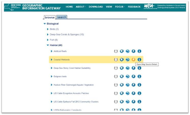
The Gateway data browser has icons for actions that can be taken with desired datasets; download, view in native map viewer, export to Google Earth, information for ingesting as a map service and metadata.

 NYS GIS Clearinghouse

The Clearinghouse was originally implemented in the late 1990s to facilitate statewide data sharing.   For many years it was the defacto #1 portal for all things/files GIS.  The focus being based on formal/written data sharing agreements between government and non-profit organizations. Amazingly in 2021 these agreements are still part of the Clearinghouse administrative structure though it does not get in the way of non-data sharing members – even those from industry and business – from downloading many datasets.  Give credit to those individuals who helped create the original Clearinghouse as it was one of the first of its kind at the time.

Much has changed since the Clearinghouse was initially launched which has impacted the data component of the site.  Time itself, and in this case decades, has proven to be a major challenge.  Publishers have come and gone, numerous retirements and point of contacts no longer exist, and limited metadata and datasets being out-of-date.  It’s a next to impossible to manage and keep most of the data files up-to-date and uniquely different in portals like the Clearinghouse.  Given the new generation of geospatial data portals that  we should expect to continue to emerge (particularly at the local level), the relevancy gap of the Clearinghouse’s data file inventory will likely continue to widen.  To say the least of the role of other similar data and web services available online via other free government and business sites such as The National Map, EPA Envirofacts, and ESRI’s Living Atlas.

The upside is the Clearinghouse is emphasizing and pushing data content  as  web services having placed this “option” at the top of the data catalog list. Seemingly to encourage users to “try this first” before sitting down and mining through the catalog on a file-by-file basis.  Much of the web service content are from the go-to State GIS office program areas (imagery, elevation, addresses, geocoding services, and to a limited degree tax parcels) albeit other state agencies are contributing services as well.   Kudos to the state agencies are keeping their individual file catalogs up-to-date and current albeit as earlier mentioned some of these state agencies are placing data on multiple portals requiring users to search in more than one location.

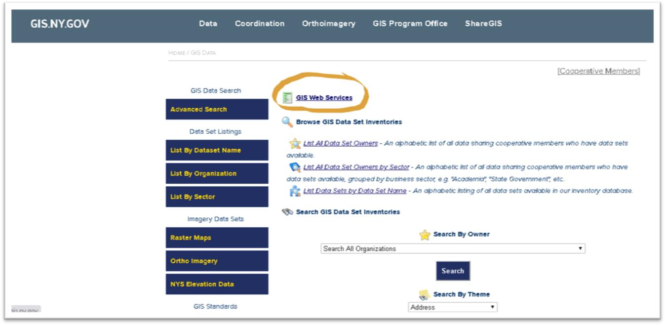
Instead of performing file based searches, users can access content via map services from a variety of state agencies

Hopefully, the legal shackles of the Clearinghouse data sharing agreement – instituted in the previous century – alone do not continue to influence the long term focus of the Clearinghouse with regard to managing and publishing individual datasets. One day, the statewide geospatial community would probably be better served when all of the remaining relevant  Clearinghouse datasets are consolidated into DATA.NY.US or CUGIR.     And perhaps leave the Clearinghouse to focus just on publishing data as a service with the current capacity it has built.

Municipal Government
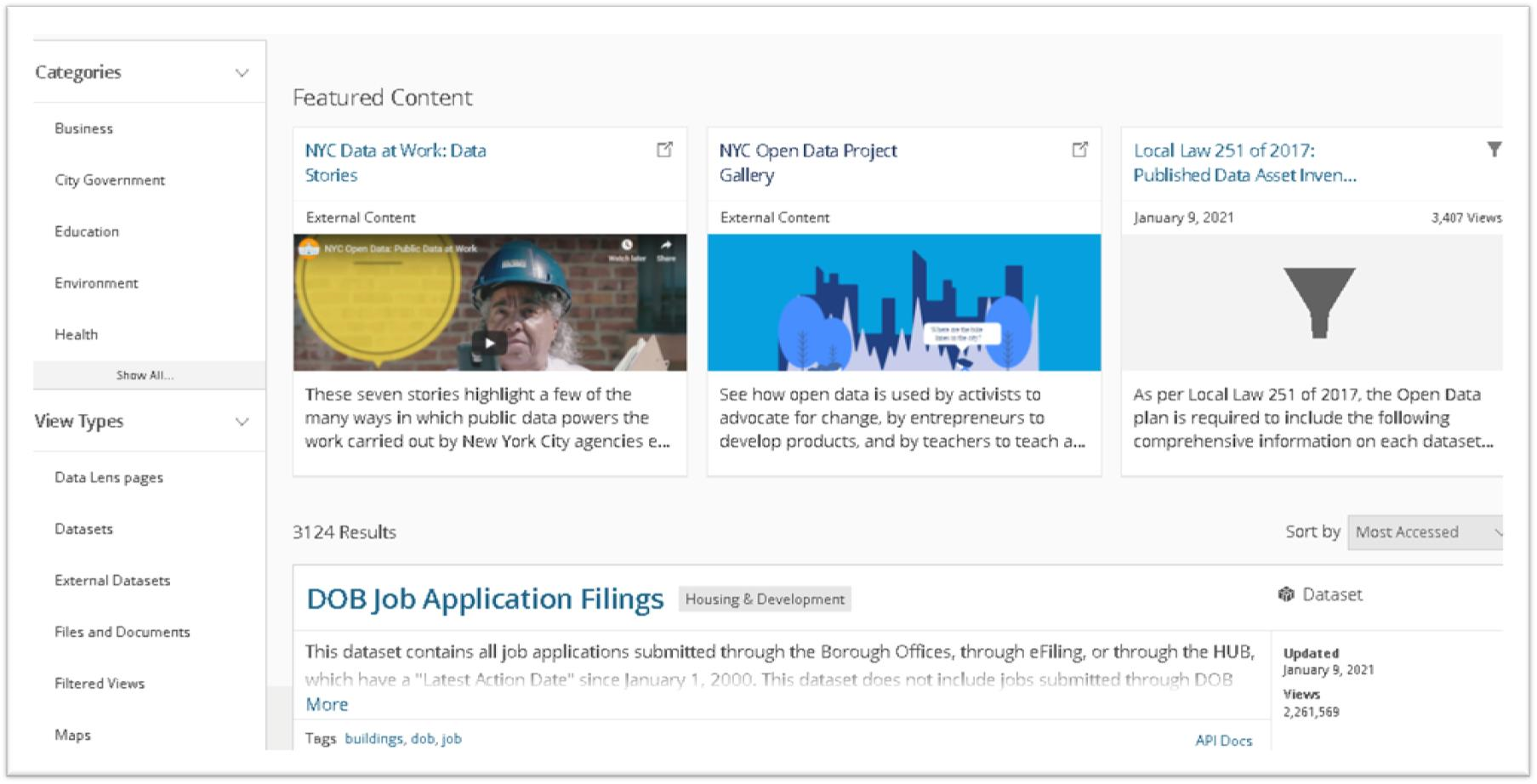
NYC Open Data

Another Socrata site, NYC Open Data is the big kid in the statewide open data sandbox with over 3,000 datasets grouped into just five categories available from nearly 100 reporting NYC departments.  In addition to just datasets, the site also includes files, documents, and external links.  So, if you are looking for geospatial data for the NYC geographic footprint this is the place to go.  The site has been around for several years already and is the creation of the  Mayor’s Office of Data Analytics (MODA) and the Department of Information Technology and Telecommunications (DoITT). As a hub of analytics in the City, MODA advocates for the use of Open Data in citywide data analytics and in the community.

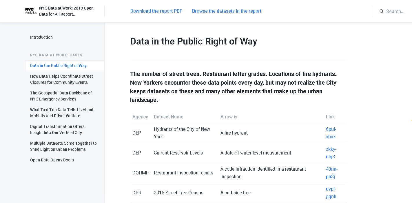
The NYC Open Data Portal also provides excellent narratives and examples of how geospatial data is used and is critical to the operations of city government.

NYC Open Data exemplifies the use of open data giving rise to a broad user community including organizations such as BetaNYC which hosts events such as the NYC School of Data, Open Data Journeys, various Open Data Classes, and in concert with the Mayor’s Office, the signature NYC Open Data Week – this year March 6 – 14. And data from the portal is routinely used in the NYC BigApps competition.

To fully appreciate how far open data has come in NYC, take a look at the list of publications and reports on this web page which chronicles its growth over the past several years.  And if you need further convincing, take a look at the NYC Open Data Project Gallery.

Go to the site and drive around.   Its worth the ride.

City of Rochester (DataROC)

Cities are great units of geography to build data portals in that their governments often oversee management of all the geographic features and data within the municipal boundary footprint.  Albeit this does vary on occasion with regard to utilities and some infrastructure  Geospatial data is consistent at the city level as government business applications are built and deployed to capture data to the same geographic extent.  As city applications continue to be geo-enabled, and open data initiatives are initiated,  this geofencing of the data provides a consistent geographic extent and a great framework to support a geospatial data portal.

DataROC was launched in 2020 and due to the city’s long time relationship with ESRI and staff who are statisticians and/or business intelligence analysts.   “ESRI’s open data framework was a good fit for the city” according to Kate Day, Chief Performance Officer, Mayor’s Office of Data Analytics & Performance.   Prior to the rollout of DataROC, the city already had both a police data portal and a map gallery of different ESRI tools, so the first major part of DataROC was to bring previously decentralized content together and make it easy to search. GIS staff in the city’s IT department assisted as change champions to make sure that the wider GIS community spread out across the City were aware of what the focus of the portal was to be and drive more traffic to the  work analysts in various department had done over the years.  Currently there are 203 items in the city’s open data catalog containing data files, apps, maps, documents.  If you need geospatial data for a project inside the Rochester footprint, this is the portal to visit and search for data.

DataROC offers easy access to data, applications that feature maps curated for a specific purpose, featuring up-to-date data, and a gallery of web maps to get around the city

With regard to an “example” as how specific governments vet data to their portals, the City of Rochester “publishes anything that is classified as public data / documents / applications that have been requested to be published by an internal or external stakeholder, but only after they have been approved by a Data Governance Committee”.  This committee ensures each dataset is truly for public consumption (essentially that it poses no individual or group harm for being published, that it would not violate any law/regulation to publish, and that the dataset meets quality standards to accurately represent whatever subject is being depicted or summarized).

Other illustrative statewide local government data portals include the City of Buffalo (Open Data Buffalo), City of Albany (openAlbany),  Westchester County (GeoHub), and City of Syracuse (DataCuse).

Academic

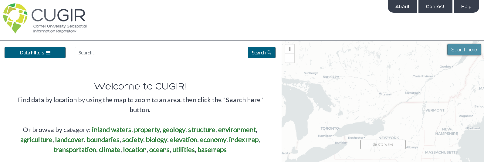
Cornell University Geospatial Information Repository (CUGIR)

I’ve always been a huge fan of the CUGIR portal and related program offerings.  Housed in academia and on the fringe of the statewide GIS mainstream, its original homegrown portal was built  and developed in Java in the 1990s.   The current CUGIR portal was launched in January 2018 and  is is built on several modern open-source components.  The front-end interface uses GeoBlacklight — https://geoblacklight.org/  which is a collaborative project being developed by several universities, including NYU, Minnesota, Stanford, Princeton, UC Berkeley, Cornell, and others.  CUGIR has made various customizations, some of which have been incorporated back to the project.

Subjects such as landforms and topography, soils, hydrology, environmental hazards, agricultural activities, wildlife and natural resource management are included  in the CUGIR catalog. All data files are cataloged in accordance with FGDC standards and made available in widely used geospatial data formats.

Behind the scenes, CUGIR uses Solr for searching and faceting (also known as “data filters”).  The site  use GeoServer to access copies of the data in a PostGIS database to generate map previews via publically-accessible WMS/WFS web services for each dataset.  Amazon S3 is used to host all the downloadable data as pre-generated zipfiles, so downloads are quick and reliable. The site uses  Leaflet to display the map on top of a CARTO basemap (which is built from OpenStreetMap data the web viewer.   Maintaining and supporting the site is long-time CUGIR GIS front man, Keith Jenkins.

Today, CUGIR’s datasets total about 15GB.  The total number of “datasets” listed in the catalog is currently 458, which appears much smaller than the nearly 8000 it used to be because in the old system CUGIR had content split up into many smaller downloads to accommodate the bandwidth limitations of the late 1990s and early 2000s.  So to leverage newer technologies and internet speeds, several data series were merged into statewide datasets.  As part of the process, CUGIR also converted old formats like ArcInfo Interchange (.e00) files to shapefiles wherever possible.  As part of the site upgrade, old links which had bookmarked or published were updated as well.  Today, NYS DEC and USDA NRCS have the most CUGIR records with other large catalogs from NYS Department of Agriculture and Markets and Cornell Institute for Resource Information Sciences (IRIS).   Data is also available from nearby Tompkins County GIS.   Excellent filtering tools enable users to search data by  several different categories  and download datasets in Shapefile, PDF, or KML format and export to either KMZ or GeoJSON.

CUGIR focuses exclusively on geospatial data which sets it apart from other general sites like DATA.NY.GOV.  The NYS GIS Clearinghouse and the NYS Geographic Information Gateway are more similar to CUGIR with each having their own unique datasets which in some instances can be confusing for someone looking for data and not sure where to look.  Additional CUGIR functionality includes pointing to and maintaining an index map to external datasets such as the National Elevation Dataset (NED).    Jenkins and his CUGIR team hope to build out similar functionality and integration with other Empire State geospatial portals in the future.
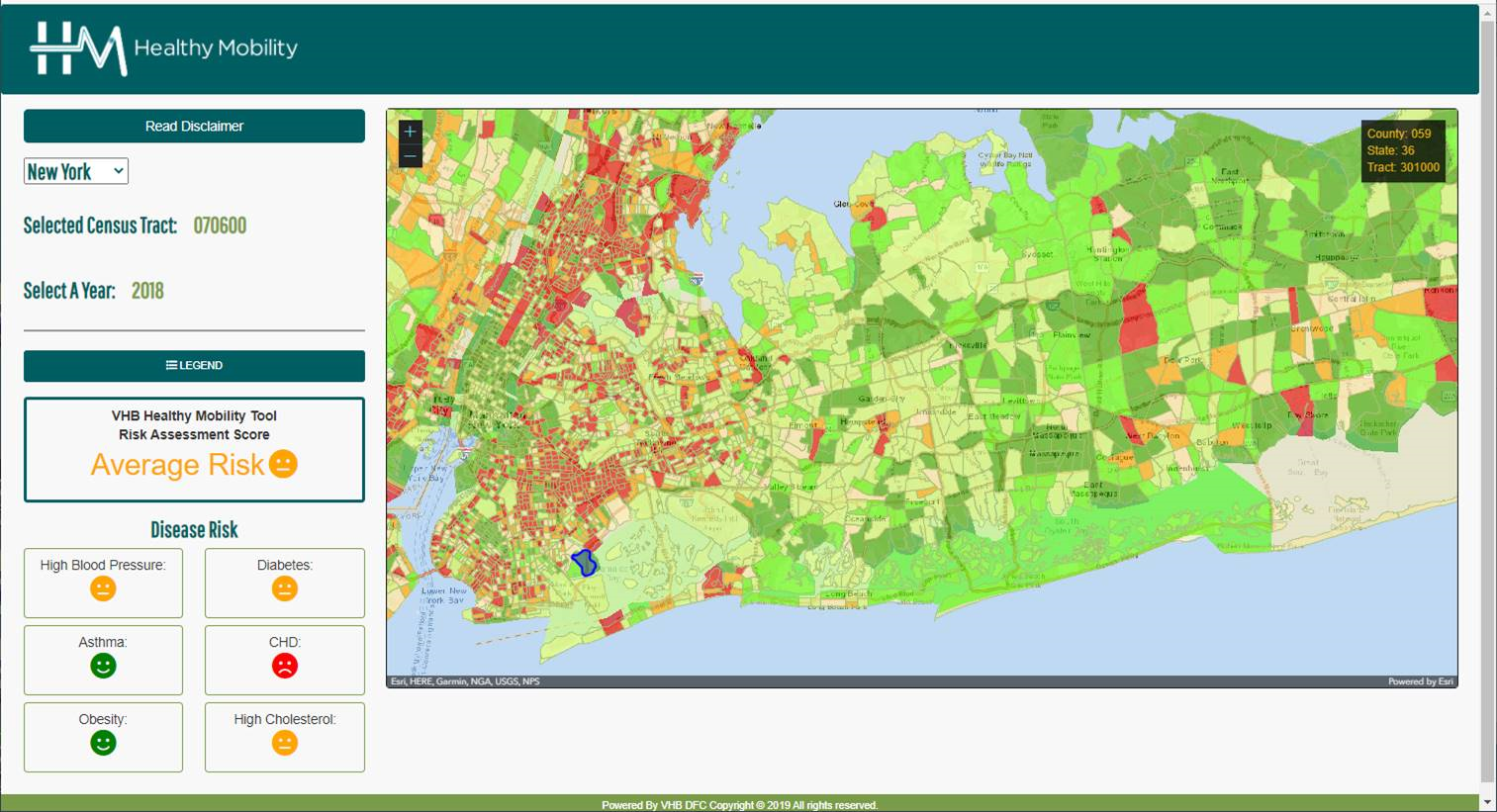
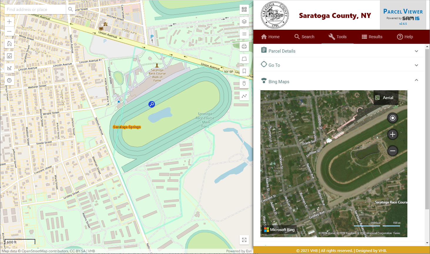
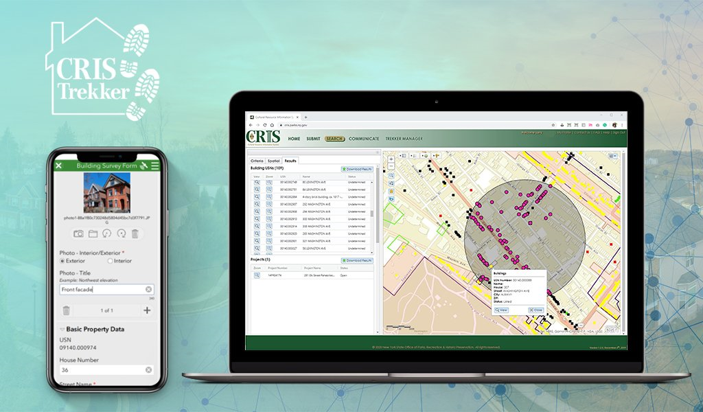
 

Geospatial Student Spotlight: Christopher Plummer

Academic Institution:

The University at Albany, SUNY
Department of Geography and Planning
Pursuing M.S. in Biodiversity, Conservation, and Policy

B.S The College at Brockport, SUNY, Environmental Science and Biology

Research Focus:

Using drones to assess white-tailed deer abundance and habitat preference in the Albany Pine Bush Preserve

Plummer’s overall research goal was to use thermal imaging drones to perform aerial surveys of white tailed deer and associated drone technology to produce an up-to-date habitat assessment of the study area to assess both white-tailed deer abundance and associated habitats. Plummer’s research proposes drones:

  • Offer a faster and lower cost of aerial data capture
  • Can be flown with lower detection from wildlife
  • Can be equipped with thermal sensors to aid in wildlife detection
  • Offer high accuracy population data with robust statistical strength

Study Area and Background:

Located northwest of Albany, the Albany Pine Bush Preserve (APBP) is approximately 3,350 acres supporting a broad variety of habitats highly fragmented by roads developed areas.  Hunting, fishing and trapping are recreational activities that are carefully regulated in the preserve following relevant APBP and New York State Dept. of Environmental Conservation (NYSDEC)  rules and regulations.

Historically, the monitoring of whitetail deer (WTD) has been difficult to establish due to obtaining reliable abundance estimates as traditional survey methods are normally very work intensive and/or expensive.  In the past such estimates have been done within the preserve with spotlight surveys and camera trap surveys.

(Historically, obtaining reliable abundance estimates of white-tailed deer has been difficult to establish, with more traditional methods being work intensive and/or expensive, and having issues with imperfect deer detection. In the past such estimates have been done within the preserve with spotlight surveys and camera trap surveys. Plummer plans to use the findings from the previous work to help understand how the use of drones compares to the more traditional survey methods.

Unmanned Aerial Vehicles (UAV) technology, more commonly called drones, was chosen as a means to facilitate WTD data collection and analysis in the Preserve.  Specifically, DJI Mavic 2 Enterprise Dual was used for the thermal deer survey while other DJI drones (Phantom 4 and  Insprie 2) were used to help create the orthophoto map.  A MicaSense RedEdge 3 multispectral camera which was attached to one of the drones helped pick up additional reflectance characteristics of varying vegetation types.  This camera has 5 bands, with the two additional bands sensing red edge (~715 nm) and near infrared (~825nm) wavelengths.

Universal Ground Control Station (UGCS) and DJI Pilot software was used to develop flight plans over three distinct focus areas in the Preserve.  Multiple flights were made to acquire enough images with sufficient overlap.  Plummer used Agisoft photogrammetry software to generate orthophotos of the study areas.

ENVI software was used to generate a supervised canopy cover classification of the study area.  Plummer was able to classify the entire orthophoto with >95% accuracy into herbaceous/open canopy, deciduous canopy, coniferous canopy, bare ground/no canopy, and developed canopy.  ArcMap 10.6 was used in a variety of ways as well as R-Studio and Microsoft Excel for data analysis.

Three flight plans in Blueberry Hill East and West and the Kaikout Kill Barrens

The research team flew a total of 34 surveys between March 9th and May 22nd 2020 with all flights occurring within 1 hour of sunrise collecting over 950GB of imagery files.  A total of 405 deer were spotted and identified in 143 unique locations.

Silhouettes of five deer as seen through Plummer’s use of thermal imaging photography

Project Findings

Plummer’s initial calculated observed average density of 13 deer per sq. km is unlikely to be uniform over the entire Preserve due to varying  landscape dynamics and various habitat types. The abundance within their study area varied widely over time, which Plummer suggests  is explained by daily movements made by individual groups into the nearby residential areas.  With regards to habitats, deer were more frequently found in the following areas of the Preserve:  (1) areas of recent timber harvest, (2) Pitch Pine cover and in the pitch-pine scrub oak barrens, (3) areas with significant dune activity, and (4) close to the edge of Preserve boundaries. He believes this new method for assessing white-tailed deer abundance has high potential in the wildlife monitoring space and hopes  his findings about deer within the Preserve will help generate well informed deer management decisions.

Plummer generated a habitat classification map based on the percent of each canopy type within a 50m x 50m grid covering the entire study area. The Pitch Pine Dominant Forest habitat along the southern border of the Preserve was one of the areas with the highest WTD counts.

Actual WTD observed during any given survey varied over time. Over the near three month data collection period in early 2020, WTD observation counts ranged from 1 to 30

Summary

Plummer’s SUNY Albany graduate work suggests that thermal drones are a viable tool to assess WTD population dynamics and can generate reliable abundance estimates.  Drone deployment provides the ability to survey large geographic areas in a small amount of time and a cost effective manner.  Results show that deer use a variety of habitat types in the Preserve and numbers at any one location varies temporally.  A detailed video presentation Chris made outlining his work to the members of the APBP is available here on YouTube.

Post-graduate work, Plummer would welcome the opportunity to work for an agency such as U.S. Fish & Wildlife Service or NYSDEC Division of Fish and Wildlife. He’s not opposed to going back to school for a PhD but not anything immediately.  He is also very interested in public policy related to climate change and sustainability.

Contact:

Chris Plummer
Graduate Student
University of Albany
Geography and Planning
ccplummer@albany.edu

Dr. Alexander Buyantuev
Associate Professor
University at Albany
Geography and Planning
http://www.albany.edu/gp/Buyantuev.php

MGRS Mapper: Software for Military Operations Mapping

Program built and designed by Rochester area New York Army National Guard member

While serving in a Joint Multinational Training Group in Ukraine (JMTG-U) in 2018 along with other NATO nation soldiers, New York Army National Guard CPT James Pistell, a Rochester resident, was using a website to make operations graphics as they planned training operations while training Ukrainian soldiers and battle staffs. A self-taught software web developer in civilian life, Pistell felt the website was outdated, had limited functionality, and believed he could build a much better version based on his military in-field service and programming skills.

Pistell makes available both free and subscription-based versions of MGRS-Mapper. The web site landing page provides access to the free version enabling site visitors to see samples of the military symbology and easy-to-use drag and drop functionality

Upon his return to the states,  leaving his full-time job in marketing and dedicating over a year of full-time development work,  Pistell released MGRS-Mapper (MGRS for Military Grid Reference System) in late 2018.  (The MGRS overlay is based on standard Grid Zone Designator intervals commonly found on military installation maps using the NAD 83/WGS 84 industry standard).  

Developed entirely with JavaScript the application enables users to easily overlay the MGRS grid atop of a Google base map (other base maps are available as well) and provides Premium users access to the latest standard in military symbols as part of  ADP 1-02 (Army Doctrine Publication) which contains over 737 unique symbols used by many branches of the military. This set includes all Land Forces, Equipment, Activities, Graphic Control Measures, Tactical Mission Tasks, Installations, Supplies, Command Posts, Civilian Authorities, Sea Units, Air Units and Sustainment.  Definitely not the same symbol sets the GIS community is accustomed to using in making land use and environmental maps albeit interesting nonetheless!

Premium Version

With access to the premium version I was able to build, if only an introductory amateur version at best, a CONOP (Concept of Operation) map.  Using symbols compliant with ADP 1-02, I’ve mapped out a National Guard training program in the area of Ft. Drum showing the locations of friendly (blue symbology) platoons and infantry, armored tank units, and field artillery. Red colored symbols, or hostile resources, identifying the locations of infantry and artillery units. Also included in the map show the locations target reference points (black crosses), check points on the western edge of Ft. Drum along Route 11 and a larger blue symbol in the southwestern part of the map to highlight a National Guard Command Post.  The symbol circled in green in the middle of the map is an Amnesty Point. Hundreds of other military symbols are available for the user.

The horizontal toolbar on the left side of the application provides the user with the capabilities of taking a screen snapshot (camera icon) and saving as a .png to be downloaded and emailed to another user, printed out as a handout, or embedded in slides.

Users can click on any symbol on the map and drag it to your preferred location. From there you can rotate, resize, invert, scale up or scale the symbol down.

Pistell is currently working on several enhancements to the application including allowing Premium mobile users to cache maps on their device for use in places with limited internet connection, porting the application for use on both Apple iOS and Android devices, and the ability to share live links of user maps for live map scenario collaboration.  MGRS Mapper also offers certain organizations a large discount on team accounts including Volunteer Search and Rescue Teams, Volunteer Fire Departments, ROTC Battalions, U.S. Military elements at section level or above, as well as any  organization that relies primarily on volunteers.

MGRS Mapper allows users to find locations by either typing in an address or inputting a valid MGRS grid coordinate as well offering several easily accessible and open source base maps including OpenStreetMaps (shown below), National Geographic, ArcGIS, Stamen (black & white) and OpenStreetMap.

Pistell notes he has about 225 active subscriptions with many in military (Army).  He also includes on the list the Panamanian National Guard, Californai Search and Rescue Team, and numerous civilians who are military trainers.  “It’s incredibly rewarding to see individuals and organizations using a software program that you’ve written all the code for and built from scratch”, he says.  Continuing he notes “ this all started with my experience overseas and wanting military leaders and colleagues to make training maps and apply the same principals to organizations stateside.”

It would appear with the release of MGRS Mapper that Pistell is fulfilling that vision.

He currently serves as Cyber Network Defense Manager for the 173rd Cyber Protection Team in the New York Army National Guard.  

Contact:

CPT James Pistell
MGRS-Mapper
admin@mgrs-mapper.com