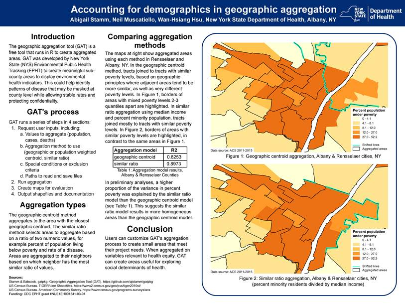
Background
Since early July this summer when our youngest son Lukas and close friend Mike Jock completed and established a new record for an unsupported thru-hike of the 46 Adirondack High Peaks, I’ve been asked by various friends and colleagues across the region (who became aware of the accomplishment) as to whether or not any professional geospatial/GIS technology was used in some capacity in supporting the effort. Each time my humbling answer has been pretty much the same: Not Really. However, they did carry some new gadgetry which is currently used ubiquitously across the adventure and extreme sports landscape to collect data that was used to authenticate their achievement. But more on that later.
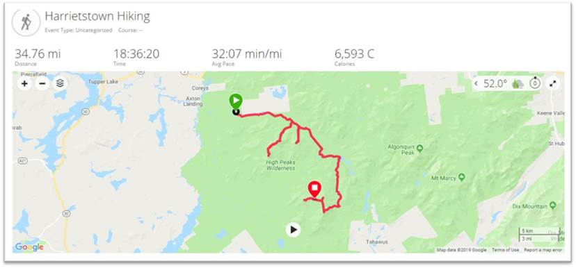
Starting their trek at the trail head to Seward Mountain at 3:30 AM Thursday, June 27th on the west side of the Adirondacks, the two covered the 46 High Peaks in 7 days, 2 hours, and 52 minutes finishing by summitting Mount Esther, on the northern shoulder of Whiteface shortly after 3 AM on July 4th. Ultimately making it down to the Mount Ester trail head at 6:20 AM to complete the trip. All said, nearly 212 miles and 70,000 feet gained in elevation – more than twice the elevation of Mt. Everest. They averaged well over a marathon a day, covering some 25-30 miles. On the final day they kept moving for more than 23 hours covering 45 miles.
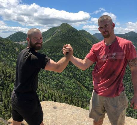
Michael, left, and Lukas at the summit of Armstrong Mountain with Gothics Mountain in the background. The two were soccer teammates at SUNY Cortland. Mike King photo.
Preparation was more old school than one would think. Nothing in this space replaces on-the-ground knowledge of the trails, trail junctions, where and when to bushwhack, locations of rock cairns for reference points, as well as planning and hiking/testing certain stretches of the route ahead of time. Yeah, practice runs. Luke had the benefit of many years of experience having first started ADK trail hiking since he was barely in kindergarten. Like many other young children, his first “mountain” being Mt. Jo overlooking Heart Lake adjacent Adirondack Loj. Safe to assume that through the family ties, his spatial orientation has always been pretty decent. Mike, a local boy, grew up in the Plattsburgh area.
This was their third attempt. And such accomplishments don’t come without the element of good fortune avoiding injuries (which was the case in 2018) and a bunch of days with generally decent weather. The 2018 attempt was also impacted due to an encounter with a black bear. Yet another ADK backcountry hiker lesson in overnight food storage.
Given the enormity, location, and challenges of the effort, it would clearly not be safe, if not irresponsible, to rely solely on the new generation of lightweight/handheld navigational devices as a means to lead one through the Adirondack Mountain wilderness. There is no substitute for first-hand knowledge of the trail network and a pre-determined plan. They carried only the essentials such as lighweight sleeping bags, tents, change of clothing, raingear, first aid/basic emergency gear, water filters, and food. Counting every ounce in keeping their backpacks to about 40 pounds. Even omitting the weight of gas canisters/gas stove and in doing so did not prepare anything hot the entire trip. Zero assistance.
Cool Gadgets
It’s amazing how far the adventure mapping and video/data collection market has evolved since GoPro technology was introduced nearly a decade ago, if not earlier. The ability to playback Mike and Luke’s accomplishment – made available below via a series of links – is amazingly made possible by just a one simple mobile (wearable) component. They used a Garmin Fenix 5 GPS Watch to collect X,Y and elevation data which, based on wireless connectivity, automatically uploads to Garmin Connect. Upon completion of their hike, the entire trip dataset was downloaded to Relive an outdoor 3D video website which allows further rendering and interactive use of the data. Two Anker PowerCore 26800 pre-charged power banks kept their phones and Garmin device charged. Of sufficient size to recharge their phones/devices numerous times over. They took two but in fact only needed one. The Garmin app also collects heart rate, estimated calories burned, pace (minutes per mile), elevataion gain/loss, and total daily distance – all of which is made available in interactive and graphic form. In addition to the default Google basemap, data can be rendered on other base maps including satellite, terrain, OpenStreetMap, and Here. Amazingly compact, yet powerful tools.
The Daily Numbers
The following section includes a brief narrative – Mike’s own words- and links which can be used to highlight trail and body metrics as well as mapping visuals for each hiking day. For those familiar with hiking and trekking in the Adirondacks, the visuals certainly help put Luke and Mike’s daily segments in better perspective.
Hold on to your seats.
Thursday June 27
Hiker Notes: 3:30 am depart from Corey’s Road. Day consisted of seven mountains: Seward, Donaldson, Emmons, Seymour, Santanoni, Panther & Couchsachraga. Out and backed the first four. Trekked approximately 10 miles to Santanoni range. Set up camp at the base, then we went up the expressway to summit Santanoni first, followed by Panther, and then finished with Couchsachraga. We came down the Panther brook trail before staying at camp at base of expressway again. Approximately 37.84 miles.
Instructions for all similar images below: Click on map for additional graphics and daily metrics. Or click the black triangle button at the bottom of the screen to see hiker movement over the course of the day.
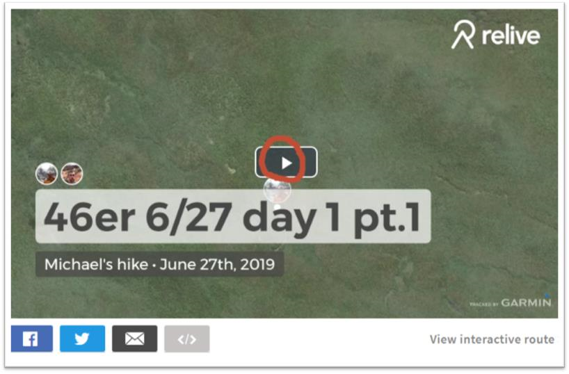
Instructions for all similar Relive 3D Interactive links below: Click on the icon circled in red to see daily hiker movement on top of a 3D base map and associated photos. Clicking on the “View Interactive Route” button enables the ability to interact with the map and trail data “twirling” the image to see from the north, east, south, and west perspective.
Friday June 28
Hiker Notes: From camp, hiked over to Allen mountain, out and backed it before moving up towards Colden/Avalanche Lakes. We out and backed Mount Marshall before setting up camp over the dam at Lake Colden. We summited two mountains and covered approximately 28.47 miles.
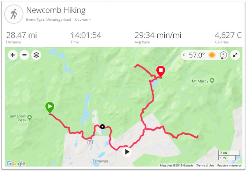
June 28th: Relive 3D Interactive
Saturday June 29
Hiker Notes: The ADK Loj Loop day. Summitting eight mountains and doing a big circle before returning to the same place we camped the night before. We started by going up the backside of Colden, then Tabletop, Phelps, Street, Nye, Wright, Algonquin and finishing on Iroquis. Approximately 32.18 miles
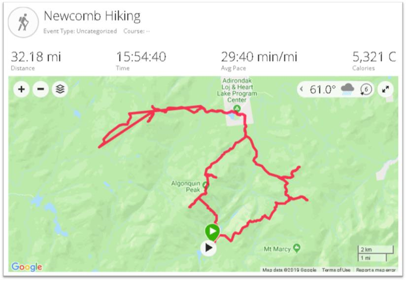
Note: The only day “noise” was either user generated or introduced by the Garmin device itself. In the vicinity of Street and Nye – Illustrated by the “straight” additional red line. Also reflected in the Relive 3D viewer.
June 29th: Relive 3D Interactive
Sunday June 30
Hiker Notes: Audible day. Started by moving to the base of Cliff and Redfield (out and bacs), then trekking up towards Gray, Skylight, Marcy, Haystack, Basin and finishing with Saddleback. Due to it raining all day, made the game time decision to check out and head towards Johns Brook Lodge where we camped at the trailhead of Big Slide Mountain (setting ourselves up the next day to finish the Great Range and start moving east). Summitted eight mountains and covered approximately 22.5 miles.
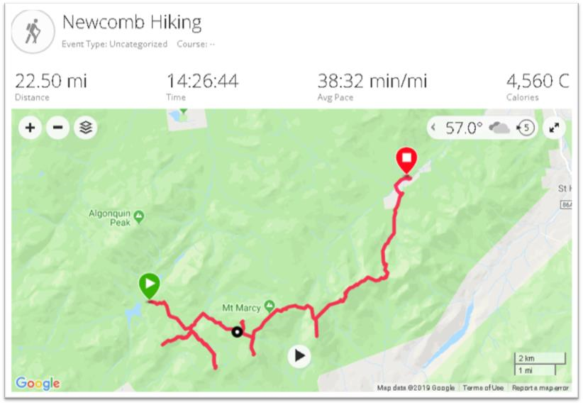
June 30th: Relive 3D Interactive
Monday July 1
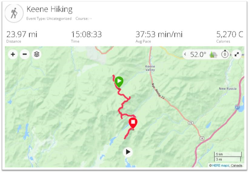
Hiker Notes: Out and backed Big Slide early in the AM, before climbing up towards Great Range. First we summited Lower Wolf Jaw, then Upper Wolf Jaw, Armstrong, Gothics and Sawteeth. We then headed down trail to Lower Ausable Lake. Next we did Colvin and Blake before camping between those two mountains. In total we summited eight peaks again and covered 23.97 miles.
July 1st: Relive 3D Interactive
Tuesday July 2
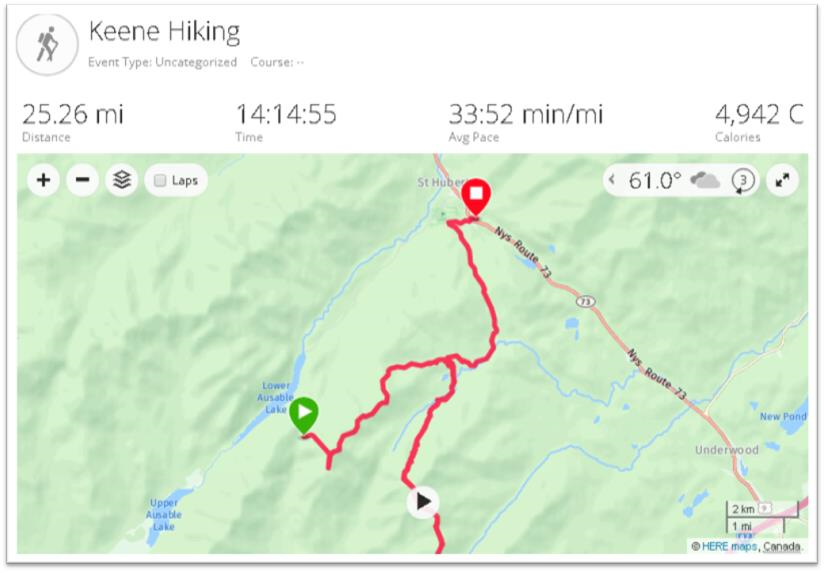
Hiker Notes: Started by ascending Nippletop, moved on over to Dial, then bushwhacked down towards the Dix Range. Once we got down from bushwhack/brook we dropped bags and then out and backed the entire Dix Range: Dix, Hough, South Dix, Grace Peak & Macomb. From there we got our bags again and then moved our stuff over to Roaring Brook and the base of Giant Mountain. In total we covered 25.26 miles and summitted seven peaks.
July 2nd: Relive 3D Interactive
Wednesday July 3
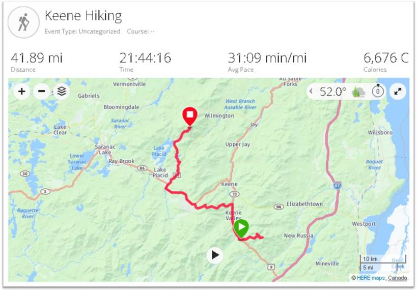
Hiker Notes: The 24 hour day. Woke up at 3 am and went to get Giant and Rocky Ridge Peak (out and backs). From there we picked up our stuff again and schlepped ourselves 5.5 miles down route 73 toward Marcy airfield. Next up was cutting from one side of 73 to the Lake Placid side of 73 along the ridge trail that summitted Porter and Cascade Mountains. Off of those we had then a 10 mile stretch on route 73 and then River Road towards the trai lhead to Whiteface mountain. Using the trail by Connery pond we entered that portion at 1030 PM and was able to summit both Whiteface and then Esther by 3:15 am. About 23 hour and 30 minutes of moving time we summitted our final 6 peaks and covered 44.18 miles. Passed out for an hour and reached Memorial Highway by 06:22 AM, where a time-stamped photo was taken.
July 3nd: Relive 3D Interactive (Part 1) Incredible day!!
July 4th: Relive 3D Interactive (Part 2)
Summary
Quite an effort and on top of setting the record, between this trip and last year’s attempt, the two helped raise nearly $18,000 for the Dubin Breast Center at Mount Sinai Hospital in New York. Their accomplishment was covered by Backpacker Magazine as well as a selected number of upstate New York online publications (UpstateNewYork and NNY360) among others. The articles are generally similar in content though do offer more details about food and other daily nuances/items which I omitted here. Choosing rather to highlight and focus on the immense geographic element of the effort.
Both Luke and Mike are personal trainers living and working out of New York City. More information can be found on their website Team Adventure Portal.


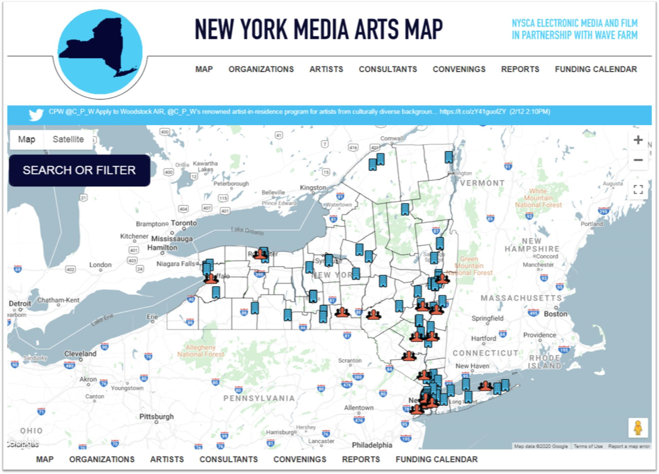
 The report was published by the Harvestworks Digital Media Arts Center and
  Founded by Javier de la Torre, CARTO is a diverse and expanding company which includes data scientists, geospatial analysts, cartographers, software developers and engineers, visualization experts, and web designers focusing on Location Intelligence. Most recently in May 2019, CARTO expanded its worldwide professional service portfolio offerings by
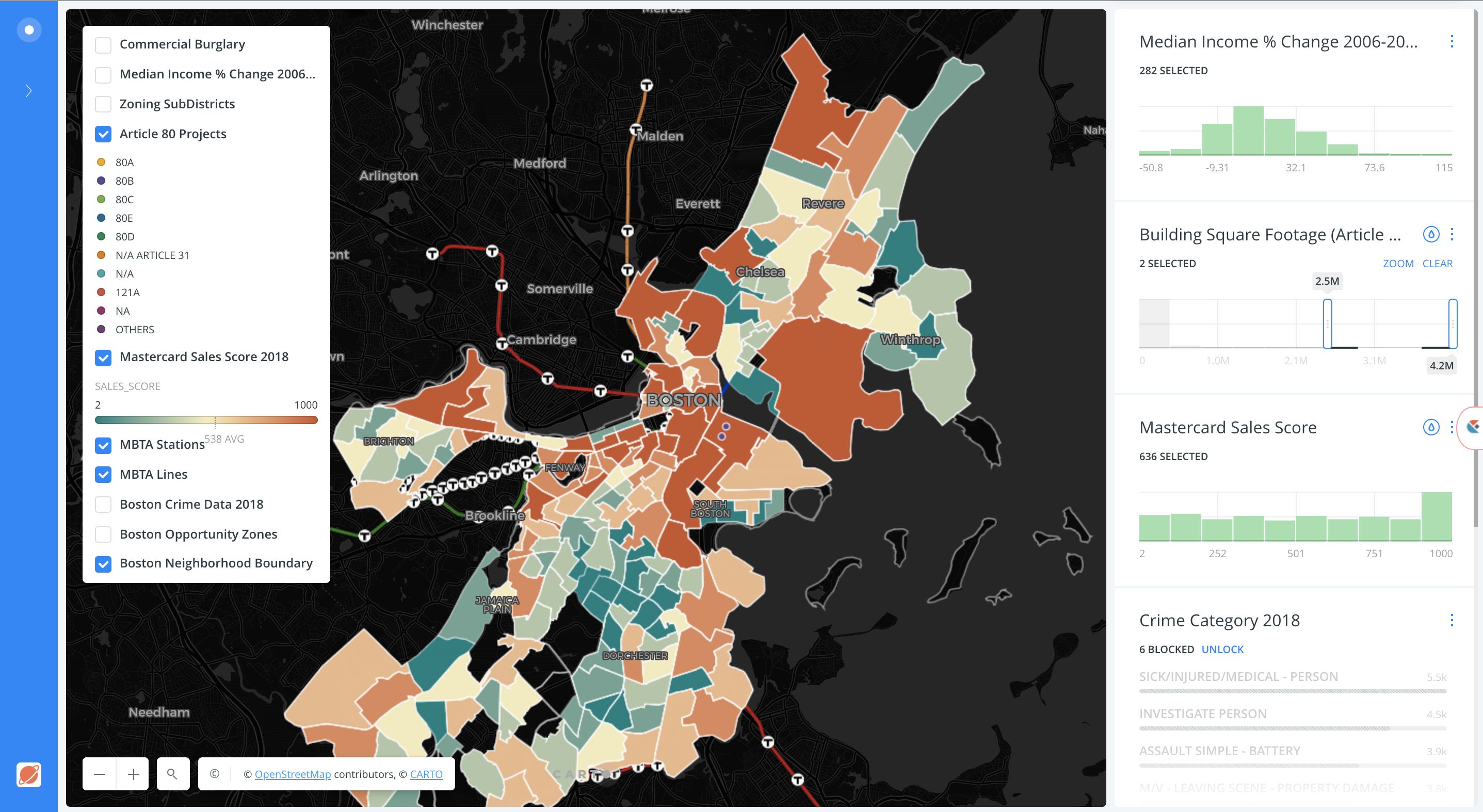
 I had the opportunity to attend the