Envisioning the Future of Buffalo’s East Side

AGOL viewer, data HUB, and other geospatial tools used in helping develop WITHIN East Side Plan

Community focused GIS projects are always a favorite of mine to write about.  Highlighting how geospatial tools can be used by community groups – including nonprofits which are often project sponsors – to better help visualize and understand the vast array of environmental, regulatory, business and public health, and cultural data which impacts their daily lives.  One such project located in Buffalo’s east side was brought to my attention in a recent communication with Lisa Matthies-Wiza, Director of Geographic Information Services at Erie County.  

WITHIN East Side

The WITHIN East Side project is one of many projects of LISC Western New York (WNY) and its larger parent organization LISC New York.  program.   WITHIN East Side  focuses on simplifying the neighborhood planning and community development process, and ensures development is driven by resident leaders and community groups.  As an open, inclusive, community-driven initiative, WITHIN East Side brings together neighborhood voices, trusted partners, and supportive funders in an effort to better the wellbeing of residents using their own visions. Together with LISC NY, the WITHIN East Side stakeholders collaboratively identify projects that sustain the positive momentum happening in local neighborhoods.

In early 2020, LISC NY began planning with community partners in three geographic focus areas in the East Side under the WITHIN East Side program.  The East Side of Buffalo, which is the heart of Buffalo’s Black community was chosen as it is purposeful to build upon and lift up the long-time visions of residents and community leaders in neighborhoods most impacted by historic disinvestment, environmental, structural, and systemic racism.  The additional impact of the racist mass shooting on May 14, 2022, that killed 10 people, at a local supermarket within the planning area, furthered the importance of amplifying the community’s voice and vision for the future.

The project was designed as a two-pronged approach–integrating economic development and quality-of-life planning.  Closely intertwined, both  economic development and quality-of-life planning require understanding community history and dynamics, collaboratively identifying projects, building relationships with diverse stakeholders, and turning community priorities into progress.
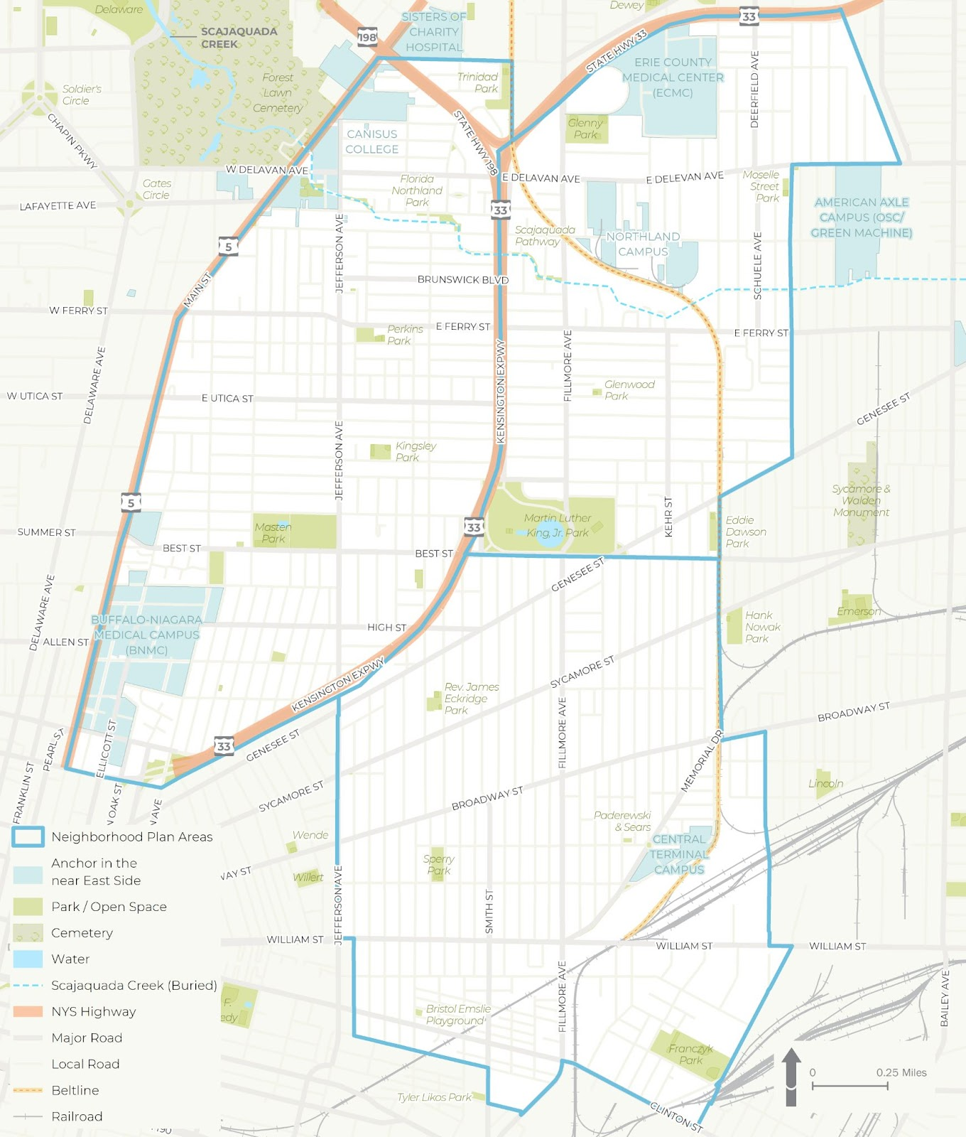
The WITHIN East Side project was broken into three distinct study areas – each of which was studied in more detail for a wide range of demographic, cultural and economic development issues

Background

LISC NY contracted with Prospect Hill Consulting (PHC), a local minority and women owned consulting firm which had responded to a formal Request for Proposals (RFP) which was issued in January 2021.  GIS mapping and analysis was a requirement and the LISC NY team knew GIS services were important to supporting the overall East Side project.  PHC was selected to perform elements A (GIS Mapping [including an online mapping tool request and a data HUB) and B (Scenario Planning).   While LISC NY had a vision of what the final plan might look like,  PHC was instrumental in assisting LISC NY in developing maps and visualizations used in the final plan and in community engagement sessions throughout the process.
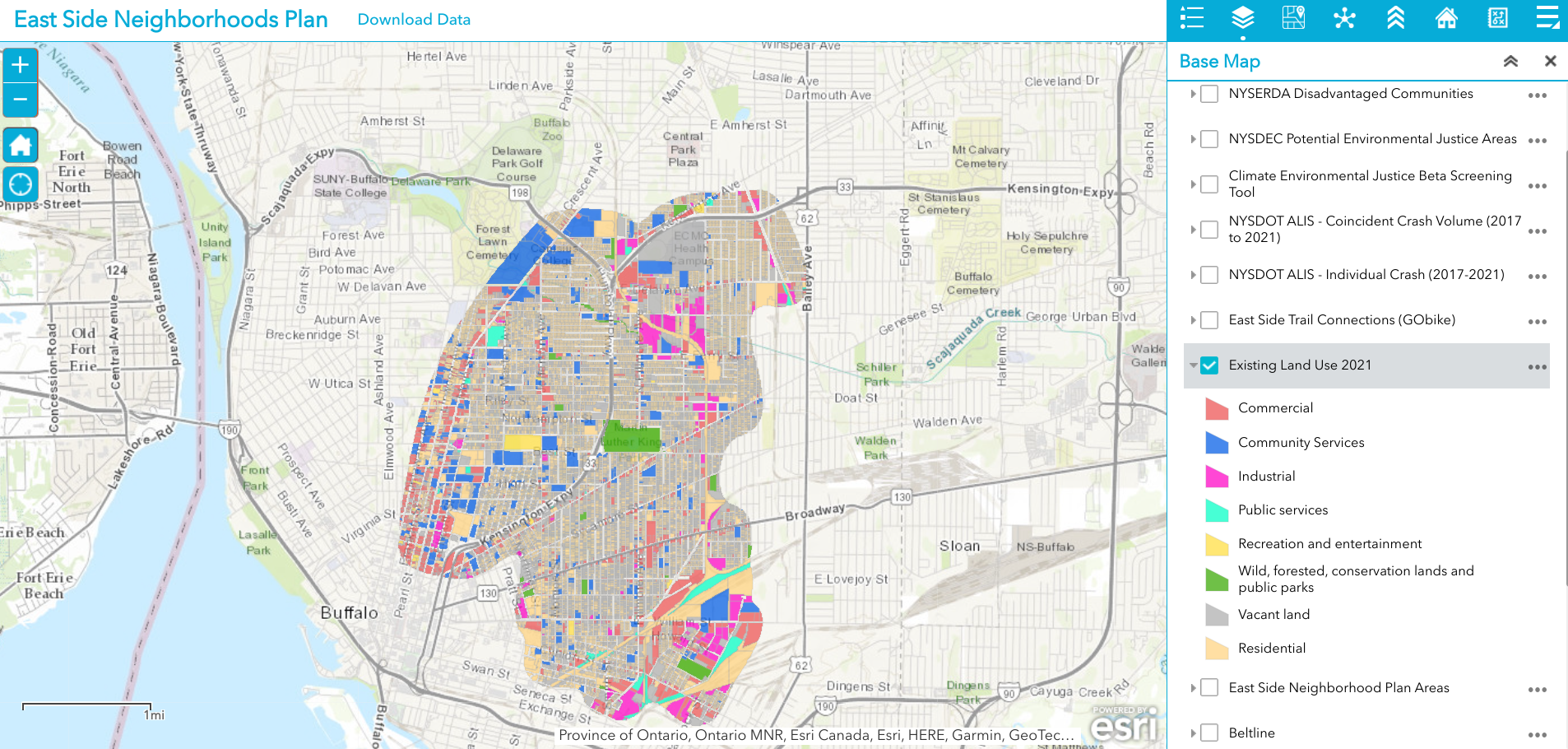
Existing 2021 land use is just one of dozens of data layers in the WITHIN East Side AGOL viewer. The rich database consists of local, regional, state and federal datasets.

Leading geospatial development of the East Side project from PHC was Jenny Magovero, President and Co-founder. Ms. Mogavero has been working in the GIS field for 23 years covering geospatial applications in community planning and environmental sciences as well as work in data visualization and  project management.  Mogavero created all of the maps in the East Side plan using the ArcGIS client as well as for spatial analysis and modeling.  The project web map is ArcGIS Online based with the data stored in a Hub Site (to allow for data sharing) and was designed about halfway through the GIS mapping and analysis task to support the WITHIN planning process itself.
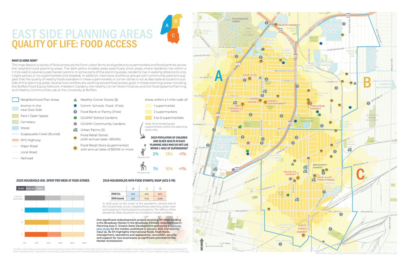
One of the many excellent graphics iWITHIN East Side report. The map on the right identities areas within the study area where supermarkets are located – a significant issue for residents with limited transportation options.

LISC NY wanted to be as transparent as possible and allow stakeholders (i.e. the community/public, organizations, etc.) to work with the data and download and use it if they needed.  To this end, the AGOL interactive map was used in community outreach and meetings early in the project and as new data came online (i.e., stakeholders requested to see additional themes) PHC continued to update the AGOL viewer. PHC designed the AGOL viewer to serve as a communication medium that allowed LISC NY to show project progress, survey the community on what themes needed to be covered and/or identify gaps, and to act as a platform to continue engagement with the community in the future. 
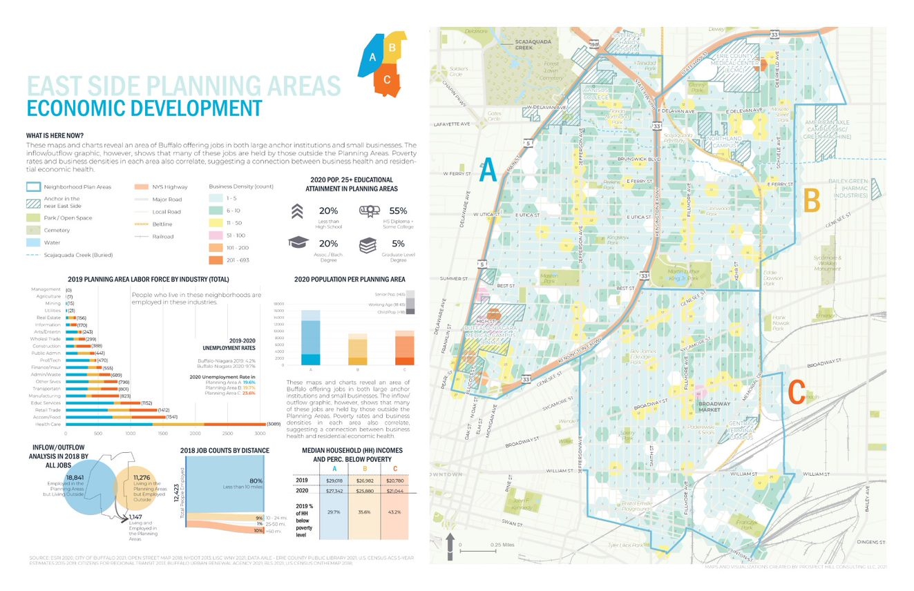
Economic Development issues are paramount in the study such as the role of small businesses, inflow of non-residents that work – but do not live – in the area, as well as the concentration(s) and accessibility of employment opportunities.

Data collection and development was specific to the mapping and analysis that the LISC NY team needed for the WITHIN plan itself.  As LISC NY has significant business relationships within the greater Buffalo community, they were able to collect a lot of data from local, state and NGOs. In addition, PHC collected publicly available data from the City of Buffalo, Erie County (parcels, land use, etc.), New York State  (NYSDEC, NYSDOT, etc.) and federal datasets (EPA, Census, etc.).  Additionally, PHC developed data from reports or datasets that were anecdotally described by stakeholders (like the air quality buffer, buried portions of the Scajaquada Creek, key intersections, etc.).  Project data was also obtained from utilities, Google, OpenStreetMaps, and ESRI.  

Most of the project data is made available through the LISC WNY Open Data Hub which was also designed and continues to be supported by PHC.  (Some providers did not want their data to be shared so it is only available for viewing in the application.)   
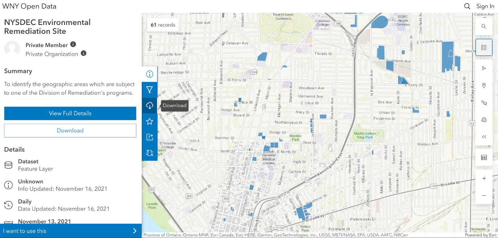
No AGOL account is necessary to access the HUB and tags help users to easily jump to specific themes of data presented in the final plan for download.

PHC used a bevy of GIS,  statistical packages, and desktop publishing software tools to generate the maps and graphics in the report including: 

  1. ArcGIS Online to collect stats for the neighborhood that were ACS 5yr census based (https://doc.arcgis.com/en/arcgis-online/analyze/enrich-layer.htm)
  2. Geospatial processing tools to buffer, clip, summarize, and run overlay analyses
  3. Spatial Analyst tools to develop walkshed layers (from points provided by Walkscore)
  4. Tableau Desktop and Excel to conduct data exploration to emphasize trends (or data insights) with graphs/visualization on  map layouts
  5. Adobe InDesign for page layouts and other graphics to be consistent with the LISC NY brand book (design guide) including colors, fonts, and logos.
  6. ESRI’s Hexagon sampling tool to visualize parcel data classes (i.e. land use, vacant parcel density, ownership) at the scale of the plan areas. 
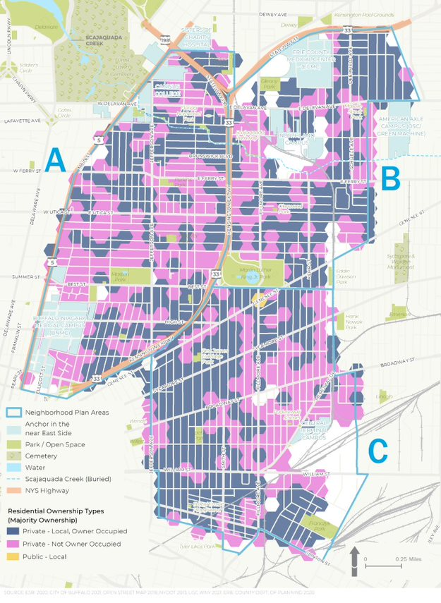
Residential ownership type is an important variable in urban studies. Data presented in the figure above suggests there continue to be many opportunities in increasing owner occupied properties in the study area

Summary

While consulting architecture and engineering companies continue to expand their geospatial offerings to governments and regional programs in 2022, particularly in the infrastructure and public works space, planning firms such as PHC serve in a unique space focusing on efforts which include applying geospatial tools as part of important community-based projects which often include significant public input and involvement.  Tools such as AGOL provide a great  framework in which to engage the public with regard to adding and removing data content and visualizing potential scenario outcomes.  A particularly useful tool given the enormity of the data used in the WITHIN East Side plan.

Reflecting on PHC’s involvement in the study, Jenny Mogavero notes:

“LISC NY is an integral part of, and key economic engine within the Western New York region.  Prospect Hill was honored to partner with the LISC NY to use GIS data, visualization tools and spatial analysis methods to not only present the existing conditions of our city’s East Side neighborhoods, but also reveal the deeper insights that occur when we overlap data-driven stories across multiple thematic lanes.  We were thrilled that our work supported the teams’ consensus building goals to develop a vision of a prosperous future for an important part of our City.”

Tyra Johnson Hux, WNY Director of Operations, also reflects on PHC’s work and the use of geospatial tools in the project adding:

“WITHIN East Side amplifies the visions of residents and community leaders in neighborhoods impacted by historic disinvestment, environmental, structural, & systemic racism. Showing their stories through, not only their own words, but also data was critical to helping our stakeholders generate a bold, authentic and comprehensive vision with an emphasis on implementation.  PHC supported the WITHIN East Side Plan by working with the project team to identify, collect and normalize relevant GIS data from neighborhood, government, academic and other partners. Additionally, they worked with us to analyze and visualize the community experience through maps and infographics.  The online interactive map and data warehouse they developed made it possible to share data in a way that breaks down silos, facilitate  strategic planning and continue community conversations.”

Contact

Jenny Mogavero, GISP
Prospect Hill Consulting LLC | Principal
716.432.9053 | www.prospecthill.co
jmogavero@prospecthill.co

Lashay Young, Director
External Affairs for LISC NY
https://www.lisc.org/
LYoung@lisc.org

Geospatial Student Spotlight: Caitlyn Jeri Linehan

Academic Institution:

Lehman College, City University of New York (CUNY)                              Bronx, NY
Department of Earth, Environmental, and Geospatial Sciences
MSc Geographic Information Science  (June 2021)

Trinity College                                                                                            Hartford, CT
B.S. Environmental Science  (May 2019)

Research Focus:

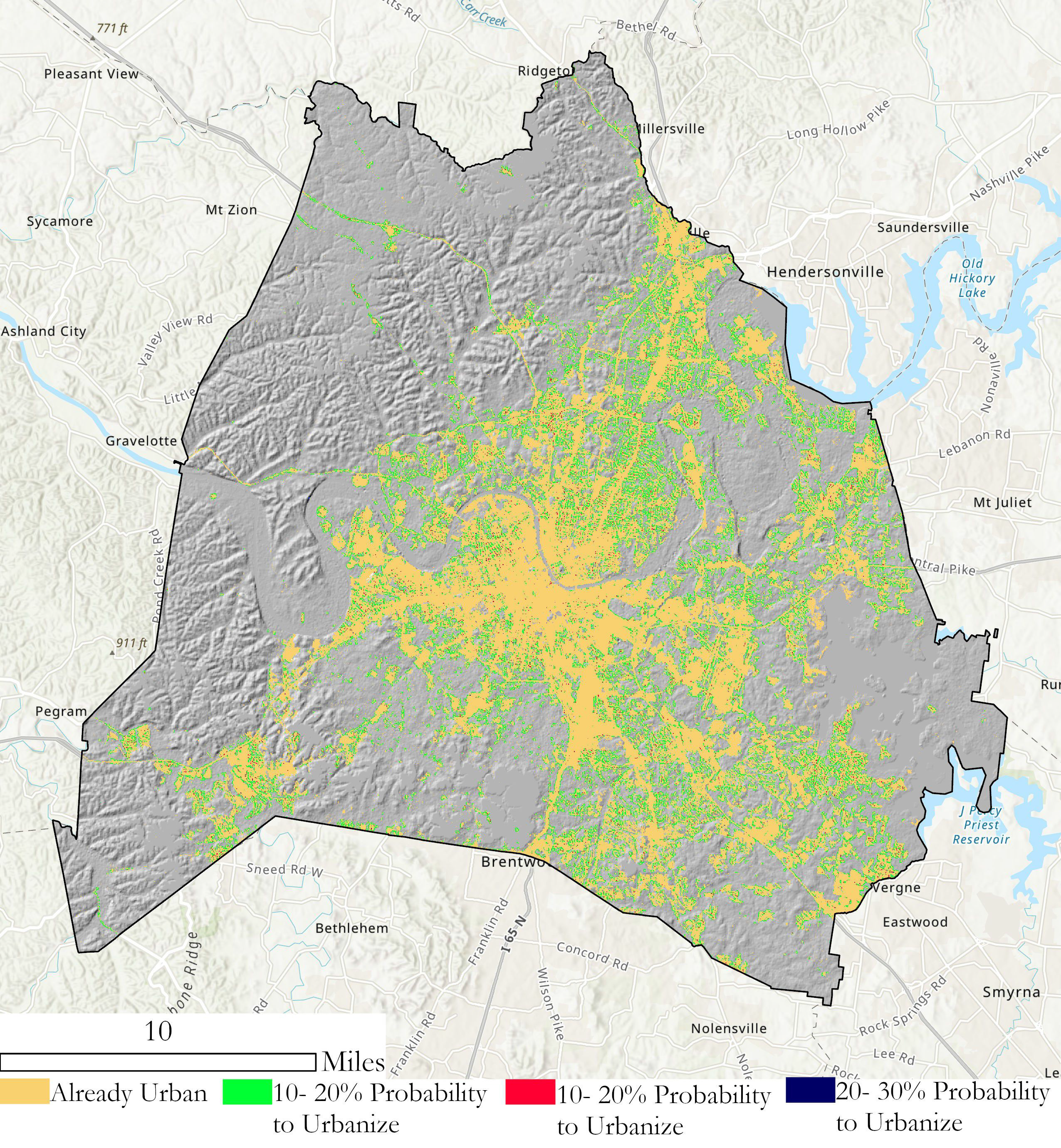
Linehan’s graduate research focused on studying future urban sprawl in the metropolitan area of Nashville, Tennessee (Davidson County).  As part of this work, she applied the SLEUTH (Slope, Land cover, Exclusion, Urban growth, Transport and Hill shade) Model which utilizes several commonly accessible geospatial datasets including
USGS Shuttle Radar Topography Mission (SRTM), National Land Cover Database (NLCD), U.S. Census Bureau road files, and Digital Elevation Models.  Additional geospatial data was added from local sources.

Developed by Dr. Keith C. Clarke at UC-Santa Barbara, SLEUTH is categorized as a “cellular automata (CA) model” and is open source and available for download.   It models urban growth based on cells (5km x 5km, 30m x 30m, etc.) which support the geographic  unit of analysis.  The model suggests that changes in the geographic construct of any specific cell normally mimics and is a result of similar changes in neighboring cells.  Clarke was faculty at Hunter College in NYC 1982-1986.

Historical imagery and vector data of the datasets identified above of Davidson County for 2001, 2006, 2011, and 2016 were collected and used to calibrate the SLEUTH model to simulate urban growth for the period of 2017-2040. The urban area for 2016 was 119.81 square miles and from the SLEUTH model is said to increase to 121.90 square miles for 2040. The urbanization rate during the historical time period (2001-2016) is 11.11% but the SLEUTH model predicts a  much slower urbanization rate during the simulated time period (2017-2040) of 1.59%.  This study shows the SLEUTH model can be beneficial in modeling future urban growth but also suggests a need to model more accurately development within intra-urban areas as well as vertical urbanization within already densely urban regions.   Here is a great 10-minute YouTube presentation describing the study and for those interested in more detailed information, here is a copy of Linehan’s thesis.

While the population of Nashville and Davidson County is expected to grow over the next 20 years, most of the growth is anticipated in already developed areas minimizing urban sprawl.

Selected Additional Geospatial Projects:

New Yorkers for Parks

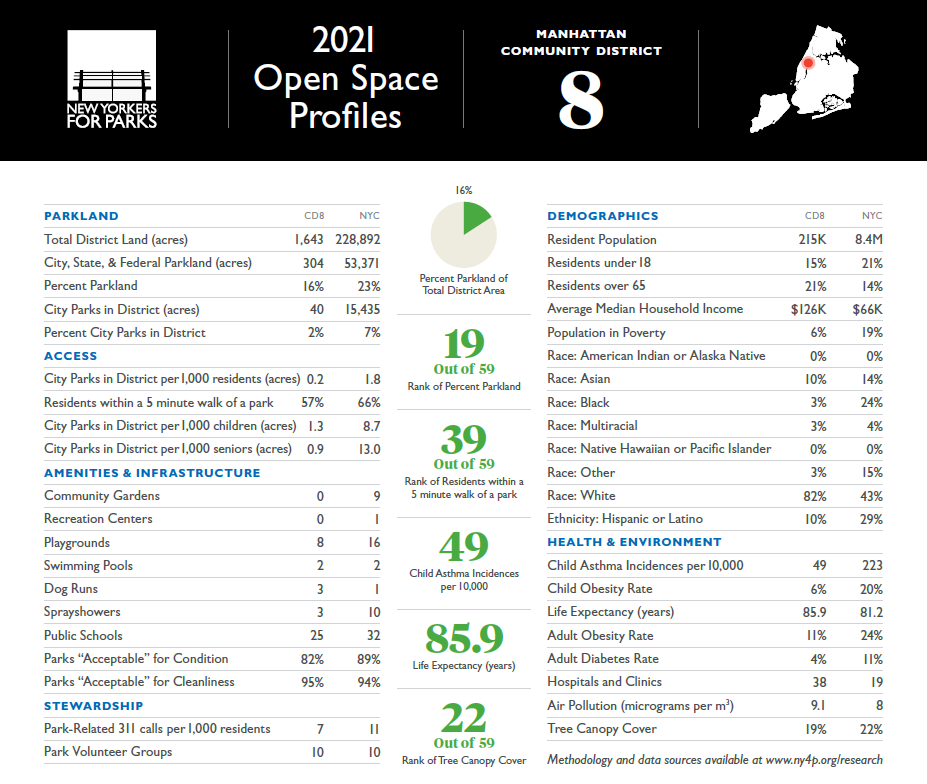
As an intern for the New Yorkers for Parks, Linehan created Open Space Profiles on parks and open space citywide, broken down by each NYC community board district. From open space quality and access to demographic and health information, the Profiles offer a summary for all 59 NYC community districts. This product enables elected officials, candidates, and community groups alike can use to better understand and convey open space issues in their communities.

Many interesting facts are presented in the profiles. For example, 33% of New Yorkers do not have a park within a five minute walk and 48 of 59 districts have less than 10 percent of city-owned parkland within their district. More data can be found here.

Best Places to Breath in New York City

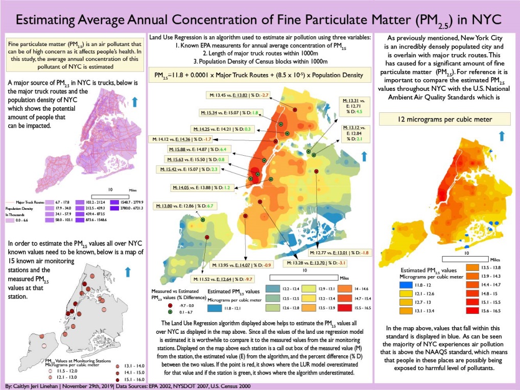
That map for the land use regression having to do with PM2.5 (particulate matter) concentrations in NYC was done as a class assignment. The purpose of this map was that there is air monitors all over NYC. Using data air monitoring stations across New York City, Linehan used an ordinary least squares regression to test the associations between the dependent variable PM2.5 (particulate matter) measurements and the independent variables (major truck routes and population density). The result from this regression was estimated PM2.5 data which was used to interpolate a surface which shows the estimated PM2.5 values across NYC. The map in the lower right shows that the suggested and safe PM2.5 values is 12 micrograms per cubic meter according to the U.S. National Ambient Air Quality Standards. Only isolated locations in south Brooklyn and Queens and a few areas in Staten Island actually have an acceptable PM2.5 value according to this study.  Data used in the study was from U.S. EPA, New York State DOT and U.S.Census.

With the focus on using data from citywide air monitoring stations, Linehan’s project identified only a select number of areas across the city that met acceptable air quality standards.  This poster can be downloaded here.

Accessibility and Connectivity of Bike Paths in the Bronx, New York

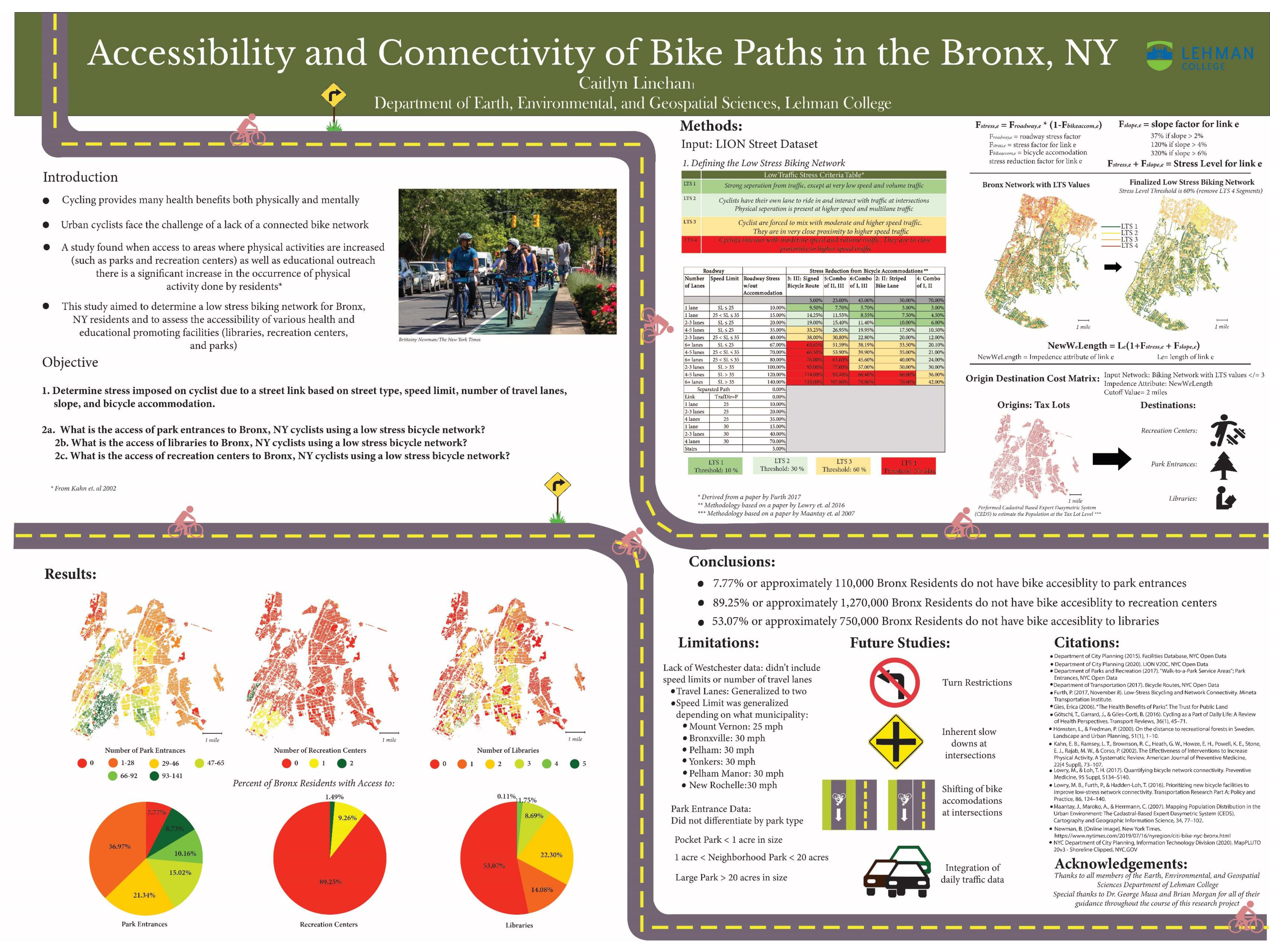
Another one of Linehan’s class projects focused on applying a network analysis on the accessibility of a low stress bike network in the Bronx to access select facilities which promote well being such as parks, recreation centers, and libraries.  It is well established people that engage in physical activity can greatly reduce the risk of different diseases as well as reducing stress and anxiety.  To this end, biking is a great form of physical activity that provides these benefits though a deterrent to urban biking in areas such as the Bronx, is a lack of a connected bike path.

Her findings, which are included in the poster below, finds that though only a small proportion of Bronx residents do not have access to a park entrance via a bike portal, it is estimated a disproportional percent (89%) do not have access to recreational centers and 53% lacking bike access to libraries.  Central to the analysis is applying “Level of Traffic Stress” (LTS) coefficients to each road segment.  A copy of the poster below can be downloaded here.

Safe and readily available bike networks are important factors in providing access to urban cultural and community facilities.  This poster can be downloaded here.

Summary:

The Lehman GISc Program emphasizes “real-world” applications of geotechnologies and geospatial analysis to solve problems and improve conditions focusing on New York City as a “living laboratory.”  The program continues to grow and providing trained and well educated graduates to organizations and governments across the metropolitan area.

Linehan will be continuing her graduate education by beginning her doctoral work at the University of California – Santa Barbara which was one of the original three universities associated with the The National Center for Geographic Information and Analysis (NCGIA).   Formed in 1988,  NCGIA also includes the University of  Buffalo and the University of Maine.

 Contact:

Caitlyn Jeri Linehan
Graduate Student
Lehman College, City University of New York (CUNY)
Department of Earth, Environmental, and Geospatial Sciences
CAITLYN.LINEHAN@lc.cuny.edu
CaitlynLinehan@ucsb.edu

Dr. Yuri Gorokhovich
Associate Professor
Lehman College, City University of New York (CUNY)
Department of Earth, Environmental, and Geospatial Sciences
yuri.gorokhovich@lehman.cuny.edu

The Geography of an Adirondack High Peaks Unsupported Thru-Hike Record

Background

Since early July this summer when our youngest son Lukas and close friend Mike Jock completed and established  a new record for an unsupported thru-hike of the 46 Adirondack High Peaks, I’ve been asked by various friends and colleagues across the region (who became aware of the accomplishment) as to whether or not any professional geospatial/GIS technology was used in some capacity in supporting the effort.   Each time my humbling answer has been pretty much the same:  Not Really.  However, they did carry some new gadgetry which is currently used ubiquitously across the adventure and extreme sports landscape to collect data that was used to authenticate their achievement.  But more on that later.

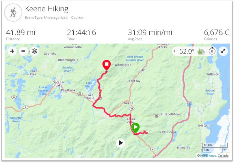
Starting their trek at the trail head to Seward Mountain at 3:30 AM Thursday, June 27th on the west side of the Adirondacks, the two covered the 46 High Peaks in 7 days, 2 hours, and 52 minutes finishing by summitting Mount Esther, on the northern shoulder of Whiteface shortly after 3 AM on July 4th. Ultimately making it down to the Mount Ester trail head at 6:20 AM to complete the trip.   All said, nearly 212 miles and 70,000 feet gained in elevation – more than twice the elevation of Mt. Everest.  They averaged well over a marathon a day, covering some 25-30 miles. On the final day they kept moving for more than 23 hours covering 45 miles.

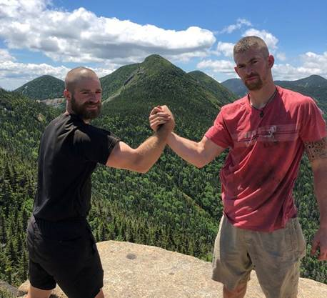
Michael, left, and Lukas at the summit of Armstrong Mountain with Gothics Mountain in the background. The two were soccer teammates at SUNY Cortland. Mike King photo.

Preparation was more old school than one would think.  Nothing in this space replaces on-the-ground knowledge of the trails, trail junctions, where and when to bushwhack, locations of rock cairns for reference points, as well as planning and hiking/testing certain stretches of the route ahead of time.  Yeah, practice runs.  Luke had the benefit of many years of experience having first started ADK trail hiking since he was barely in kindergarten.  Like many other young children, his first “mountain” being Mt. Jo overlooking Heart Lake adjacent Adirondack Loj.  Safe to assume that through the family ties, his spatial orientation has always been pretty decent. Mike, a local boy, grew up in the Plattsburgh area.

This was their third attempt.   And such accomplishments don’t come without the element of good fortune avoiding injuries (which was the case in 2018) and a bunch of days with generally decent weather.  The 2018 attempt was also impacted due to an encounter with a black bear.  Yet another ADK backcountry hiker lesson in overnight food storage.

Given the enormity, location, and challenges of the effort, it would clearly not be safe, if not irresponsible,  to rely solely on the new generation of lightweight/handheld navigational devices as a means to lead one through the Adirondack Mountain wilderness.  There is no substitute for first-hand knowledge of the trail network and a pre-determined plan.  They carried only the essentials such as lighweight sleeping bags, tents, change of clothing, raingear, first aid/basic emergency gear, water filters,  and food.  Counting every ounce in keeping their backpacks to about 40 pounds.  Even omitting the weight of gas canisters/gas stove and in doing so did not prepare anything hot the entire trip.  Zero assistance.

Cool Gadgets

It’s amazing how far the adventure mapping and video/data collection market has evolved since GoPro technology was introduced nearly a decade ago, if not earlier.  The ability to playback Mike and Luke’s accomplishment – made available below via a series of links – is amazingly made possible by just a one simple mobile (wearable) component.  They used a Garmin Fenix 5 GPS Watch to collect X,Y and elevation data which, based on wireless connectivity, automatically uploads to Garmin Connect.  Upon completion of their hike, the entire trip dataset was downloaded to Relive an outdoor 3D video website which allows further rendering and interactive use of the data.    Two Anker PowerCore 26800 pre-charged power banks kept their phones and Garmin device charged.   Of sufficient size to recharge their phones/devices numerous times over.  They took two but in fact only needed one.   The Garmin app also collects heart rate, estimated calories burned, pace (minutes per mile), elevataion gain/loss, and total daily distance – all of which is made available in interactive and graphic form.  In addition to the default Google basemap, data can be rendered on other base maps including satellite, terrain, OpenStreetMap, and Here.  Amazingly compact, yet powerful tools.

The Daily Numbers

The following section includes a brief narrative – Mike’s own words- and links which can be used to highlight trail and body metrics as well as mapping visuals for each hiking day.  For those familiar with hiking and trekking in the Adirondacks, the visuals certainly help put Luke and Mike’s daily segments in better perspective.

Hold on to your seats.

Thursday June 27

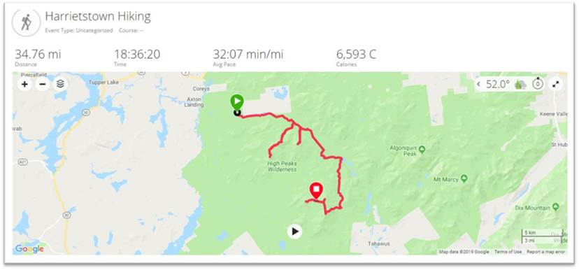
Hiker Notes: 3:30 am depart from Corey’s Road.   Day consisted of seven mountains: Seward, Donaldson, Emmons, Seymour, Santanoni, Panther & Couchsachraga. Out and backed the first four.  Trekked approximately 10 miles to Santanoni range.  Set up camp at the base, then we went up the expressway to summit Santanoni first, followed by Panther, and then finished with Couchsachraga. We came down the Panther brook trail before staying at camp at base of expressway again. Approximately 37.84 miles.

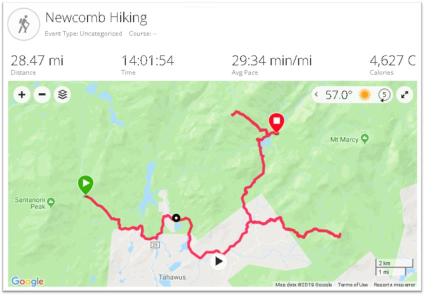
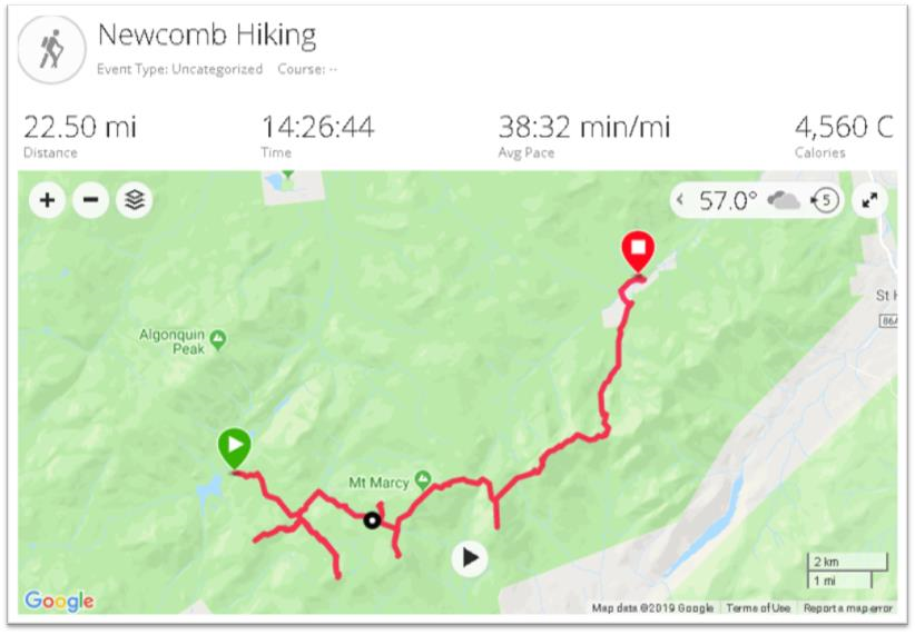
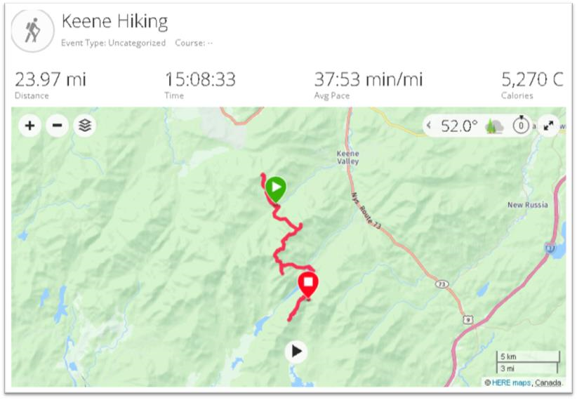
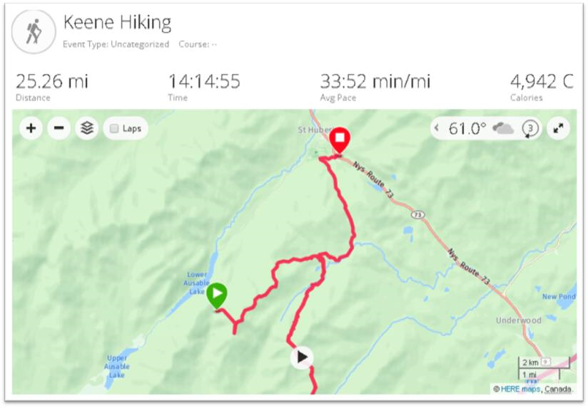
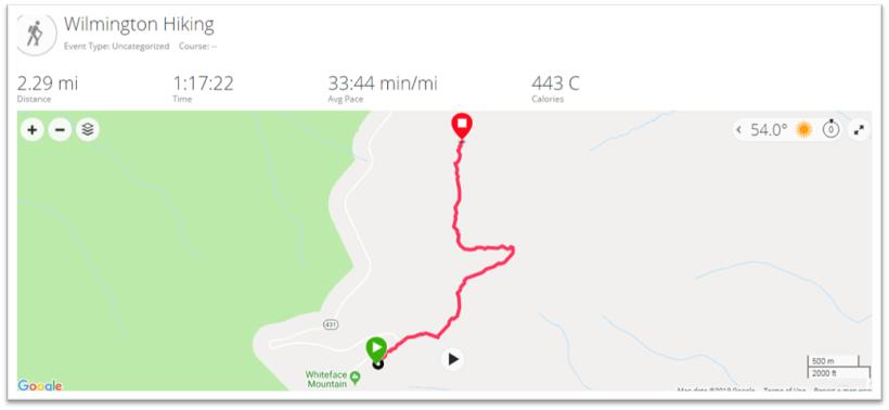
Instructions for all similar images below: Click on map for additional graphics and daily metrics. Or click the black triangle button at the bottom of the screen to see hiker movement over the course of the day.

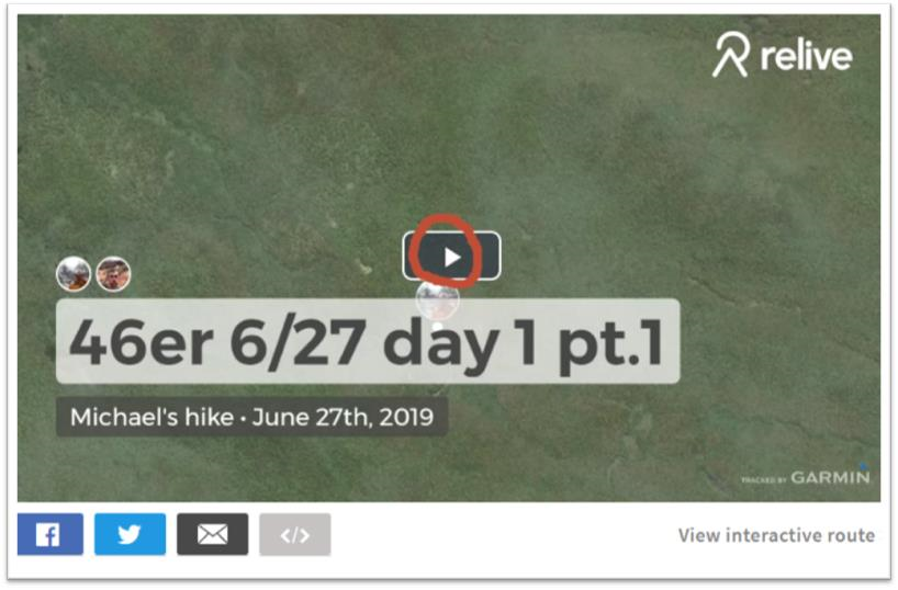
Instructions for all similar Relive 3D Interactive links below: Click on the icon circled in red to see daily hiker movement on top of a 3D base map and associated photos. Clicking on the “View Interactive Route” button enables the ability to interact with the map and trail data “twirling” the image to see from the north, east, south, and west perspective.

Friday June 28

Hiker Notes: From camp, hiked over to Allen mountain, out and backed it before moving up towards Colden/Avalanche Lakes. We out and backed Mount Marshall before setting up camp over the dam at Lake Colden. We summited two mountains and covered approximately 28.47 miles.

June 28thRelive 3D Interactive

Saturday June 29

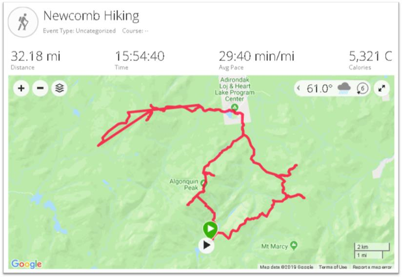
Hiker Notes: The ADK Loj Loop day. Summitting eight mountains and doing a big circle before returning to the same place we camped the night before. We started by going up the backside of Colden, then Tabletop, Phelps, Street, Nye, Wright, Algonquin and finishing on Iroquis. Approximately 32.18 miles

Note: The only day “noise” was either user generated or introduced by the Garmin device itself. In the vicinity of Street and Nye – Illustrated by the “straight” additional red line. Also reflected in the Relive 3D viewer.

June 29thRelive 3D Interactive

Sunday June 30

Hiker Notes:   Audible day. Started by moving to the base of Cliff and Redfield (out and bacs), then trekking up towards Gray, Skylight, Marcy, Haystack, Basin and finishing with Saddleback. Due to it raining all day, made the game time decision to check out and head towards Johns Brook Lodge where we camped at the trailhead of Big Slide Mountain (setting ourselves up the next day to finish the Great Range and start moving east). Summitted eight mountains and covered approximately 22.5 miles.

June 30th:  Relive 3D Interactive

Monday July 1

Hiker Notes:  Out and backed Big Slide early in the AM, before climbing up towards Great Range. First we summited Lower Wolf Jaw, then Upper Wolf Jaw, Armstrong, Gothics and Sawteeth. We then headed down trail to Lower Ausable Lake. Next we did Colvin and Blake before camping between those two mountains.   In total we summited eight peaks again and covered 23.97 miles.

July 1st:  Relive 3D Interactive

Tuesday July 2

Hiker Notes: Started by ascending Nippletop, moved on over to Dial, then bushwhacked down towards the Dix Range. Once we got down from bushwhack/brook we dropped bags and then out and backed the entire Dix Range: Dix, Hough, South Dix, Grace Peak & Macomb. From there we got our bags again and then moved our stuff over to Roaring Brook and the base of Giant Mountain. In total we covered 25.26 miles and summitted seven peaks.

July 2nd:  Relive 3D Interactive

 Wednesday July 3

Hiker Notes:  The 24 hour day. Woke up at 3 am and went to get Giant and Rocky Ridge Peak (out and backs). From there we picked up our stuff again and schlepped ourselves 5.5 miles down route 73 toward Marcy airfield. Next up was cutting from one side of 73 to the Lake Placid side of 73 along the ridge trail that summitted Porter and Cascade Mountains. Off of those we had then a 10 mile stretch on route 73 and then River Road towards the trai lhead to Whiteface mountain. Using the trail by Connery pond we entered that portion at 1030 PM and was able to summit both Whiteface and then Esther by 3:15 am. About 23 hour and 30 minutes of moving time we summitted our final 6 peaks and covered 44.18 miles. Passed out for an hour and reached Memorial Highway by 06:22 AM, where a time-stamped photo was taken.

July 3nd:  Relive 3D Interactive (Part 1)  Incredible day!!

July 4th:  Relive 3D Interactive (Part 2)

Summary

Quite an effort  and on top of setting the record, between this trip and last year’s attempt, the two helped raise nearly $18,000 for the Dubin Breast Center at Mount Sinai Hospital in New York.  Their accomplishment was covered by Backpacker Magazine as well as a selected number of upstate New York online publications (UpstateNewYork and NNY360) among others.  The articles are generally similar in content though do offer more details about food and other daily nuances/items which I omitted here.  Choosing rather to highlight and focus on the immense geographic element of the effort.

Both Luke and Mike are personal trainers living and working out of New York City.  More information can be found on their website Team Adventure Portal.

The Geography of Homelessness

Background

The Institute for Children, Poverty, and Homelessness (ICPH) is a New York City-based policy research organization focused on family homelessness in New York City and throughout the United States.

Formerly known as the Institute for Children and Poverty, ICPH was founded in 1990 as federal and state governments looked for ways to address growing rates of family homelessness. Through the examination of empirical, quantifiable data, ICPH seeks to inform and enhance public policy related to homeless families, with an emphasis on the impact on children.  The New York City numbers are staggering with over 12,000 families—including 25,000 children—calling a city shelter their home.  A small city in itself.

And unfortunately, the experience of housing instability and homelessness in New York City’s neighborhoods goes far beyond what shelter numbers alone show. In school year (SY) 2015–16, City schools identified four times as many homeless students as there were children living in shelter, and the current structure of the City’s shelter system is ill-equipped to meet the long-term stability needs of homeless children and families living both in and outside of the City’s family shelters.

ICPH examines the demographics of this growing population, the challenges these families face in becoming self-sufficient, and the programs that are most effective in helping them transition out of homelessness in their reports, research-based books, and policy research commentary.   ICPH’s publications inform government officials, policymakers, other research organizations, advocates, academics, and service providers from across the metropolitan region to promote a robust, evidence-based dialogue.  Central to ICPH’s core work is the intersection of statistical analysis, data visualization, and mapping technologies resulting in a wide range of geospatial-related products and applications.

ICPH Geospatial

ICPH utilizes several mapping, desktop publishing, and statistical software packages in support of publishing online and hardcopy products.  While ICPH actively promotes the use of traditional interactive maps, the increasing use of hybrid products i.e.  maps/charts/tables/graphics (a.k.a. Inforgraphics) are widely used as part of delivering the organization’s message.   Inforgraphics are increasingly being used across the GIS community to provide graphic visual representations of information, data or knowledge intended to present information quickly and clearly.

Managing geospatial applications and development at ICPH is Bronx-native Kristen MacFarlane.  She arrived at ICPH in December 2016 after a stop at the New York Botanical Gardens.   She received her undergraduate degree in Natural Resources from Cornell University and her masters in Geographic Information Science (GISc) from CUNY Lehman College in the Bronx.  Kristen oversees an organizational geospatial tool box which includes a several software packages including Tableau and ESRI.  While most ICPH projects are NYC focused, the reach of the organization’s research and work covers other areas of the country as well.  Projects are funded by foundations, grants, and other contributions and initiated by ICPH professional staff and industry colleagues.  MacFarlane notes that data used in the studies is mostly gathered from open data portals or through Freedom of Information Law (FOIL) requests.  As a primer on her involvement with ICPH, see her November 17, 2017 GIS Day blog post GIS Day: Discovering Family Homelessness Through GIS.

ICPH Geospatial and Data Visualization Applications

Suspension Hubs Interactive Map

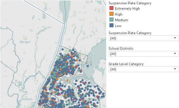
In New York City, there are 102 Suspension Hub schools serving nearly 3,500 homeless middle schoolers. These schools suspended more than 6.6% of their students overall in SY 2015–16—nearly three times the city’s rate of 2.5%—and their rate of suspension among homeless middle school students actually increased during the years since SY 2010–11. Understanding where Suspension Hubs are located represents an opportunity to offer these schools more support and resources so that they, too, can turn the tide like the 83% of other schools with declining suspension rates. The Suspension Hubs Interactive Map was developed in Tableau using data generated and analyzed with Stata.  Project data is from NYC Department of Education for SY 2015-2016.

In New York City, there are 102 suspension hub middle schools where students are disciplined at extremely high rates.

Interactive Map and Atlas of Student Homelessness

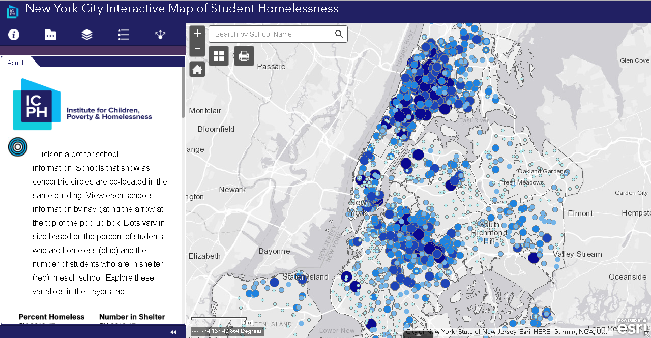
Unless current trends change, one in seven New York City public school students will be homeless during elementary school. More than 140,000 children attending New York City public schools have experienced homelessness within the past six years.  Visualizing the magnitude of this issue is the updated ICPH application New York City Interactive Map of Student Homelessness as well as On the Map:  The Atlas of Student Homelessness in New York City 2018.  Both products provide a wide range of  data to allow people from different fields to tailor and engage with data on student homelessness in a way that is meaningful to them and the unique needs of their organizations and locales in the city. The Atlas documentation is from Section 1 only of the report which is available for download from this link.  The August 2018 update is more similar to ones that ICPH presents as static publications.  The full report contains maps generated with the ArcGIS client which are exported for inclusion in online and hardcopy publications.  On a larger scale, ICPH created a similar interactive nationwide map – The United States of Homelessness – scale using data from the U.S. Department of Education.

This interactive map provides users with the ability to see what student homelessness looks like in every NYC neighborhood.

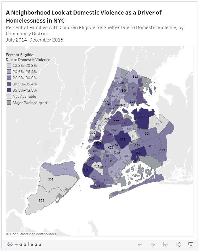
Neighborhood Look at Domestic Violence as a Driver of Homelessness in NYC

Family homelessness has many different causes and drivers. One of the more common drivers in NYC are families being pushed into homelessness because of experience with domestic violence. This map demonstrates the rates at which domestic violence is driving family homelessness in neighborhoods across NYC.

Percent of families with children eligible for shelter due to domestic violence by Community District July 2014 – December 2015. Data source: NYC Department of Homeless Services.

Food Insecurity & NYC’s Homeless Children

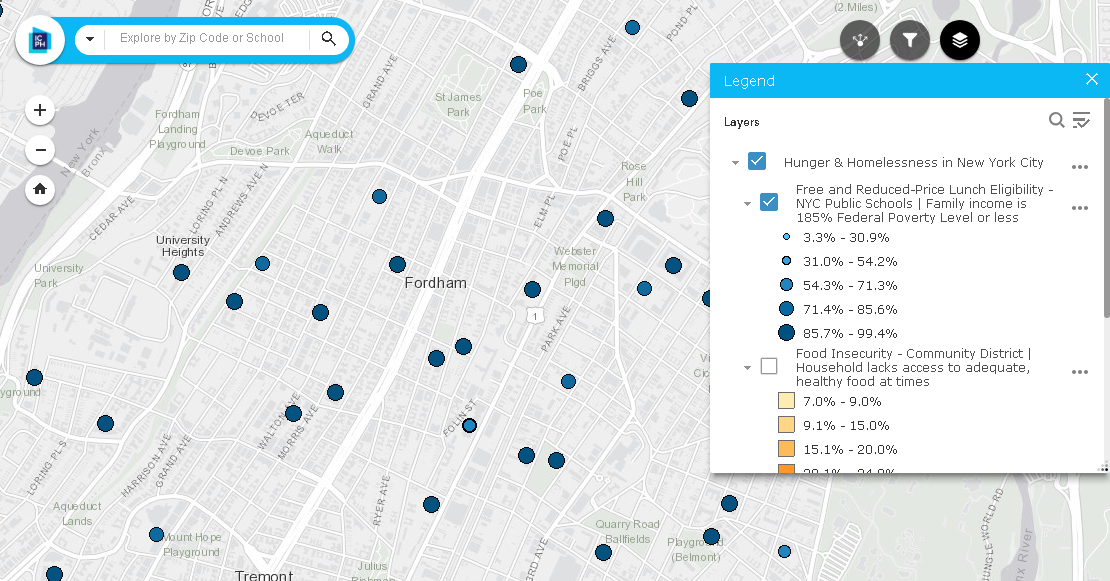
A household is considered food insecure if there is a lack of access to adequate, healthy food for all household members.    In NYC, students are eligible for free or reduced-price lunches  if their family income is 185% of the Federal Poverty Level or less. Other programs such as the federal Supplemental Nutrition Assistance Program (SNAP) provides food stamps or SNAP benefits to households with incomes 130% of the Federal Poverty Level or less, in addition to employment requirements.  This ICPH interactive map enables users to access localized data on school lunch programs, food insecurity by community district and SNAP benefits.  An excellent User Manual is provided as well.

Data sources for this interactive map include NYC Dept. of Education, Food Bank for NYC, Feeding American, Data2Go.nyc, and U.S. Census Bureau, 2012-2016 American Community Survey estimates.

Summary

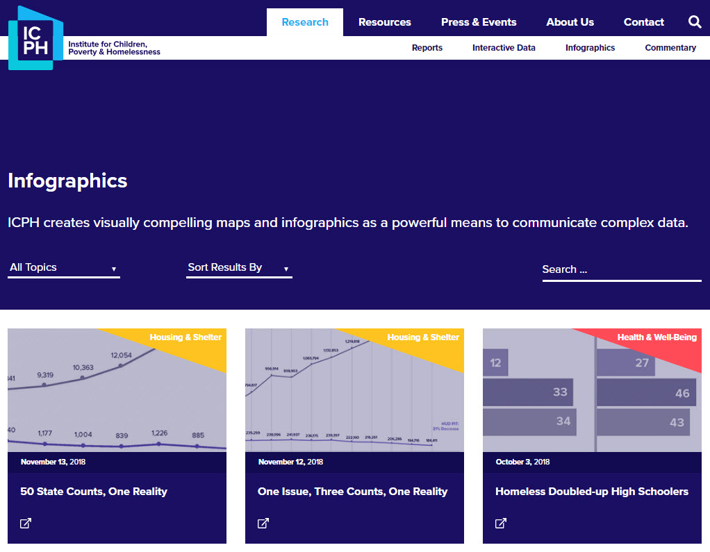
While the core focus of ICPH’s research and advocacy continues to be in the New York City region, its work covers the entire United States.  Detailed homelessness related studies have been done in specific metropolitan areas.  Similar the nationwide scope of the United States of Homelessness study referenced above, ICPH released the Student Homelessness and Food Deserts interactive map during Hunger and Homelessness Awareness Week, November 12-16, 2018. Other student-focused homelessness studies have been conducted in California, Georgia, Seattle, and New Jersey.  A wide range of publications and reports compiled by ICPH staff and collaborating organizations focusing on homelessness-related topics such as education, health and well being, housing, and community issues can be accessed  by clicking on the image below and then using the Research tab to browse Reports and Interactive Data.

“Geospatial tools are essential for our organization as we work to give the public a clearer, more informed picture of what child and family homelessness looks like in their community and across the country,” said Kristen MacFarlane, Senior GIS Analyst at ICPH. “Homelessness is a national crisis but a local issue and the specific ways that homelessness varies between localities and even neighborhoods are important to understand in order to develop policy solutions for those experiencing it. GIS software helps ICPH convey the complexities and the scope of this growing crisis.”

Contact:

Kristen MacFarlane
Senior GIS Analyst
Institute for Children, Poverty, and Homelessness
36 Cooper Square, 2nd Floor
New York, New York  10003
KMacFarlane@icphusa.org

2017 GeoCon Wish List: Part 1

I first wanted to publish this article initially as a wish list to the GIS Santa Claus in early December, but the holidays came and went so I am now submitting it as a New Year’s wish list (Part 1) for the 2017 GeoCon  in Lake Placid.  There will  be other suggestions over the next several months and I’ll remain cognizant  what I wish for as I may be submitting an abstract to present myself.  Maybe.

So to start the discussion, here is an initial list of  ten geospatial mapping applications and program areas I’d like to send a speaker invite to for the 2017 GeoCon – and why.

NYS Office of the Attorney General:  New York Crime Gun Analysis https://targettrafficking.ag.ny.gov/tool/

While mapping continues to be one of the primary end products of GIS analysis, geospatial data is increasingly being used in a wide range of data visualization platforms such as Tableau.    I’d welcome the opportunity to attend a presentation by the Office of the Attorney on the Crime Gun Analysis report outlining data collection, data analysis, and the rendering of the data through maps, tables, and charts.  Not the normal GIS menu.

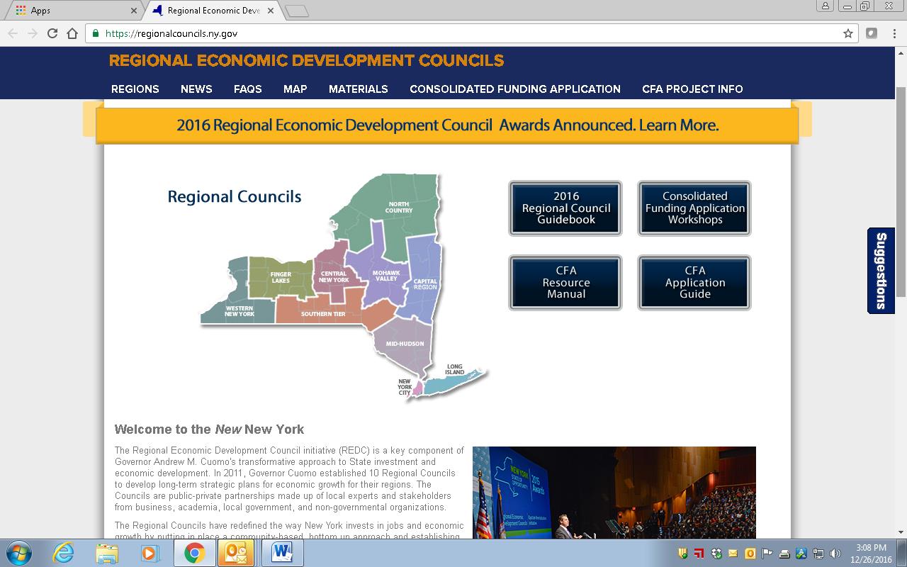
New York State Regional Economic Development Councils (REDC) http://regionalcouncils.ny.gov/

In context of geospatial, this program reference isn’t so much about “what it is”, as opposed to more about “what it isn’t”.  Or at least I think.  From my level, the REDC framework has always been somewhat of a mystery since current state administration created the 10 Regional Councils in 2011.  And even more confusing that the geography of the REDCs do not coincide with the statewide Regional Planning Commission boundaries. That said, there is an incredible amount of geospatial information and analysis in the Council’s underlying mission.  Everything happens somewhere.  And there is a ton of money coming through the Consolidated Funding Application (CFA) process which I believe the GIS community should be more engaged and recipients of to some degree. Uber opportunities for web mapping applications, Story Maps, and GIS-produced maps for publications though one would be hard pressed to see any real evidence of a professional GIS touch in any of the Council products and services.   I looked through four regional 2016 “progress” reports (Hudson Valley, Finger Lakes, Capital Region and Southern Tier and found very limited reference to GIS/geospatial technologies.   Some kind of presentation by one of the REDCs and/or regional GIS personnel involved in this program would be most informative for the statewide GIS community.  Otherwise I doubt we’re going to hear anything through the state GIS program office on this.

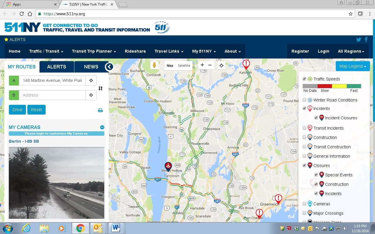
511NY
https://www.511ny.org/

This is more of a selfish request than anything because I really don’t fully understand the makings and how 511NY operates in context of GIS/geospatial data collection, sources, work flows, or even development of their applications including the online mapping stuff.  I do know it’s big, visible, seemingly growing in functionality, supported by a mess of New York State transportation agencies -even though it has its own .org web address.  It also creates a lot of data which would be useful to consume and use in local government web mapping applications.   I’d be the first one to sign up to hear how it all comes together, funding, sources of the data (including what is being taken from and/or generated at the local level), opportunities for collaboration with local GIS programs, and what’s next.  How long before we see an Uber icon on the 511NY homepage to help support trip planning?

Continue reading

NiJeL Expands its New York State Presence

Established by Nancy S. Jones, JD Godchaux, and Lela Prashad in 2007, NiJeL is a company founded on the goal of helping organizations and communities building interactive dashboards, infographics and maps, building strong advocacy tools, and to connect with their communities and sponsors.  Ms. Prashad (CEO) currently leads NiJeL, while Mr. Godchaux (CTO) serves as the primary interactive developer, and Ms. Jones provides management oversight and strategic direction.  NiJeL began after the three had volunteered as American Friends for the International Rescue Committee (IRC) in Phoenix, Arizona while attending Arizona State University as graduate students.

After the successful launch of one of their early online mapping applications in support of Duet – a metro-Phoenix nonprofit dedicated to supporting and improving the quality of life for senior citizens – NiJeL relocated main staff in 2011 to Brooklyn, and since then have been engaged in a number of Empire State oriented geospatial projects.

NiJeL uses standard statistical, mapping, and database software, and develop custom open applications for websites, mobile devices, and desktop computing.  “What makes us different from other groups like us in this space is our custom process to assess current data, metrics, and technology workflows with regards to the organization’s culture and specific goals” notes JD Godchaux .   NiJeL works with  a wide variety of organizations and their focus on using open-source components allows the firm to be flexible in how projects are approached and ultimately designed.  Their commitment to open-source tools allows to provide training for technical staff to manage and make changes to the technology solution they deliver to the client.  Illustrative projects include: Continue reading