Engage New York Puts Nonprofits and Community-Based Service Providers on the Map

Application identifies similar focused programs across the state which can support funding and philanthropic efforts

While the cost and ease of entry into web mapping has come down significantly over the past several years, many organizations – particularly nonprofits and community based programs – still do not have the capacity to create or support their own web mapping program.  While it’s easy enough to create a basic web presence and business profile with Google,  smaller, more community service focused programs can often gain wider exposure as part of larger, more thematic based web mapping applications.  When carefully assembled and exposed to the right audiences, these same mapping services are now serving to reach philanthropic programs looking to support nonprofit efforts and expand their geographic funding footprint.

The 10 Engage New York regions are consistent with the New York State Economic Development Regions

One such web map is Engage New York.  Launched in 2021, this interactive map is intended to constitute and visually represent  the Empire State nonprofit landscape which is critical to foundations and nonprofit leaders in supporting community-based initiatives  The initial map included over 300 organizations which categorizes their services as well as identifying the geographic area where they’re located and working.   It is intended to be used by nonprofit leaders and funding organizations to build relationships, strengthen interregional networking, identify geographic gaps in the nonprofit ecosystem and aid place-based nonprofits to find peers and colleagues working on similar issues in other regions of the state. The map is the work of the organization of the same name – Engage New York (ENY).

After reinvigorating the network in 2018 and focusing on issues including immigration and safe and healthy housing, ENY in 2020 moved to support movements and movement leaders throughout New York State that were organizing communities impacted by injustice. Engage New York Program Manager Lisa Fasolo Frishman comments “We know that all of the issue areas are intersectional and it is more important for us as a network to support leaders and movements that are inclusive of voices that are often excluded from advocacy efforts particularly in underserved and rural areas. Census 2020 and redistricting work has been a pivotal area for us because representation matters, and we are committed to ensuring communities impacted by injustice are seen and heard.”

Continue reading

Warren County GIS: A Showcase of Geospatial Content for County and Local Government

Program’s modest beginning started in the late 1990s with AutoCAD files and a copy of ArcInfo

Now spending a significant amount of time upstate New York in Essex County, we now find ourselves looking for different routes to take back and forth from southeast New York State instead of the “go-to” I87/Northway option every time.  Just to mix things up – the four-plus hour drive going the normal route can get to be a bit monotonous.

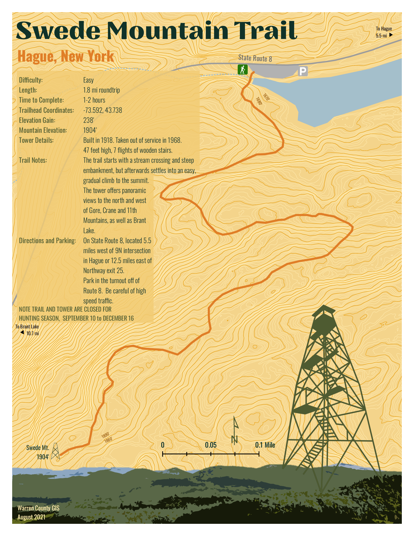
So it was in September I came south out of Ticonderoga headed to Hague (yes, named after The Hague in the Netherlands) on the northern end of Lake George – an area I had never been to.  And it did not disappoint.  Though ultimately to State Route 8 (aka Graphite Mountain Road) to a new Adirondacks trailhead:  Swede Mountain Firetower.  Even though the round-trip hike isn’t that long and relatively easy, it was getting late and I didn’t even get out of the car while in the trailhead parking lot.  Instead, making a note to print out a trail map when I got home.  A couple days later and not having a clue what trail maps were actually available, I Googled “Swede Mountain Firetower trail map” and a candidate list of URLs and image options were immediately returned.  Randomly selecting the one below,  the cartography caught my eye and I quickly looked for the map’s author.  There on the bottom left:  Warren County GIS.  

It was quickly then off to the Warren County GIS website.  Which became the genesis of this article.

Warren County GIS

Just by coincidence, this article coincides with the release of the new Warren County GIS Hub as announced by long-time county GIS Administrator, Sara Frankenfeld.  Overseeing a countywide GIS program judiciously developed over the course of more than two decades – from the days of ARC/INFO coverages to 2022 mobile field apps and interactive online viewing applications.  Also available through the program and Hub is a rich repository of dozens of hardcopy maps available for download covering areas such as countywide outdoor recreation, history, demographics, municipalities, planning and the environment and much more.   An amazing amount of content bundled into three main categories:  Web Maps and Apps | Maps for Print | Download Data.

Background

Originally from the northside of San Francisco Bay in Marin County and earning a degree in Geography from Northern Arizona University, Frankenfeld came to the east coast to initially start work with Dutchess County.  After a short stint with NYSDEC she ultimately made her way to Warren County in 1999 where she got started with a copy of ARC/INFO on a standalone computer in the county building basement.   The county had created a new GIS position in the Planning Department to help convert the tax maps to AutoCAD and then over a period of time converting from AutoCAD to ARC/INFO and then later to geodatabase. 

Over the next four years, she was successful in winning over several other departments on the value and usefulness of GIS technology which she accomplished by focusing on easy, visible “wins” such getting people to use the newly available digital tax parcel data (linked to the RPS data) as quickly as possible and making hardcopy maps.  Lots of maps.  The visibility of the Warren County program also expanded by her working with municipal government zoning administrators and assessors and providing access to the new digital parcel data and including zoning maps,  wetlands data, and FEMA floodplain maps.  A New York State Archives and Administration (SARA) grant enabled the development of a parcel viewer app sby AppliedGIS – where she would later go to work for several years – called the Spatial Data Viewer.  The groundwork was also laid for the implementation of ArcIMS and Imagemate Online.  Somehow she also found time to include outreach programs to local schools and GIS Day.  

After a period in the private sector with (then) AppliedGIS/Fountains Spatial, she returned to Warren County in 2013 where she remains today.  

Today’s Environment

In 2022, the Warren County GIS program is built totally around the ArcGIS Online (AGOL) environment.   Frankenfeld states AGOL has “totally transformed the workplace” and furthers her two main goals of (1) improving public access to data and (2) streamlining/improving processes for county departments and organizations the GIS program supports.  She, along with GIS Specialist Amanda Beck, have embraced StoryMaps, Dashboards, Hubs and Survey123 in ways to make it easy for non-tech users to create and maintain data and access it.  While many of the combo Survey123/dashboard applications are internal facing, others, like the Lake George Milfoil Harvesting real-time app is available to the public.  And so is the Capital Improvement Project Planning viewerBoth respond to GIS requests from local municipalities, local organizations including  the Adirondack/Glens Falls Transportation Council (AGFTC), Lake George Park Commission and the Lake Champlain Lake George Regional Planning Board – all of which have tech support contracts the County.  Projects range from data compilation to hardcopy map preparation to creating and supporting online apps.  Usually these three organizations know exactly what they want, but GIS staff we do often try to suggest ways to streamline or improve their requests.  For example, County GIS staff helped AGFTC come up with a method to inventory sidewalk/crosswalk/curb ramps for ADA transition plans that proved really popular and resulted in a training session for all the Metropolitan Planning Organizations (MPO) in the state.

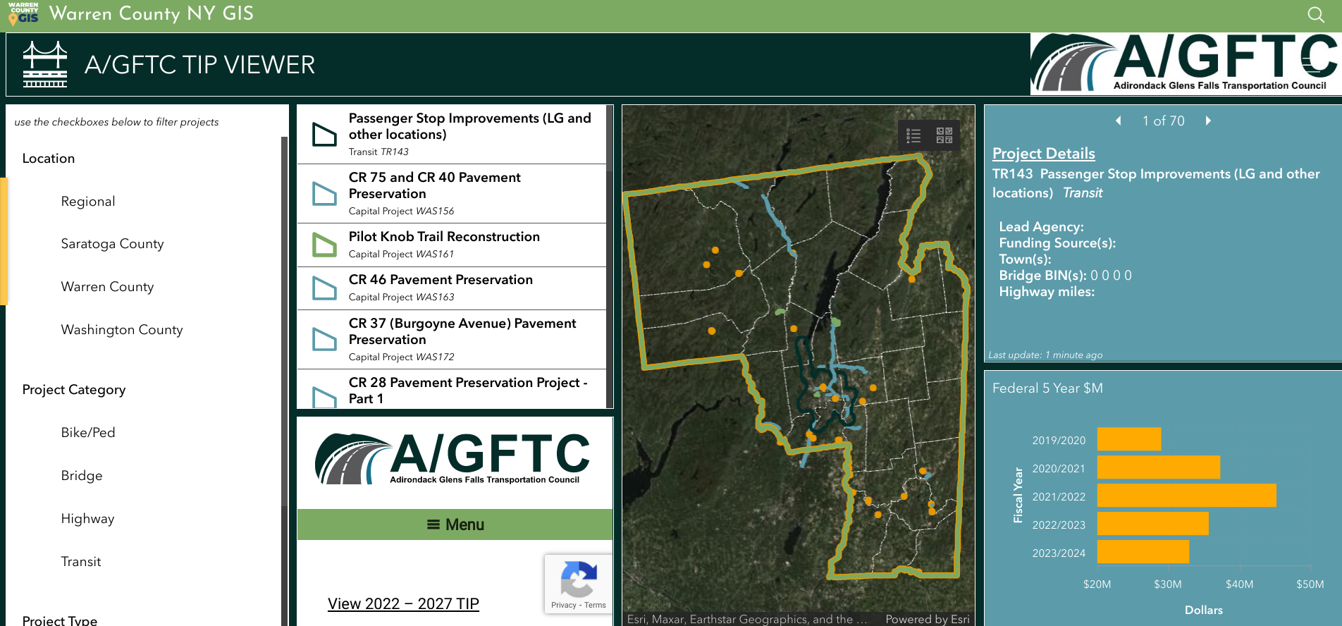
Dashboard for Adirondack/Glens Falls Transportation Council’s Transportation Improvement Program projects.

Having transitioned to ArcGIS Pro to support data editing, cartography and more complex analysis, Warren County GIS staff do a majority of their work in AGOL which includes the mobile pieces Field Maps and Survey123.  They still collect GPS data as needed (usually related to recreation or e911) and support field operations, such as collecting milfoil harvest or infrastructure data, for other users.  They also have Trimble boosters and cell phones which can be checked out to both county staff and municipalities for field data collection along with field worker licenses.   While there are still a few remaining ArcGIS desktop users, most users are using AGOL with named users in Planning, Soil and Water, Public Affairs, the Sheriff’s Department, Office of Emergency Services, Public Works, and Parks and Recreation.  Address and road centerlines are uploaded to the state twice a year and parcel data once a year.  A large current project Sara and Amanda are currently working on is building additional GIS capacity and functionality in County Department of Public Works.

Except for Queensbury which has its own full-time GIS staff person, Warren County GIS supports all municipalities in the County.  At the beginning of the program, Sara had  set up each municipality with desktop GIS as well as providing training and support.  In hindsight and it comes as no surprise this desktop support  was the most time consuming element of her job in the early years.  With the advent of online GIS, County staff has transitioned most of the towns off of desktop GIS, although there are a small number of towns which still use the desktop client.  Most local communities across the County now utilize new AGOL applications.   “We often will take the initiative with projects for the towns that relate to work the County Planning Department is doing such as the Warrensburg buildout analysis“, notes Frankenfeld, “as well advocating the adoption of Field Maps for maintaining water and sewer data.”

New GIS Hub

As noted previously, the new Warren County GIS Hub contains three main areas of content:  Web Maps and Apps | Maps for Print | Download Data.  Each area is then broken down further thematically into categories such as recreation, environment, transportation and infrastructure, planning and zoning, history, citizen reports and more.  With an established user community in County government, most of the time departments and organizations now approach GIS staff directly with applications to develop to support their business needs such as the Safe Pace, Opioid Dashboard, Storm Reporter, TIP viewer, etc).  Other projects have been initiated by GIS staff themselves such as the covid hub and election polling locator.   GIS staff work frequently  with other Planning Department and and apply grant funding to create projects such as History Mapper and the letterboxing challenges (Letterboxing Trail and Historians’ Challenge).

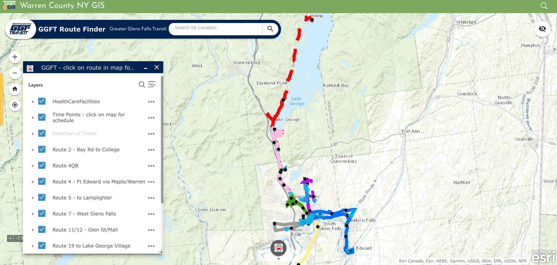
Geospatial viewers are excellent for publishing public transportation systems content. In addition to making time tables and schedules available, ones such as the GGFT also include important public sites such as health care facilities.

Today the COVID Hub is the most popular app though much simplified from early COVID and no longer maintained by the GIS team.   It’s had around 1.5 million views  since its inception in April 2020 – not bad for a county with a population of 64,000   The next most popular is the parcel viewer app (Community Map), which gets about 12k views a month.  After that, the First Wilderness website (about 7k views a month) and the Recreation Mapper which gets a couple hundred views a day, higher in the summer.  Warren County’s primary industry is tourism and is an outdoor recreation destination, so trail maps and recreational resources are popular content and Sara and Amanda spend a substantial amount of time creating and maintaining recreation data and providing access to it.

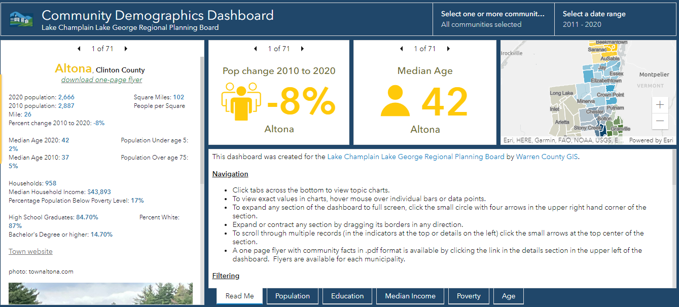
Warren County GIS provides technical support to the Lake Champlain Lake George Regional Planning Board which extends beyond the Warren County footprint. This viewer contains both American Community Survey and 2020 Census data for areas in the five north country counties covered by the Regional Planning Board

Though the application was closed in August, another public facing app focused on the American Recovery Plan Act (ARPA).  Survey123 was customized to create an application for those organizations interested in applying for ARPA funding.  The applications were made available to committee members for review through a Dashboard, and scoring was completed using another Survey123 form.

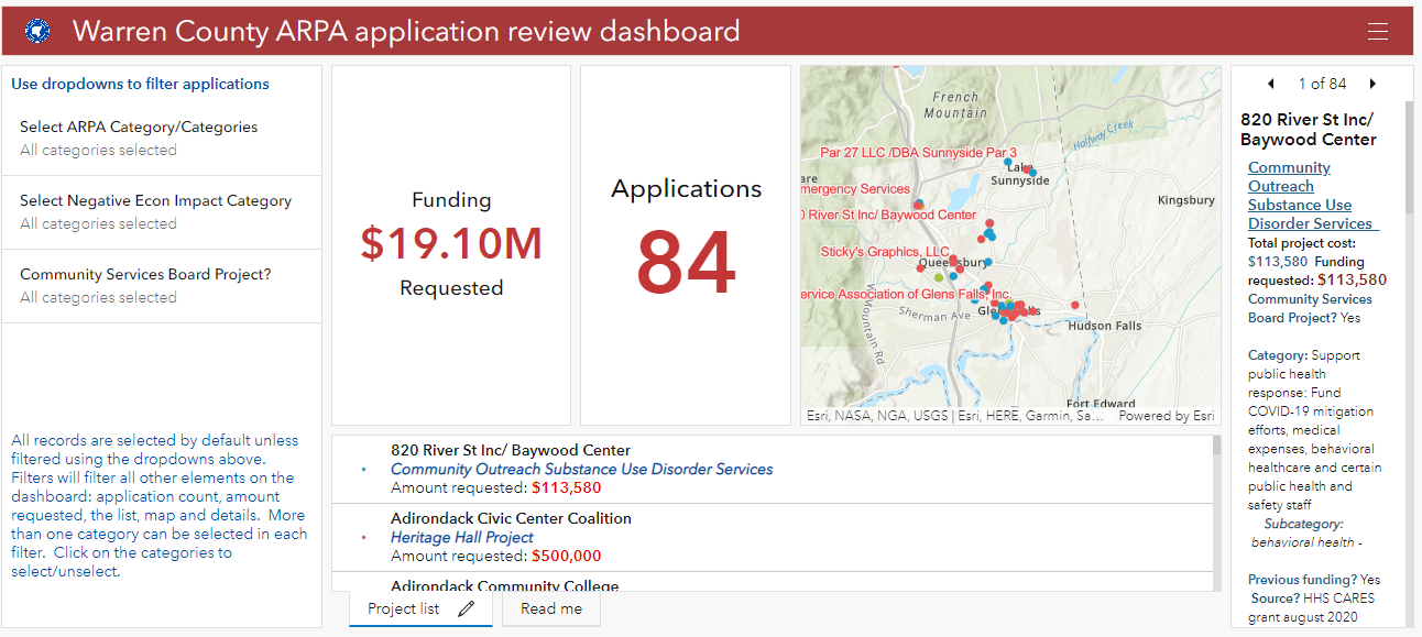
American Recovery Plan Act (ARPA) grant monies provides funding for investment in a wide ranges of community programs and services including geospatial efforts in the rehabilitation and mapping of infrastructure systems.

Sara’s Law

There probably aren’t many geospatial professionals working today across the Empire State that are familiar with Sara’s own little piece of New York State GIS history.  The year was 2002 and it was during her first stint with Warren County.  While using a GPS unit to map the locations of fire hydrants in the North Creek area, she was “challenged” by the professional surveying community of mapping features in a manner/way she was not qualified to do so.   Her post to New York State GIS listserve at the time describing the events read:

“In January, I(Sara) was contacted by an investigator from the New York State Education Department’s Office of Professional Discipline.  They had received a complaint from a surveyor stating that I was surveying without a license.  I was using a Trimble Pathfinder Pro XR GPS unit to collect fire hydrant locations and then plot them on a reference map.  Two investigators met with myself, our planning director, and our county attorney.  The investigators were unfamiliar with GPS and GIS and were basically on a fact-finding mission.  The investigation has progressed, and today we met with the two investigators, an attorney from the Office for Professional Discipline and a surveyor from the New York State Board of Licensed Engineers and Land Surveyors.  The state’s attorney told us at the beginning of the meeting that after reviewing the facts in the case, they do feel that we are guilty of practicing surveying without a license.  She then gave our county attorney a chance to state our case, which I thought he did very well. We were informed that the board will make a decision within the next week.”

At the time, it WAS a really big deal in the statewide geospatial and surveying communities – particularly New York State Association of Professional Land Surveyors (NYSAPLS) and the subject of much discussion and debate.  Significant in that it marked, for the first time, the visible intersection of emerging GIS/geospatial technologies and the professional discipline of surveying – and by extension, engineering in New York State.    While legislation (A01927 & S04396) was proposed in the 2007/2008 timeframe looking to “enhance the definition of land surveying with current standards and tools, i.e., GPS”, nothing was ultimately passed.  And along the way over the course of several years, the discussion and the proposed legislation became known as “Sara’s Law”.  

Little did she know the backpack GPS unit she was using in 2001 in North Creek would one day be the beginning of bringing these different, but similar geospatial technologies together as they are today.   Sara’s place in NYS GIS lore is secure.  

Summary

In addition to the broad presence the Warren County GIS program has throughout county government, it also represents the great relationship and guidance county geospatial programs can provide and offer to local governments.   Local governments that often have both limited financial and technical resources can benefit greatly from county GIS which have technical expertise and infrastructure in place.  A model that can be replicated in other areas across New York State.   

Contact

Sara Frankenfeld
GIS Administrator
Warren County GIS
Warren County Municipal Building
Lake George, NY 12845
frankenfelds@warrencountyny.gov
518-761-6410

NYC H2O: Advocating Cleaner Water through StoryMaps

NYC-based nonprofit has developed extensive portfolio of educational products for all ages and settings

StoryMaps are such a great communication tool.  Turning geographic and location-based features and concepts into an easy-to-understand medium for the much broader audience which help identify key community resources, assets and experiences that can inform planning and policy-making.  By combining narrative text and other multimedia content with Geographic Information System (GIS) maps and data, story maps serve as an effective means of helping residents and developers visualize and understand projects with greater clarity.  Increasingly becoming an art form unto itself.  Broadly and increasingly used across the geospatial spectrum from the industry-leading ESRI StoryMaps platform  to say the least of the versions being offered by others in the geospatial space including Google Earth, CARTO, or Tableau

I’m sure its not the first time Story Map subject matter has found its way to be included in a more technical oriented conference, but I was nonetheless interested, if not surprised, to see a presentation by NYC H2O at the recent the September 9th New York City Watershed Science and Technical Conference.   A conference historically the home for geospatial-based technical and scientific presentations by engineers, biologists, and others in the water science disciplines, NYC H2O’s presentation was entitled Engaging an Urban Population With Water Engineering Utilizing a Virtual GIS Platform in the Pandemic Era”.

Having received its nonprofit 501(c)(3) designation in May, 2012, such work is not new to NYC H2O as it has built a niche in the environmental education space using the Story Map platform as its primary teaching and outreach tool. Story Maps augment and support their mission to “inspire and educate New Yorkers of all ages to learn about, enjoy and protect their city’s local water ecology.  Since 2009, NYC H2O has offered over 120 educational programs focused on NYC’s water system and ecology to a combined audience of 4,000 people.  Their StoryMaps often incorporate  digitized historic maps, photographs, videos, and social narratives to tell the story of waterrelated  infrastructure.

A couple of NYC H20’s StoryMaps in the water sciences and environmental space include:

Water Systems Overview

I’ve often heard the New York City aqueduct system referred to as the “eight wonder of the world”.   Maybe not as sexy and visible as the Great Pyramid but an incredible engineering marvel nonetheless.  Conceived, designed and built in another era to support the drinking water lifeline of the city

NYC receives 90% of its water from the Delaware and Catskill Watersheds. Aqueducts (red line work) transports the fresh water from a series of reservoirs in the Catskill Mountains over 100-miles from the city.

Fitting that the first StoryMap posted by NYC H2O on their “Hub” website is entitled  Water Systems Overview outlining and showing the many geographies of the system which originates in the Catskills Region.  An interactive StoryMap highlighting the major aqueduct systems (Catskill and Delaware – named for the watersheds where the water is collected), as well as the individual reservoirs both upstate and those in the city.  Household water consumption stats are also included in the StoryMap as well as several interactive learning activities as illustrated in the application toolbar below.  Included in the Site Specific Lessons is a StoryMap just for High Bridge and the Jerome Park Reservoir.

Sewer System and Stormwater Management

This StoryMap, focusing on the relationship between storm water and sanitary sewage, and its overall impact on water quality in the metropolitan region has lots more maps and associated data.

Beginning in 1850, NYC laid 70 miles of sewers, or underground pipes that carried away wastewater.   Today the city has over 7,400 miles of sewer pipes. These pipes move wastewater with the help of 95 pumping stations to 14 sewage treatment plants located in all five boroughs.  Each day, NYC wastewater treatment plants process, or “clean”, a total of 1.3 billion gallons of wastewater.   Produceing about 1,400 tons, or 60 truckloads, of biosolids!

The city maintains 14 sewage treatment plants covering the five boroughs. Treated sewage effluent is discharged into the Hudson and East Rivers and Long Island Sound.

About 60% of New York City’s sewer system is a combined sewer system. This means that one single pipe carries both stormwater runoff AND sewage from city buildings.  During heavy rainstorms, combined sewers systems receive more stormwater runoff and sewage. Wastewater Treatment plants have a capacity, or a limit, to how much water they can clean. When there is more water than the capacity, a mix of stormwater and untreated sewage empties directly into the City’s surrounding waterways. These wet weather events are called combined sewer overflows (CSOs).

The presence of combined sewers are still very prevalent in the metropolitan region with the majority emptying into the East River and the east side of the Hudson River.

Also central to the long term management of clean water – are government regulated programs entitled Municipal Separate Storm Sewer System (MS4) programs.  In populated areas many neighborhoods, including in New York city, as well as industrial areas along coasts, have deployed MS4 programs.  A MS4 has one set of pipes that transports sewage to sewage treatment plants and another set of pipes that transports stormwater directly to local waterways.   Unfortunately, many pollutants (like oil, trash, pet waste, pesticides, and fertilizers from lawns) are washed into this system when it rains. MS4 helps solve one problem (CSOs and sewage in the local waterways) but causes a similar, although smaller, problem since trash and pollution can still enter the local waterways when it rains.

Currently, only about 40% of the NYC footprint is covered by an MS4.

As it relates to the collection of data for the purposes of monitoring citywide water quality, this StoryMap also includes interesting map displays of both fecal coliform (1985-2017) and dissolved oxygen (1909-2017) testing.

Summary:

It’s nice to see as part of such advocacy efforts the use of open data sets and geographic content as made available by government agencies and data portals.  Much of which is included in many of the 21 StoryMaps listed on the NYC H2O HUB.

StoryMaps allowed us to keep students engaged in learning about their local water issues throughout the challenges of the pandemic. The tool has been so popular with schools that this year we launched a curriculum introducing GIS and StoryMaps to several environmental science and environmental justice in high school classrooms”, notes Kevin Barrett who guides NYC H2O’s mapping instruction.

With regard to the September 9th New York City Watershed Science and Technical Conference, Stalin Espinal, School Program Manager for NYC H2O adds “The conference gave us the opportunity to share our work and programs to a community of our peers. We were delighted to have received such enthusiasm and interest in our work with GIS and StoryMaps.  Even resulting in a new StoryMap collaboration in partnership with the Watershed Agriculture Council (WAC) which works with local farms on and around the upstate New York City watershed to promote Best-Practices and make improvements that help protect the water quality of our drinking water.”

Contact:

Kevin Barnett
GIS Education/Project Manager
kevin@nych2o.org
www.nych2o.org

D.I.Y MS4: Erie County

The County’s Homegrown Application Provides Mapping and Data Collection Support to the Multi-Agency Western New York Stormwater Coalition

While the  Municipal Stormwater Sewer System (MS4) regulatory program may be taking a back seat in focus to COVID-19 across Empire State governments in 2020, compliance efforts nonetheless continue in the background.  The DEC program has seen governments responding to meet annual submission requirements in a variety of ways ranging from full vendor supported solutions, hybrid approaches of using in-house resources and commercial-off-the-shelf (COTS) products, while others have built the solution totally in-house.  Aka Do-it-Yourself (DIY).

One such MS4 DIY organization is Erie County which provides administrative and technical support to the Western New York Stormwater Coalition (WNYSC) which has a broad geographic footprint.  Erie County took the stormwater management regional lead in western New York in 1999 when it became apparent both Erie and Niagara Counties would be required to come in compliance with the United States Environmental Protection Agency (U.S. EPA) Phase II Stormwater requirements. Recognizing much of the MS4 General Permit was general in context of most permit requirements being the same for all governments, the Coalition was created in 2003 as a means to share work such as public education and outreach, development of policies and procedures, employee training – and mapping.  While the Coalition is not an official Erie County government agency, it is housed administratively inside County offices.

Erie County MS4 Support 

Initial development of the program started in 2012 by the current Director of Erie County’s Office of GIS, Lisa Matthies-Wiza, who was part of a team that designed databases, field applications, and quality assurance plans to manage data collection.  This was facilitated through a series of grants through NYSDEC and partnerships with Erie County and Buffalo State College provided to the Coalition.

More recently, support to the Coalition’s MS4 compliance efforts has been Michael Ruffino who came to the County in March of 2019.  Prior to Erie County, he had experience in the use of ArcGIS Online (AGOL) Survey123 and Collector in Chautauqua County where he was able to incorporate similar apps for the environmental health department septic systems and water supply inspections.  Currently Erie County hosts all of the GIS data and hardware/software infrastructure for the entire WNYSC program.

Continue reading

Green Map 2020: Evolving with Technology and Staying Community Focused

For nearly 30 years, Green Map has been an anchor in the Metro NYC nonprofit mapping community.  Led by its original founder, Wendy Brawer, Green Map’s portfolio of work and advocacy in locally-led mapping and sustainability efforts is quite impressive.  Since the launch of the Green Map System by Wendy Brawer in 1995 and publication of the original Green Map of NYC through her eco-design company, the program’s engagement tools and mapping resources have been adapted by locally-led projects in 65 countries.   Many joined the Green Map network when Greenhouse – their first content-managed website – was activated in 2007.   The site grew to become a rich resource highlighting community developed mapping work in all parts of the world.

While “green” mapping was one of its early defining products and focus,  the organization has expanded its services to include interactive web mapping, education, multimedia, event coordination, workshops, tours, planning and consulting, and creating software development tools.


Community Engagement Maps and Tools

Green Map’s award-winning icons, tools, platform(s) and tutorials help create engaging and visually powerful mapping content used as guides for local nature, culture, community living, social justice and resources for sustainable living. In addition to providing tools and tutorials on making maps, Green Map promotes their mapping efforts as part of Project Stories.  Project Stories are locally written and use tags to categorize the story type, theme, and purpose. Users can  discover how Green Map projects were created, people and organizations involved and about the project’s impact on their community.   Green Map projects are tagged and can be searched as part of the following 11 categories:

Besides its own mapping platform (with version 2 of the Open Green Map now in beta), the program also offers suggestions and tutorials on how to promote the use of the Green Map icons in other interactive mapping platforms such as ArcGIS Online (Story Maps), CARTO, Google Maps, Google Earth, and the Map of Tomorrow.

Continue reading

COVID Era Geospatial Applications to Support Empire State Communities

Here in southeastern New York State, it’s amazing how fast the COVID wave came and went. At first, mid-March to mid-May seemed like an eternity, but now, not so much.  I likened the preparation for COVID to preparing for Super Storm Sandy.  Albeit phenomenally different, the buildup and the anxiety of waiting for it to show up.  Peering out the windows to see the outcome of a completely different kind of damage and suffering  altogether.  Physical and psychological.  Now July, it seems and feels like we can see the first wave of the pandemic in the rear view mirror.  But then as we refocus on the road in front of us, we know there are speed bumps ahead of us.  Not if, but when.

There were a plethora of interesting and meaningful geospatial viewers created across the state during the mid-March to mid-May time frame.  Most included highlighting COVID case numbers by larger units of geography (municipal or zip code boundaries),  generalized heat or pattern maps, impacts to businesses and institutions, as well as  information on hotlines and sources of assistance.  However, its pretty well documented the geospatial community across the state has struggled with being part of providing detailed spatial analysis or mapping support functions at the address level.   Or for that matter, even being asked to participate in this regard.

Personal health related data is uber protected with its use regulated and governed by the Health Insurance Portability and Accountability Act (HIPPA).  HIPPA  regulations reign supreme and contributed to a lesser involvement of GIS analysts in  providing geospatial content, metrics and analytics during the pandemic.  There is also the unspoken reluctance on the part of the public health community to release data sets  which might be difficult to understand or easily misinterpreted by the general public.  Department of Health  professionals often cautious to release data – particularly in new instances such as the COVID pandemic – and leaving analysis/interpretation  to internal professional staff only.  Ultimately though,  releasing some flavor of the data but in a more generalized context.

NYS Department of Health (DOH)  COVID-19 reporting has improved dramatically since the pandemic appeared in March.  Though while numbers  are made available only on a county basis, users can access and visualize the data in a variety of ways.  Reporting and posting of the data has become much more timely.  DOH is also now publishing a regional “Early Warning Monitoring Dashboard“.

Continue reading

Social Determinants of Health: How Place Can Affect Health Outcomes

Why does location matter for health?

In 1948, the World Health Organization defined Health as “a state of complete physical, mental and social well-being and not merely the absence of disease or infirmity.” This definition has evolved over time to recognize additional factors that have been found to impact health. Driven in part by improved understanding of socioeconomic influences, technological changes, and increased attention on health policy, there has been a growing effort to more thoroughly elucidate factors that determine health. Genetics, individual behavior, social factors, the physical environment, health services and governmental policies all have been found to play a role in health outcomes. Crafting effective policy depends upon a solid understanding of each of these factors, as well as their complex interactions.

Social determinants of health—as distinct from medical care—are increasingly recognized as influencing a broad range of health matters, from access to outcome. According to America’s Health Rankings, when compared with other developed and many developing nations, the U.S. ranks at or near the bottom for health outcomes related to life expectancy. However, data from the Organisation for Economic Co-operation and Development (OECD), which seeks to understand what drives economic, social and environmental change across governments, show that the U.S. continues to exceed other countries in healthcare spending.

While the United States trails other developed countries in life expectancy (years), it still leads all others in healthcare spending.

Moreover, evidence illustrating the powerful role of social factors in determining health suggests “the effects of medical care may be more limited than commonly thought, particularly in determining who becomes sick or injured in the first place.” Studies have shown that states with a higher ratio of social to health spending had significantly better health outcomes for adult obesity, asthma, mentally unhealthy days, days with activity limitations, and mortality rates for lung cancer, acute myocardial infarction, and type 2 diabetes. Some studies have estimated that medical care is only responsible for 10-15% of preventable mortality in the U.S., indicating that social factors can lead to—or help prevent—poor health outcomes and inequalities.

To address this, the World Health Organization created the Commission on Social Determinants of Health in 2005. By 2008, the Commission concluded in their final report that “inequities are killing people on a grand scale”. Recommendations included improvement of daily living conditions, addressing the inequitable distribution of power, money and resources, measuring and understanding the problem, and assessing impact of action. Growing awareness also led to U.S. Centers for Disease Control (CDC) research, and implementation of a program to advance health equity called Healthy People 2020 which advocates for the creation of “social and physical environments that promote good health for all”, one of their four overreaching goals for the decade.

The Role of GIS

Location affects health. We see dramatic differences in life expectancy between countries, as well as between zip codes. Socioeconomic differences between countries are tied to disparities in health outcomes. Within the U.S., poverty and transportation affects access to healthcare. At a smaller scale, we know that safer neighborhoods, healthy and secure housing, and access to healthy food and open space are associated with healthier populations. U.S. Census data, American Community Survey data, and other sources can help tie such social factors to geography, allowing for better understanding, measurement 
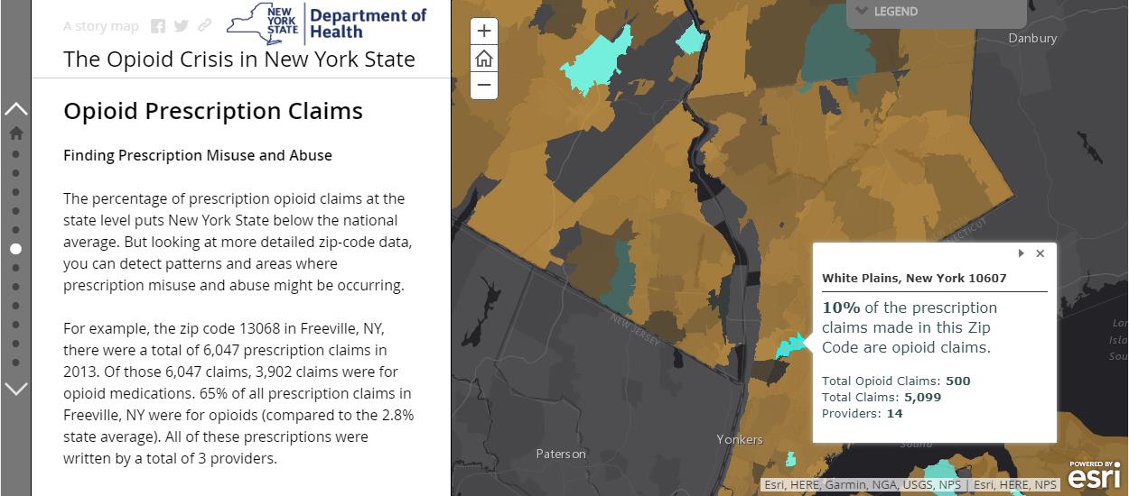
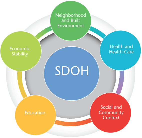
and tracking of social determinants of health. Universities, governmental and non-profit organizations now routinely collect such data and utilize GIS to help inform analysis and better decision-making, leading to stronger policies. The Healthy People 2020 Approach to Social Determinants of Health employs a “place-based” organizing framework, organized around Economic Stability, Education, Social and Community Context, Health and Healthcare, and the Neighborhood and Built Environment.  Many factors reflecting economic stability, such as poverty and employment, can be mapped within a GIS framework. Mapping education levels, literacy and language, quality of housing, environmental contaminants and areas with high concentrations of chronic disease can help to identify vulnerable populations, reallocate resources and better plan interventions and public education and awareness campaigns. Much of this data is readily available and free of charge. Furthermore, GIS lends itself well to Disparities Analytics, the development of analysis and visualization methods to monitor and report health disparities.

The Westchester Community Foundation and the Westchester Index

For 40 years, the Westchester Community Foundation, a division of the New York Community Trust, has worked to improve local and regional quality of life in Westchester County, NY by addressing community issues, promoting responsible philanthropy, and connecting donors to critical, local needs. In this capacity, the Foundation, together with the Community Healthcare Association of New York State (CHCANYS) and Westchester County GIS recently developed and released the Westchester Index, a tool developed to help understand social determinants of health in Westchester County.  The collaboration relied on data from American Community Survey, the U.S. Census survey, the New York State Department of Health as well as school districts for select health outcomes and socioeconomic indicators. The CDC Social Vulnerability Index (SVI), created by the Geospatial Research, Analysis, and Services Program (GRASP) of the CDC, was also included in the Westchester County Index. The SVI uses 15 U.S. census variables at the census tract level grouped into 4 themes (Socioeconomic Status, Household Composition, Race/Ethnicity/Language, and Housing/Transportation) to help identify communities that may need support in preparing for hazards or recovering from disaster.  Westchester County GIS provided detailed data on public transportation, land use

A collaborative effort between Westchester County GIS and the Westchester Community Foundation, the Westchester Index contains data on over 200 indicators reflecting social determinants of health.

categories, as well as locations of environmental hazards. In addition, zip code, census tract and block, school district, municipality, County Legislative district, New York State Senate and Assembly district, and U.S. Congressional district boundaries were provided by Westchester County GIS, allowing for a user to further tailor an analysis. Overall, the Westchester Index contains data on over 200 indicators reflecting social determinants of health. The interactive tool is expected to be used by planning officials, community healthcare networks, school districts, non-profit organizations and others to explore the data and better understand the factors that drive health outcomes in Westchester County, leading to more informed decision-making for greater health equity.  View the Westchester Index Story Map here.

Editor’s Note:  This article was prepared by Anjali Sauthoff.  Ms. Sauthoff is an environmental health scientist currently working with Westchester County GIS to develop integrated approaches that address climate adaptation and community resilience. Her previous research at the Energy Institute at the University of Wisconsin at Madison focused on potential mitigation strategies for reducing transportation-related climate emissions. She received her PhD from Columbia University, where she developed an air pollution exposure model and received training in the health effects of environmental exposures. Her Master’s degree is in Neurobiology from SUNY Stony Brook. She can be reached at ap768@columbia.edu.


Retail Trade Geospatial Mapping and Analysis

There is no secret of the increasing use of GIS technology in the real estate industry due to the latter’s overwhelming interest and dependency on LOCATION.  For real estate professionals, location is always one of the determining factors influencing property value.  Geospatial technology provides the foundation for many common real estate tasks including  property research, market analysis, spatial analysis, matching tenants to available properties, plan market expansion and contraction, as well as staying abreast of changing consumer tastes and local demographics.  The expanding availability of business and marketplace datasets, online property (records) and land information systems, and more friendly and accessible enterprise web-based  geospatial software tools enables real estate firms building geospatial capacity to act more quickly than their competitors.

One Empire State firm which has embraced and is currently expanding it’s GIS infrastructure is the The Shopping Center Group (SCG).  A more focused group within the company is called SCG Retail which is located in Manhattan and concentrates on retail real estate properties in urban environments not specific to shopping centers.  It is in this office where primary SCG GIS resources are located providing geospatial support and guidance to other SCG offices in the United States.   Established in 1984, SCG is a retail-only real estate company providing advisory services to tenants, landlords, developers, investors and financial institutions.  With 22 offices from New York to Southern California, it is the largest commercial/retail-only real estate firm in the United States.

Sample SCG-Retail map of “targeted” neighborhoods in southern Westchester and Fairfield (CT) Counties. SCG-Retail uses ESRI’s Business Analyst to estimate the number of total employees who work within a defined area to generate a general idea of daytime population/employment hubs.  Rent ranges (Est. rent per square foot of retail space) is provided by brokers and business partners.

The SCG-Retail GIS operations are built on top of the ESRI GIS platform to conduct their industry leading mapping and demographic studies.  Connected offices utilize ArcGIS Server services, ArcGIS Online, and selected ArcGIS client programs.  In the Metro NYC region, SCG GIS staff utilize a variety of datasets as part of their market and site specific analysis including ESRI’s Business Analyst and Tapestry Segmentation products and in the a variety of public (Metropolitan Transportation Authority [train, bus, subway ridership], New York City [property/parcels, permits, bus ridership, etc]) and other commercially available real estate and consumer databases. Directing the SCG Retail geospatial efforts its New York City office is Will Parra who joined SCG Retail after working with Sanborn Mapping Company in Pelham, New York.

“SCG Retail’s use of GIS has grown significantly over the past 24-26 months” notes Parra, “it is used and integrated into all of our business decisions”.  Illustrative of SCG-Retail’s work is their recent 125th Street Corridor retail analysis in Harlem, New York – with the world famous Apollo Theater near the center of the study area.   To assess current and anticipated demographic changes in this area of Manhattan and how these trends will effect the potential retail trade landscape,  SCG-Retail GIS staff employed a variety of databases and mapping/analysis tools which enables staff to utilize custom designed GIS tools to establish potential consumer movement patterns in the study area during daytime and evening hours.  The resultant findings of their analysis, as highlighted in this StoryMap, identifies the 125th corridor, particularly the western end, as an excellent area for commercial retail growth and development.

Chase Welles, Partner, SCG Retail comments “Within the last 24-36 months, GIS technology has become an essential tool in working with clients and defining potential retail trade areas.  SCG Retail always had access to U.S. Census and demographic data, estimated consumer trade and drive-time zones, the ability to place potential consumers in defined locations at specific times of the day (AM/PM) via mobile device (smart phone) generated X,Ys  has been a game changer for us working in this space.  This mash-up of new consumer locational data with traditional Census, consumer spending patterns, and other GIS overlays is a very new, powerful, and emerging market analysis tool.”

When representing clients, a basic SCG-Retail map product is a radius map (typically .5 mile radius around a specific address) which provides a basic understanding of the demographics in a given designated trade area. Data is generated using ESRI Business Analyst Online.

Using data collected by mobile devices, The Shopping Center Group developed this map in ArcGIS Desktop to highlight the differences between where people who frequent Colonie Center in Albany, New York, live and where they work. This information is then used within Esri Business Analyst Online to uncover the slight variations in both the demographics and the psychographics of Colonie Center guests.

Learn More About SCG

SCG Retail GIS work has been featured in a February 2017 ArcNews article as well as in an ESRI Case Study YouTube video.  In 2016, The Shopping Center Group was also recognized at the annual ESRI User Group Conference with a Special Achievement In GIS (SAG) award.  Additional information and background on consumer research and analysis in the shopping center industry, visit the International Council of Shopping Centers (ICSC) website.

Contact Will Parra, SCG Retail, at wparra@scg-retail.com.

2017 GeoCon Wish List: Part II

In January of this year, I published my first 2017 GeoCon wish list relative to geospatial mapping applications and topics I’d like to see as part of the Lake Placid October 17-19 conference.  Since January, writing and publishing eSpatiallyNewYork has enabled me to communicate with a wide range of individuals and organizations involved in geospatial programs across the state  – some of which are included in the list below.  Others itemized on the list are new business start-ups,  government and nonprofit initiatives, and programs involved in the emerging drone technology.

So without any further adieu, here is Part II itemizing geospatial topics and program areas I’m advocating for 2017 GeoCon in Lake Placid.  Speakers, presentations, and ideas to mix things up and start some new discussion – and why.

Opioid Crisis Mapping

With the opioid crisis well documented in New York State, Story Mapping and data visualization help further detail the magnitude of this public health issue to a much wider audience.  Story Maps also enable authors with much greater flexibility in developing a narrative to accompany the data which might be otherwise be difficult to interpret or understand with just a map by itself.  Here in New York, it’s the hope to see greater use of Story Mapping (not just ESRI’s solution – all platforms) by agencies and organizations which historically have been reluctant to publish maps due to concerns of data which might be sensitive or misinterpreted.  This Opioid Story Map provides a powerful message and can prove to be a catalyst in seeing other statewide public health data being published in a similar geographic format.  It would be interesting to hear more from this Story Map author(s) about the datasets used (availability, sensitive/non-sensitive, sources, etc.) and possible collaboration with other GIS programs and agencies at the federal, state, and local level.  See also the Northern Kentucky Story Map:  The GEOStory of Opioid Addiction and The Urban Observatory: The Opioid Epidemic.

Story Maps provide an easy and powerful framework to combine narrative and maps which is often very helpful when publishing sensitive or “difficult” to interpret data. Publishing agencies have can better help how data is interpreted and read.

New York State Wildland Fire Mapping

Nothing special or cutting edge here geospatial, but I’ve always had a soft spot for wildland fire maps having served on U.S. Forest Service interregional fire crews back in the day in both Idaho and Montana.   Though in context of publishing fire data, it’s unfortunate how little capacity New York State Department of Environmental Conservation (DEC) has built in context of publishing their data and products as services. Not that statewide wildland fire data and map services would be a top seller for DEC, but the image below (scrapped from the DEC website) speaks to the continued reliance on static maps and other enterprise map applications  which cannot be consumed by other viewers.  The map is actually interesting in showing how there are more fires per square mile closer to urban areas (red) than in the more forested areas such as the Adirondacks – where most would think wildland fires occur and with more frequency.   Publishing this type of data as some type of map service would Continue reading

Orbitist: Storytelling on the Western Front

It’s always refreshing discovering new startups and firms mixing geospatial concepts with other technology and media platforms.  Not necessarily true geospatial firms which we’ve come to label as such, but clearly operating on the fringe and providing selected products and services mainstream geospatial consultants market and provide.  One such relatively new firm is Orbitist based out of Fredonia, New York.

Orbitist is led by Nick Gunner who has been filming and directing video productions since 2007 when he began pursuing his Bachelor of Science Degree in TV/Digital Film, Audio/Radio production, and Earth Science at the State University of New York at Fredonia. During that time, Nick started building content management systems and digital mapping technology which he continued while serving four years as the university’s New Media Manager.   On the side, he continued to pursue freelance work as a public radio producer, freelance documentary filmmaker, and web developer. In the Summer of 2015, Nick launched Orbitist LLC as part of the Fredonia Technology Incubator with the idea of using digital storytelling and technology to make important information as accessible as possible.

Initial Work

The Roger Tory Peterson Institute (RTPI) of Natural History was Orbitist’s first client.   In the Summer of 2015 they commissioned a short documentary on the Chadakoin River in Jamestown, as well as map three tours about various natural history topics.  Representative examples of RTPI products can be viewed on YouTube and the bottom three links on this Orbitist web page.  During this same time period – and ongoing today – Orbitist also performed work for the Chautauqua County Visitors Bureau.

Other recent products and services include:

A Story Map documenting the Winter 1929 Tewksbury boat and bridge crash on the Buffalo River resulting in the flooding of a 18 neighborhood blocks in South Buffalo.

This Story Map uses a variety of multimedia which pinpoints cultural and historical features from different Spanish-speaking countries, including architectural feats, traditional dances, and tipping customs, among others. Each map utilizes Spanish phrases with English translations to bridge the gap between languages.

Software Suite

Relying on the experience he gained building systems for the last 10 years, software products used at Orbitist reflects Nick’s commitment to combining content management with interactive mapping – much of which is accomplished by integrating and combining leading Open Source components.   Currently the Orbitist mapping platform is a simple content management system which associates posts (internally called “points”) with latitude/longitude values.  The Orbitist team often uses Mapbox GL as a primary front-end mapping library but behind that everything in their system is API-driven, meaning story maps are created top of products such as Leaflet and Google Maps.  They also use Carto as a stand-alone product for building real-time analytics maps.  All combined, the Orbitist “system” also manages images and a variety of data (icon type, time of day, external links, etc.) and provides access to YouTube, Vimeo, and even Facebook for video hosting. GitHub is leveraged to host static web projects. Continue reading