Envisioning the Future of Buffalo’s East Side

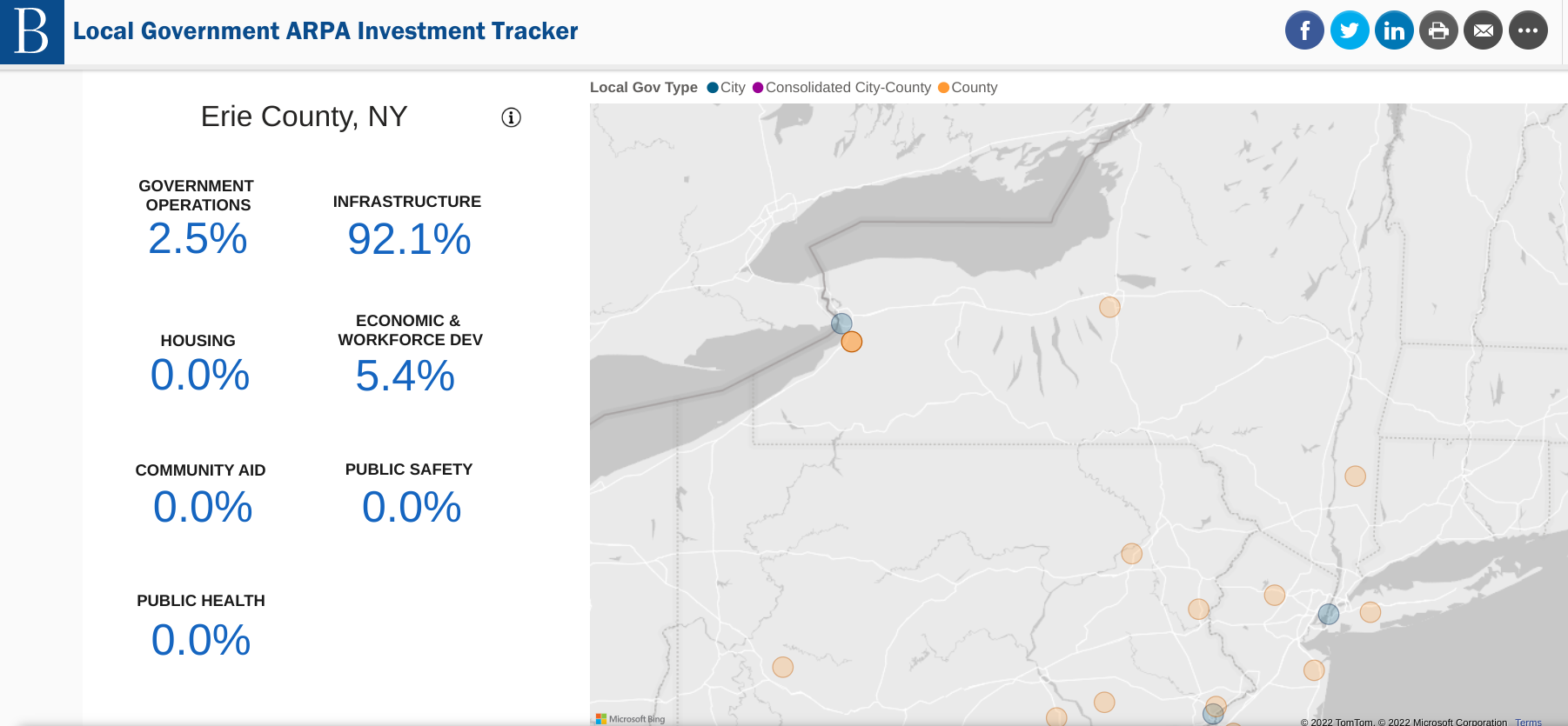
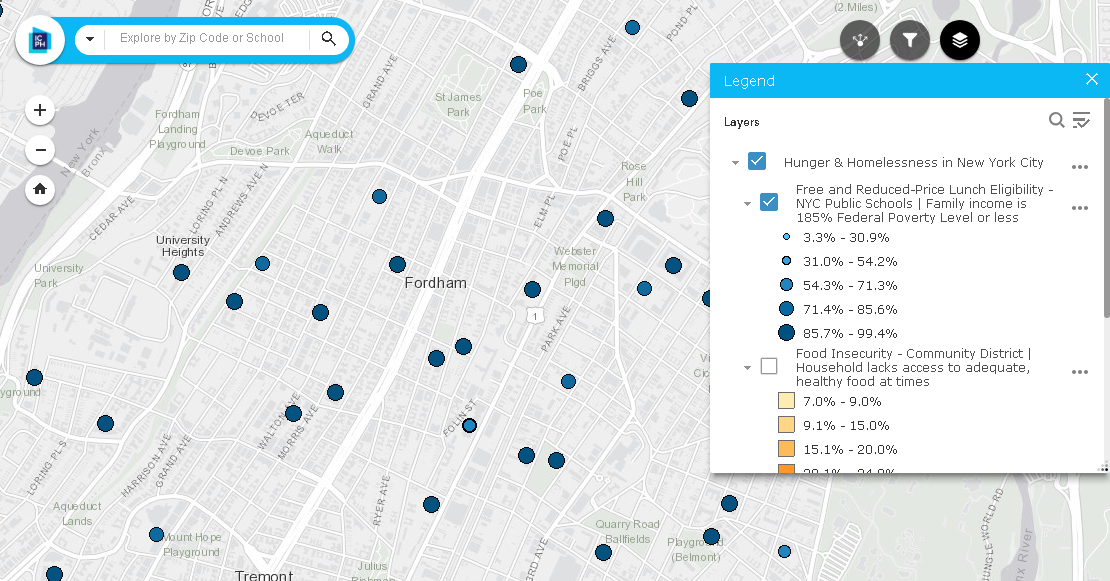
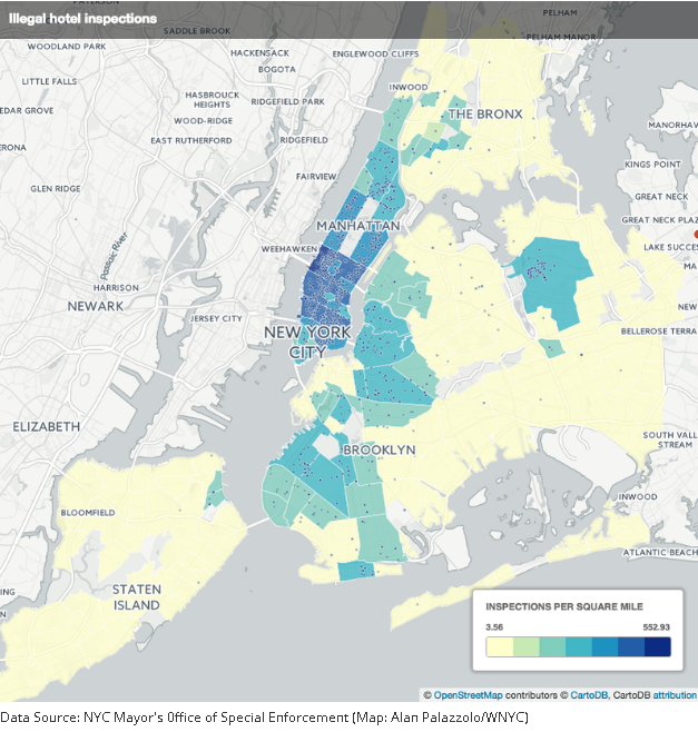
AGOL viewer, data HUB, and other geospatial tools used in helping develop WITHIN East Side Plan

Community focused GIS projects are always a favorite of mine to write about.  Highlighting how geospatial tools can be used by community groups – including nonprofits which are often project sponsors – to better help visualize and understand the vast array of environmental, regulatory, business and public health, and cultural data which impacts their daily lives.  One such project located in Buffalo’s east side was brought to my attention in a recent communication with Lisa Matthies-Wiza, Director of Geographic Information Services at Erie County.  

WITHIN East Side

The WITHIN East Side project is one of many projects of LISC Western New York (WNY) and its larger parent organization LISC New York.  program.   WITHIN East Side  focuses on simplifying the neighborhood planning and community development process, and ensures development is driven by resident leaders and community groups.  As an open, inclusive, community-driven initiative, WITHIN East Side brings together neighborhood voices, trusted partners, and supportive funders in an effort to better the wellbeing of residents using their own visions. Together with LISC NY, the WITHIN East Side stakeholders collaboratively identify projects that sustain the positive momentum happening in local neighborhoods.

In early 2020, LISC NY began planning with community partners in three geographic focus areas in the East Side under the WITHIN East Side program.  The East Side of Buffalo, which is the heart of Buffalo’s Black community was chosen as it is purposeful to build upon and lift up the long-time visions of residents and community leaders in neighborhoods most impacted by historic disinvestment, environmental, structural, and systemic racism.  The additional impact of the racist mass shooting on May 14, 2022, that killed 10 people, at a local supermarket within the planning area, furthered the importance of amplifying the community’s voice and vision for the future.

The project was designed as a two-pronged approach–integrating economic development and quality-of-life planning.  Closely intertwined, both  economic development and quality-of-life planning require understanding community history and dynamics, collaboratively identifying projects, building relationships with diverse stakeholders, and turning community priorities into progress.

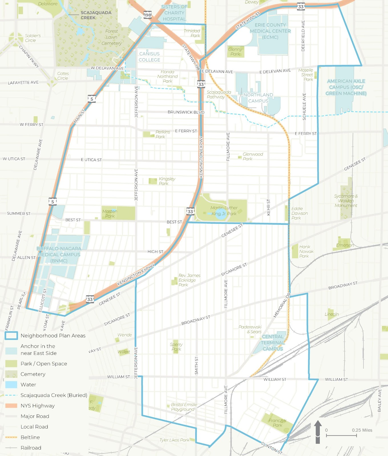
The WITHIN East Side project was broken into three distinct study areas – each of which was studied in more detail for a wide range of demographic, cultural and economic development issues

Background

LISC NY contracted with Prospect Hill Consulting (PHC), a local minority and women owned consulting firm which had responded to a formal Request for Proposals (RFP) which was issued in January 2021.  GIS mapping and analysis was a requirement and the LISC NY team knew GIS services were important to supporting the overall East Side project.  PHC was selected to perform elements A (GIS Mapping [including an online mapping tool request and a data HUB) and B (Scenario Planning).   While LISC NY had a vision of what the final plan might look like,  PHC was instrumental in assisting LISC NY in developing maps and visualizations used in the final plan and in community engagement sessions throughout the process.

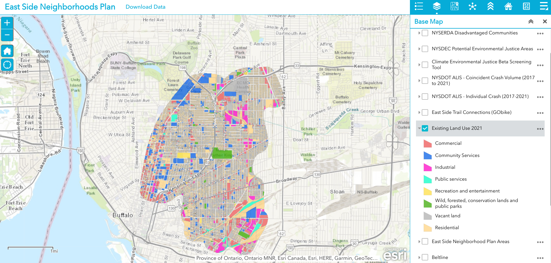
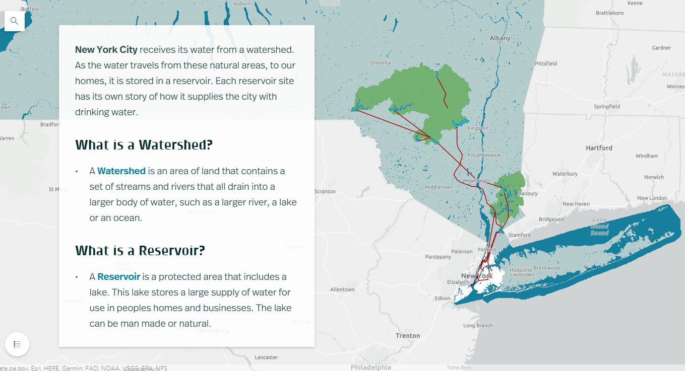
Existing 2021 land use is just one of dozens of data layers in the WITHIN East Side AGOL viewer. The rich database consists of local, regional, state and federal datasets.

Leading geospatial development of the East Side project from PHC was Jenny Magovero, President and Co-founder. Ms. Mogavero has been working in the GIS field for 23 years covering geospatial applications in community planning and environmental sciences as well as work in data visualization and  project management.  Mogavero created all of the maps in the East Side plan using the ArcGIS client as well as for spatial analysis and modeling.  The project web map is ArcGIS Online based with the data stored in a Hub Site (to allow for data sharing) and was designed about halfway through the GIS mapping and analysis task to support the WITHIN planning process itself.

One of the many excellent graphics iWITHIN East Side report. The map on the right identities areas within the study area where supermarkets are located – a significant issue for residents with limited transportation options.

LISC NY wanted to be as transparent as possible and allow stakeholders (i.e. the community/public, organizations, etc.) to work with the data and download and use it if they needed.  To this end, the AGOL interactive map was used in community outreach and meetings early in the project and as new data came online (i.e., stakeholders requested to see additional themes) PHC continued to update the AGOL viewer. PHC designed the AGOL viewer to serve as a communication medium that allowed LISC NY to show project progress, survey the community on what themes needed to be covered and/or identify gaps, and to act as a platform to continue engagement with the community in the future. 

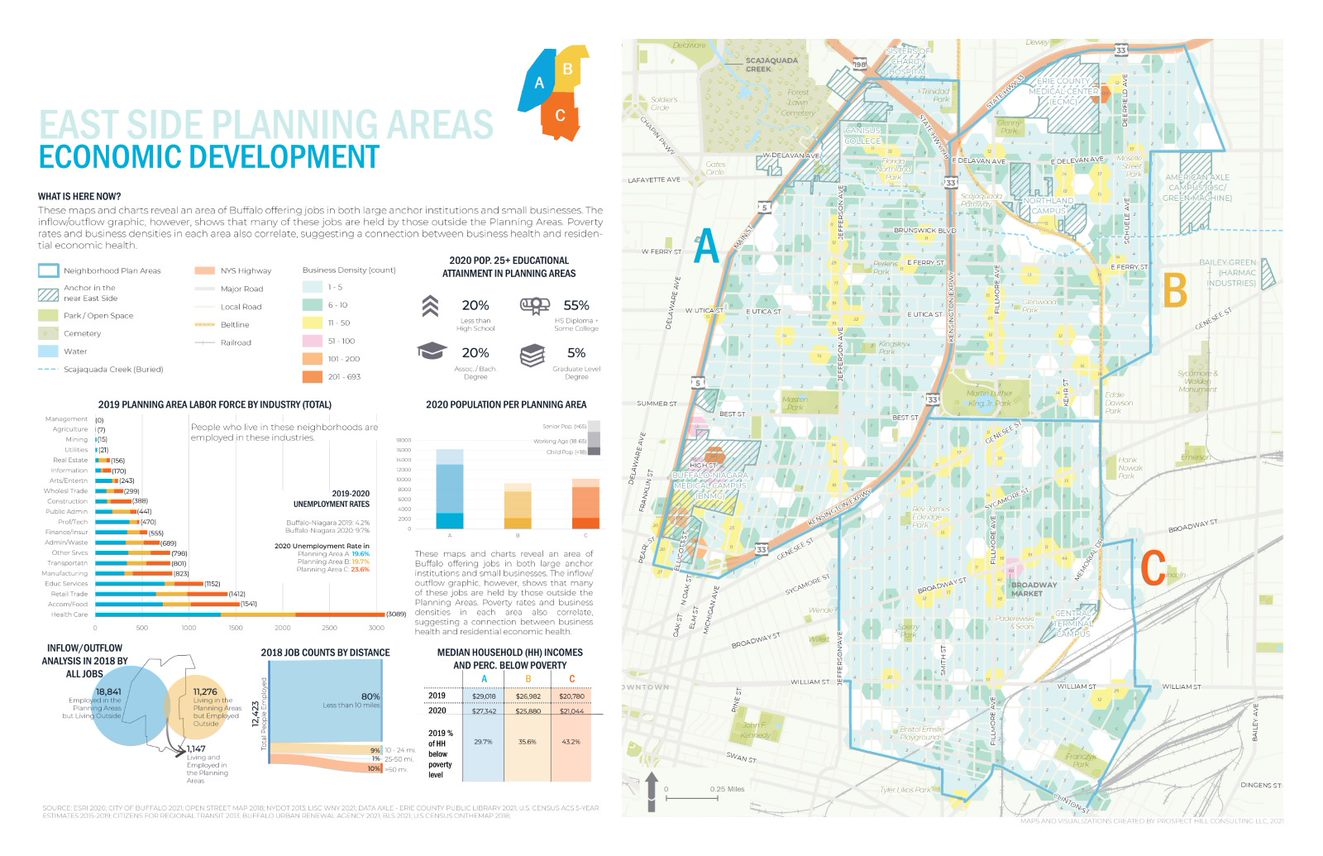
Economic Development issues are paramount in the study such as the role of small businesses, inflow of non-residents that work – but do not live – in the area, as well as the concentration(s) and accessibility of employment opportunities.

Data collection and development was specific to the mapping and analysis that the LISC NY team needed for the WITHIN plan itself.  As LISC NY has significant business relationships within the greater Buffalo community, they were able to collect a lot of data from local, state and NGOs. In addition, PHC collected publicly available data from the City of Buffalo, Erie County (parcels, land use, etc.), New York State  (NYSDEC, NYSDOT, etc.) and federal datasets (EPA, Census, etc.).  Additionally, PHC developed data from reports or datasets that were anecdotally described by stakeholders (like the air quality buffer, buried portions of the Scajaquada Creek, key intersections, etc.).  Project data was also obtained from utilities, Google, OpenStreetMaps, and ESRI.  

Most of the project data is made available through the LISC WNY Open Data Hub which was also designed and continues to be supported by PHC.  (Some providers did not want their data to be shared so it is only available for viewing in the application.)   

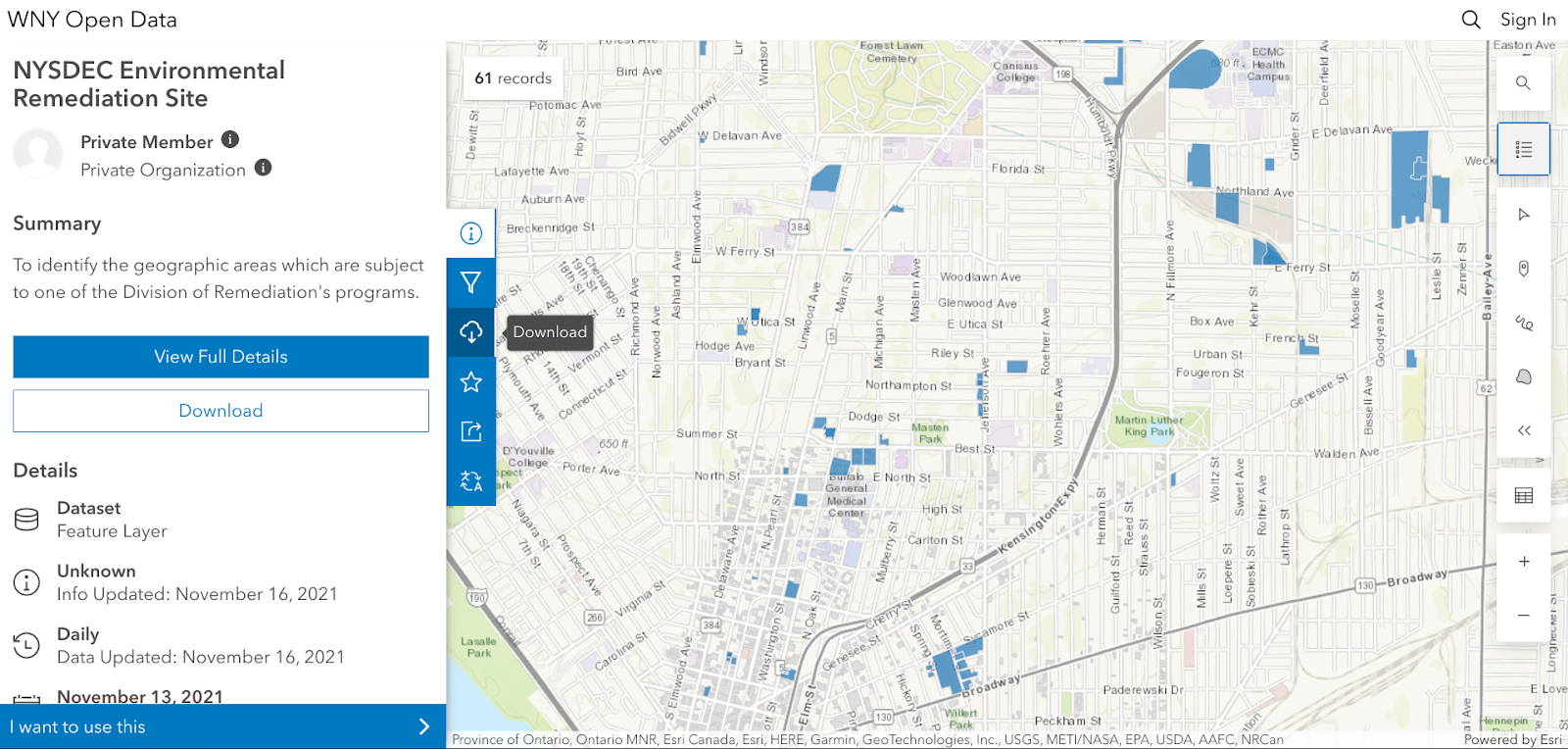
No AGOL account is necessary to access the HUB and tags help users to easily jump to specific themes of data presented in the final plan for download.

PHC used a bevy of GIS,  statistical packages, and desktop publishing software tools to generate the maps and graphics in the report including: 

  1. ArcGIS Online to collect stats for the neighborhood that were ACS 5yr census based (https://doc.arcgis.com/en/arcgis-online/analyze/enrich-layer.htm)
  2. Geospatial processing tools to buffer, clip, summarize, and run overlay analyses
  3. Spatial Analyst tools to develop walkshed layers (from points provided by Walkscore)
  4. Tableau Desktop and Excel to conduct data exploration to emphasize trends (or data insights) with graphs/visualization on  map layouts
  5. Adobe InDesign for page layouts and other graphics to be consistent with the LISC NY brand book (design guide) including colors, fonts, and logos.
  6. ESRI’s Hexagon sampling tool to visualize parcel data classes (i.e. land use, vacant parcel density, ownership) at the scale of the plan areas. 

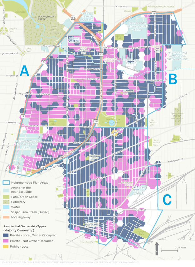
Residential ownership type is an important variable in urban studies. Data presented in the figure above suggests there continue to be many opportunities in increasing owner occupied properties in the study area

Summary

While consulting architecture and engineering companies continue to expand their geospatial offerings to governments and regional programs in 2022, particularly in the infrastructure and public works space, planning firms such as PHC serve in a unique space focusing on efforts which include applying geospatial tools as part of important community-based projects which often include significant public input and involvement.  Tools such as AGOL provide a great  framework in which to engage the public with regard to adding and removing data content and visualizing potential scenario outcomes.  A particularly useful tool given the enormity of the data used in the WITHIN East Side plan.

Reflecting on PHC’s involvement in the study, Jenny Mogavero notes:

“LISC NY is an integral part of, and key economic engine within the Western New York region.  Prospect Hill was honored to partner with the LISC NY to use GIS data, visualization tools and spatial analysis methods to not only present the existing conditions of our city’s East Side neighborhoods, but also reveal the deeper insights that occur when we overlap data-driven stories across multiple thematic lanes.  We were thrilled that our work supported the teams’ consensus building goals to develop a vision of a prosperous future for an important part of our City.”

Tyra Johnson Hux, WNY Director of Operations, also reflects on PHC’s work and the use of geospatial tools in the project adding:

“WITHIN East Side amplifies the visions of residents and community leaders in neighborhoods impacted by historic disinvestment, environmental, structural, & systemic racism. Showing their stories through, not only their own words, but also data was critical to helping our stakeholders generate a bold, authentic and comprehensive vision with an emphasis on implementation.  PHC supported the WITHIN East Side Plan by working with the project team to identify, collect and normalize relevant GIS data from neighborhood, government, academic and other partners. Additionally, they worked with us to analyze and visualize the community experience through maps and infographics.  The online interactive map and data warehouse they developed made it possible to share data in a way that breaks down silos, facilitate  strategic planning and continue community conversations.”

Contact

Jenny Mogavero, GISP
Prospect Hill Consulting LLC | Principal
716.432.9053 | www.prospecthill.co
jmogavero@prospecthill.co

Lashay Young, Director
External Affairs for LISC NY
https://www.lisc.org/
LYoung@lisc.org

The American Recovery Plan Act (ARPA) of 2021: Where’s the GeoBeef?

There's lots of money out there. But few in the GIS community seem to be talking about it

During the waning months of my service with Westchester County last fall, I began to see references and documentation connecting geospatial technology to Coronavirus State and Local Fiscal Recovery Funds (SLFRF) program which was enabled as part of the American Rescue Plan Act (ARPA) passed earlier in 2021.  Earmarked monies for each government in New York State.  This was followed by passage of the Infrastructure Investment and Jobs Act (IIJA) passed in November 2021.   In general, SLFRF funding is more directed to local governments and IIJA funding being more focused on state government appropriations.  The progams certainly haven’t gone unnoticed by GIS software companies such as ESRI and Cartegraph which have published documentation outlining how specific categories of ARPA funding  can be used to support local government geospatial activities.  Even Autodesk, the AutoCAD giant, has recognized the relevance and importance of these landmark funding programs.

Empire State organizations such as the New York State Association of Towns (NYTOWNS), New York State Association of Counties (NYSAC) and the New York State Conference of Mayors and Municipal Officials (NYCOM) which represent the many levels of local governments across the state are also busy tracking funding allocations and keeping their own scorecards.  For example there is NYCOM’s Municipal ARPA Plans and Programs inventory, NYTOWNS procurement guide, and NYSAC’s county-level breakdown of funding   And there’s more.  The U.S Treasury Department’s Allocation for Metropolitan Cities  or the Brookings Local Government ARPA Investment Tracker.  Your county or municipality may have yet to make the connection to these geospatial opportunities.  

The Brookings ARPA Investment Tracker is one of several sites monitoring the use of grant funds. Erie County’s use of the funding is highlighted here with 92% of the funding being used for infrastructure purposes. Other New York State government interim reports can be found here.

But even with all of this publicly available information, and aggressive marketing by the vendor community, there seems to be a limited amount discussion about how these major federal grant funding programs can be woven into local geospatial initiatives.  And this is unfortunate because its very clear there ARE local activities which are “ARPA eligible” in the areas such infrastructure management, economic development, health and human services delivery, housing, transportation and community revitalization to name only a few.  So who is leading the statewide local government ARPA geospatial discussion?

Diving a little deeper, I took out attempting to survey the statewide local government geospatial community on the ARPA and IIJA programs by issuing a simple survey via the NYS GIS listserv, as well as having a link put on the NYS GIS Assocation’s website (thank you, Association webmasters).  Perhaps I would have gotten a better response to the survey offering links to both of the funding programs, but instead, wanted to capture the respondent’s immediate understanding/awareness of the programs when opening the survey.  Providing links to the programs would have defeated the purpose of the survey.   And I made it clear the survey was only for New York State local government users and/or their contractors.    That takes a lot of potential respondents off the table via the listserv and with local government representation in the Association hovering around less than 25% of the total membership, I wasn’t sure what the response would be.  Though not included in the images below, I emailed a handful of former county colleagues separately ahead of the online survey which resulted in very similar results.

The results can hardly be considered a statistically representative sample of the statewide local government GIS user community.  I received only 20 responses of which 18 provided usable data.   As such, I would submit the following pie charts can be considered illustrative or reflectiveof the current overall awareness, if not understanding, of the current ARPA funding programs.  While only a third of the respondents indicated they were even aware of the ARPA program (first pie chart),  there was barely any understanding of the funding as it relates to geospatial (second pie chart) and only one of the respondents indicated he/she had been involved in any discussions regarding the use of ARPA funding (third pie chart) in their organization.   Though to some degree many GIS practitioners across the state often hold down technical positions in department-line staff positions which are normally far removed from the grant funds discussions being held in much higher administrative offices.

Unfortunately, as historically been the case, the top level NYS government associations noted above have rarely made GIS/geospatial a visible and outward facing part of their agenda.  Even today, Its hard to find anything really meaningful for the local government GIS community when using keyword searchs such as  “GIS, geospatial, or mapping” on any of their websites.  And its highly doubtful there will be, or can be, any real meaningful advocacy through any state program offices as this political or elected official outreach framework doesn’t even exist on behalf of local government GIS programs.    As the next generation of local government GIS/geospatial programs evolve, particularly in the urban environments where the focus will be more on the public infrastructure, utilities, sustainability and climate change impacts, large scale and high resolution mapping and surveying – the collective internet of things (IoT) – discussions and geospatial strategies with most state government offices in this space will  become more distant.    Geospatial programs for different levels of government in New York State evolving in completely different directions.   Albeit for sure New York City is on a different level when is comes to infrastructure and underground mapping, but it’s Underground Infrastructure Project concept does represent an important direction of the next generation of local government GIS programs in urban areas across the state.  It’s just a matter of degree.

The list below, from an ESRI publication and is available on numerous websites, highlights the local government programs in play.  No, not necessarily direct funding to your GIS office, but does serve as a roadmap of who GIS practioners should be talking with at the local level.  EcoDev, public health, infrastructure and public works, and cooperative efforts with utilities.  And then find out who is administering your government’s ARPA funding.    You can be assured someone or some agency has dibs on the funding.  And apparently the GIS programs are only visible in the rearview mirrow. 

The four major ARPA funding program areas include:

1.  Support public health expenditures, by, for example, funding COVID-19 mitigation efforts, medical expenses, behavioral healthcare, and certain public health and safety staff
2.  Address negative economic impacts caused by the public health emergency, including economic harms to workers, households, small businesses, impacted industries, and the public sector
3.  Replace lost public sector revenue, using this funding to provide government services to the extent of the reduction in revenue experienced due to the pandemic

4.  Invest in water, sewer, and broadband infrastructure, making necessary investments to improve access to clean drinking water, support vital wastewater and stormwater infrastructure, and to expand access to broadband internet

Within these overall categories, recipients have broad flexibility to decide how best to use this funding to meet the needs of their communities

While actually securing funding is much easier said than done, often requiring great grant and proposal writing skills as well as involving many individual offices and agendas in the organization.  But the almost complete lack of even a discussion by the statewide local government GIS/geospatial community to date seems amiss.

There are so few funding opportunities such as these 2021 federal grant programs to take advantage of.  These are generational programs.  Right now the onus of finding representation and advocacy for local government GIS funding in the federal grants arena falls squarely on local government GIS leaders and their representatives.  As well as local GIS practitioners.

Right now, though, the silence is deafening.

NYC H2O: Advocating Cleaner Water through StoryMaps

NYC-based nonprofit has developed extensive portfolio of educational products for all ages and settings

StoryMaps are such a great communication tool.  Turning geographic and location-based features and concepts into an easy-to-understand medium for the much broader audience which help identify key community resources, assets and experiences that can inform planning and policy-making.  By combining narrative text and other multimedia content with Geographic Information System (GIS) maps and data, story maps serve as an effective means of helping residents and developers visualize and understand projects with greater clarity.  Increasingly becoming an art form unto itself.  Broadly and increasingly used across the geospatial spectrum from the industry-leading ESRI StoryMaps platform  to say the least of the versions being offered by others in the geospatial space including Google Earth, CARTO, or Tableau

I’m sure its not the first time Story Map subject matter has found its way to be included in a more technical oriented conference, but I was nonetheless interested, if not surprised, to see a presentation by NYC H2O at the recent the September 9th New York City Watershed Science and Technical Conference.   A conference historically the home for geospatial-based technical and scientific presentations by engineers, biologists, and others in the water science disciplines, NYC H2O’s presentation was entitled Engaging an Urban Population With Water Engineering Utilizing a Virtual GIS Platform in the Pandemic Era”.

Having received its nonprofit 501(c)(3) designation in May, 2012, such work is not new to NYC H2O as it has built a niche in the environmental education space using the Story Map platform as its primary teaching and outreach tool. Story Maps augment and support their mission to “inspire and educate New Yorkers of all ages to learn about, enjoy and protect their city’s local water ecology.  Since 2009, NYC H2O has offered over 120 educational programs focused on NYC’s water system and ecology to a combined audience of 4,000 people.  Their StoryMaps often incorporate  digitized historic maps, photographs, videos, and social narratives to tell the story of waterrelated  infrastructure.

A couple of NYC H20’s StoryMaps in the water sciences and environmental space include:

Water Systems Overview

I’ve often heard the New York City aqueduct system referred to as the “eight wonder of the world”.   Maybe not as sexy and visible as the Great Pyramid but an incredible engineering marvel nonetheless.  Conceived, designed and built in another era to support the drinking water lifeline of the city

NYC receives 90% of its water from the Delaware and Catskill Watersheds. Aqueducts (red line work) transports the fresh water from a series of reservoirs in the Catskill Mountains over 100-miles from the city.

Fitting that the first StoryMap posted by NYC H2O on their “Hub” website is entitled  Water Systems Overview outlining and showing the many geographies of the system which originates in the Catskills Region.  An interactive StoryMap highlighting the major aqueduct systems (Catskill and Delaware – named for the watersheds where the water is collected), as well as the individual reservoirs both upstate and those in the city.  Household water consumption stats are also included in the StoryMap as well as several interactive learning activities as illustrated in the application toolbar below.  Included in the Site Specific Lessons is a StoryMap just for High Bridge and the Jerome Park Reservoir.

Sewer System and Stormwater Management

This StoryMap, focusing on the relationship between storm water and sanitary sewage, and its overall impact on water quality in the metropolitan region has lots more maps and associated data.

Beginning in 1850, NYC laid 70 miles of sewers, or underground pipes that carried away wastewater.   Today the city has over 7,400 miles of sewer pipes. These pipes move wastewater with the help of 95 pumping stations to 14 sewage treatment plants located in all five boroughs.  Each day, NYC wastewater treatment plants process, or “clean”, a total of 1.3 billion gallons of wastewater.   Produceing about 1,400 tons, or 60 truckloads, of biosolids!

The city maintains 14 sewage treatment plants covering the five boroughs. Treated sewage effluent is discharged into the Hudson and East Rivers and Long Island Sound.

About 60% of New York City’s sewer system is a combined sewer system. This means that one single pipe carries both stormwater runoff AND sewage from city buildings.  During heavy rainstorms, combined sewers systems receive more stormwater runoff and sewage. Wastewater Treatment plants have a capacity, or a limit, to how much water they can clean. When there is more water than the capacity, a mix of stormwater and untreated sewage empties directly into the City’s surrounding waterways. These wet weather events are called combined sewer overflows (CSOs).

The presence of combined sewers are still very prevalent in the metropolitan region with the majority emptying into the East River and the east side of the Hudson River.

Also central to the long term management of clean water – are government regulated programs entitled Municipal Separate Storm Sewer System (MS4) programs.  In populated areas many neighborhoods, including in New York city, as well as industrial areas along coasts, have deployed MS4 programs.  A MS4 has one set of pipes that transports sewage to sewage treatment plants and another set of pipes that transports stormwater directly to local waterways.   Unfortunately, many pollutants (like oil, trash, pet waste, pesticides, and fertilizers from lawns) are washed into this system when it rains. MS4 helps solve one problem (CSOs and sewage in the local waterways) but causes a similar, although smaller, problem since trash and pollution can still enter the local waterways when it rains.

Currently, only about 40% of the NYC footprint is covered by an MS4.

As it relates to the collection of data for the purposes of monitoring citywide water quality, this StoryMap also includes interesting map displays of both fecal coliform (1985-2017) and dissolved oxygen (1909-2017) testing.

Summary:

It’s nice to see as part of such advocacy efforts the use of open data sets and geographic content as made available by government agencies and data portals.  Much of which is included in many of the 21 StoryMaps listed on the NYC H2O HUB.

StoryMaps allowed us to keep students engaged in learning about their local water issues throughout the challenges of the pandemic. The tool has been so popular with schools that this year we launched a curriculum introducing GIS and StoryMaps to several environmental science and environmental justice in high school classrooms”, notes Kevin Barrett who guides NYC H2O’s mapping instruction.

With regard to the September 9th New York City Watershed Science and Technical Conference, Stalin Espinal, School Program Manager for NYC H2O adds “The conference gave us the opportunity to share our work and programs to a community of our peers. We were delighted to have received such enthusiasm and interest in our work with GIS and StoryMaps.  Even resulting in a new StoryMap collaboration in partnership with the Watershed Agriculture Council (WAC) which works with local farms on and around the upstate New York City watershed to promote Best-Practices and make improvements that help protect the water quality of our drinking water.”

Contact:

Kevin Barnett
GIS Education/Project Manager
kevin@nych2o.org
www.nych2o.org

10 Questions: Christine Gayron, Gayron de Bruin Land Surveying and Engineering, PC

Christine Gayron currently serves as President of Gayron de Bruin Land Surveying and Engineering, PC (GdB) based in Melville, New York.   The company provides a wide range of geospatial products and services for clients in the Empire State.  As part of eSpatiallyNewYork’s continued effort to reach out to the statewide geospatial professions, we were able to meet and have a conversation at the 2019 New York State Association of Licensed Surveyors (NYSAPLS) annual conference.

eSpatiallyNewYork:  GdB was created in 2010.  The company has made a lot of progress in a relatively short period of time and adding a lot of new technologies along the way – GIS, drones, laser scanning, etc. – how is the company making it all happen?

Gayron:  I only hire people who are awesome. They are the ones who make it happen. I just bring in the work and create a company culture that makes the employees want to be the best at what we do. I have to credit my partner, Greg de Bruin, for constantly pushing the envelope, and insisting on investing in technology, and Jason Graf, my partner in charge of operations, for putting the technology in everyday use. Greg introduced GIS in the 90’s before I started my career. I actually think my contribution was my ability to run the business and bring work in, creating a revenue stream that would allow us to afford to make the investments. So I grew the company and oversaw things and generated profit, while the technology nerds in the company figured out how to customize software and put new technology into use.

eSpatiallyNewYork: Tell me a little bit about your education.   B.S. in Geology – how did you make the jump to surveying?

Gayron: I have a BA in Geology from CUNY Queens College and a minor in secondary education. I thought I was going to be an Earth Science teacher, but a month into student teaching, I realized teaching was not for me. I wasn’t sure what to do. My stepfather saw an ad in the paper for GIS Specialists at an engineering firm called A. James de Bruin & Sons, the predecessor firm to Gayron de Bruin.  It was in Bethpage, NY, the next town over from where I live. I had taken one class in GIS in college. The mapping aspect of geology interested me more than the rocks and minerals part, so I applied for an entry level position. I was hired to draft utilities and base maps for utility company conduit design drawings. Then I worked with one of the engineers on the conduit design. I designed hangers to support conduits underneath a couple of bridges over the Long Island Expressway (LIE).   I also designed horizontal directional drilling of conduit underneath the LIE. When the conduit design work dried up, I started doing more boundary surveying and control surveys for NYSDOT.  I used GIS to plan control networks.  At 23 years old, I was managing design survey projects. There was lots of opportunity at the small family owned firm and I was good at seeing what needed to get done. As I approached licensure in 2010, my boss, Greg de Bruin, and I decided to partner and form Gayron de Bruin.  It was time for Greg to start planning for retirement and I was the successor.

eSpatiallyNewYork:  Early on, traditional surveying and engineering companies were a bit slow embracing GIS technology/software but today this intersection is complete.  GdB is part of the ESRI Partner Network and has ArcGIS Online Specialty Did GdB have ESRI capacity from the beginning?

Gayron:  We’ve always been an ESRI shop. We saw how ESRI had discounted licenses for schools and government and we knew that was key. As we are geospatial data collectors and data managers we push GIS as a data management tool to our clients.  We try to provide this to all of our clients. GIS is just one of the tools in the toolbox. It used to be a hard sell to get clients to use GIS, but ArcGIS Online (AGOL) has made that a lot easier because we can set up the GIS tools, bring the data in, and show them how to view, analyze, and manipulate it.

eSpatiallyNewYork:  Are the new/younger generation of surveyors – and engineers – who are just getting into the work force have a broad enough understanding/experience with GIS software?

Gayron:  We hire a lot of people right out of college with GIS education. We find that they have a basic understanding of what it can do, but how we use it in surveying and engineering is usually new to them. Most of it is learned along the way. I think this is true of most industries – college gives a basic foundation and only scratches the surface. Getting into the workforce is where the detailed applications and user expertise is developed.

eSpatiallyNewYork:  Speaking of data, what has GdB’s experience been in obtaining government data?  I see that elevation certificates and tax parcel data are key business components in your space.    What’s been your experience in getting this digital data across New York State?

Gayron: Orthoimagery has been very attainable and useful. Parcel data is useful for elevation certificates as you suggested. Tax map line work is valuable for getting an idea of what the parcel layout may look like, but it can be deceiving. We try not to use it on our drawings because we are licensed land surveyors and if we put a line on the drawing, it’s got to be in the right place. We love to see government offices scanning their maps and storing them in a GIS and making them available, but this is still rare.

eSpatiallyNewYork:  Drone technology is becoming a geospatial game changer.  What’s the GdB read on this evolving technology?

Gayron: So drones are all the rave, but they are really just another cool option in the geospatial tool box – a glorified robot camera holder.   It’s really the software that connects drone flights to GPS and uses drone photography to create point clouds and 3D surface models that I find impressive. Like other tools such as LiDAR, it is the accurate and precise control that yields accurate 3D models. The software is key in reconciling the data with the ground control.

eSpatiallyNewYork:  This is impressive  – “GdB is ranked in POB Magazine as one of the top 100 Geospatial firms in the United States.”

POB magazine gathered data in 2015 and 2016 on revenue in the geospatial community. I’m attaching the articles so you can see how they used the data to rank firms. They stopped doing it after 2016, but I’m certain we would rank even higher on the list now!

eSpatiallyNewYork:  How does Honeoye Falls, New York fit into the GdB business plan? It’s a long way from your Long Island headquarters!

Honeoye Falls is just outside of Rochester. So we wanted to expand the company and it seemed we had the choice to expand geographically providing the same services or we could expand our range of services to include more civil engineering. We decided to stick with what we are good at and do it farther away. My partner, Jason Graf, LS, found New York State Department of Transportation (NYSDOT) data available online. It listed NYSDOT projects by location and contract budget. He manipulated the data in GIS and created a heat map to see where NYSDOT was spending the most money. The New York City area glowed the brightest, of course. The next “glowiest” cities were Buffalo, Rochester, and Syracuse. With Rochester in the middle of those three cities, it seemed like a place to look into. We had some contacts there and did our research. Within one year of starting to think about a Rochester office, we had the branch office open with 5 employees. 18 months later, we have 11 employees and they are all busy! Scott Smith, LS, the Branch Manager, is building an all-star team upstate. I truly believe that the bringing on the right people drives our success. As we grow, we are putting effort into making our operation more structured and efficient, but as stated above, we only hire people who are awesome, and I want them to feel appreciated for their ideas and contributions.

eSpatiallyNewYork:  What are some of GdB’s current larger or unique projects using geospatial technologies? 

Power companies are putting out very large corridor projects requiring surveying and mapping of several miles along a proposed power line route. I think these projects are coming about as new forms of energy generation are being developed. They need transmission lines to connect the new power plants, solar panel fields, and wind farms to traditional power grids. We also do large mapping projects for design of infrastructure in New York City. The city’s infrastructure is crumbling and needs upgrading. One of the first steps is mapping the existing conditions. These jobs are always a huge rush.

eSpatiallyNewYork: Considering all of GdB’s business – what is the breakdown between private and business clients? 

Most of our work is for government agencies. The breakdown is aboutt 80% government agency work, and 20% private clients.

eSpatiallyNewYork: Tell us about the online teaching you do through GeoLearn?

I met Joe Paiva, the founder of GeoLearn, before I got licensed because I took his review course when I prepped for the Licensed Land Surveyor test, and then I would see him at conferences a couple times per year. Joe is an excellent presenter. Joe knew that I was doing some presentations to professional organizations and he knew that my company was using GIS and other new technologies in Land Surveying – so he asked me to present courses on GIS for GeoLearn.  I prepared power point slides just like I would for a live presentation. I flew to GeoLearn’s studio in Kansas City to record them. It’s actually much easier to present this way, because you only have to present 10-15 minutes at a time to create the segments. Being in the studio was a very cool experience!

eSpatiallyNewYork:  Work aside, I understand you’re a triathlete and compete in many similar events.  What’s next on your calendar? 

Last year, I qualified for XTerra World Championship race in Maui. This is an off-road triathlon consisting of an ocean swim, mountain bike, and trail run. Unfortunately, I was injured a couple weeks before the race and didn’t go. This year, I am not signed up for any races, which is an interesting experiment, because I’m still training, but without the pressure of an upcoming race. So I know I’m doing it because I really love it. I usually wake up at 4:30am and train early in the morning. I’m done by 8am in time to get my kids off to school and get to work. I am married to a NY City Firefighter and we have three amazing children, who are very active. Right now, I’m ok with putting my racing career on hold to attend their lacrosse games, concerts, and cheer competitions.

Contact:

Christine Gayron, President
Gayron de Bruin Land Surveying and Engineering, PC
cgayron@gayrondebruin.com

The Geography of Homelessness

Background

The Institute for Children, Poverty, and Homelessness (ICPH) is a New York City-based policy research organization focused on family homelessness in New York City and throughout the United States.

Formerly known as the Institute for Children and Poverty, ICPH was founded in 1990 as federal and state governments looked for ways to address growing rates of family homelessness. Through the examination of empirical, quantifiable data, ICPH seeks to inform and enhance public policy related to homeless families, with an emphasis on the impact on children.  The New York City numbers are staggering with over 12,000 families—including 25,000 children—calling a city shelter their home.  A small city in itself.

And unfortunately, the experience of housing instability and homelessness in New York City’s neighborhoods goes far beyond what shelter numbers alone show. In school year (SY) 2015–16, City schools identified four times as many homeless students as there were children living in shelter, and the current structure of the City’s shelter system is ill-equipped to meet the long-term stability needs of homeless children and families living both in and outside of the City’s family shelters.

ICPH examines the demographics of this growing population, the challenges these families face in becoming self-sufficient, and the programs that are most effective in helping them transition out of homelessness in their reports, research-based books, and policy research commentary.   ICPH’s publications inform government officials, policymakers, other research organizations, advocates, academics, and service providers from across the metropolitan region to promote a robust, evidence-based dialogue.  Central to ICPH’s core work is the intersection of statistical analysis, data visualization, and mapping technologies resulting in a wide range of geospatial-related products and applications.

ICPH Geospatial

ICPH utilizes several mapping, desktop publishing, and statistical software packages in support of publishing online and hardcopy products.  While ICPH actively promotes the use of traditional interactive maps, the increasing use of hybrid products i.e.  maps/charts/tables/graphics (a.k.a. Inforgraphics) are widely used as part of delivering the organization’s message.   Inforgraphics are increasingly being used across the GIS community to provide graphic visual representations of information, data or knowledge intended to present information quickly and clearly.

Managing geospatial applications and development at ICPH is Bronx-native Kristen MacFarlane.  She arrived at ICPH in December 2016 after a stop at the New York Botanical Gardens.   She received her undergraduate degree in Natural Resources from Cornell University and her masters in Geographic Information Science (GISc) from CUNY Lehman College in the Bronx.  Kristen oversees an organizational geospatial tool box which includes a several software packages including Tableau and ESRI.  While most ICPH projects are NYC focused, the reach of the organization’s research and work covers other areas of the country as well.  Projects are funded by foundations, grants, and other contributions and initiated by ICPH professional staff and industry colleagues.  MacFarlane notes that data used in the studies is mostly gathered from open data portals or through Freedom of Information Law (FOIL) requests.  As a primer on her involvement with ICPH, see her November 17, 2017 GIS Day blog post GIS Day: Discovering Family Homelessness Through GIS.

ICPH Geospatial and Data Visualization Applications

Suspension Hubs Interactive Map

In New York City, there are 102 Suspension Hub schools serving nearly 3,500 homeless middle schoolers. These schools suspended more than 6.6% of their students overall in SY 2015–16—nearly three times the city’s rate of 2.5%—and their rate of suspension among homeless middle school students actually increased during the years since SY 2010–11. Understanding where Suspension Hubs are located represents an opportunity to offer these schools more support and resources so that they, too, can turn the tide like the 83% of other schools with declining suspension rates. The Suspension Hubs Interactive Map was developed in Tableau using data generated and analyzed with Stata.  Project data is from NYC Department of Education for SY 2015-2016.

In New York City, there are 102 suspension hub middle schools where students are disciplined at extremely high rates.

Interactive Map and Atlas of Student Homelessness

Unless current trends change, one in seven New York City public school students will be homeless during elementary school. More than 140,000 children attending New York City public schools have experienced homelessness within the past six years.  Visualizing the magnitude of this issue is the updated ICPH application New York City Interactive Map of Student Homelessness as well as On the Map:  The Atlas of Student Homelessness in New York City 2018.  Both products provide a wide range of  data to allow people from different fields to tailor and engage with data on student homelessness in a way that is meaningful to them and the unique needs of their organizations and locales in the city. The Atlas documentation is from Section 1 only of the report which is available for download from this link.  The August 2018 update is more similar to ones that ICPH presents as static publications.  The full report contains maps generated with the ArcGIS client which are exported for inclusion in online and hardcopy publications.  On a larger scale, ICPH created a similar interactive nationwide map – The United States of Homelessness – scale using data from the U.S. Department of Education.

This interactive map provides users with the ability to see what student homelessness looks like in every NYC neighborhood.

Neighborhood Look at Domestic Violence as a Driver of Homelessness in NYC

Family homelessness has many different causes and drivers. One of the more common drivers in NYC are families being pushed into homelessness because of experience with domestic violence. This map demonstrates the rates at which domestic violence is driving family homelessness in neighborhoods across NYC.

Percent of families with children eligible for shelter due to domestic violence by Community District July 2014 – December 2015. Data source: NYC Department of Homeless Services.

Food Insecurity & NYC’s Homeless Children

A household is considered food insecure if there is a lack of access to adequate, healthy food for all household members.    In NYC, students are eligible for free or reduced-price lunches  if their family income is 185% of the Federal Poverty Level or less. Other programs such as the federal Supplemental Nutrition Assistance Program (SNAP) provides food stamps or SNAP benefits to households with incomes 130% of the Federal Poverty Level or less, in addition to employment requirements.  This ICPH interactive map enables users to access localized data on school lunch programs, food insecurity by community district and SNAP benefits.  An excellent User Manual is provided as well.

Data sources for this interactive map include NYC Dept. of Education, Food Bank for NYC, Feeding American, Data2Go.nyc, and U.S. Census Bureau, 2012-2016 American Community Survey estimates.

Summary

While the core focus of ICPH’s research and advocacy continues to be in the New York City region, its work covers the entire United States.  Detailed homelessness related studies have been done in specific metropolitan areas.  Similar the nationwide scope of the United States of Homelessness study referenced above, ICPH released the Student Homelessness and Food Deserts interactive map during Hunger and Homelessness Awareness Week, November 12-16, 2018. Other student-focused homelessness studies have been conducted in California, Georgia, Seattle, and New Jersey.  A wide range of publications and reports compiled by ICPH staff and collaborating organizations focusing on homelessness-related topics such as education, health and well being, housing, and community issues can be accessed  by clicking on the image below and then using the Research tab to browse Reports and Interactive Data.

“Geospatial tools are essential for our organization as we work to give the public a clearer, more informed picture of what child and family homelessness looks like in their community and across the country,” said Kristen MacFarlane, Senior GIS Analyst at ICPH. “Homelessness is a national crisis but a local issue and the specific ways that homelessness varies between localities and even neighborhoods are important to understand in order to develop policy solutions for those experiencing it. GIS software helps ICPH convey the complexities and the scope of this growing crisis.”

Contact:

Kristen MacFarlane
Senior GIS Analyst
Institute for Children, Poverty, and Homelessness
36 Cooper Square, 2nd Floor
New York, New York  10003
KMacFarlane@icphusa.org

Wayfinding: Geospatial Goes Indoors with Connexient

As GIS and mapping technologies evolved through the later part of the 20th century focusing mainly on the physical(outdoor)  landscape, the digital mapping of the  built/interior environment continued to focus on the use of AutoCAD/Revit and related CAD technologies.  With exceptions, there were two definitive geographic mapping camps:  Geographic Information Systems (GIS) software vs. Computer Aided Design (CAD) software.   One or the other.  And with little integration of both.

As both technologies matured, integration between the two computing environments became more common and the lines of division blurred.  New technologies including, but not limited to Global Positioning Systems (GPS), Laser Scanning, Building Information Modeling (BIM), and drones, as well as advancements in 3D modeling and increased desktop and internet capacity aided to the continued integration of the software platforms. GIS and BIM Integration Will Transform Infrastructure Design and Construction is a very recent and quick read from Autodesk charting the path of this flourishing market.

Fast forward to 2018 and the evolution of indoor wayfinding which leverages many of the components of these same outdoor and indoor mapping concepts.   Based on a similar spatial data model, Wayfinding applications are now found in a wide range of public spaces, educational and industrial campuses, entertainment and athletic venues, buildings, and healthcare facilities.  Offering indoor maps for handheld mobile devices is becoming more and more common, as are digital information kiosk systems in office complex lobbies, and as part of web mapping applications. (It is often recognized that The Americans with Disabilities Act of 1990 (ADA) represented a milestone and was instrumental in helping to make spaces universally accessible and improving wayfinding for all individuals.)

Connexient

New York City-based Connexient was formed in June 2012 with the vision that indoor GPS and navigation will become as widespread inside as it is outside.

With over 60 licensed hospital client sites and a total square footage over 70 million square feet mapped, Connexient is a market leader in healthcare in providing  smart phone based turn-by-turn indoor navigation and all screens digital wayfinding solutions.   Leveraging significant breakthroughs in the ability to implement low cost, navigation quality indoor positioning, users can now expect the same kind of functionality –  intuitive, reliable and accurate maps, directions and turn-by-turn navigation which is commonly available from outdoor world mapping and navigational companies such as Google, Apple and Waze.    The same user experience can be available via a mobile app for any large, complex indoor facility or campus that they enter.  Today, these capabilities are highlighted in Connexient’s flagship product MediNavTM.

Selected MediNav functions include:

  • Multiple levels of zoom and detail
  • 5D visualization and 360 degrees of freedom of camera control
  • Detailed routing network and intelligent routing
  • Turn-by-turn instructions
  • Visual landmarks (signage) to provide locational reference
  • Visual and audio turn prompts
  • Off-route notification & route recalculation
  • “Balcony view” route visualization – what is coming next
  • 1 to 2 meter accuracy
  • Dynamic refresh of user position
  • Parking Planner, Find my Car and Meet Me
    Continue reading

Geospatial Business Spotlight: CycloMedia Technology, Inc.

Company Name:       CycloMedia Technology Inc.

Location:                   Berkeley, CA

Website:                    www.cyclomedia.com

Employees:               120 Globally

Established:              1981

A privately held company, founded in the Netherlands over thirty years ago, CycloMedia Technology, Inc. is a rapidly expanding international company with staff in Syracuse, New York.  Annually, CycloMedia captures and processes approximately 160,000 linear miles of 360° panoramic street level images, representing over 48 million recordings per year. The company holds five key image capture technology patents and specializes in the local government market. Currently the company has projects with the cities of New York, Philadelphia, Washington DC, as well as  Franklin County, OH (Columbus), Dakota County, MN (Minneapolis) and Jefferson County, KY (Louisville) to name a few.

Specific benefits of Cyclomedia technology include:

  • GeoCyclorama images and basemaps are geographically linked
  • Provides ability to conduct searches with address, postal code or coordinates
  • Integrate with interprise applications and work processes using the GlobeSpotter API
  • Determine the location and dimensions of objects in GeoCyclorama imagery
  • Ability to create precise point, line and area measurements
  • Overlay enterprise spatial data on the GeoCyclorama images
  • Supports Open Geospatial Consortium (OGC) standards
  • Integrate data in formats such as WFS, WMS, Shapefile and GML
  • Create reports and bookmark locations of interest
  • Users can save and utilize GeoCyclorama images for reporting and analysis functions.

Geospatial Products and Services:

A.  GlobeSpotter

GlobeSpotter (web) is an interactive web-based application that provides cloud access to GeoCyclorama imagery and tools for measuring, collecting data, and reporting.  The software and data are directly available from CycloMedia’s software as a service (SaaS) model.

GlobeSpotter (web) screenshot with area measurement and reporting window 

GlobeSpotter for ArcGIS Desktop  provides visualization, measurement and overlay tools within the ArcMap or ArcGIS Pro allowing a user to fully leverage the power of GeoCycloramas within the ArcGIS client environment.  Specific capabilities include:

    • Open GeoCyclorama imagery from a recording point layer added to the map
    • View one or multiple GeoCyclorama images
    • Measure on GeoCyclorama images
    • Use the native editing capabilities of ArcGIS to collect features in 2D or 3D
    • Ability to save and utilize GeoCyclorama images for reporting and analysis functions.

Continue reading

BetaNYC:  Championing the Open Data Cause

Background

In 2008, friends, hackers, open data/open government enthusiasts, and other professional acquaintances began to gather and discuss the state of open governance in New York City and created the NYC Open Government Meetup by Hailey Austin Cooperrider.   In 2009, this group was relaunched as the Open NY Forum under the leadership of Philip Ashlock, Cooperrider, and Noel Hidalgo.  Over the next 3-4 years, the group met periodically to discuss and push for an Open Data agenda in the city.

The movement and discussion on open data in the metropolitan region was augmented by ongoing work of Council Member Gale A. Brewer who at the time was Chair of NYC Council Committee on Technology in Government and was campaigning for an Open Data  statue for the City of New York. In June 2009 she hosted a public hearing on open data standards legislation.   Another public hearing was held in June 2010. The law has finally passed, and was signed into law by Mayor Bloomberg on March 7 2012. In 2013 and after New York State Governor Cuomo launched Open NY, the state’s Open Government initiative, the group renamed to BetaNYC.

In 2013 the BetaNYC community embarked on a five borough tour and authored The People Roadmap to a Digital New York City – and agenda setting publication identifying community values and 34 ideas for successive administrations and Council to work on. Since this this time, BetaNYC and the civic tech community have seen several policy and legislative victories — better Freedom of Information tools, NY City Record Law, expanded Mayor’s Office of Data Analytics (MODA), and the expansion of civic innovation challenges.

During the same time period, the City of New York partnered with Code for America to enlist a team of fellows to build technology to address criminal justice issues as well as initiating a search to hire a local community organizer.  Noel Hidalgo was hired to fill this position and bringing a broad understanding and connections with the open data/open government community across New York City as part of his involvement with betaNYC. It was at this time BetaNYC became Code for America’s official NYC brigade.

In 2015, BetaNYC became a “Partner Project” of the Fund for the City of New York (FCNY) continuing its mission to “improving lives in New York through civic design, technology, and data.”  A purpose which clearly augments the New York City Open Data program, though with a uniquely different and more clearly refined focus on community groups and city residents.  As FCNY had been one of the organizations supporting the City’s first data datalog,  being a Partner Project had enabled the city’s efforts towards open government and open data to come full circle.

With FCNY as fiscal sponsor and Noel being selected as a fellow at Data & Society, BetaNYC began work with the Civic Innovation Fellowship program out of the Manhattan Borough President’s Office. BetaNYC and the FCNY have continued the partner project relationship. As of April 2017, the Alfred P. Sloan Foundation has provided the funding for the Civic Innovation Fellowship program, and the FCNY continues to manage those funds.

BetaNYC Today

BetaNYC supports a broad range of programs focusing on geospatial-focused efforts in the city’s civic technology arena, open data, and community neighborhoods.  Of particular focus in their outreach and mission are the city’s community boards which are the appointed advisory groups of the community districts of the five boroughs. There are currently 59 community districts: twelve in Manhattan, twelve in the Bronx, eighteen in Brooklyn, fourteen in Queens, and threehttps://communityprofiles.planning.nyc.gov/ in Staten Island.

Manhattan’s 59 Community Districts covering the five boroughs

Data

At the core of BetaNYC’s offerings is its data portal which currently includes 130 datasets (BetaNYC sponsors 27) from 22 different organizations.  The interactive portal offers developers and individual users access to a wide range of data formats.  Illustrative of their work in advocating open data and access, BetaNYC sponsored its third NYC School of Data conference on March 3, 2018.  This community-driven conference included conversations, panels and workshops intended to empower community members to improve neighborhoods across the city.  The conference is framed to celebrate NYC’s transformative open data law and International Open Data Day, while kicking off NYC’s second annual open data week. Conference attendees are encourged to participate in #hackhall — a daylong open space for open source civic & government technology projects. In the #hackhall, attendees collaborate, connect to new libraries/projects, and improve open source projects.

BetaNYC’s data catalog is leveraged to support the development of apps, websites and visualizations.  Selected datasets are featured in media articles, news reports and blog posts across the region and are highlighted in the Showcases collection on their website.

Programs and Activities

Community Boards

As the result of a three year partnership with the Manhattan Borough President’s Office, BetaNYC designed tools and customized trainings specifically intended to help Community Boards access, analyze, map and use data to inform decision-making. The workshop introduces the easy-to-use BoardStat tool to query NYC 311 – service requests and explore trends in health, safety and quality of life concerns.  BoardStat is designed for community. Not only does BoardStat empower a community board staff and its members to gain timely insights, it is furthering the Manhattan Borough President’s long-standing goal of making government transparent and responsive, reactive, and moving beyond open data access to meaningful use.  BetaNYC’s most recent event in this space was March 5th.  Examples of documents and materials used as part of this BetaNYC training session are available in this Google Drive shared folder.

Attendees at BetaNYC’s School of Data March 5th focusing on NYC Community Boards

#BetaTALK – Affordable Housing: Data, Policy, People

In July 2016 BetaNYC hosted a lunchtime discussion at Civic Hall centering on the topic of affordable housing in New York City.  The event was to share knowledge about this extremely important and complex topic focusing on a wide range of housing-related topics (and data) including, but not limited to, rent-stabilization, New York City Housing Authority and Section 8 voucher statistics, proposed building plans and Landmark Laws, and NYC government datasets such as Pluto, ACRIS, Department of Buildings, and the Dept. of Housing Preservation and Development as well as the American Community Survey among others.   Other BetaTalks are available for viewing on YouTube.

BetaNYC is committed to continue the conversation and help the Civic tech community grow ideas, analyses, and projects on this topic by building more accountability, clearer, and up-to-date information on rents across the City at a highly localized level, since differences can be stark between blocks, buildings, professional even within buildings.

Testimony & Advocacy

On behalf of BetaNYC, Executive Director Noel Hidalgo frequently provides expert testimony to the New York City administration and legislature on a wide range of open data/open source, new technologies, and government transparency issues.  BetaNYC has been instrumental in Over the past 18 months, illustrative efforts in this context include presentations on the Automated Decision Systems Local Law 49, testimony on both the Open Data Examination and Verification Report, and Intro 1696-2017 (Open Algorithms Bill).  

Data Jams

Data Jams are occasional BetaNYC “hands-on” events focusing accessing and interpreting  specific NYC government program datasets. Recent Data Jams have centered on program data from NYC311, NYC Dept. of Planning, and NYC Parks.  

NYC School of Data

Held in conjunction with NYC Open Data Week (March 3-10, 2018), BetaNYC’s School of Data is a community conference showcasing NYC’s civic design, civic/government technology, and open data ecosystem. It seeks to build a framework of relationships that can demystify data and technology, foster democracy, build cross-borough relationships, and mentor a new generation of civic leaders. 2018 topics focused on four key areas: digital literacy & privacy, smart & wise cities, effective & open government, and lastly, civic

Summary

BetaNYC continues to champion the open data and government transparency intersection in New York City.  Best illustrating how grassroots efforts can have significant and game changing impacts on public policy in the new technologies realm.  For the taxpayers and by the taxpayers.

Their broad catalog of programs and activities offers many opportunities for involvement much of which is centered around their long-standing and highly visible BetaNYC Meetup platform. And by extension, collaboration with several other Meetups (GeoNYC, New York Tech, Civic Hall) Code for America, Coalition for Queens, Dev Bootcamp, OpenPlans, Silicon Harlem, NYC Digital, NYC Mayor’s Office of Data Analytics, NYC Mayor’s Office of Technology and Innovation, NYC’s Department of Information Technology and Telecommunications, and NYC 311 has broadened its footprint as well.  While this critical mass of geospatial infrastructure, to say the least of visible and strategic political support, has contributed to the development of BetaNYC’s success and unique position on the Manhattan geospatial landscape, it can serve as a model to other metropolitan areas across the Empire State in establishing frameworks for similar open data and civic technology causes.

We are pleased to have BetaNYC on our agenda for this year’s Westchester GIS User Group Meeting May 17th at Purchase College.  We anticipate considerable discussion and attendee involvement focusing on open data and government transparency as part of our  “GIS for “Resiliency and Sustainability” theme.  The BetaNYC community is encouraged to attend.

For more information, BetaNYC contact Noel Hidalgo and Emily Goldman or visit the betaNYC website.

Jonathan Levy: Cartography Remixed

Jonathan Levy is yet another geospatial enthusiast I have made contact with via the burgeoning GeoNYC Meetup group. It’s a small world indeed as Jonathan and I share some common interests including music, sports, and time spent in one of my most favorite spaces: Idaho. His path down the cartographic road might be considered a bit different than the conventionally trained geospatial professional.  However, what is coming out the other end today is a wide range of interesting cartographic products and services.  Enough for an interesting dialog and blog post – including some interesting personal stuff on the side.  Enjoy.

Jonathan Levy grew up in the Durham and Chapel Hill areas of North Carolina spending lots of time running around in the outdoors.  His dad was a huge fan of National Geographic exposing Jonathan to both the beauty and vastness of the publication’s cartographic products and at the same time taking him camping and trail hiking around  in the Appalachian Mountains.  In his teens, he completed an Outward Bound course which introduced him to orienteering and using maps for navigation and survival.

After graduation from high school, Jonathan attended Brandeis University majoring in Near Eastern and Judaic Studies with a minor in Environmental Studies focusing on conservation biology and environmental politics.  After finishing his undergraduate work he traveled to Grenada, West Indies, to teach environmental/social science to children with Dr. Dessima Williams.   Afterwards, he worked for Polaroid’s Corporate Environmental Department in Boston, MA for nine months before heading to Salmon, Idaho as part of the Student Conservation Association working with the U.S. Forest Service in the Frank Church Wilderness Noxious Weed Inventory program.  It was here he was introduced to Global Positioning System (GPS) data collection concepts and GIS software to make maps of field guides of rare plant species in the wilderness area.

Completing his internship work in Idaho in 2002, Jonathan was  given a grant towards graduate study at at Hunter College in New York City in the MA program specializing in Geographic Information Systems (GIS)  and Media during which time he was able to intern at the United Nations and the New York City Office of Emergency Management.  He received his Masters from Hunter College in 2005.

Getting Started

His first job out of Hunter College was with the NY State Legislative Task Force for Demographic Reapportionment which Jonathan notes “was very GIS heavy and really interesting”.  At this point he began picking up freelance work on the graphics side of things with TED.com, Maps.com and Not For Tourists – the latter of which was has continued to be a successful long term contract.

Along the way he has continued to expand his use of the ESRI software particularly with regard to the spatial/network analyst extensions as well as becoming proficient in QGIS and Carto. Because he extends his cartographic product beyond the what is available with GIS software, Jonathan uses Adobe Illustrator and Photoshop for graphics processing, texturing and post production. For 3D renderings he uses Cinema 4D, After Effects, and Sketchfab.

Sample Cartographic Products

Lower Manhattan Buildings:

This 3D rendering of buildings in Lower Manhattan show the years in which they were built from 1700 to the present. The gradations of dark orange to light orange correspond to the newest to the oldest buildings. The data used to create this map came from NYC Open Data.

Environs Map Series:

This series is a way of sharing Jonathan’s life experiences of favorite places and spaces in his  life through map renderings and illustrations.  It is his personal experience of specific places and the personal “visions” of that space.  He gets requests to produce custom maps for friends, family and clients who want their town or neighborhood mapped in this style. He’s currently working on a Valentine’s day gift for a client who wants a map of Roncolo di Quattro Castella in this style.  These images are created using: Photoshop, Adobe Illustrator, scanned textures and GIS data.

Jonathan notes: “I love seeing Long Island City from across the East River. The Pepsi and Long Island City signs are featured prominently although here I’ve replaced them with my sister and brother in law’s names in lieu of their recent marriage.”

Airbnb:

Jonathan notes this was a “fun” project. Using some fancy internal tools Airbnb developed, Jonathan helped map out neighborhood boundaries in 20+ cities across the U.S – including New York City.   It involved lots of research and involvement with city planners, residents and/or a combination thereof to get a feel for the individual city.

Sample of one NYC neighborhood maps – Chinatown – Jonathan researched and created for Airbnb helping users better define which areas and neighbors they are looking for lodging and accommodations.

Montauk 3D:

This was a personal project that was inspired by his time this past summer learning to surf in Montauk. He was struck by the interesting topography of the area. He took digital elevation model (DEM)  data, exaggerated the contours in Cinema 4D for effect, created custom topographic palettes and created a website that uses Sketchfab’s API to switch out textures on the 3D surface. Link to website: http://aws-website-montaukd-vr1zr.s3-website-us-east-1.amazonaws.com.  (Note:  Sketchfab recommends WebGL to display 3D content in real-time  which is a standard in most modern browsers.  Check your browser for compatibility at http://get.webgl.org/).

Amped Topography of Montauk: If you know the Montauk landscape and locations of specific geographic features (i.e., Lake Montauk and the Lighthouse – chances are you would find these renderings of the area very interesting – and different.

Loud Noise/Noise Complaints:

Jonathan also enjoys scrapping data from public web sites to develop maps and visuals.  While living on the Lower East Side of Manhattan, Jonathan created a Party/Loud Music Complaints map based on 311 data obtained from New York City’s Open Data Portal. These maps include and reflect his interest in rendering the “personality” of geospatial data through design choices – as illustrated in this map/web map – including a dark background, a purplish nighttime color palate and star animated Gifs.  Indeed an interesting map from a person who loves loud music and spends his spare time playing in a metal band!

Built with OpenStreetMap, this interactive map allows users to pan around Manhattan to see which NYC zip code has the largest number of noise complaints as filed through 311.

The Other Stuff

Jonathan always finds his legal mapping client work interesting as it requires mapping and data development to such a fine level of detail.  Often such work involves boundary disputes requiring the review of historical deeds and historic photogrammetry to determine boundary line changes. Looking forward he continues working with Sketchfab in context of mapping in the 3D space.  He supports Sketchfab because it is “accessible, light and has a community for sharing 3D models with annotation”.

As a one person shop, Jonathan does not have a large marketing and public relations budget and as such all of  his business development is  word-of-mouth.  He’s recently created an interactive presentation for a close friend and chef/owner Will Horowitz (Duck’s Eatery / Harry & Ida’s) which he presented at the Food on the Edge conference in Ireland. He’s working on an online platform, Common Scraps, which addresses the issue food waste.   As an extension he has produced some animated maps that show how food scraps can be saved and reused in an exchange system between local farms/suppliers and restaurants.

Jonathan covers a lot of ground and styles in his work which is more detailed and described on his website. Take a look, and if you are really lucky you might find him playing at a local club down the street with his band Autowreck.  Go check them out.

Though take some ear plugs and hold on.

Contact:  Jonathan Levy @ jl@jlcartography.com


2017 GeoCon Wish List: Part 1

I first wanted to publish this article initially as a wish list to the GIS Santa Claus in early December, but the holidays came and went so I am now submitting it as a New Year’s wish list (Part 1) for the 2017 GeoCon  in Lake Placid.  There will  be other suggestions over the next several months and I’ll remain cognizant  what I wish for as I may be submitting an abstract to present myself.  Maybe.

So to start the discussion, here is an initial list of  ten geospatial mapping applications and program areas I’d like to send a speaker invite to for the 2017 GeoCon – and why.

NYS Office of the Attorney General:  New York Crime Gun Analysis https://targettrafficking.ag.ny.gov/tool/

While mapping continues to be one of the primary end products of GIS analysis, geospatial data is increasingly being used in a wide range of data visualization platforms such as Tableau.    I’d welcome the opportunity to attend a presentation by the Office of the Attorney on the Crime Gun Analysis report outlining data collection, data analysis, and the rendering of the data through maps, tables, and charts.  Not the normal GIS menu.

New York State Regional Economic Development Councils (REDC) http://regionalcouncils.ny.gov/

In context of geospatial, this program reference isn’t so much about “what it is”, as opposed to more about “what it isn’t”.  Or at least I think.  From my level, the REDC framework has always been somewhat of a mystery since current state administration created the 10 Regional Councils in 2011.  And even more confusing that the geography of the REDCs do not coincide with the statewide Regional Planning Commission boundaries. That said, there is an incredible amount of geospatial information and analysis in the Council’s underlying mission.  Everything happens somewhere.  And there is a ton of money coming through the Consolidated Funding Application (CFA) process which I believe the GIS community should be more engaged and recipients of to some degree. Uber opportunities for web mapping applications, Story Maps, and GIS-produced maps for publications though one would be hard pressed to see any real evidence of a professional GIS touch in any of the Council products and services.   I looked through four regional 2016 “progress” reports (Hudson Valley, Finger Lakes, Capital Region and Southern Tier and found very limited reference to GIS/geospatial technologies.   Some kind of presentation by one of the REDCs and/or regional GIS personnel involved in this program would be most informative for the statewide GIS community.  Otherwise I doubt we’re going to hear anything through the state GIS program office on this.

511NY
https://www.511ny.org/

This is more of a selfish request than anything because I really don’t fully understand the makings and how 511NY operates in context of GIS/geospatial data collection, sources, work flows, or even development of their applications including the online mapping stuff.  I do know it’s big, visible, seemingly growing in functionality, supported by a mess of New York State transportation agencies -even though it has its own .org web address.  It also creates a lot of data which would be useful to consume and use in local government web mapping applications.   I’d be the first one to sign up to hear how it all comes together, funding, sources of the data (including what is being taken from and/or generated at the local level), opportunities for collaboration with local GIS programs, and what’s next.  How long before we see an Uber icon on the 511NY homepage to help support trip planning?

Continue reading