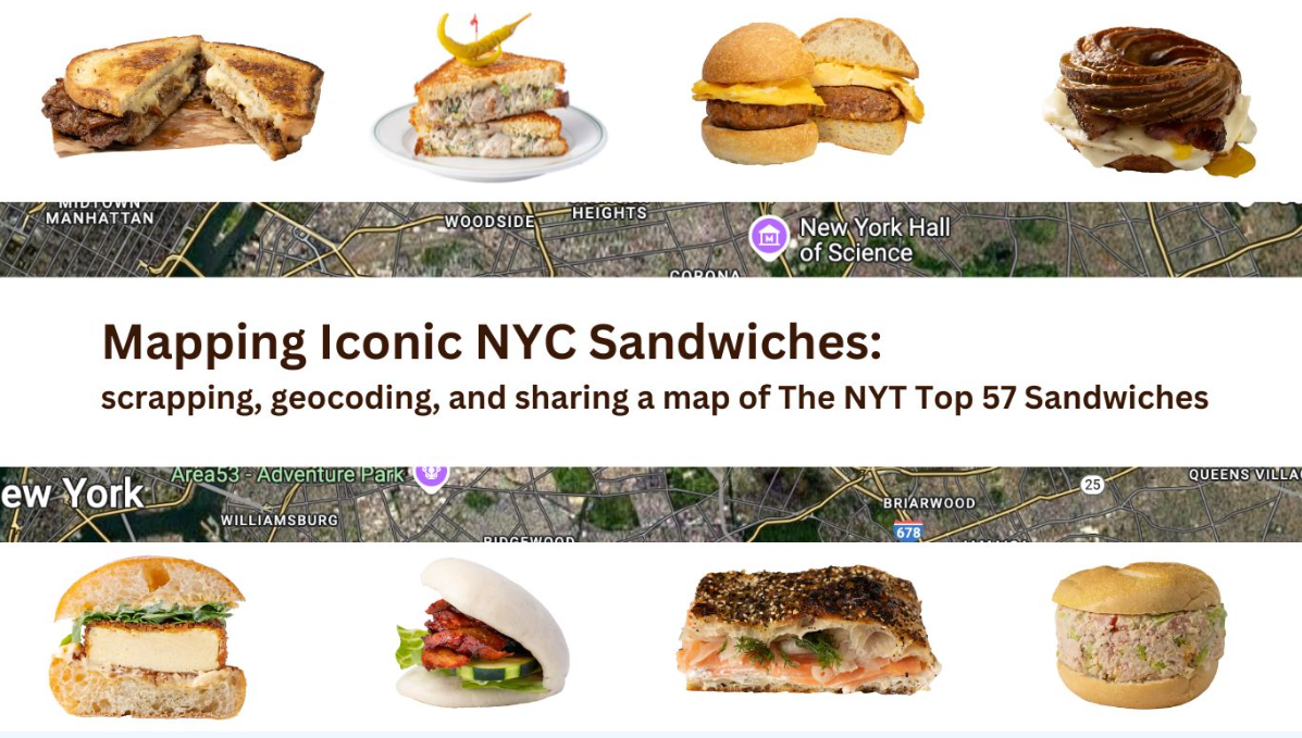
Hold the Mayo: Yeah, a Sandwich Map

Nothing worse than being in a place where you know there are zillions of places to shop and eat, but you really don't know where anything is. Around the next corner? Street level at the next subway stop? Somewhere right in front of you? Tired of being lost in this regard, NYC sandwich guru and data scientist Dan DeWitz took matters into his own hands and came up with his own solution for the next time he has that certain palate craving.

Background

Held this past March 22-30, Open Data Week is an annual festival of community-driven events organized by the NYC Open Data Team at the Office of Technology and Innovation (OTI), BetaNYC, and Data Through Design.  It is held each March to coincide with the anniversary of the City’s first open data law which was signed in March 2012.  Additionally, one of the highlights of Open Data Week is the NYC School of Data which includes a myriad of workshops, panels, and demonstrations with the intent of  demystifying the policies and practices around data and technology in the City.  This year’s program included over 30 presentations.  At its foundation, an immerseful week of users, open data, open software, and open development discussions.

Not all of the week’s presentations are specific to GIS technology as topics such as law, journalism, government budget transparency, data analytics, career development, even data comics, and much more are covered in the  agenda.   And as Open Data Week has evolved over the years, there’s also always been a healthy dose of the traditional GIS and mapping concepts which the geospatial community is actively engaged in.  Though always the space for the unexpected mapping product and presentation, too.  Something a little out-of-the-box and out of the norm.  This year was no different.

Ye​ah, ​a Sandwich Map.

Background

As part of the Data Week’s events, Dan DeWitz led an online interactive hour-long workshop  showing attendees how he built the sandwich map from scratch.  Working from his Jupyter Notebook, DeWitz illustrated how  he used ChatGPT as a coding partner, as well as python code, to scrape a list of  sandwich names – and associated information – from a website and create an interactive sandwich map using the Google Maps API and GitHub Pages.

New York Times Article

Central to the map was a New York Times article published ​February 18, 2024.  Authored by Nikita Richardson, the article was  based on three months of work by  New York Times Food staff which covered all five boroughs in search of heroes, bodega staples, breakfast specialties, veggie entrees, and much more.  The intent wasn’t to necessarily rank the sandwiches but much more so to illustrate the culinary diversity across the New York City urban landscape.  As mappers and always worrying about icons and how to symbolize our work, the images depicting the  sandwich categories are a treat, too.  Which DeWitz was able to scrape and use in his web map as well.
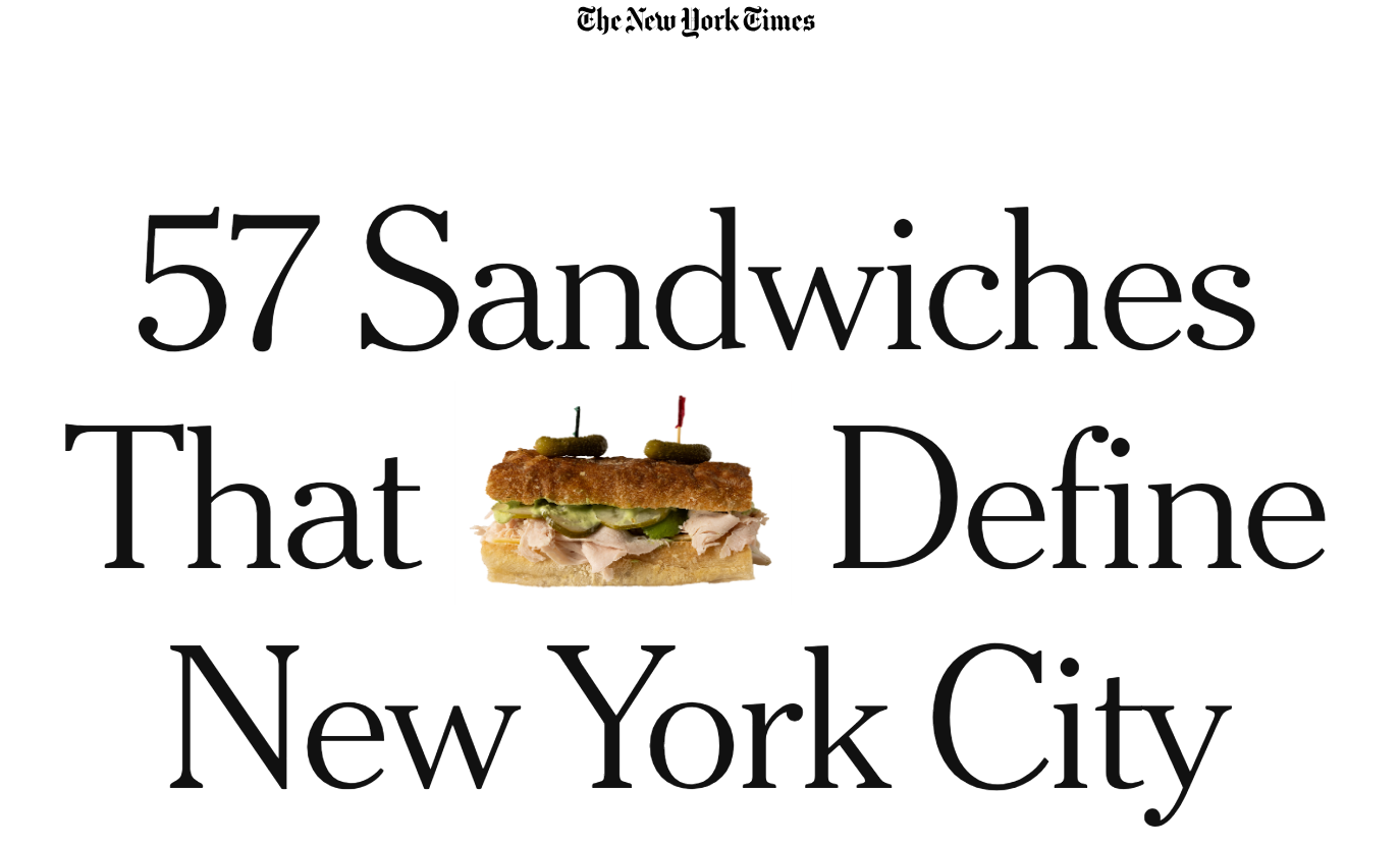
Nine sandwich types were identified in the article: Breakfast Bangers, Hero Worship, Veg In, Pastrami City, Gotham Greats, “Let Me Get, Uhh..”, Diner Party, Honorary New Yorkers, and Extremely Online. Something for everyone!

 Scraping and Geocoding

DeWitz’s initial dialog with ChatGPT to start building and ultimately generating the sandwich map is shown in the image below.  He initially intended to be able to parse each of the variables shown – sandwich and restaurant names, addresses, description, and images from the Times website, but determined large language models (LLM) like ChatGPT still can’t parse websites just from a URL.  Dewitz notes,  “I used Python to  scrape data from a page and guiding the model through each step: identifying the structure of the site, selecting relevant HTML elements, handling errors, formatting results, and mapping the output – all while applying judgment about what matters and why”.
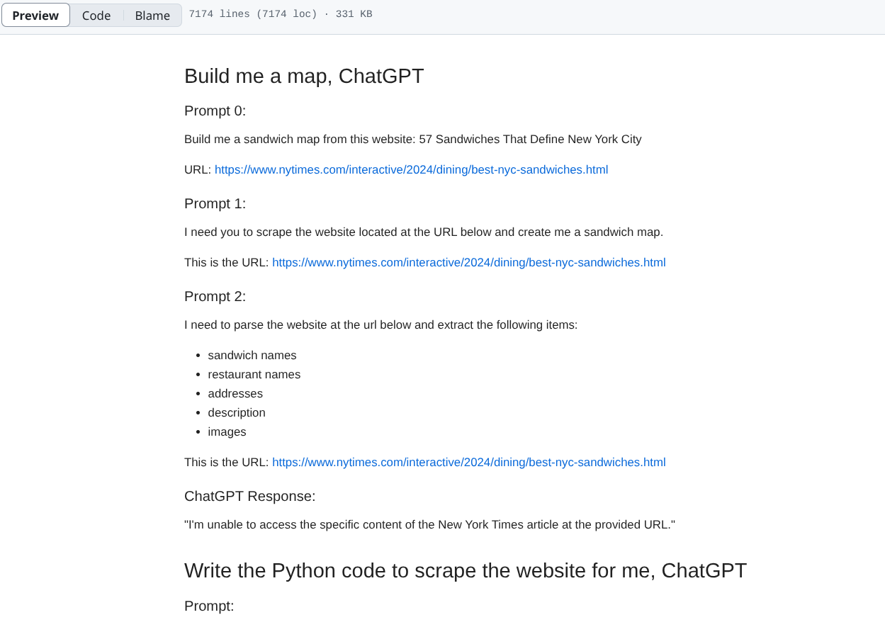
DeWitz’s initial dialog with ChatGPT to start building and ultimately generating the sandwich map

For geocoding, DeWitz used the Google Maps API and ChatGPT handled writing most of the python code – most of which was the focus of his Data Week presentation.  DeWitz felt the Google Maps API did a good job with the addresses, particularly in context that the restaurant addresses included only a cross street and didn’t have the city name or zip – as presented in the Times article. For example, just passing the text (address) below, which was scraped from the article, to the Google Maps API, was good enough for most of the shops and the API returned the correct lat/long:

135 India Street (Manhattan Avenue)

For the remaining shops that did not match, he queried the API by restaurant name and then manually looked at the results and filtered as needed.  The web map base map also comes from the Google Maps API.

In the Jupyter Notebook, the interface is made up of individual cells with some containing text and others with code that can be executed.  The blocks with a tinted blue background are the ones where users write and execute Python code. This code sometimes comes AI engines such as chatgpt.com or the chatgpt assistant which is integrated into the Jupyter Notebook. All of the major steps and coding DeWitz used in the development process is available on his GitHub page which is available here

The End Product

For those wanting to take a deeper dive into the process and product, a  recording of the actual Data Week online presentation can be found at this YouTube link.   And of course, here’s the online Iconic NYC Sandwiches interactive map.
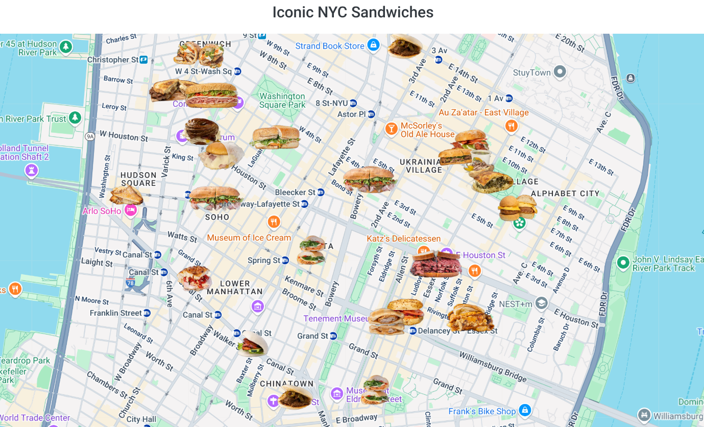
Interesting to note in context of determining that he actually accomplished what he set out to do, DeWitz feels the process had a built in quality assurance test. “Since I’m making a map, the output itself is the quality assurance test— especially that now I can actually use the map to go to restaurants and shops.”

It certainly appears that the QA passed.

Contact:

Dan DeWitz
dewitz.dan@gmail.com

Streamlining the New York City Environmental Quality (CEQR) Review Application with Geospatial Tools

Open source content and tools at the core of automating complex process

City Environmental Quality Review, or CEQR, is the process by which New York City agencies determine what effect, if any, a discretionary action they approve may have upon the environment. CEQR is a disclosure process and not an approval process in and of itself. Completion of an environmental review supports other decisions made by agencies such as approvals of rezoning or variance applications, funding, or issuance of discretionary permits. Ministerial actions, such as the issuance of a building permit, are not subject to environmental review.

Historically, CEQR, along with other government environmental review programs such as the New York State Environmental Quality Review Act (SEQRA) and the National Environmental Protection Act (NEPA) have been the subject of much debate – right or wrong – with regard to being overwhelming, complicated, and costly to those individuals and/or organizations involved in projects or “actions” which trigger the application process.

CEQR is precursor to ULURP (Uniform Land Use Review Procedure), which, in part, is the approval process that decides the fate of the action.  ULURP cannot start until the environmental review process is complete.

Introducing AutoCEQR

In the New York CEQR space, leave it to a couple seasoned GIS folks to step in and combine  professional experience with geospatial tools and programming skills to offer a cost effective and streamlined process to work through the CEQR application.

AutoCEQR cofounder Matt Sloane has worked in the planning field since 2007, working extensively with SEQRA and CEQR.  Over that time Matt developed specialties in both GIS and Data Science.  As Matt learned to program the tools that power ESRI ArcDesktop software, he realized that many of the processes required by CEQR, which are explicitly prescribed by the CEQR Technical Manual, could be automated based on existing data (e.g., MapPLUTO) and several project-specific inputs. He approached Danny Sheehan, a close friend and former classmate at SUNY Geneseo’s planning and geography courses, about the project. Both agreed it would be a great opportunity to put their combined skills to work and build a platform to augment the CEQR application process.  Danny was able to bring geospatial development expertise and software production knowledge he learned at UBS, Carto, and Columbia University to start and evolve the project into a production application.

AutoCEQR leverages a mixture of City, State, and Federal data resources, though primarily relies on NYC Open Data.  Other data sources include:

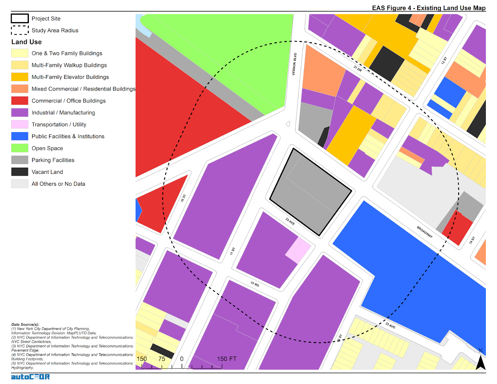
This 400’ radius buffer around a subject property which requires CEQR shows adjacent parcel land use classifications that are included in the NYC MapPluto file on a regular basis

A. Coding and Software Environments

Python is at the core of the AutoCEQR technology.  For working with data, the AutoCEQR team uses  Pandas, GeoPandas, Shapely, Fiona and ArcPy for generating Map Document files (.mxd’s), and creating custom Python classes for the workloads.  Sheehan notes “With GeoPandas and Shapely it’s phenomenal how close to parity they now are for matching ArcPy functionality.”  In the development environment, PyCharm Community Edition and GitHub are used for code development & versioning.   

AutoCEQR prototyping started with ArcPy for all tasks but it was decided to abstract the high-level functions so the geoprocessing engine could be changed to GeoPandas, the geoprocessing library of choice.  For interacting and communicating with Amazon Web Services (AWS) – the current AutoCEQR Cloud Computing Platform – developers leveraged Boto3 (AWS SDK for Python).  EC2 and S3 is leveraged in the AWS environment for computing, data storage, and distribution which has enabled to keep the application computing bill fairly low per month. In the future, it is anticipated to modify the architecture by leveraging more serverless technology and more scalable architecture for added compute cost savings.   AWS generously provided AutoCEQR with free computing credits for one year through AWS Activate – which was brought to their attention as part of their involvement and experience at the Columbia Startup Lab (CSL).  QGIS is also used to verify results and quick GIS work. 

Interacting with Census data and a whole host of services is made possible by leveraging the many great open-source libraries available on PyPl and GitHub. The storefront is the Squarespace AP which is used to process and deliver orders.

AutoCEQR still uses ArcPy mapping for generating maps, .mxd’s, and map packages but given the high cost of licensing and the technical slowdown it adds to both the production application and ongoing development speed, and it’s unclear if .mxd’s will exist in future iterations. (Both Sheehan and Sloane would like to have more feedback from users if the .mxd deliverable is necessary or if the application should generate static maps with Matplotlib and GeoPandas or if interactive web maps would be more helpful.)

The data engineering ETL process mostly consists of pulling down data with requests, unzipping files, some transformations and projecting data, and API libraries and a scheduler. We download the latest data every night – whether the source is updated daily or not. Data ETL would be a big focus to redesign to improve the platform and save on cloud storage and computing costs.

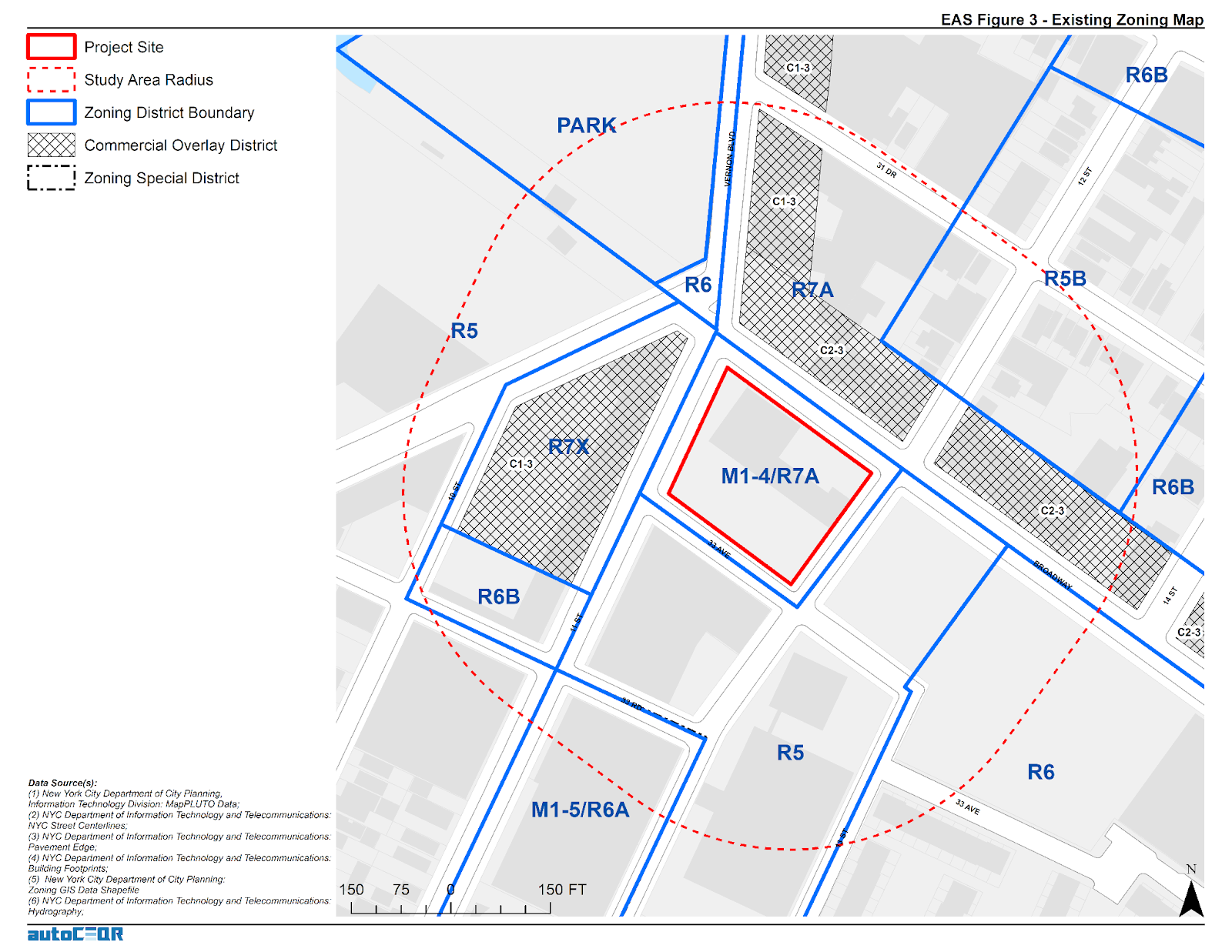
In addition to being consistent with existing property zoning classifications, projects are also reviewed in context of proximity to a myriad of other special districts and overlay zones.

B.  Application Process

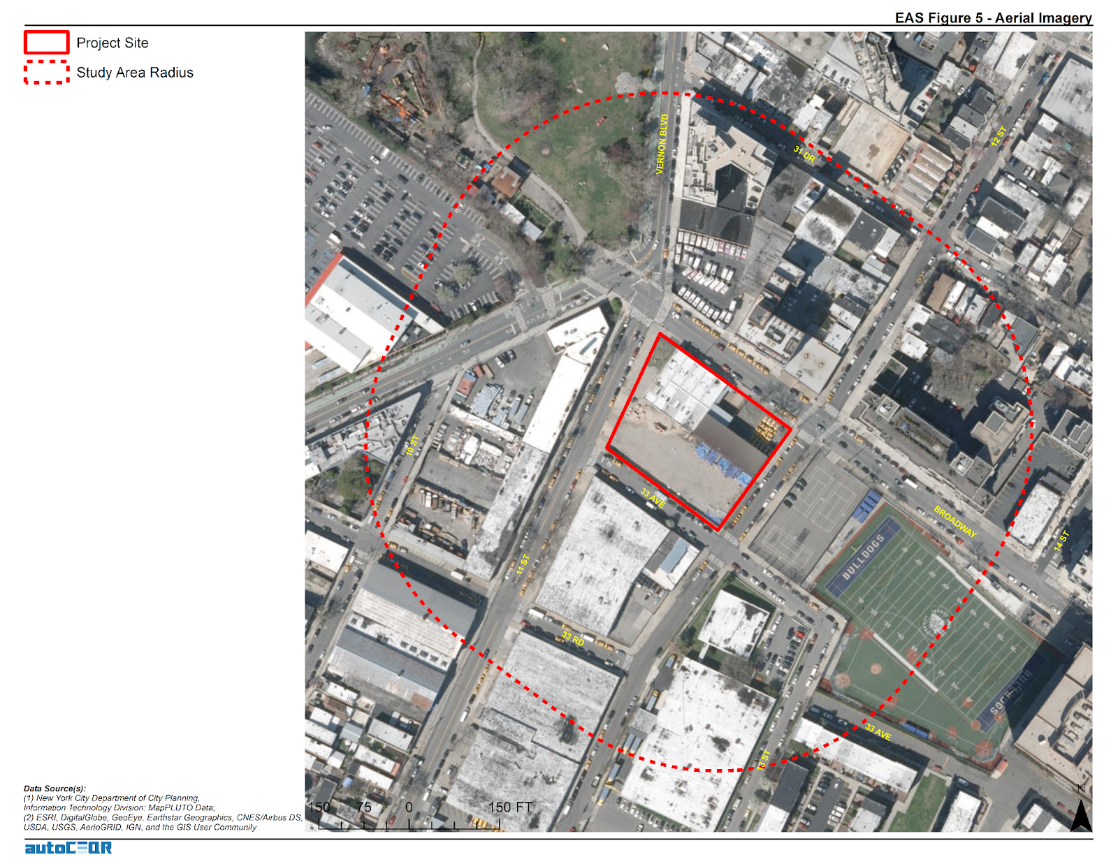
Users input relevant project-specific information (e.g., dwelling units, building height, square footage, etc.) via the AutoCEQR website.  From there the application software ingests  the data and checks it against public data sources – usually with some intermediate geoprocessing steps required – and then references the analysis thresholds stated in the Environmental Assessment Form (EAS) to determine which analysis the proposed project is required to undertake as part of the CEQR environmental review. For certain quantitative calculations,  AutoCEQR has translated all of that logic into functions or classes in the codebase. Users also receive the data and maps for either a CEQR Pre-Screen or a select set of CEQR Full Analysis items. This VIMEO video provides an introduction to accessing the application and illustrates the products generated.

C.  Usage

To date, AutoCEQR has had several dozen environmental professionals targeted from a few key firms to evaluate application and then go on to use AutoCEQR in production. Currently Sheeran and Sloane are allowing users to leverage AutoCEQR freely in order to get helpful product feedback and gain traction.  With the aim of soliciting feedback for refinement, feature expansion, and product evolution,  AutoCEQR has been well received by former director of the NYCDCP Environmental Assessment Review Division, Ms. Olga Abinader.  She comments:

“AutoCEQR is an excellent application – as its title indicates, it automates tedious, time-consuming CEQR documentation that has historically taken consultants dozens of person-hours to complete.  As a longtime NYC environmental review expert and former public service leader, I appreciate that it gathers data points from the City’s publicly available databases and agency websites (MapPLUTO, NYC Parks, NYC LPC, GIS sources), and combines this information with user inputs (i.e., analysis framework details) to generate useful EAS Maps, visuals, and content/data for the EAS Forms in a short turnaround. Given the time savings it offers, I am very enthusiastic about AutoCEQR as a tool and recommend it highly to consultants, public service professionals, the general public, decision-makers and others interested in preparing or reviewing CEQR materials.” 

As the product is currently operating under a freemium model, users don’t need to currently apply the discount.  However, it is important for AutoCEQR to continue this offering to support affordable housing in NYC in the event AutoCEQR ever moves to any kind of fee-based model. 

All AutoCEQR maps included in the project delivery file as both ArcGIS Map Document files (.mxd) and Map Package files (.mpk).

D.  Affordable Housing Development Services Discount

Those working on the development of Affordable Housing or Inclusionary Housing are encouraged to contact the AutoCEQR team.  It is their aim is to provide the AutoCEQR platform and reporting deeply discounted for individuals or companies involved in these types of housing projects.  If the entire development provides 100% Affordable units, the AutoCEQR team intends to provide free reporting and analysis.*

As the product is currently operating under a freemium model, users don’t need to currently apply the discount.  However, it is important for AutoCEQR to continue this offering to support affordable housing in NYC in the event AutoCEQR ever moves to any kind of fee-based model. 

* Free reporting with minimal overhead for costs associated with report processing. 

Summary 

Development and marketing efforts on the AutoCEQR project has slowed down since both Sheehan and Sloane have started new full-time positions.  Nonetheless, both continue to explore interesting options for its future development and continued success.  Individuals and companies interested in the application and/or communicating with Sheehan and Sloane are encouraged to do so via the contact information below.

Contact:

Daniel M. Sheehan
danny@autoceqr.com

Matt Sloane
matt@autoceqr.com

Empire State GIS/Mapping DIYer Phenom: Andy Arthur

Self-taught hobbyist has a treasure chest of geospatial content on website

One of the benefits of writing about all-things geospatial in Empire State is sometimes I just don’t know what I’ll come across.  Looking for this thing and finding that.   Starting in earnest on an article about a certain GIS channel and a couple days later finding myself having completely jumped the rails and find myself way over there writing about Channel Z.  (Yup, that static in the attic).  Or ending up on a cool or fun website not really knowing how I got there.

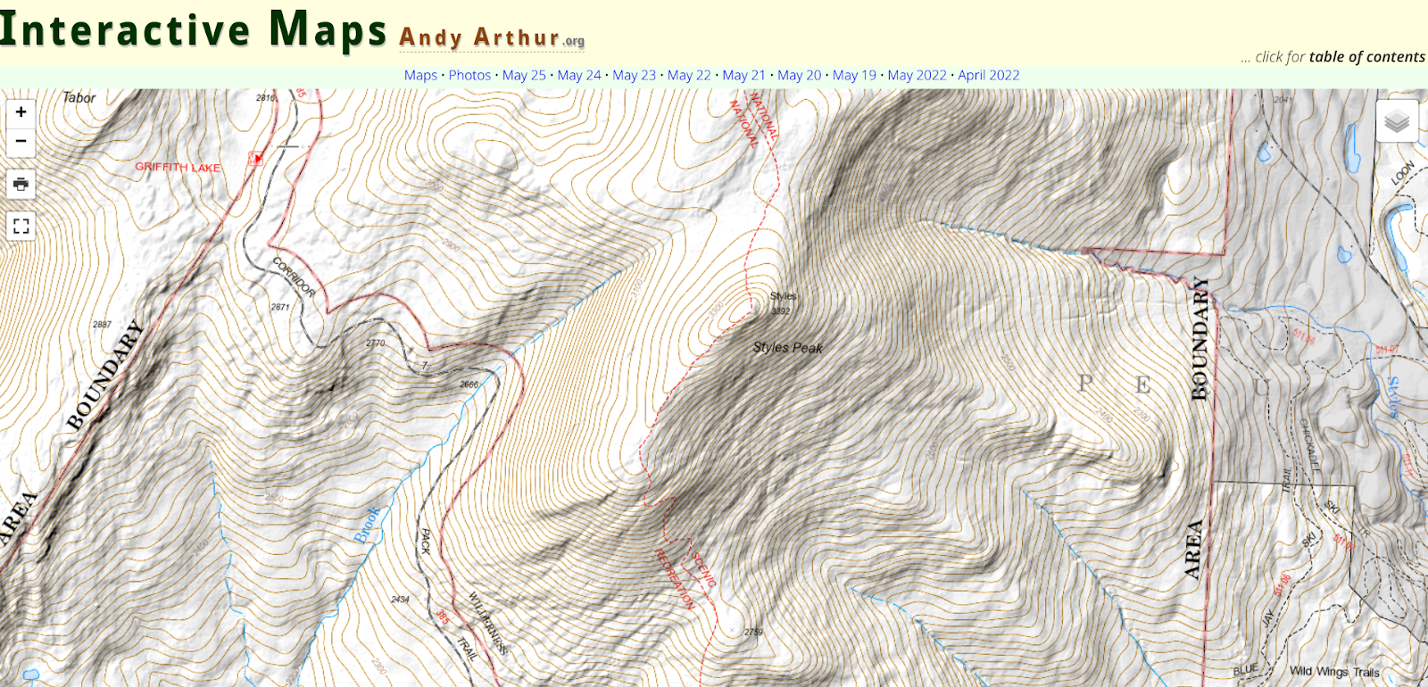
Case in point:  Interactive Maps by Andy Arthur.  Empire State mapping DIYer extraordinaire.  Just a hobby.

When I first stumbled onto the site and having spent some time driving around, I realized I needed to find out who was behind it all.  It definitely isn’t the kind and feel of the traditional geospatial website I normally include or reference in my blog, but enough interesting – and yes, quite different – content to dig a little deeper.  And glad I did.  This is not a blog post to focus on a particular topic or concept, but rather just more of a pointer to the URL and let you take away from the website what you want.  

It turns out the person behind all of this is Andy Arthur, who by day, is Deputy Director of Research Services in the NYS Assembly.   “I have no formal GIS training, as things were still pretty primitive back when I was in college (SUNY Plattsburgh)  in the early 2000s especially when it came to web services, online data and open source software” says Arthur, “computers were a lot less powerful back then. I remember vaguely hearing a bit about Remote Sensing when I was involved in the Environmental Science Club in college, but it wasn’t something I ever used.

Since then and working on his own, Arthur picked up QGIS (and the accompanying PyQGIS developer tools), as he was looking for a way to make his own topographic maps because he wasn’t happy with what was available on  the Internet. He later found out he could FOIL a primative campsite shapefile from NYS DEC and get data from there to help find campsites. “I was pretty good at map and compass stuff from my years in Boy Scouts and always interested in environmental and land use issues”, he says.  Over time, he branched out into other geospatial areas including web services.  More recently He’s been focusing on more automation of processes, using Python and R statistical language to do some map plotting and a lot of Census data gathering and processing. “I like working with R as it is fast and easy to implement code in. I’ve also lately been doing a lot more with Leaflet and web services”.  Along the way he continues to use GeoPandas and Leaflet for map making. (btw as I was putting this blog piece together I found out the creator of Leaflet 11 yeas ago was  Volodymyr Agafonkin, a Ukrainian citizen who at the time was living in Kyiv.)  Content on the site is also made available in KMZ for use in Google Earth.

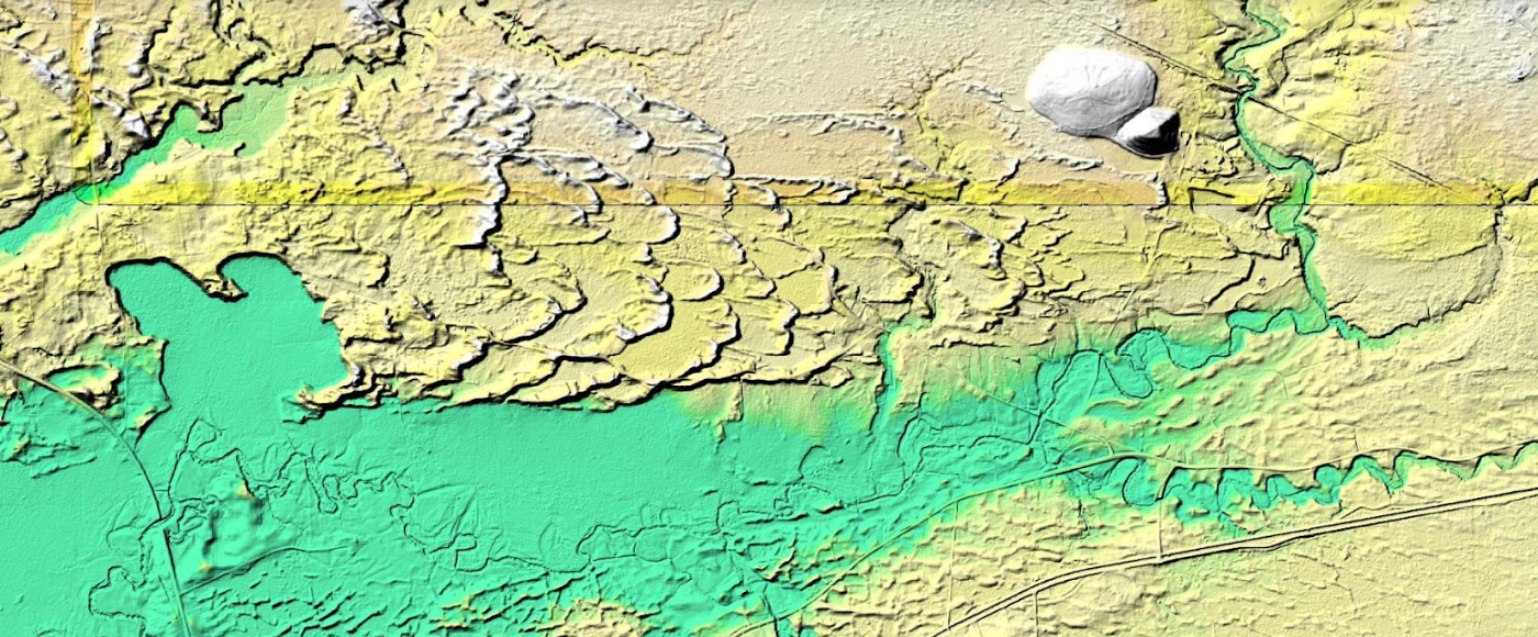
This is a example of how Arthur processed LIDAR data covering the Rome Sand Dunes west of the City of Rome in Oneida County. The landscape ifs a mosaic of sand dunes rising about 50 feet above low peat bogs which lie between the dunes. Processed LIDAR data renders the dunes very clearly. Arthur created this originally by writing a QGIS plugin that queries a shapefile with the LIDAR Digital Terrain Model Bare-Earthindex, then downloads the geotiffs, and finally joining them together to create the hillshade.The plugin itself is in Python and runs in QGIS, while the lidar download/processing script is in php-cli shell script.

The best place to start navigating the website is to open the table of contents link located in the upper right corner of the landing page. The table of contents page then provides additional links products and visuals Andy has created including aerial photos, charts, interactive maps (recommend starting here), and thematic maps to name just a few.   This page also provides more detail on open source components, some specifics on the use of Python and Pandas, a downloadable CSV file listing of web services (WMS, ArcGIS services, etc) used on the blog, and much more.  It’s worth noting that the website also includes non-GIS/geospatial content.

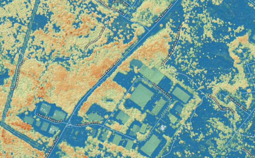
If you need some additional evidence of how much Arther has picked-up on programming, using open source components, and navigating the geospatial landscape in this space,  check out his tutorial on how to create a  Digital Surface Model GeoTIFF Using National Map Downloader, LiDAR Point Clouds and PDAL.  By example, the DSM image above is from a section of the Albany Pine Bush.  For a larger montage of the Albany Pine Bush digital surface model and samples of his code, click here for downloads.

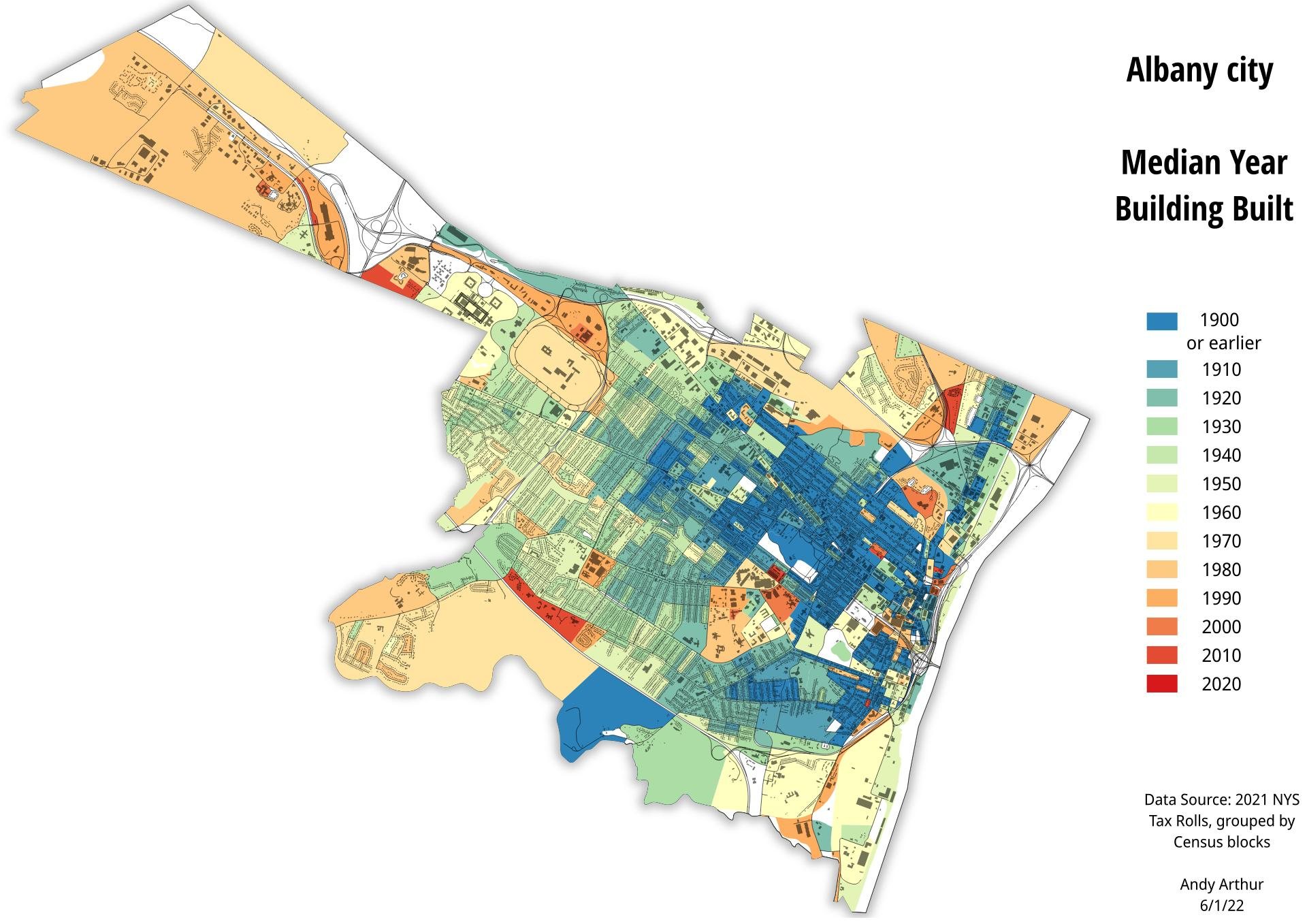
And of course, the old stand-by hardcopy product. Here, a recently created thematic map of the City of Albany median year of housing construction map. He used the NYS Tax Parcel Centroid Points data aggregated down to the parcel level using R code and created a GeoPackage. Which was then used to create the map in QGIS. Additional layers were added for context.

There are many many more examples of geospatial products, maps, and viewers on the website.  Its a great example of how much can come out of the other end when diving into and applying geospatial tools to one’s own personal interests and way of living. 

When you have a few minutes over lunch or a cup of coffee, take a look at his site.  In communicating with Andy over the course of putting this piece together, he would be open to talking with and assisting non-profit or similar community groups on specific GIS/mapping projects.  His contact information is below. 

Contact:

Andy Arthur
www.andyarthur.org
andy@andyarthur.org