Geography as a Factor in Accessing Educational and Human Services

Focus on SUNY Campuses and NYS Correctional Facilities

In recent years I had a close college friend incarcerated in the New York State prison system and during this time I became interested in rehabilitation and re-entry programs offered to inmates.  Particularly in context of encouraging and helping my friend to focus on a path which would lead him to a better space, a new beginning, and away from the dark past.  My friend Bob (not his real name) actually became a shining example of what is possible in context of educational degrees and technical skills that are offered by the state as part of in-prison and reentry programs.  The intent of both which are to help incarcerated individuals to a successful transition to personal and community life after being released.  Bob became a minister while in prison and then was able to finish up his undergraduate degree and earn a Masters in social work from the City University of New York (CUNY) after his release.  Unfortunately these personal educational accomplishments did not change the trajectory of his life as what ultimately followed after prison were years of living in transitional housing and homeless shelters.  Never really able to rid himself of the many demons within that had haunted him most of his adult life.  Bob died of a heroin overdose four years ago.

Not long after one of my last correspondences with Bob’s family, I came across Mapping the Landscape of Higher Education in New York State Prisons (February 2019) published by the Prisoner Reentry Institute (PRI) at the John Jay College of Criminal Justice in New York City.    It’s a noteworthy report with plenty of content and includes an interesting reference which discusses the availability of educational opportunities for inmates which can depend, in part, on the geographic proximity between the locations of State University of New York (SUNY/CUNY) institutions and the statewide network of correctional facilities as administered by the New York State Department of Corrections and Community Supervision (DOCCS).  While I was able to establish communication with staff at the PRI, I had hoped to establish more in-depth discussions with staff at the two state departments (SUNY and DOCCS) to further build the story of the campus-prison relationship.   It is unfortunate that I did not as there is evidence of mapping products/software in the departments based on graphics in the report which includes a SUNY published interactive online viewer.  These products illustrate the issue of geography as a potential factor in the delivery of educational services to the statewide inmate population.

Current Correctional Facilities Landscape

Per the image below, New York State maintains 52 correctional facilities in seven administrative regions across the state with approximately 46,000 individual under custody and another 35,855 parolees under supervision.
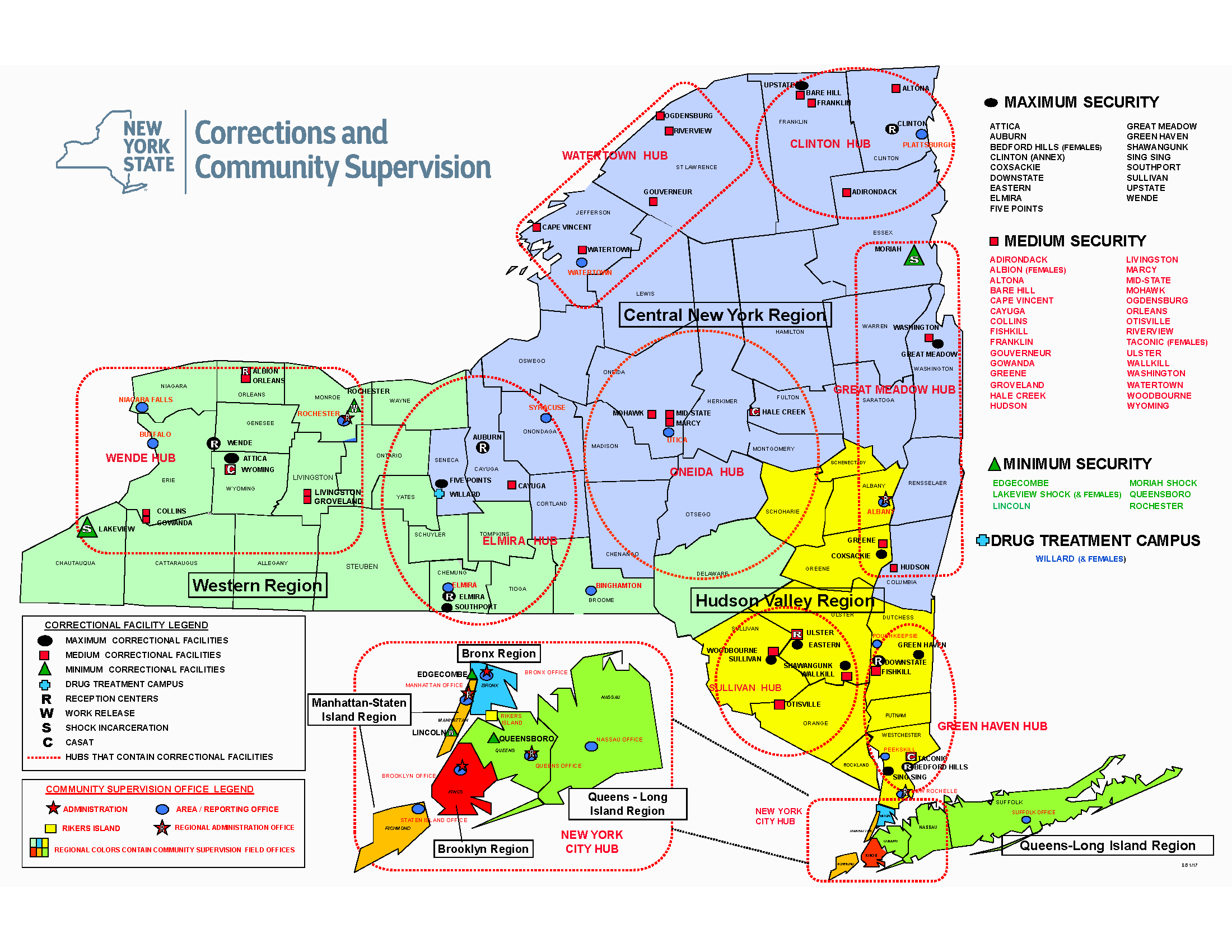
This map is better rendered by downloading the original PDF from DOCCS. Four of the seven administrative regions are in the metro NYC area.

There are now 15 college programs involving over 30 institutions of higher education operating in 25 DOCCS facilities. The report looks into the two systems – higher education and corrections – that are seemingly distinct, yet come together to provide access to college education for incarcerated people. It looks at the challenges, including geography, in meshing these two systems and how both corrections and college staff can work to overcome problems.

Good News Bad News

While the good news is there is generally good geographic proximity between SUNY (including the New York City CUNY system) campuses and statewide correction facilities – particularly in southeastern NYS, there is considerable variation in the operation of college-in-prison programs, including different types of administrative and financial structures, faculty, and pathways to higher education post-incarceration.  A detailed description of educational and academic opportunities for inmates is made available on this DOCCS webpage.   Of the participating colleges, roughly two-thirds are private institutions and one-third belong to the public sector.  Just over half of the maximum and medium security prisons in New York – 25 facilities – host some form of face-to-face college programming. Of the 54 DOCCS facilities, ten out of 16 male maximum security facilities and 12 out of 27 male medium security prisons house college programs. All three of the female prisons – two medium and one maximum – house college programs. The prisons with college education programs are shown in figure below (a clearer version of the map is found on page 27 of the report) and itemized in the following table.
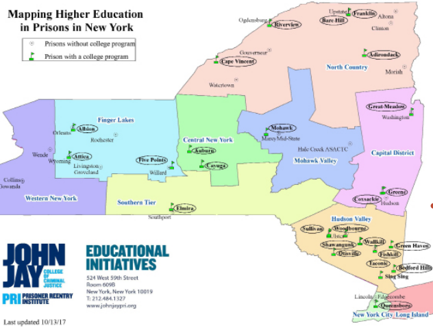
Most of the in-prison college programs are in southeastern New York State with less in the northern and western part of the state. A somewhat clearer version of this image can be downloaded from the report.
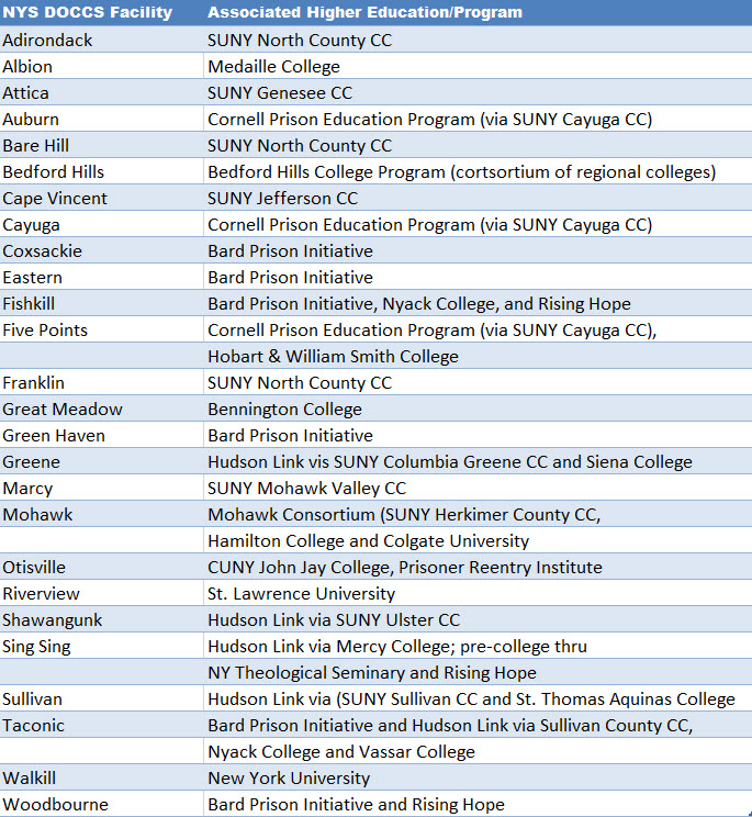
Most prisons with college programs are clustered in the Hudson Valley near the New York metropolitan area. The prisons without college programs tend to be further from New York City, likely a function of the fact that incarcerated people in downstate prisons (Bedford Hills and Sing Sing) were leaders in working with community groups and colleges from New York City and its immediate environment, as well as the ability of the colleges and non-profit organizations to generate funding and support for such programs. Moreover, the political environment of these communities was and remains more supportive of college-in-prison programs.

The PRI report (Include report name here) highlights how geography can play towards the delivery of educational services in the statewide correctional system albeit there are many other factors in play.  Matt Bond, staff at PRI, reported that currently only about 3% of the 46,000 individuals incarcerated in Empire State prisons are able to take college classes. Geography certainly presents challenges to offering college classes in prisons, but there are numerous other challenges, including:

  • Difficulty getting materials approved to bring into prisons,
  • The lack of technology (particularly internet access) in prisons,
  • Other demands on students’ time (such as working in order to purchase essential items from the prison commissary),
  • The fact that incarcerated students can be transferred from one facility to another, which interferes with their educational progress,
  • The need for sustained funding to maintain and expand college in prison programs,
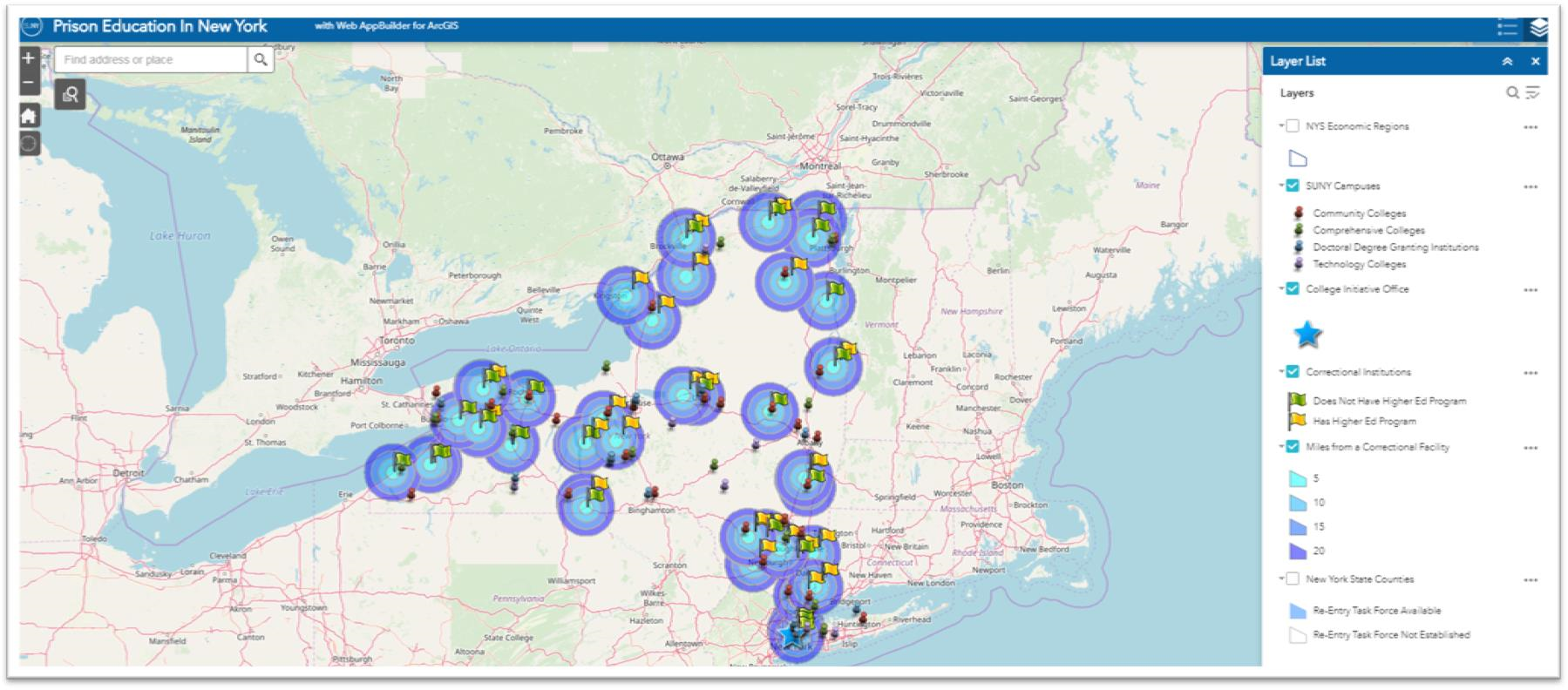
This interactive SUNY published viewer shows the locations of both SUNY/CUNY campuses and NYS Correctional facilities. Rather than clicking the Miles from Correctional Facility box (which makes the make very busy at large scales) simply click on a correctional facility to see the distance to the closest SUNY campus.

Even though both of the institutions in this scenario are state governed and administered, each are largely fixed/physically located assets which dictates how much the delivery of educational opportunities can change albeit there are increasingly more options of offering educational programs remotely.  However, technology and internet capacity inside prisons available to inmates continues to be an issue.

But the fact remains today there are thousands of current inmates in the NYS correctional system in 2019 – male and female – who do not have access to the educational opportunities where geography does matter on some level.  The PRI report did not provide a specific overview or comparison on the quantity/quality of educational programs in the 5, 10, 15, and 20 mile buffers around each of the correctional facilities which would have spoke more specifically to the geographic issue.

The Geography Factor in other Human Services

While the PRI report did not make reference to any significant “gaps” in the delivery of educational opportunities to inmates, the “gap” issue is becoming more of an issue (or reference) in context of delivering other important public services across the state.  Such “gaps” are now being referred to as “deserts”.  In New York State, it is not difficult to search for recent references to deserts in the areas of  child care, maternity and mental health care, food deserts, and the struggles of rural hospitals disappearing across the U.S. landscape.  Significant geographic rural areas of the Empire State  are increasingly losing access to essential human services to which the reasons are many.
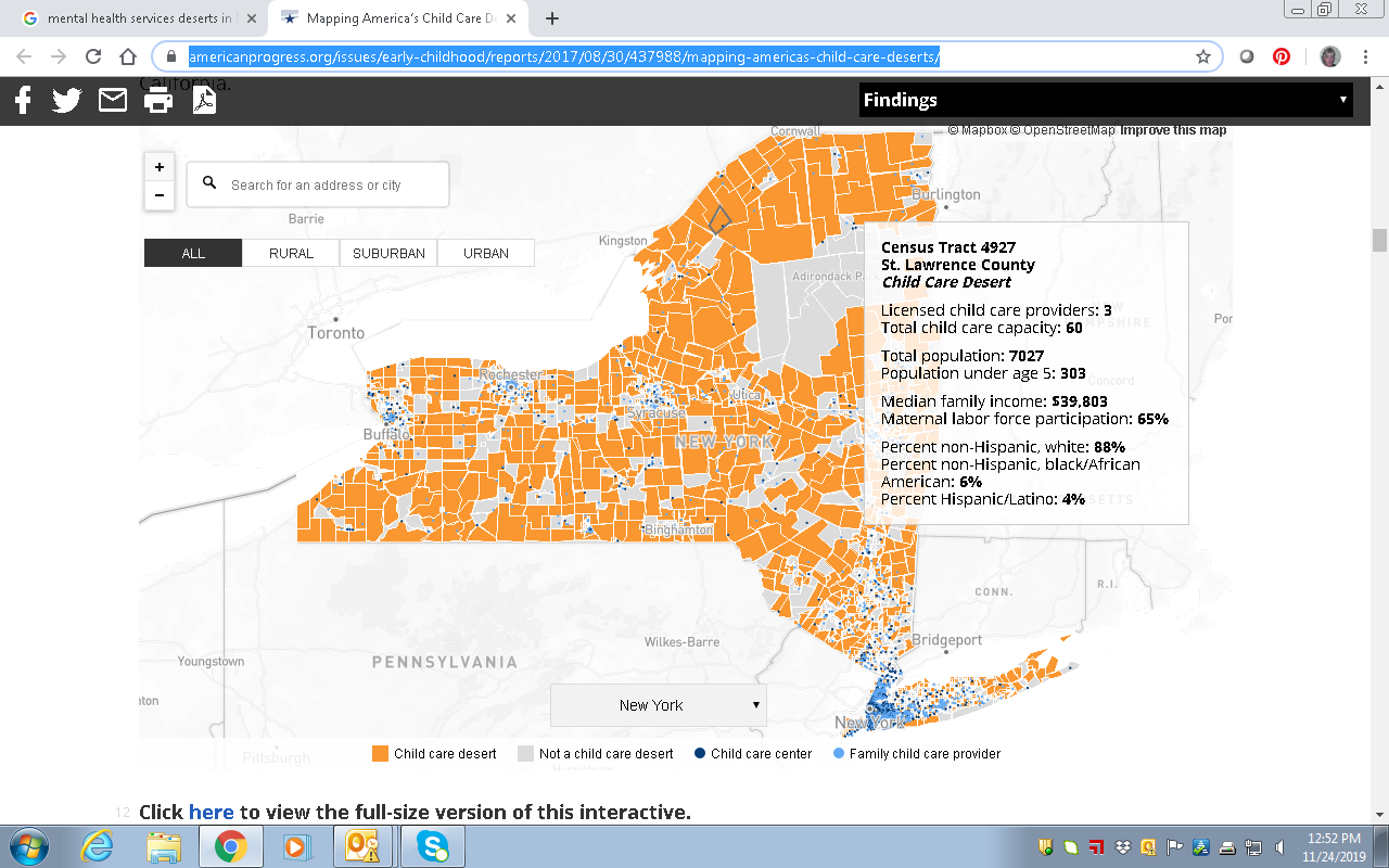
This image is a subset from the larger statewide map published in the article Mapping America’s Child Care Deserts. According to the report California and New York have the largest percentage of people living in child care deserts.

Geospatial technologies can play a central role in helping solve geography issues associated with growing number of health and human service delivery “deserts”.  Route GIS-based optimization programs based population centers, road networks, geocoding, and other dependencies. Furthermore, identifying potential temporary or “pop-up” service center locations in areas of greatest need which constantly changing over time.  A more mobile service delivery framework which can be leaner and more efficient.  Avoiding the need to higher cost fixed and permanent facilities.

There is much that can be done to advance access to a wide range health and human services including educational options for those incarcerated in New York State correctional facilities.  We are fortunate there is a strong geospatial technology foundation across the Empire State to build out these opportunities.

Spatial Data Science Conference 2019

I had the opportunity to attend the 2019 Spatial Data Science Conference (SDSC) at Columbia University on October 16th.  Hosted by NYC-based Carto, the event was attended by over 500 people from government, nonprofits, industry and business, and academia.  The day-long conference was highlighted by a variety of presentations and lightning talks from data scientists and program managers representing organizations from around the world including Uber, Airbnb, Datarobot, Waze, Instacart, MIT, Sidewalk Labs, Two Sigma, and Facebook among others.  All of the presenters use Carto’s Software as a Service (SaaS) platform which provides GIS functionality, web mapping, and spatial data science tools.
Data Science

Founded in 2017, SDSC  brings together organizations who are pushing the boundaries of spatial data modelling – ranging from large enterprise, to cities and government, as well as thought leaders from academic institutions.  Shown through the use of geospatial applications and organizational project initiatives, there was no doubt the common denominator and focus of those attending:  Data. It was definitely worth the trip.  SDSC is similar, but a very different kind of a “geospatial conference” for those of us who have spent a career running in traditional government geospatial circles.  Attendees and presenters are largely a completely different make-up from those normally attending the annual New York State GIS conferences.  (Of the 500+ preconference registrants, nearly 55% were from the private sector).   The day’s event included high quality presentations on the latest in modelling techniques, data science and analytics, visualization practices, and new data streams.  This later issue an increasingly important and interesting one across the statewide geospatial community as the day’s conversation clearly illustrated both the growing number of online geospatial data sources  (for example, numerous references were made to U.S. Census Bureau American Community Survey) and related data access tools.  Speakers noted both the importance and benefits of open data portals though not without the caveat that it was not uncommon to have to clean and often normalize the data prior to using in applications.  Numerous references to popular sites such as GitHub, Leaflet, OpenStreetMap, and Elastic (which presented at the event) were made with regard to supporting the open source ecosystem.

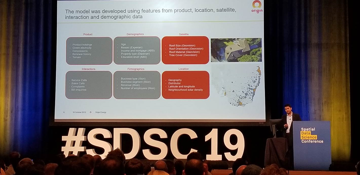
Mudit Srivastav from Australia-based Origin Energy, presented on the use of spatial data to support the increase sales of residential roof top solar panels. Note the many types of data the company is using to better define growth areas.

Data for the Social Good

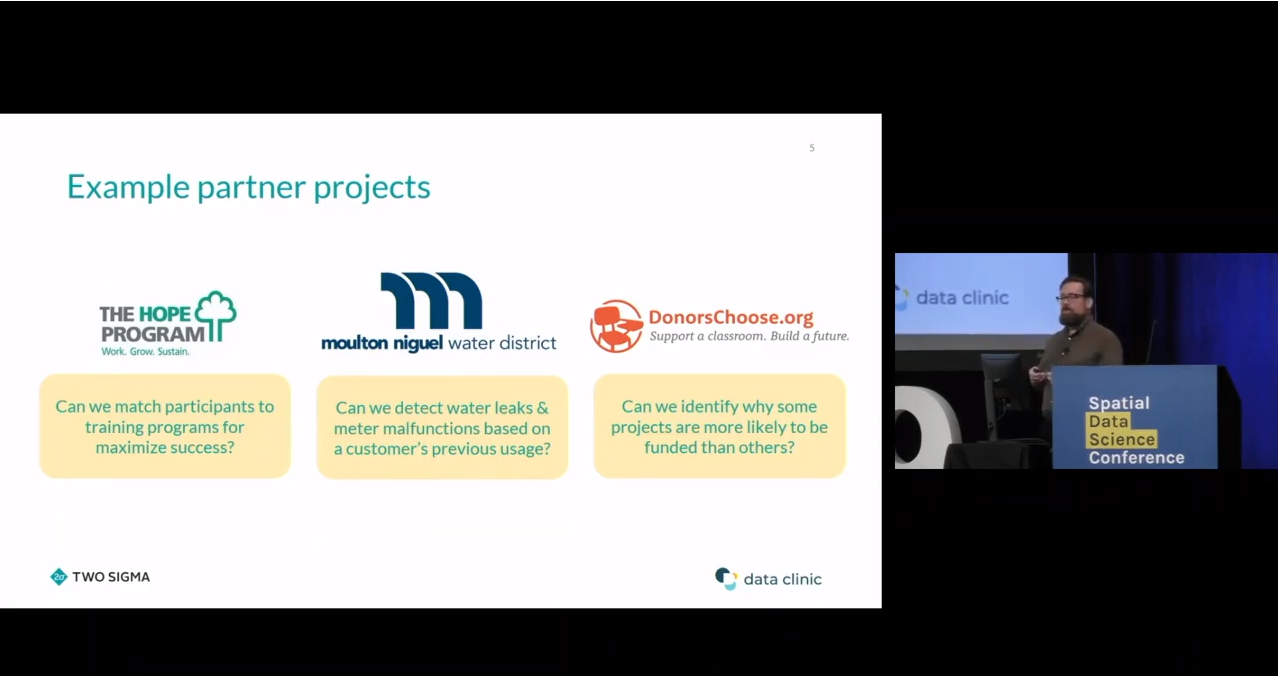
Another common theme throughout the day was the use of geospatial data for the social good.  Interesting to hear the point being made not only from nonprofits and academia, but from the private sector as well.  Way far away from the normal Albany GIS crowd, Stuart Lynn made a presentation focusing on how Two Sigma, an investment management firm located in New York City, provides spatial analysis support through the company’s Data Clinic program to nonprofits, academic institutions, and government organizations.  Their focus:  Enabling and promoting social impact through data driven predictive models while funding breakthrough research, education and a wide range of charities and foundations.    The image below identifies some of their recent projects.  Great stuff and I’m already planning on a more in-depth article with Stuart in the future.

Enabling Social Impact Organizations with Spatial Analysis Techniques

Stuart’s talk, as well as others during the day, made reference to the  The Data for Good movement which was a social media movement first started by DataKind to highlight how data science could be used to help address a range of humanitarian issues. DataKind is a collaborative network of organizations that work together with data scientists to leverage the science of data for social impact.  DataKind’s afternoon presentation “Spatial Data Science for Social Good:  Improving Access to Dignified Sanitation in Haiti” was excellent.  The video for this session and all of the day’s presentations are now available online at the Spatial Data Science Conference website.

Arguably, the demand for “data scientists” will increasingly intersect and expand in government geospatial programs in areas such as the health and human services, climate change, public safety, sustainability and resiliency,  and social and environmental justice to name only a few.   As the universe of geospatial data continues to expand and be integrated with both new artificial intelligence (AI) and machine reading technologies, as well as combined with the availability of more powerful GIS software, it is easy to see where the demand for data scientists focusing on locational and predictive analytics is headed.

I asked Javier de la Torre, Carto founder and SDSC organizer, what his impressions were of the day’s presentations and content.  He replied:

“First, moving the data discussion from WHERE to Why. Time to move to analyzing data using maps opposed to just seeing data in maps.  Second, the rise of the Spatial Data Scientist and/or where advance GIS is emerging as a new platform. And third, identifying the need for better data marketplaces which provides interactive solutions resulting in increased performance to users”

Links to the 2017 and 2018 presentations are also available on the SDSC website.

Using Smart Phone Metrics for Carrier Network Design

I really did start a conversation with Brian Webster at Wireless Mapping regarding an article for eSpatiallyNewYork.  It was my intent to begin a discussion on the use of geospatial technology in the  telecommunications and wireless engineering space.  Turns out the discussion ended up aspiring Brian to author a detailed article for his own blog which provides much more detail clarity than I could ever produce.   Which makes it easy for me – I’m going to send you to his post.

An initial focus of his company was in mapping of broadband internet availability. Using GIS technology, the company provides clients with maps showing broadband internet availability down to the census block level on a local, statewide or national basis.  These analysis are further quantified by the type of services available, number of occupied households in each census block, and market penetration rate. For those businesses shifting  to an internet based marketing program such as social networks, knowledge of where the broadband customers are located is a key factor to future successful marketing campaigns.

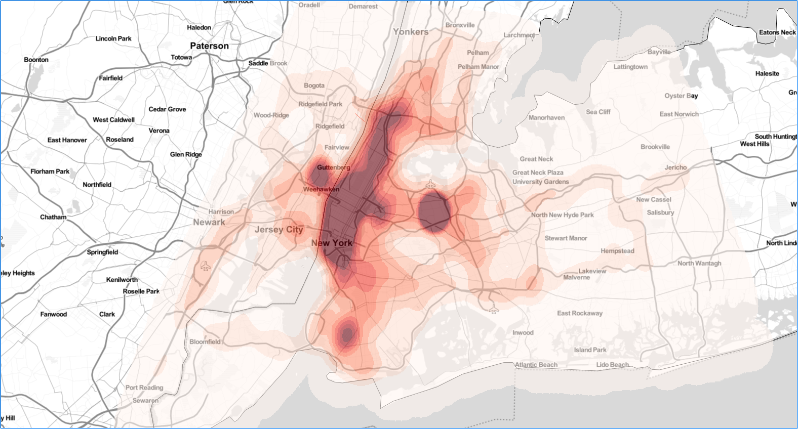
His more recent work focuses on a paradigm shift of designing carrier networks based on mobile metrics generated from smart phones vs. traditional fixed metrics such as demographics and/or traffic counts tied to specific roadways, among others.  Today’s smart phone applications gather significant location based information which can be compiled and used in such a way to be able to show high and low “user” traffic areas. Taking this information and converting it to easily understandable formats such as heat maps, it is easier to visualize society’s mobility, where the heavy traffic areas are, where people work, and where they spend their free time. Smart phones use show the more heavily used portions of existing mobile carrier networks and moving forward such data can be used to aid in planning new carrier networks – particularly in the emerging 5G arena.


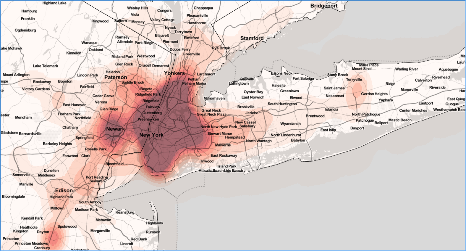
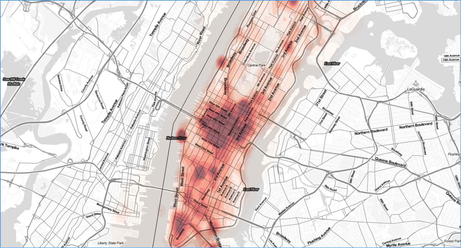
This series of maps, generated by Wireless Mapping, show cell phone data for the greater New York metro area (nearly 10 years of data through December 2017) changing in granularity when looking at more focused regions such as the five boroughs and then just Manhattan.  The smallest level of detail show where network capacity needs to be addressed and will be the areas where carriers will be targeting first for 5G deployments.

For a more detailed discussion on the use of smart phone data use and GIS and their potential use in designing the 5G carrier networks, visit Brian’s July 12th post.  You can also follow his other work in areas of radio frequency (RF) system design, business analytics, mapping, data mining, telecommunications and wireless engineering  by using links available as part of the blog post.


Deep GIS: Mapping What You Touch In the Subways

I’ve recently been communicating with Ebrahim Afshinnekoo who is Project Director for the PathoMap project based at the Weill Cornell Medicine Mason Laboratory in New York City.  Launched in the summer 2013, PathoMap was the first project of its kind, with the intent to comprehensively map and investigate the presence of bacteria and DNA on the surfaces of large urban, metropolitan environments such as New York City. And of course what better venue to collect bacteria samples in NYC than the subway system – the large subterranean behemoth home to 5.5 million riders on an average weekday.

I was drawn to the project in that it involves several common geospatial components the traditional GIS community is routinely involved with such as  data collection/data validation, data analysis, mobile apps, web mapping and visualization. To date, discussion on this geospatial research effort has focused mainly within the Cell Systems (scholarly journal) community, though with little exposure within the traditional NYS GIS community. While both the Wall Street Journal and the New York Times published articles on PathoMap in 2015 we’ve seen little work of this nature at statewide conferences or how it can promote similar geospatial analysis across the Empire State. With this in mind, eSpatiallyNewYork initiated this blog entry with the purpose of exposing the PathoMap project, and its subsequent global expansion (MetaSUB) to the larger statewide GIS community.

Data Collection

The molecular profiling initiative launched in the summer of 2013 with the help of undergraduates from Cornell University and Macaulay Honors College – which were soon to be given the appropriate moniker “Swab Squad”.  To create a city-wide profile, the research team first built an Android/iOS  mobile application in collaboration with GIS Cloud to enable real-time entry and loading of sample metadata directly into a database (Figure 1).

Figure 1: Data collection from the project included the “swabbing” of sites and subsequent analysis and data entry of the findings into a mobile app which are dynamically uploaded to the Cloud GIS database. Source: Afshinnekoo et al., 2015

Continue reading

Relative vs. Absolute Accuracy Revisited

I recently attended a presentation by Dr. Wende Mix, Associate Professor, Geography and Planning Department at SUNY Buffalo State entitled “Field Data Collection Using Smart Phones, Tablets, and GPS Devices:  A Case Study Though the presentation focused on using mobile devices for field data collection, augmented with high resolution aerial imagery,   Dr. Mix inadvertently helped revisit a debate on the long standing geospatial issue of relative accuracy vs. absolute accuracy. While relative mapping accuracy issues are certainly pertinent as part of the emerging Volunteered Geographic Information (VGI) and crowd sourcing data collection movements, Dr. Mix’s presentation highlights street feature data collection which was once the mapping domain reserved only for surveying and engineering disciplines.

So how do mobile devices intersect with spatial accuracy?  If at all?   Tons of geospatial data being collected with mobile devices (particularly by the growing Smart Phone market), data of varying scales and accuracies by personnel with varying degrees of training and expertise.  But at the end of the day, with all the disparate data combined, the data mash-up stills supports most decision making needs.  Quite a difference from the efforts of New York State Association of Professional Land Surveyors (NYSAPLS) which for years lobbied that similar street feature mapping across the state could legally only be done by licensed surveyors.  So does spatial data accuracy matter anymore?

Of course it does, though an easier answer is that data is normally collected of sufficient accuracy to support specific business needs.    But perhaps the best way to illustrate how this new market of mobile devices plays into the relative accuracy vs. absolute accuracy discussion, one first needs to consider the body of geospatial data development since the late 1970s/early 1980s.

Early Data Development:  With many early government GIS programs getting started with public domain U.S. Geological Survey  1:100000 (+/- 166’)  Digital Line Graph (DLG) or 1:24000 (+/- 40’)  digital files, widespread use of the technology, particularly within the engineering communities and urban environments, was slow to take hold because the data was considered too generalized and “not accurate” enough. Beyond the human resources needed to manually digitize and convert hardcopy manuscripts, much of the first generation of geospatial data was cheap to acquire and develop.  The trade-off was that the geospatial data was of limited accuracy and content due largely to the generalized nature of the source documentation.

However, as data accuracy improved through photogrammetric projects creating many urban and metropolitan land bases at larger and more accurate scales (1”=200’  & 1”=100’), including a wide range of planimetric datasets such as building footprints, edge of pavement, hydrology, bridges and even stone walls – so did the associated data development costs.   However, the increased accuracy and completeness of the data resulted in a much broader acceptance and use within the engineering community.   And certainly some of this increased user acceptance was also a result of the growing inner-operability between GIS and AutoCAD software packages.  Improved  GPS technology (as well as with “Selective Availability” being discontinued in 2000) also gave government and industry additional tools to further push the limits of high accuracy feature mapping, though as a whole, industry mapping costs remained high.  And cadastral programs continued to mature making large scale digital tax map datasets available providing even more reference and content to both hardcopy and online mapping efforts.  Overall, particularly in the urban environment, higher accuracy datasets with features being mapped a higher degree of positional accuracy,  were slowly replacing the more generalized first generation land bases.

Referencing Data Collected in the Field:   With many urban and even rural land bases now created and available online as a service and augmented by a variety of high resolution aerial imagery services, a large portion of data collected by mobile devices can now be easily referenced and spatially edited to its right relative location. (And as an added benefit, normally at a lower data development cost.)  Most mobile devices now include cameras, so including a picture of the selected feature adds even greater context to its relative location.  Using desktop tools, fire hydrants can be moved to their right relative X,Y location in front of the proper house.  Catch basins can be spatially adjusted to register in their right relative locations on street corners, street signs in their right relative location in the right-of-way, or the locations of underground storage tanks or septic fields moved to their right relative location on the proper tax parcel.  Overall, an industry witnessing an increased body of geospatial data that is not absolute accurate, but relatively accurate and ultimately more useful to a larger community of users – including the public works and engineering disciplines.   (It is noted that some workflows and business models may limit or not include resources for the editing of data; thus requiring high accuracy data capture in the field).

Dr. Mix’s presentation unintentionally illustrated how far we’ve come in context of building and using relative accurate geospatial datasets.  The content of her presentation was both typical and timely as much of the work across the state with mobile devices is being used with public infrastructure and street feature mapping.  While non-survey grade GPS units initially introduced some of these very same issues, the new mobile devices, and in particular Smart Phones, are game changers in context of affordability and ease-of-use.   It is to be seen long term how Smart Phone data collection will impact the low-end GPS hardware market.  (Any Google search on “GPS vs. Smart Phone Data Collection” will provide a long list of opinions on the matter.)

There is no question absolute (or near) accuracy – and its high price tag in data acquisition – is still mandatory for engineering and design/build projects.  But for nearly all other business needs, relative accurate and complete datasets will continue to augment design/build projects and support government and industry decision making.    All said “everything happens somewhere – and it is increasingly being mapped in its right relative location”.