Spatial Data Science Conference 2019

I had the opportunity to attend the 2019 Spatial Data Science Conference (SDSC) at Columbia University on October 16th.  Hosted by NYC-based Carto, the event was attended by over 500 people from government, nonprofits, industry and business, and academia.  The day-long conference was highlighted by a variety of presentations and lightning talks from data scientists and program managers representing organizations from around the world including Uber, Airbnb, Datarobot, Waze, Instacart, MIT, Sidewalk Labs, Two Sigma, and Facebook among others.  All of the presenters use Carto’s Software as a Service (SaaS) platform which provides GIS functionality, web mapping, and spatial data science tools.

Data Science

Founded in 2017, SDSC  brings together organizations who are pushing the boundaries of spatial data modelling – ranging from large enterprise, to cities and government, as well as thought leaders from academic institutions.  Shown through the use of geospatial applications and organizational project initiatives, there was no doubt the common denominator and focus of those attending:  Data. It was definitely worth the trip.  SDSC is similar, but a very different kind of a “geospatial conference” for those of us who have spent a career running in traditional government geospatial circles.  Attendees and presenters are largely a completely different make-up from those normally attending the annual New York State GIS conferences.  (Of the 500+ preconference registrants, nearly 55% were from the private sector).   The day’s event included high quality presentations on the latest in modelling techniques, data science and analytics, visualization practices, and new data streams.  This later issue an increasingly important and interesting one across the statewide geospatial community as the day’s conversation clearly illustrated both the growing number of online geospatial data sources  (for example, numerous references were made to U.S. Census Bureau American Community Survey) and related data access tools.  Speakers noted both the importance and benefits of open data portals though not without the caveat that it was not uncommon to have to clean and often normalize the data prior to using in applications.  Numerous references to popular sites such as GitHub, Leaflet, OpenStreetMap, and Elastic (which presented at the event) were made with regard to supporting the open source ecosystem.

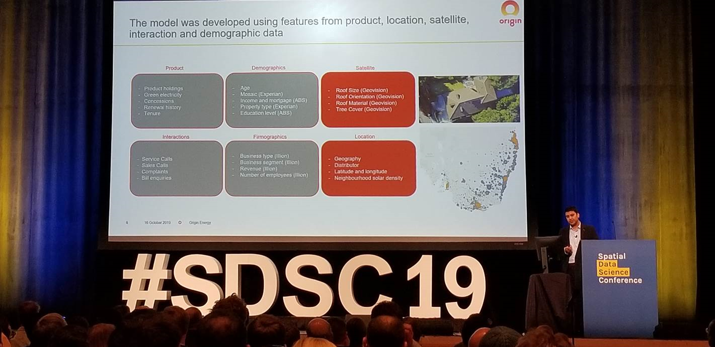
Mudit Srivastav from Australia-based Origin Energy, presented on the use of spatial data to support the increase sales of residential roof top solar panels. Note the many types of data the company is using to better define growth areas.

Data for the Social Good

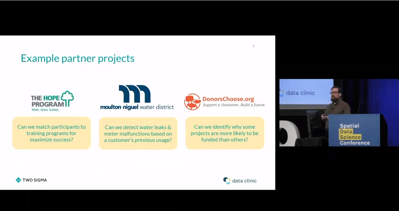
Another common theme throughout the day was the use of geospatial data for the social good.  Interesting to hear the point being made not only from nonprofits and academia, but from the private sector as well.  Way far away from the normal Albany GIS crowd, Stuart Lynn made a presentation focusing on how Two Sigma, an investment management firm located in New York City, provides spatial analysis support through the company’s Data Clinic program to nonprofits, academic institutions, and government organizations.  Their focus:  Enabling and promoting social impact through data driven predictive models while funding breakthrough research, education and a wide range of charities and foundations.    The image below identifies some of their recent projects.  Great stuff and I’m already planning on a more in-depth article with Stuart in the future.

Enabling Social Impact Organizations with Spatial Analysis Techniques

Stuart’s talk, as well as others during the day, made reference to the  The Data for Good movement which was a social media movement first started by DataKind to highlight how data science could be used to help address a range of humanitarian issues. DataKind is a collaborative network of organizations that work together with data scientists to leverage the science of data for social impact.  DataKind’s afternoon presentation “Spatial Data Science for Social Good:  Improving Access to Dignified Sanitation in Haiti” was excellent.  The video for this session and all of the day’s presentations are now available online at the Spatial Data Science Conference website.

Arguably, the demand for “data scientists” will increasingly intersect and expand in government geospatial programs in areas such as the health and human services, climate change, public safety, sustainability and resiliency,  and social and environmental justice to name only a few.   As the universe of geospatial data continues to expand and be integrated with both new artificial intelligence (AI) and machine reading technologies, as well as combined with the availability of more powerful GIS software, it is easy to see where the demand for data scientists focusing on locational and predictive analytics is headed.

I asked Javier de la Torre, Carto founder and SDSC organizer, what his impressions were of the day’s presentations and content.  He replied:

“First, moving the data discussion from WHERE to Why. Time to move to analyzing data using maps opposed to just seeing data in maps.  Second, the rise of the Spatial Data Scientist and/or where advance GIS is emerging as a new platform. And third, identifying the need for better data marketplaces which provides interactive solutions resulting in increased performance to users”

Links to the 2017 and 2018 presentations are also available on the SDSC website.

The Essential New York Climate Change Science Clearinghouse

There is no lack of geographic information these days on Climate Change and its increasing impacts across the Empire State in the areas of sea level rise, rising heat indexes, more frequent and intense storms, changes to the natural environment and critical habitats, and its influence on a broad range of public health issues to name only a few.  And we see geospatial technologies at the core of sciences being used to analyze, respond, and prepare for future consequences.

Whether it be policymakers, planners, business and industry, residents or community groups, New York State is fortunate to have its own geocentric one-stop website on climate change issues as part of the New York Climate Change Science Clearinghouse (NYCCSC).   Hosted by NESCAUM (Northeast States for Coordinated Air Use Management) , NYCCSC contains documents, data, websites, tools, and maps relevant to climate change adaptation and mitigation across New York State. The goal of the NYCCSC is to support scientifically sound and cost-effective decision-making. It was developed to provide a framework where users can find information in multiple ways, including through interactive tools that use data from different sources.

Established in 2015, the site today contains nearly 2100 resources including over 200 web maps and viewers and an assortment of data products and datasets and is curated by Ingrid H. H. Zabel, Ph.D.  Initially the site was populated by resources that had been referenced in the 2011 ClimAID Report and several other key documents, as well as resources identified by groups of sector experts.  Today, the site curator continues to seek out new content from a variety of sources to keep the site current and fresh.  Submissions to the Clearinghouse are welcome though each are reviewed based on relevance, utility, credibility, and accessibility as described in the site’s Business Rules.   The underlying mission of the site is to provide resources that are relevant to communities of many different sizes around New York State, are focused on practical, applied science and that are open access as much as possible.

Dr. Zabel is assisted by a Content Team and Sector Expert Groups consisting of individuals originally involved in the development of the site, from Cornell’s Northeast Regional Climate Center, the Paleontological Research Institution,  , Northeast States for Coordinated Air Use Management (NESCAUM), Frontier Spatial, and New York State Energy and Research Development Authority (NYSERDA). The sector experts were identified by NYSERDA, NYS Department of Environmental Conservation, and the NYCCSC team, and include individuals from New York state agencies, academia, and nonprofits such as (New England Interstate Water Pollution Control Commission (NEIWPCC),  , and the New York State Floodplain and Stormwater Managers Association (NYSFSMA).

Users can explore and mine through the site via ad hoc interactive mapping, topic specific web maps, data charts, and for published documents and reports.  In addition to offering advanced search tools, site content is also grouped thematically in categories such as Climate and Weather, Sea Level, Energy, Flooding, Plants and Animals, Social and Economic, among others.

Some options on the user interface to dive in and start searching for data include:

Interactive Mapping and Web Maps

One of the focal points of the website is an interactive map of climate change and related data for New York State.   Users can select data layers to display from a menu, filter layers by sector, vary parameters within certain layers, and select from a variety of base layers and regional boundaries. For each layer, links are available to metadata and the original source. Data being made available in the viewer has been curated through more of a group effort, with the NYCCSC team getting requests and feedback from a variety of places, including project managers (NESCAUM) and sponsor (NYSERDA).

The NYCCSC interactive mapper also leverages map services from authoritative sources. For example, this GAP Land Cover Dataset is a service being published by the USGS. Users can click the ‘i’ icon for a given layer which provides metadata on relevant URLs. The interactive mapper also includes a function for the user to add a map layer of their own using the Layer Import button found along the toolbar in the upper right hand corner of the viewer (circled in red). Imported layers do not get added to the map permanently, but rather are a means to temporarily “mash-up” local data with the permanent collection of content in the application

The site is built almost exclusively with open source products and largely supported by Steve Signell at Frontier Spatial.  PostgreSQL is the geodatabase used to store and manage map layers and metadata.  A combination of Geoserver and Leaflet are used to create and manage the web services and support the user interface. Javascript and CSS coding was used to create the custom UI and map functions.

If you’re looking for standalone web and story maps for specific Empire State climate change issues – look no further. As the date of publication of this article, the site listed 203 separate maps from a wide variety of contributors including this one from Westchester County focusing on the potential impacts of sea level rise on critical infrastructure assets.

Among the many great offerings, sites found in the catalog of interest include The Natural Resources Navigator (The Nature Conservancy), New York State Geographic Information Gateway (NYS Department of State), Surging Seas Risk Zone Map:  New York (Climate Central), Environmental Justice Screening and Mapping Tool (U.S. Environmental Protect Agency), and Trees for Tribs Statewide Data Explorer (New York Natural Heritage Program) to name only a few.

Climate Data Grapher

User-generated time series graphs of climate data, both observed and projected (future and historical.)  The data grapher provides access to climate data which can be summarized by the user according to various geographic units such as counties. The same summaries are used in the maps & GIS viewer to attribute the corresponding map layers for county and watershed boundaries.  Both user interfaces (Interactive Mapping and Data Grapher) draw on the same raw data sources but offer different capabilities for query, summary and visualization.

I used the interactive graphing tool to plot Westchester’s Winter Average Temperature. It’s one of
19 types of climate related data which can be charted by either geographic area: state, county, or river basin. (Upper left hand corner pull-down). Other datasets area available by gauging and/or weather stations. The chart renders different results depending on which RCP radio button (4.5 or 8.5) is selected. RCP (Representative Concentration Pathway) 4.5 and 8.5 are scenarios of future climate change based on varying degrees of societal progress in reducing human contributions to greenhouse warming.

Documents

A wide range of documents and reports on statewide climate change issues including the author(s) or publishing agency, a pdf download option and where available a corresponding website URL. The first document itemized –  a document central to the launch of the site – is  Responding to Climate Change In New York State: The ClimAID Integrated Assessment for Effective Climate Change Adaptation in New York State: Final Report (2011) which provided information on climate change impacts and adaptation for eight sectors in New York State: water resources, coastal zones, ecosystems, agriculture, energy, transportation, telecommunications, and public health.

The 2011 ClimAID report is one of the first comprehensive and definitive compilations on the many challenges on impacts of climate change across New York State.

Summary

NYCCSC is a huge repository of geospatial and other content focusing on the ongoing and constantly evolving Empire State climate change issue being made available by a wide range of publishers including governments, academia, nonprofits, and industry.     And whereas much New York State climate change focus in recent years has concentrated on the impacts to our coastal communities (i.e., due to sea level rise, hurricanes/severe weather events, storm surges –  much of which is included in the repository), NYCCSC offers content and case studies covering the entire New York State footprint.   Sometimes, however, the scale of the data associated with individual sites can be an issue when looking at issues at the local level.   But nonetheless the data is there.  Itemized websites are always a good starting point for metadata, individual dataset downloads or access to public facing REST endpoints.  .

It takes a considerable amount of effort and oversight to keep such online clearinghouses up-to-date and to this end NYCCSC is fortunate to have an ongoing relationship with NYSERDA for continued support of the project.  NYCCSC continues to welcome submissions but does not accept every resource that is submitted. At the bottom of the site landing page there is a button labeled “Propose Content” which provides access to a form in which content can be proposed.

Contact:

Ingrid H. H. Zabel, Ph.D.
Climate Change Education Manager and Curator, New York Climate Change Science Clearinghouse
Paleontological Research Institution, Affiliated with Cornell University
(607) 273-6623, ext. 122
info@nyclimatescience.org
nyclimatescience.org

Geogames: The Intersection of Geospatial and Games

Behind the scenes in the various worlds of films, games, science, military, government, and even the maker culture, is how “geo” has been gradually verging/bringing all of these industries together. The proliferation of smart phones with maps and searches for food and entertainment, geotagging, as well as ride sharing has brought “geo-data” to everyone and seemingly everything.  Though geospatial data, geospatial analysis, and basic mapping and cartographic concepts have been well established for many years, it’s only been within recent years that technology has enabled science to push and combine animation and gaming with real world geometry.

Here in the Empire State, faculty at Rochester Institute of Technology (RIT),  recently ranked #4 in the United States in Video Game Design Schools, Brian Tomaszewski and David Schwartz, are currently working on this technology “convergence” supported through a grant from the National Science Foundation (NSF).  This effort combines Dr. Tomaszewki’s recognized work focusing on GIS (geographical information systems) applications in the areas of disaster management and risk assessment.  He currently serves as Associate Professor and runs the Center for Geographic Information Science and Technology. Augmenting this work is Dr. Schwartz’s background and ongoing work in game programming, prototyping, and design, which he uses to build academic collaborations across RIT program areas including liberal and visual arts, engineering, business, and now the geospatial sciences. He serves as Director and Associate Professor in the  School of Interactive Games and Media (IGM).

“The world of games has long sought academic legitimacy, which for the most part has been achieved, by demonstrating ‘seriousness,’” notes Schwartz.  Some of the best games are great at teaching players to play those games, many of which have been designed at RIT: Lost and Found (religion), IPAR (computing security), and others.

Lost & Found is a game series that teaches medieval religious legal systems with attention to period accuracy and cultural and historical context. Both games are set in Fustat (Old Cairo) in the 12th Century.

If designers can capture that same immersive engagement for learning, training, education, then game development can make traditional learning, or “non-fun” entertaining and more participatory. There have been several great examples, and there are all kinds of offshoots with government, military, humanitarian, scientific applications, e.g., Instructional Design, Games for Health, and Cybersecurity.

Some of the underlying concepts and building blocks of mashing gaming and GIS software, what is called geogames and location-based games, together include, but not limited to, are:

  • Focusing on creating applications around a recent and “real life” historical event that has relevance to end users
  • Using industry accepted development tools to create the geogame
  • Demonstrate that a location-based game based on real-world data can promote and teach spatial thinking skills
  • Provide a “game” to emergency responders and local users that provides a framework for future refinements and enhancements to the game
  • Demonstrate that a serious geogames have academic and research merit

With respect to the intersection of gaming and geospatial, Pokemon Go has recently demonstrated people interacting with a virtual world “on top” of the real world, incorporating location-based data into visual interactive, decision-making environment. “The Games for Change” organization based in New York City has generated considerable attention to showing how game creators and social innovators drive real-world change using games that help people to learn, and improve their communities.

Convergence of Films and Games through GIS

One reason for the excitement on the evolution of geogames is this convergence of various disciplines, technologies, and software environments. Geogames being developed at RIT include free and open source software (FOSS), such as Open Street Map for ubiquitous baseline street data, as well as  Unity—a leading and popular game engine for rapidly making games. Unity (which is free for certain applications) has been incredibly important for the “indie” game scene, as well many other industries in professional games, movies, advertising, marketing, and more.

Other key aspects of the convergence include ESRI’s CityEngine, which historically has been used for urban design and 3D modeling.  It has had success in various films in making the worlds for Toy Story 2 and Coco. Even RIT’s hometown of Rochester, New York, was an early adopter of City Engine. Other pieces include real-world geospatial datasets, such as elevation models and flooding reach information.

Taking real-world mapping data into City Engine and then porting everything into a game engine enables game developers to visualize a real-world city or landscape. The game then renders graphics and animation,  handles interactions (player controls and responses), and embeds (through a lot more programming and design) the game rules (what happens, or outcomes, when the player interacts in specific ways.

Project Lily Pad:  Bringing the Pieces Together

Tomaszewski and Schwartz’s NSF grant and support of RIT’s computing college includes research experience for undergraduates (REU), which took eight undergraduate students from around the United States and four School of Interactive Games and Media (IGM) students from RIT to study how geogames can improve visualization for disaster planning.  Their study area was city of Dickinson, Texas, where Hurricane Harvey hit the city on August 30, 2017.

The program was developed integrating GIS and game technology by transferring (and updating) data/models from Open Street Map to ArcGIS to CityEngine and finally to Unity. Both local elevation model and flood data were used to model the city and create the game with almost real-life accuracy as best the team could in only a few weeks of summer work!

Project Lily Pad was developed over Summer 2018 with the purpose of teaching spatial thinking in terms of disaster resilience. The game is set in the city of Dickinson, Texas, which was impacted by Hurricane Harvey on August 20, 2017.

Through a series of lectures and background on geogame research, game jams (rapid prototyping of games), game design, programming, geographical information systems (GIS), spatial thinking, and more, the students developed and implemented Project Lily Pad—a serious geogame to demonstrate how to educate citizens about wayfinding in a disaster, like a flood. The name “Lily Pad” derives from the concept of higher elevations where people go to rise above flooding.

Responders in the Dickinson flooding had a chance to review the first generation of the geogame and offered suggestions. There is a new team of REU and IGM students who will collaborate this summer to improve the game, its workflow, and learn more about what a geogame can do as part of RIT’s new MAGIC building. This project is just one of many that bring together films, games, and other technology. Future ideas include investigating virtual reality (VR) for deeper immersion for players, using procedural generation for creating urban environments, and involving residents for crowd sourcing accuracy of urban environments.  It is hoped the geogame concept can be applied for planning for other disaster scenarios besides flooding. The Lily Pad user manual and a game download can be accessed here.

The above images are screenshots from the game. The main character has to navigate Dickinson using a “paper” map and notepad. Playing the game repeated helps the player to develop spatial reasoning of the actual town.

Summary

While the concept has been around for a while (ArcNews Summer 2017), the convergence of geospatial technologies and the game world is only now beginning to take hold in the Empire State.  We are fortunate to have work and research being done in this space at a university, which has strong and established geospatial/GIS and game development credentials. The School of Interactive Games and Media has recently hired tenure-track faculty with research interests in geogames, and so, we look forward to more from RIT in their continuing work this summer and into the coming years.

Contact: 
David Schwartz, PhD
Rochester Institute of Technology
disvks@rit.edu

Editor’s Note:  The author acknowledges the contribution of David Schwartz towards the development and content of this article.

URBAN-X: Supporting New York Geospatial Startups

Curious to know about technology accelerators in New York State which are supporting  geospatial startups?  Look no further than Brooklyn-based URBAN-X built by MINI and Urban Us and operating since 2016 offering customer development, product development, and fundraising support to get selected startups off the ground into production and operation.   Geospatial is not the only type of startup  URBAN–X supports  (its actually much more)  with an existing resume of 37 firms in its portfolio covering technology solutions in the areas of real estate, transportation, energy, infrastructure, public health, and government among others.  The URBAN-X startup focuses on the urban tech environment developing hardware and software solutions which address key needs of city systems, as well as businesses and individuals.   The accelerator’s current cohort consists of seven  startups which each received $100,000 and five months of immersive mentorship.  This cohort was selected from over 500  applications this past November.

Every six months Urban-X selects up to 10 startups and invest $100,000 per company. The 20-week accelerator program also includes six on-site “experts-in-residence”.

Illustrative of the geospatial startups which have come through the accelerator is Citiesense.

Citiesense creates data-driven maps and dashboards that layers information about new permits, recent sales and property changes in urban areas, guiding real estate investors and other local stakeholders to support more informed business decisions.  Using interactive mapping and data visualization techniques, the company continues to focus on helping business districts better understand market demand and dynamics.   Citiesense uses Carto software to support their mapping applications and leverages data available in the NYC Open Data Portal.  Examples of their mapping apps are at the Downtown Brooklyn website and the Long Island City Partnership.  Citiesense is also referenced in a 816 New York article “3 map-based tech tools perfect for neighborhoods and housing authorities”.

I quickly developed an account on the Citiesense website and immediately started mapping various features around 347 East 105th Street. Out-of-the-box the application provides access to dozens of variables and features. This image shows recent 311 Reports, the NYC Street Tree Inventory, and the Commercial Overlay Districts layer.

Starting a tech company is never easy” notes Citiesense CEO Starling Childs. “I think this is particularly true of ‘Urban Tech’ startups. Joining URBAN-X was like adding the perfect final cofounder to our team right when we needed to begin testing our idea in the market. The people behind URBAN-X know the challenges urban tech companies face when thinking about solutions that consider some level of government and private sector collaboration. They understand the value of things like open data; how it supports public private sector collaboration and accelerates innovation in cities.”

Other URBAN-X supported startups in the location and navigation space include Revmax, Rentlogic, WearWorks and Swiftera.

Revmax:  Revmax develops fleet management and routing software for ride-hail vehicles. Its technology maximizes vehicle utilization by proactively forecasting rider demand based on historical data and future events. Revmax ensures that vehicles are in the optimal location to find rides quickly — increasing fleet revenue while reducing pollution and congestion.  According to  CEO Jonathan Weekley and chief operating officer Briggs Fraser,  cabs and Uber cars are empty some 50 percent of the time — highly inefficient for drivers trying to make the most of their time on the road. But the real target market for Revmax, Weekley says, is auto manufacturers such as GM and Ford, who are looking to get into ride-hailing. “They see declining car ownership, and they need to figure out a way to keep building cars and use that fleet more efficiently,” he said. Those manufacturers will have extra incentive to optimize routes, since they, not the drivers, will own the cars that are out on the road.

Rentlogic:  Rentlogic is a standards organization that measures and letter-grade rates the quality of multi-family residential buildings. Rentlogic ratings recognize building owners that invest time and energy in to operating great buildings, and helps connect them with residents trying to navigate a difficult marketplace.  Data underneath the application is harvested from the city’s 311 system.    Every week, roughly 4,000 complaints are initiated by renters about their landlords via calls to the #311 system. These complaints can include mold, heat and hot water issues, infestations, structural problems and more – all of which are used in the application.  It is Rentlogic’s aim to bring transparency and standardization to the residential real estate market.

WearWorks:  WearWorks is a New York-based haptics design company using sensory feedback systems to communicate information entirely via touch. Using vibration-based language, their product augments the senses of blind and visually impaired users through a non-visual interface, helping them to easily and effectively navigate to any destination.  Btw – WearWorks technology was worn/used by Simon Wheatcroft, a blind runner, in the 2017 New York City Marathon.

Swiftera: Swiftera’s business plan is to support citizens, businesses and municipalities in mobility, leisure and urban planning decisions. By providing access to fresh and actionable geospatial data at a competitive cost, the company leverages its novel urban-imagery technology to help customers analyze the past, explore the present and be the first to see the future.  While still in development, Swiftera anticipates delivering unprecedented urban imagery: available all-the-time, in real time.  For more information visit their website or contact them at info@swiftera.co. 

Summary:

URBAN-X provides an excellent opportunity for startups – including those in the geospatial space – to get started in a way which would otherwise be financially and logistically very difficult.    URBAN-X is itemized in a 2017 Dreamit article as one of the leading voices in the New York City “nascent urban tech movement”.  In the broader statewide context, the Empire State Development corporation supports several regional certified business incubators.  The New York State geospatial community is fortunate to have both the access and ability to work with companies such as URBAN-X.

Contact:

Micah Kotch
Managing Director
URBAN-X
Micah.Kotch@urban-x.com
Mobile: +1.646.645.0459
www.urban-x.com

Geospatial Business Spotlight: Topographics, LLC

Company Name:                              Topographics, LLC

Location:                                          Saratoga Springs, New York

Website:                                           www.topographics.org

Number of Employees:                   3

Established:                                    2016

Topographics  provides maps and mapping solutions for a wide variety of clients throughout New York and the United States. Evolved from JIMAPCO, Inc, a long time and well recognized New York State based cartographic and mapping company, the Topographics cartographic team has over 100 years of combined experience providing printed maps, digital files, and most recently interactive mapping applications.  Their client portfolio includes a variety of municipalities, chambers of commerce, educational, religious, and medical organizations, as well as a vast assortment of business clients across the Empire State.

Products and Services

Hardcopy

Using their expertise in graphics and print production, Topographics provides printed folded maps, laminated wall and tourism maps, atlas books, and other hard-copy products for hundreds of customers. Hardcopy products are published using Adobe Illustrator. Selected New York State examples include:

Data obtained from the New York State GIS Clearinghouse provided the foundation to create this statewide elevation model map for a major upstate university.

Product for Adworkshop, which does marketing and communications for Greene County and other organizations in the Catskills.

A section of the Town of Islip (Long Island) hardcopy map. The map contains OpenSource content (OpenStreetMap), features obtained from Suffolk County GIS, and other data sources.

Additionally, Paul Hein, one of the principals at Topographics has an impressive personal portfolio of cartographic products available for viewing and purchase at www.fineartamerica.com. This is a map of the Finger Lakes Region showing elevation contours and shaded relief. Each contour interval is colored with a different shade presenting the area as an abstract map. Take a look.

Online and Mobile

Beyond hard-copy, Topographics  provides digital files used for tourism promotion, sales and marketing, realty operations, way-finding, and business development, among others. Their online maps are interactive applications displaying information ranging from business locations to recreational trails. They most often implement the Leaflet or OpenLayers open source JavaScript libraries and make use of Mapbox and Mapzen services for the styling of OpenStreetMap and custom data as well as providing geocoding and directions. Other platforms include Avenza Web Author and the Google Maps and MapQuest API.  Ilustrative examples include:

This is one of my favorites: The Roman Catholic Diocese of Albany interactive map showing facilities and services within the Diocese. The application includes hundreds of Diocese related facilities and properties which can be turned off/on with the Categories button.

The Saratoga Convention and Tourism Bureau interactive map presents hundreds of visitor resources and opportunities for those in the city or planning a visit. Using our mobile-friendly technology, users can see their current location, locate nearby resources, see walking and biking trails, and find recreational resources.

The following examples are interactive maps for both the Washington County Tourism and the Village of Chatham (Columbia County).  Click on either image to be rerouted to the actual online map viewer.

The Topographics Crown Maple Farm (Dutchess County) map below is available as a hardcopy map and also runs on the Avenza Mobile Map App so it can be “used on the trail” with a smartphone.  User’s can also record their track (their movement) including elevation. User’s can also plot points on the map and assign attributes to the points, including photos. For the Crown Maple Map, Topographics had the owner of the property actually walk the trails using a preliminary map they created for the app to capture histracks. The owner emailed the X,Y’s back to Topographics to be incorporated into the final product. Topographics has created similar maps for other clients all over the world using the Avenza app.

Summary

Far from just a traditional hardcopy cartographic mapping company, Topographics uses and combines many industry leading Open Source software components in producing and publishing their products and services to their clients.   Be informative and nice to see Topographics presenting at future New York State GIS events and conferences.

For more information on Topographics, LLC products and services:

Contact:                        Paul Hein
                                      Topographics, LLC
                                       info@topographics.org
                                       518-428-6638


2017 GeoCon Wish List: Part II

In January of this year, I published my first 2017 GeoCon wish list relative to geospatial mapping applications and topics I’d like to see as part of the Lake Placid October 17-19 conference.  Since January, writing and publishing eSpatiallyNewYork has enabled me to communicate with a wide range of individuals and organizations involved in geospatial programs across the state  – some of which are included in the list below.  Others itemized on the list are new business start-ups,  government and nonprofit initiatives, and programs involved in the emerging drone technology.

So without any further adieu, here is Part II itemizing geospatial topics and program areas I’m advocating for 2017 GeoCon in Lake Placid.  Speakers, presentations, and ideas to mix things up and start some new discussion – and why.

Opioid Crisis Mapping

With the opioid crisis well documented in New York State, Story Mapping and data visualization help further detail the magnitude of this public health issue to a much wider audience.  Story Maps also enable authors with much greater flexibility in developing a narrative to accompany the data which might be otherwise be difficult to interpret or understand with just a map by itself.  Here in New York, it’s the hope to see greater use of Story Mapping (not just ESRI’s solution – all platforms) by agencies and organizations which historically have been reluctant to publish maps due to concerns of data which might be sensitive or misinterpreted.  This Opioid Story Map provides a powerful message and can prove to be a catalyst in seeing other statewide public health data being published in a similar geographic format.  It would be interesting to hear more from this Story Map author(s) about the datasets used (availability, sensitive/non-sensitive, sources, etc.) and possible collaboration with other GIS programs and agencies at the federal, state, and local level.  See also the Northern Kentucky Story Map:  The GEOStory of Opioid Addiction and The Urban Observatory: The Opioid Epidemic.

Story Maps provide an easy and powerful framework to combine narrative and maps which is often very helpful when publishing sensitive or “difficult” to interpret data. Publishing agencies have can better help how data is interpreted and read.

New York State Wildland Fire Mapping

Nothing special or cutting edge here geospatial, but I’ve always had a soft spot for wildland fire maps having served on U.S. Forest Service interregional fire crews back in the day in both Idaho and Montana.   Though in context of publishing fire data, it’s unfortunate how little capacity New York State Department of Environmental Conservation (DEC) has built in context of publishing their data and products as services. Not that statewide wildland fire data and map services would be a top seller for DEC, but the image below (scrapped from the DEC website) speaks to the continued reliance on static maps and other enterprise map applications  which cannot be consumed by other viewers.  The map is actually interesting in showing how there are more fires per square mile closer to urban areas (red) than in the more forested areas such as the Adirondacks – where most would think wildland fires occur and with more frequency.   Publishing this type of data as some type of map service would Continue reading

Orbitist: Storytelling on the Western Front

It’s always refreshing discovering new startups and firms mixing geospatial concepts with other technology and media platforms.  Not necessarily true geospatial firms which we’ve come to label as such, but clearly operating on the fringe and providing selected products and services mainstream geospatial consultants market and provide.  One such relatively new firm is Orbitist based out of Fredonia, New York.

Orbitist is led by Nick Gunner who has been filming and directing video productions since 2007 when he began pursuing his Bachelor of Science Degree in TV/Digital Film, Audio/Radio production, and Earth Science at the State University of New York at Fredonia. During that time, Nick started building content management systems and digital mapping technology which he continued while serving four years as the university’s New Media Manager.   On the side, he continued to pursue freelance work as a public radio producer, freelance documentary filmmaker, and web developer. In the Summer of 2015, Nick launched Orbitist LLC as part of the Fredonia Technology Incubator with the idea of using digital storytelling and technology to make important information as accessible as possible.

Initial Work

The Roger Tory Peterson Institute (RTPI) of Natural History was Orbitist’s first client.   In the Summer of 2015 they commissioned a short documentary on the Chadakoin River in Jamestown, as well as map three tours about various natural history topics.  Representative examples of RTPI products can be viewed on YouTube and the bottom three links on this Orbitist web page.  During this same time period – and ongoing today – Orbitist also performed work for the Chautauqua County Visitors Bureau.

Other recent products and services include:

A Story Map documenting the Winter 1929 Tewksbury boat and bridge crash on the Buffalo River resulting in the flooding of a 18 neighborhood blocks in South Buffalo.

This Story Map uses a variety of multimedia which pinpoints cultural and historical features from different Spanish-speaking countries, including architectural feats, traditional dances, and tipping customs, among others. Each map utilizes Spanish phrases with English translations to bridge the gap between languages.

Software Suite

Relying on the experience he gained building systems for the last 10 years, software products used at Orbitist reflects Nick’s commitment to combining content management with interactive mapping – much of which is accomplished by integrating and combining leading Open Source components.   Currently the Orbitist mapping platform is a simple content management system which associates posts (internally called “points”) with latitude/longitude values.  The Orbitist team often uses Mapbox GL as a primary front-end mapping library but behind that everything in their system is API-driven, meaning story maps are created top of products such as Leaflet and Google Maps.  They also use Carto as a stand-alone product for building real-time analytics maps.  All combined, the Orbitist “system” also manages images and a variety of data (icon type, time of day, external links, etc.) and provides access to YouTube, Vimeo, and even Facebook for video hosting. GitHub is leveraged to host static web projects. Continue reading

10 Questions: Steve Romalewski

Steven Romalewski is currently director of the Mapping Service at the Center for Urban Research at The Graduate Center / CUNY.  During his 32-year career he has helped hundreds of nonprofit groups across the country leverage the power of GIS; helped develop more than two-dozen online mapping services analyzing environmental issues, social services, transit routing, demographic trends, voting behavior, and legislative representation.  He has also coordinated the work of community groups and others across New York to advocate for sensible environmental policies at the local, state, and federal levels.  For the past 10 years, he has taught students at Pratt Institute how to use GIS in their urban planning careers, and helped educate many others through presentations about the value of GIS.  He lives in Manhattan.

eSpatiallynewyork:  How did you end up in your current position at Center for Urban Research?  

Romalewski:  Before joining CUNY I ran the Community Mapping Assistance Project (CMAP) at NYPIRG for about eight years, providing mapping services to nonprofit organizations across the country.  (Before that I was an environmental researcher and advocate at NYPIRG.)  By 2004 or so, CMAP’s work had started to outgrow our advocacy-oriented parent organization. Internally we discussed options of spinning off CMAP as a social business venture, merging it with another organization, or launching it as its own nonprofit.

At the same time we were going through a strategic planning effort for the OASIS project, and one of the key findings was that OASIS would benefit from an institutional setting such as academia where the OASIS website would be able to leverage more stable technology resources and organizational support.

One of the academic programs we talked with was the Center for Urban Research (CUR) at the CUNY Graduate Center.  I had worked on projects over the years with CUR’s director John Mollenkopf, and he was a big fan of our work. It seemed like a great fit, and in January 2006  I moved to CUNY.

eSpatiallynewyork:  How do CUR projects come to be or developed?

Romalewski:  We’re fortunate to have a good amount of leeway in deciding on projects.  Generally CUR engages in applied research projects in the areas of neighborhood change, immigration, and urban development broadly speaking. Within those areas, we look for mapping projects where we can have an impact, where we can leverage CUR’s mapping skills and expertise in analyzing urban trends, and that come with funding support so we can cover staff time and related expenses.

We’re especially interested in working with our colleagues throughout CUNY, as well as within city government (since CUNY has a close relationship with New York City agencies), but we also take on projects with a wide array of partners.

If the project involves an online mapping component we try to structure it so we can incorporate the latest and greatest interactive web and mapping techniques and technologies. Continue reading

SAVI Builds a Metro NYC Presence

The last couple years I’ve been watching the growth of GeoNYC Meetup group and continue to be amazed at the far-reaching representation of individuals and companies now involved in the broad field we call “geospatial”.  One person shops, start-ups, open source/open data techies, apartment and loft based companies, strong business and private sector representation, community based mappers, and everything in-between.  A much different composition and representation than that of the other existing statewide geospatial/GIS communities and organizations that I and other colleagues of my GIS generation came through.   To date I have published three previous blog posts focusing on other contacts made through GeoNYC:  Mapzen, Mapillary and NiJel.

Spatial Analysis and Visualization Initiative (SAVI)

Also establishing a niche in the expanding geospatial space are community facing programs associated with and supported in academia environments.  One such program, which I was also introduced to through GeoNYC, is the  Spatial Analysis and Visualization Initiative (SAVI).  It was launched in 2013 and is at Pratt Institute.  SAVI is a GIS-based research lab and service center that focuses on mapping, data analysis, and visual storytelling, providing students, faculty, and community groups with the resources they need to communicate information in compelling ways. The first and only New York City college-based GIS lab open to community organizations and civic groups, SAVI offers computer access, technical assistance, professional training, workshops, and research that empower local organizations to create their own visions to improve the quality of life for their clients and constituents. At Pratt, SAVI supports students and faculty whose work reaches beyond the Institute’s campus to engage and benefit New York City.

Leading the SAVI program is Jessie Braden, who was appointed Director in the Fall of 2013.  Prior to SAVI, Braden spent three years at the Pratt Center for Community Development, a non-profit affiliated with Pratt Institute that provides technical services to community organizations.  She has also been an adjunct professor of GIS in Columbia University’s Graduate School of Architecture, Planning and Preservation Program since 2010.  Braden initially started SAVI with Pratt Programs for Sustainable Planning and Development (PSPD) Professor Juan Camilo Osorio as a volunteer side project in 2011 with the guidance of then Department Chair John Shapiro.  In addition to PSPD, Pratt Center and the Graduate Communications Design Department offered their official support, allowing the lab to come to fruition and solidifying SAVI’s focus on communities AND design.  Pratt Center also secured a $670,000 grant from NYC City Council to renovate a physical space on Pratt’s campus so SAVI can serve community organizations and students.  During the time the program was being institutionalized at Pratt, Osorio took a full-time position as Director of Research at the New York City Environmental Justice Alliance. Though not involved in day to day operations, Osorio remains a trusted advisor to SAVI.

SAVI consolidates the Institute’s GIS resources with an eye to social benefit. This means putting data analysis in the hands of community activists, students, and faculty. It also means making the products of GIS expertise visually legible and compelling so that the stories they tell will have as much impact as possible.

“At the end of the day, visual representation is as important as the quality of data analysis,” Braden observes. “Our vision for SAVI is to produce outstanding multidisciplinary projects  with the highest-caliber visual display— making the invisible visible, both inside and outside Pratt’s gates.”  Its Jessie’s belief, which I share,  that a well designed map should be able to stand on its own.  Such a product enables the reader to conduct the “spatial analysis” based on the distribution and rendering of the map data itself – with only minimal accompanying narrative to explain or describe the map.

Braden points to specific mapping projects which exemplify the SAVI cause:
Continue reading

Geospatial Business Spotlight: Mapillary

Company Name:                 Mapillary

Website:                              http://www.mapillary.com/

Established:                       2013

THE COMPANY

Mapillary is a new and different approach to Street View. Using computer vision, Mapillary stitches together photos taken with any device to create street-level imagery for extracting geospatial data. By empowering anyone anywhere to easily create street-level imagery, Mapillary aims to create a photo representation of the world. To date, Mapillary’s community has contributed 63 million photos spanning over 900,000 miles across all seven continents.

Mapillary was founded in 2013 by Jan Erik Solem, Johan Gyllenspetz, Yubin Kuang, and Peter Neubauer, who share a vision for putting mapmaking into the hands of people everywhere. Solem, who serves as CEO, previously founded Polar Rose, a facial recognition software that was bought by Apple in 2010.  The company is headquartered in Malmö, Sweden, and has fifteen full-time employees located around the world.   Mapillary’s New York office is based In Brooklyn, NY.

PRODUCTS AND SERVICES

Mapillary allows community members to create and explore a crowd-sourced, street-level view of the world through its app, which is available for web, iOS, Android, and Windows Phone. Users can upload photos from their smartphones or other digital cameras and Mapillary then combines the images together geotagging each using GPS metadata. The resulting 3D reconstruction is created using computer vision and the company’s own open source “Structure from Motion” algorithm. Mapping isn’t limited to streets—the community has captured hiking trails, favorite bike routes, and even a stretch of Antarctica. Mapillary integrates with any mapping platform through simple APIs.

Street-level photos can be captured using Mapillary's iPhone app

Street-level photos can be captured using Mapillary’s iPhone app

In addition to creating photo-maps, Mapillary also utilizes computer vision techniques to extract useful data from uploaded images. For instance, the software can recognize symbols on street signs in photos taken in the U.S. or Europe. This capability grew out of the app’s need to blur faces and license plates for privacy purposes, and is now used by groups like city governments for urban planning, land surveys and asset inventory. Using Mapillary with Esri’s ArcGIS platform has helped cities streamline infrastructure updates, from speed limit changes to road surface quality checks.

Mapillary uses computer vision to automatically detect traffic signs and extract geospatial data

Mapillary uses computer vision to automatically detect traffic signs and extract geospatial data

Humanitarian organizations also use Mapillary to further their initiatives. In Haiti, the American Red Cross and Humanitarian OpenStreetMap partnered with Mapillary to help record previously unmapped areas to aid disaster response efforts. Mapillary has also been used by the World Bank and other groups in Dar Es Salaam, Tanzania, to record infrastructure in flood-prone areas of the city to help plan improvements. The app is ideally suited for these sorts of tasks because it doesn’t require any special equipment beyond a basic smartphone.

Street level imagery is reconstructed by creating point clouds from photos.

Street level imagery is reconstructed by creating point clouds from photos.

Mapillary is free to use for individuals and for non-profit or educational purposes. For commercial solutions, ranging from embedding a photo-map into a webpage to extracting specific data from images, Mapillary has several pricing plans available.

Westchester County GIS is using the Mapillary app to inventory hiking trails in County parks

Westchester County GIS is using the Mapillary app to inventory  hiking trails in Westchester County parks

To find out more about Mapillary, visit their website.

CONTACT: 

hello@mapillary.com
Bredgatan 4, 211 30 Malmo, Sweden
www.mapillary.com