The art form is still alive as counties design and create maps as part of the Agricultural District Certification process
I’ve written about agriculture in New York State before in context of the farming community continuing to evolve with the adoption of geospatial technologies. With farmland covering nearly 20% of the state’s geographic footprint, its easy to see why geospatial tools are so increasingly important in managing the state’s prime agricultural lands. And one does not need to look far to see the advancements of new geospatial technologies in New York State agriculture, particularly with the recent Systems and Technologies for Remote Sensing Sensing Applications Through Unmanned Aerial Systems (STRATUS) conference May 23-25, 2022 at SUNY ESF in Syracuse. Several papers and even dedicated tracks of papers and presentations focusing on UAV/drone technology in agriculture.
And it’s big business, too. A November 2021 article published by NY Business Agribusiness Column: Economic Impact of Agriculture in New York State stated that “agriculture in New York State contributed $43.6 billion in total industry output, 160,100 jobs and $12.3 billion in gross domestic product across the state economy.” It’s a rather amazing article with many more figures on how agriculture impacts the statewide economy, The article is based on the work and research of Todd Schmidt, an associate professor with the Charles H. Dyson School of Applied Economics Management at Cornell University.
Which makes it all the more interesting in 2022, even with the fledgling agritech applications and the almost complete conversion and automation of our mapping, cartography, and business/financial systems, the certification of agricultural districts in the state still involves the use of an iconic piece of mapping and cartography: The hardcopy map. Yes, while the digital data/products in producing the hardcopy maps are used and repurposed in many useful and productive ways across the state, it is still the hardcopy map which is used as part of the agriculture district certification process by NYS Department of Agriculture and Markets (AgMkts).
Background
Since 1971 , the Agricultural Districts Law, Article 25AA of the Agriculture and Markets Law (AML), as administered through (AgMkts), has reflected state and county level efforts to preserve, protect and encourage the development and improvement of agricultural land for the production of food, fiber and other agricultural products. As districts are created, or modified during renewal, maps are generated, based on tax parcels included in the districts. Each county is responsible for creating maps to meet the requirements of the Agricultural Districts Mapping Program. Supporting AgMkts in this regard is Cornell University’s Institute for Resource Information Sciences (IRIS) has helped facilitate the mapping program since 1977. Its primary responsibility is to support agricultural district mapping efforts by reviewing, distributing, and archiving agricultural district maps, and to provide consultation services. Automation of the statewide district maps began in earnest In 1996 when the entire set of NYS Agricultural District maps in the collection of Cornell IRIS (formally CLEARS) was converted to digital format. This was done by shipping blueprint copies of the maps to the NYS DEC for scanning.
Article 25AA references maps several times in Section 303 as a required deliverable for certification of a district. Specifically the text includes “The district review plan shall include a description of the district, including a map delineating the exterior boundaries of the district which shall conform to tax parcel boundaries”. Agricultural districts across New York State are reviewed and certified on an eight-year cycle.
The Map
It’s a real treat anymore to show up at a meeting or discussion and be given the chance to review a traditional, well designed hard copy map. Increasingly becoming rarer and rarer. And just think how much less demand there would be for hardcopy maps if it wasn’t for the ubiquitous use and sharing of the PDF file format? For so many years, the 1:24,000 map was one of the most commonly used map design and layouts following in step with the classic U.S. Geological Survey 2000-scale quadrangle grid series. And yes, it just so happens the required base map standard for the agricultural district maps, as outlined in the Agiriculture Districts Program Mapping Checklist prepared by IRIS, is 1:24,000. According to Diane Ayers, who provides staff support to the mapping program, “IRIS recommends either the NYS DOT 7 ½ minute planimetric map series (available in either raster or vector format) as the base map for individual County mapping products.”
The 32-page document consists of written requirements covering topics such as, but not limited to, map content including roads, civil boundaries, and water features, as well as traditional map items such as north arrows, keys and legends, scale bars, and the bounding geographic coordinate grid. Documentation on the source of base map data, other data layers, year of parcel data, and geographic reference information (datum, projection, etc) is also recommended. It also includes several pages of examples covering a wide range of other hardcopy cartographic principles including annotation, color selection, and symbology. Many items which cartographers and map makers have greater flexibility in controlling when using desktop client software vs. web mapping cartographic tools.
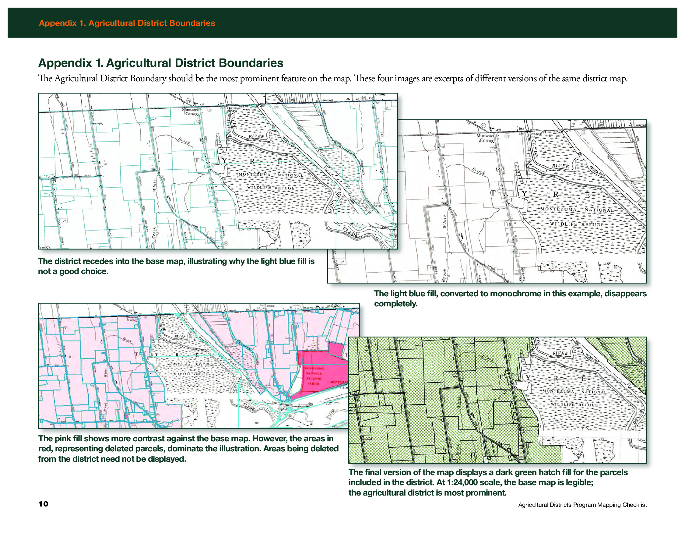
Appendix 1 in the Mapping Checklist document shows examples of how to render the district boundary as the most prominent feature on the map
While counties send all review materials associated with the eight-year review, including tax parcel information, directly to AgMkts, the county produced hardcopy map and shapefiles are sent directly to Ayers. She reviews the maps for consistency with the mapping checklist and then forwards to AgMkts and uses the shapefiles to maintain a consistent a set of statewide district maps which are available via CUGIR. The statewide coverage she maintains based on this relationship and data exchange with the counties can be found here.
The 2022 Ontario Agriculture District Map as produced by IRIS. Shapefiles and documentation received from counties enables IRIS to maintain a statewide agricultural district coverage.
Sheri Norton is the GIS Coordinator for Ontario County, located in the Finger Lakes region renown for viticulture and other agricultural products. She has been through three district reviews including a large countywide consolidation in 2021. “Agriculture District mapping is a big effort with partnership between our Planning, Real Property and GIS Program staff”, she says, “but with my previous experience in producing the mapping products for IRIS and becoming more comfortable with ArcGIS Pro, the map series and formal reports are now easily updated for the next review cycles. The ArcGIS client is all I use.” Which is quite an accomplishment, as keep in mind many final cartographic products are often “touched up” before final publication with other desktop publishing software such as Adobe Illustrator. The certification also includes generating a list of all tax parcels in the district(s) based on the county assessment roll.
Sheri Norton’s 2021 Ontario County Agriculture District One map designed and produced entirely with desktop GIS software. This same map was provided to AgMkts as part of the review and certification process
Summary
Hard copy maps are as close to GIS comfort food as we can get. And here in New York is refreshing to see how this important piece of our cartography past is still being used in a government regulatory program. Holding its own against all of the advancements – and acceptance of digital web mapping. Kudos to GIS professionals across the state who are still producing hardcopy maps and helping the product remain relevant as part of the profession.
Agricultural Districts protect and promote the availability of land for farming purposes. For informative overview of this important Empire State Program review this presentation.
Contact
Diane Ayers
Data Manager and Educator
NYS Agricultural Districts Mapping Program
Cornell IRIS
1015 Bradfield Hall
Ithaca, NY 14853
dag10@cornell.edu
Sheri Norton
GIS Coordinator, GISP
Geographic Information Systems Program
Ontario County Information Technology Department
70 Ontario Street
Canandaigua, NY 14424
Sheri.Norton@ontariocountyny.gov
Jeff Kehoe
Farmland Protection Specialist
Department of Agriculture and Markets | Division of Land and Water Resources
10B Airline Drive
Albany, New York 12235
jeffrey.kehoe@agriculture.ny.gov