Envisioning the Future of Buffalo’s East Side

AGOL viewer, data HUB, and other geospatial tools used in helping develop WITHIN East Side Plan

Community focused GIS projects are always a favorite of mine to write about.  Highlighting how geospatial tools can be used by community groups – including nonprofits which are often project sponsors – to better help visualize and understand the vast array of environmental, regulatory, business and public health, and cultural data which impacts their daily lives.  One such project located in Buffalo’s east side was brought to my attention in a recent communication with Lisa Matthies-Wiza, Director of Geographic Information Services at Erie County.  

WITHIN East Side

The WITHIN East Side project is one of many projects of LISC Western New York (WNY) and its larger parent organization LISC New York.  program.   WITHIN East Side  focuses on simplifying the neighborhood planning and community development process, and ensures development is driven by resident leaders and community groups.  As an open, inclusive, community-driven initiative, WITHIN East Side brings together neighborhood voices, trusted partners, and supportive funders in an effort to better the wellbeing of residents using their own visions. Together with LISC NY, the WITHIN East Side stakeholders collaboratively identify projects that sustain the positive momentum happening in local neighborhoods.

In early 2020, LISC NY began planning with community partners in three geographic focus areas in the East Side under the WITHIN East Side program.  The East Side of Buffalo, which is the heart of Buffalo’s Black community was chosen as it is purposeful to build upon and lift up the long-time visions of residents and community leaders in neighborhoods most impacted by historic disinvestment, environmental, structural, and systemic racism.  The additional impact of the racist mass shooting on May 14, 2022, that killed 10 people, at a local supermarket within the planning area, furthered the importance of amplifying the community’s voice and vision for the future.

The project was designed as a two-pronged approach–integrating economic development and quality-of-life planning.  Closely intertwined, both  economic development and quality-of-life planning require understanding community history and dynamics, collaboratively identifying projects, building relationships with diverse stakeholders, and turning community priorities into progress.

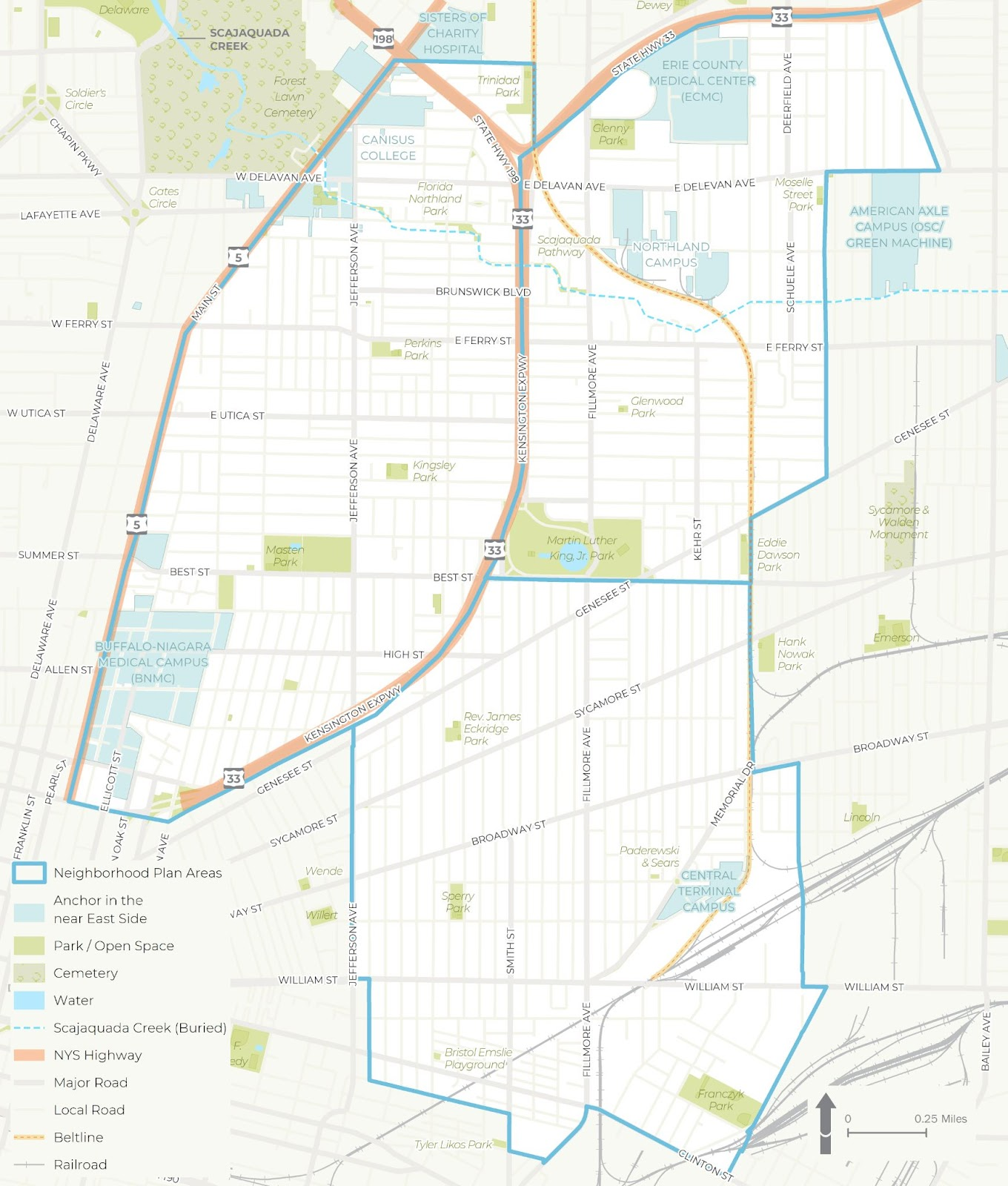
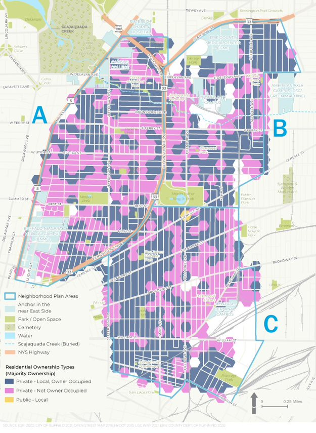
The WITHIN East Side project was broken into three distinct study areas – each of which was studied in more detail for a wide range of demographic, cultural and economic development issues

Background

LISC NY contracted with Prospect Hill Consulting (PHC), a local minority and women owned consulting firm which had responded to a formal Request for Proposals (RFP) which was issued in January 2021.  GIS mapping and analysis was a requirement and the LISC NY team knew GIS services were important to supporting the overall East Side project.  PHC was selected to perform elements A (GIS Mapping [including an online mapping tool request and a data HUB) and B (Scenario Planning).   While LISC NY had a vision of what the final plan might look like,  PHC was instrumental in assisting LISC NY in developing maps and visualizations used in the final plan and in community engagement sessions throughout the process.

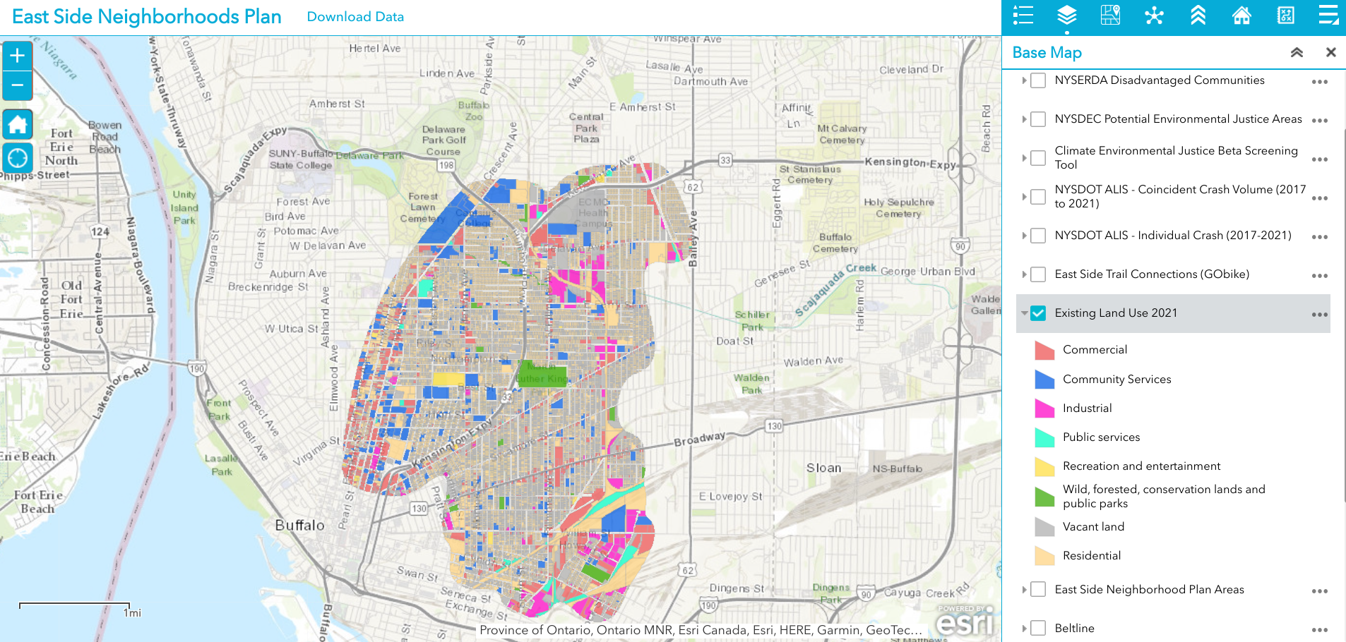
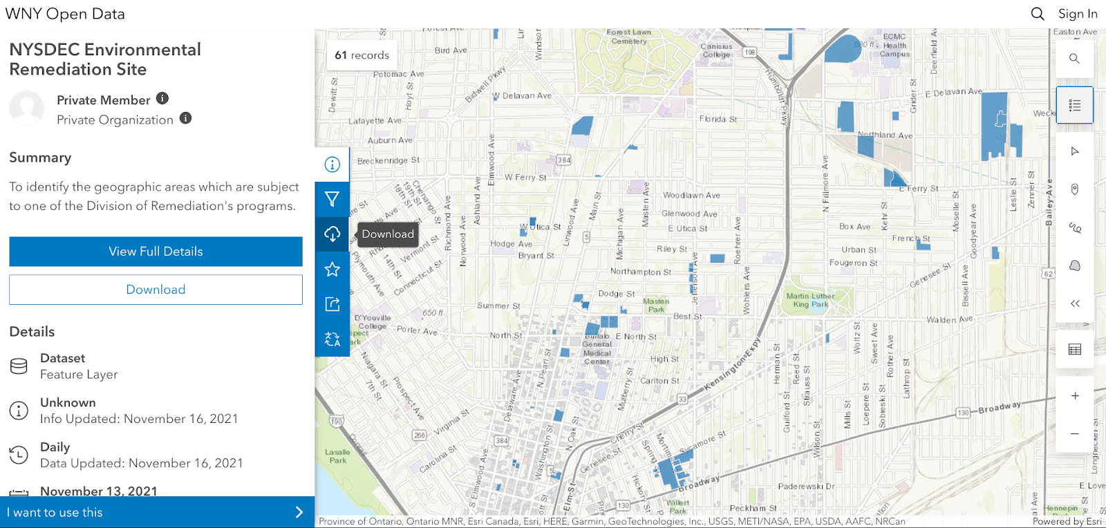
Existing 2021 land use is just one of dozens of data layers in the WITHIN East Side AGOL viewer. The rich database consists of local, regional, state and federal datasets.

Leading geospatial development of the East Side project from PHC was Jenny Magovero, President and Co-founder. Ms. Mogavero has been working in the GIS field for 23 years covering geospatial applications in community planning and environmental sciences as well as work in data visualization and  project management.  Mogavero created all of the maps in the East Side plan using the ArcGIS client as well as for spatial analysis and modeling.  The project web map is ArcGIS Online based with the data stored in a Hub Site (to allow for data sharing) and was designed about halfway through the GIS mapping and analysis task to support the WITHIN planning process itself.

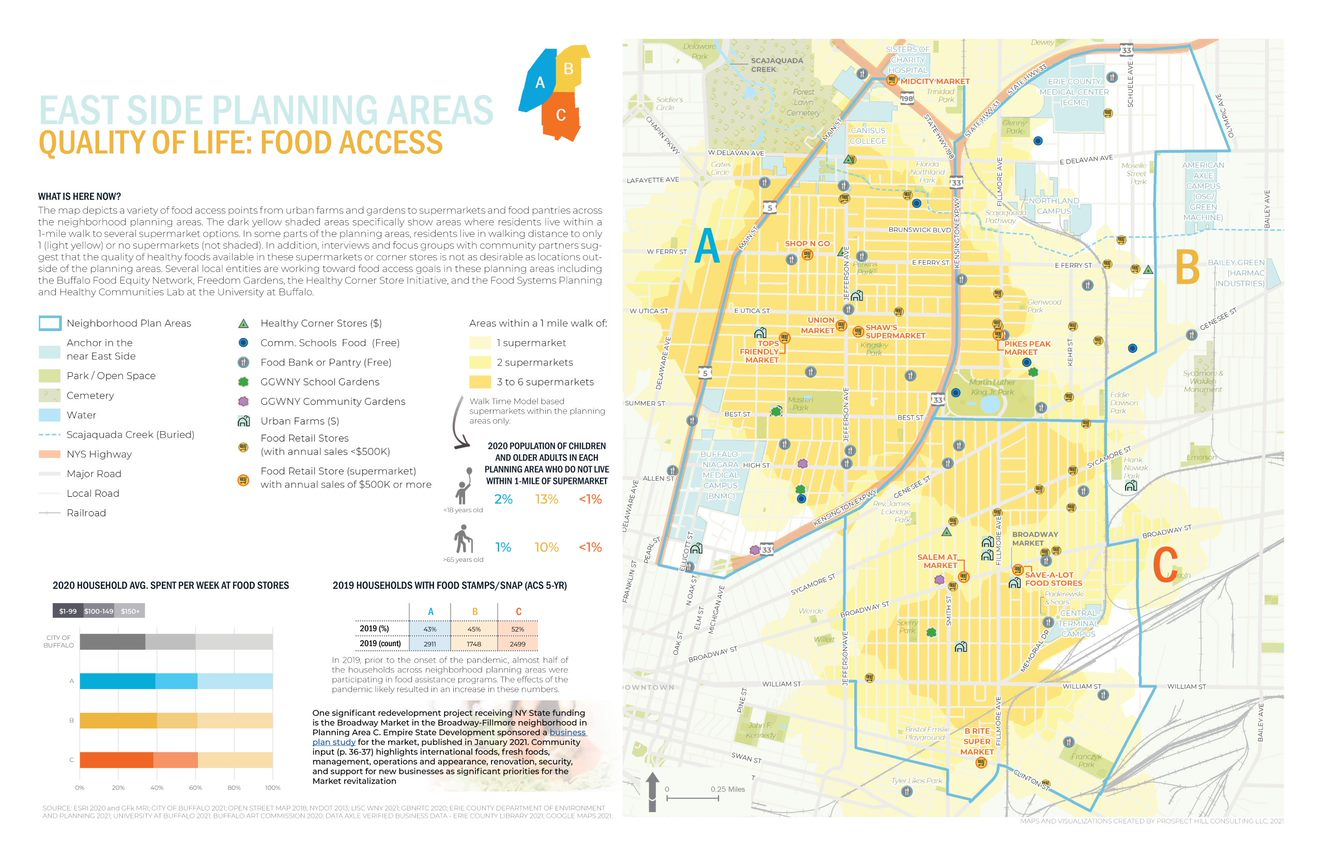
One of the many excellent graphics iWITHIN East Side report. The map on the right identities areas within the study area where supermarkets are located – a significant issue for residents with limited transportation options.

LISC NY wanted to be as transparent as possible and allow stakeholders (i.e. the community/public, organizations, etc.) to work with the data and download and use it if they needed.  To this end, the AGOL interactive map was used in community outreach and meetings early in the project and as new data came online (i.e., stakeholders requested to see additional themes) PHC continued to update the AGOL viewer. PHC designed the AGOL viewer to serve as a communication medium that allowed LISC NY to show project progress, survey the community on what themes needed to be covered and/or identify gaps, and to act as a platform to continue engagement with the community in the future. 

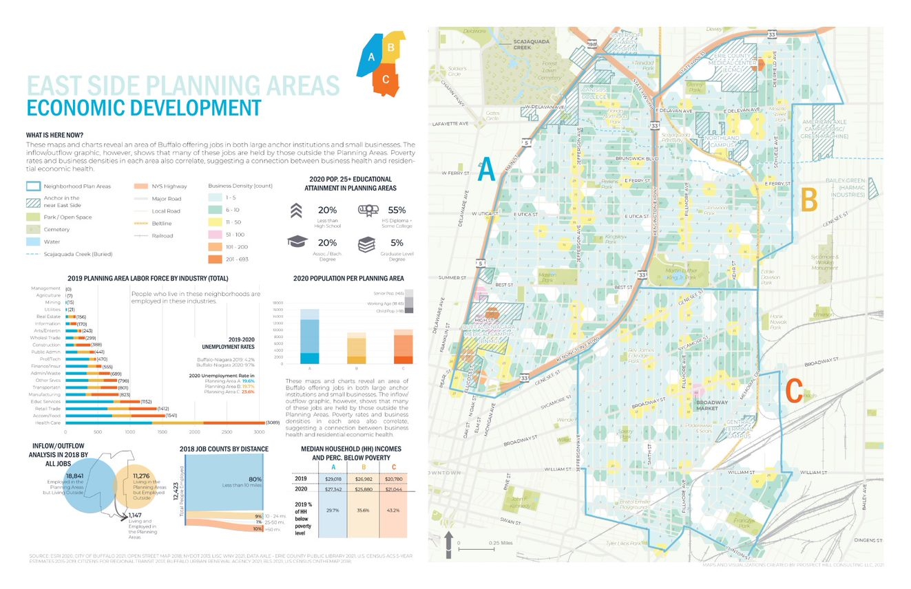
Economic Development issues are paramount in the study such as the role of small businesses, inflow of non-residents that work – but do not live – in the area, as well as the concentration(s) and accessibility of employment opportunities.

Data collection and development was specific to the mapping and analysis that the LISC NY team needed for the WITHIN plan itself.  As LISC NY has significant business relationships within the greater Buffalo community, they were able to collect a lot of data from local, state and NGOs. In addition, PHC collected publicly available data from the City of Buffalo, Erie County (parcels, land use, etc.), New York State  (NYSDEC, NYSDOT, etc.) and federal datasets (EPA, Census, etc.).  Additionally, PHC developed data from reports or datasets that were anecdotally described by stakeholders (like the air quality buffer, buried portions of the Scajaquada Creek, key intersections, etc.).  Project data was also obtained from utilities, Google, OpenStreetMaps, and ESRI.  

Most of the project data is made available through the LISC WNY Open Data Hub which was also designed and continues to be supported by PHC.  (Some providers did not want their data to be shared so it is only available for viewing in the application.)   

No AGOL account is necessary to access the HUB and tags help users to easily jump to specific themes of data presented in the final plan for download.

PHC used a bevy of GIS,  statistical packages, and desktop publishing software tools to generate the maps and graphics in the report including: 

  1. ArcGIS Online to collect stats for the neighborhood that were ACS 5yr census based (https://doc.arcgis.com/en/arcgis-online/analyze/enrich-layer.htm)
  2. Geospatial processing tools to buffer, clip, summarize, and run overlay analyses
  3. Spatial Analyst tools to develop walkshed layers (from points provided by Walkscore)
  4. Tableau Desktop and Excel to conduct data exploration to emphasize trends (or data insights) with graphs/visualization on  map layouts
  5. Adobe InDesign for page layouts and other graphics to be consistent with the LISC NY brand book (design guide) including colors, fonts, and logos.
  6. ESRI’s Hexagon sampling tool to visualize parcel data classes (i.e. land use, vacant parcel density, ownership) at the scale of the plan areas. 

Residential ownership type is an important variable in urban studies. Data presented in the figure above suggests there continue to be many opportunities in increasing owner occupied properties in the study area

Summary

While consulting architecture and engineering companies continue to expand their geospatial offerings to governments and regional programs in 2022, particularly in the infrastructure and public works space, planning firms such as PHC serve in a unique space focusing on efforts which include applying geospatial tools as part of important community-based projects which often include significant public input and involvement.  Tools such as AGOL provide a great  framework in which to engage the public with regard to adding and removing data content and visualizing potential scenario outcomes.  A particularly useful tool given the enormity of the data used in the WITHIN East Side plan.

Reflecting on PHC’s involvement in the study, Jenny Mogavero notes:

“LISC NY is an integral part of, and key economic engine within the Western New York region.  Prospect Hill was honored to partner with the LISC NY to use GIS data, visualization tools and spatial analysis methods to not only present the existing conditions of our city’s East Side neighborhoods, but also reveal the deeper insights that occur when we overlap data-driven stories across multiple thematic lanes.  We were thrilled that our work supported the teams’ consensus building goals to develop a vision of a prosperous future for an important part of our City.”

Tyra Johnson Hux, WNY Director of Operations, also reflects on PHC’s work and the use of geospatial tools in the project adding:

“WITHIN East Side amplifies the visions of residents and community leaders in neighborhoods impacted by historic disinvestment, environmental, structural, & systemic racism. Showing their stories through, not only their own words, but also data was critical to helping our stakeholders generate a bold, authentic and comprehensive vision with an emphasis on implementation.  PHC supported the WITHIN East Side Plan by working with the project team to identify, collect and normalize relevant GIS data from neighborhood, government, academic and other partners. Additionally, they worked with us to analyze and visualize the community experience through maps and infographics.  The online interactive map and data warehouse they developed made it possible to share data in a way that breaks down silos, facilitate  strategic planning and continue community conversations.”

Contact

Jenny Mogavero, GISP
Prospect Hill Consulting LLC | Principal
716.432.9053 | www.prospecthill.co
jmogavero@prospecthill.co

Lashay Young, Director
External Affairs for LISC NY
https://www.lisc.org/
LYoung@lisc.org

Empire State GIS/Mapping DIYer Phenom: Andy Arthur

Self-taught hobbyist has a treasure chest of geospatial content on website

One of the benefits of writing about all-things geospatial in Empire State is sometimes I just don’t know what I’ll come across.  Looking for this thing and finding that.   Starting in earnest on an article about a certain GIS channel and a couple days later finding myself having completely jumped the rails and find myself way over there writing about Channel Z.  (Yup, that static in the attic).  Or ending up on a cool or fun website not really knowing how I got there.

Case in point:  Interactive Maps by Andy Arthur.  Empire State mapping DIYer extraordinaire.  Just a hobby.

When I first stumbled onto the site and having spent some time driving around, I realized I needed to find out who was behind it all.  It definitely isn’t the kind and feel of the traditional geospatial website I normally include or reference in my blog, but enough interesting – and yes, quite different – content to dig a little deeper.  And glad I did.  This is not a blog post to focus on a particular topic or concept, but rather just more of a pointer to the URL and let you take away from the website what you want.  

It turns out the person behind all of this is Andy Arthur, who by day, is Deputy Director of Research Services in the NYS Assembly.   “I have no formal GIS training, as things were still pretty primitive back when I was in college (SUNY Plattsburgh)  in the early 2000s especially when it came to web services, online data and open source software” says Arthur, “computers were a lot less powerful back then. I remember vaguely hearing a bit about Remote Sensing when I was involved in the Environmental Science Club in college, but it wasn’t something I ever used.

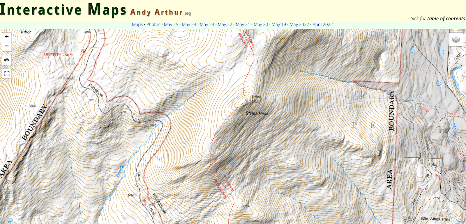
Since then and working on his own, Arthur picked up QGIS (and the accompanying PyQGIS developer tools), as he was looking for a way to make his own topographic maps because he wasn’t happy with what was available on  the Internet. He later found out he could FOIL a primative campsite shapefile from NYS DEC and get data from there to help find campsites. “I was pretty good at map and compass stuff from my years in Boy Scouts and always interested in environmental and land use issues”, he says.  Over time, he branched out into other geospatial areas including web services.  More recently He’s been focusing on more automation of processes, using Python and R statistical language to do some map plotting and a lot of Census data gathering and processing. “I like working with R as it is fast and easy to implement code in. I’ve also lately been doing a lot more with Leaflet and web services”.  Along the way he continues to use GeoPandas and Leaflet for map making. (btw as I was putting this blog piece together I found out the creator of Leaflet 11 yeas ago was  Volodymyr Agafonkin, a Ukrainian citizen who at the time was living in Kyiv.)  Content on the site is also made available in KMZ for use in Google Earth.

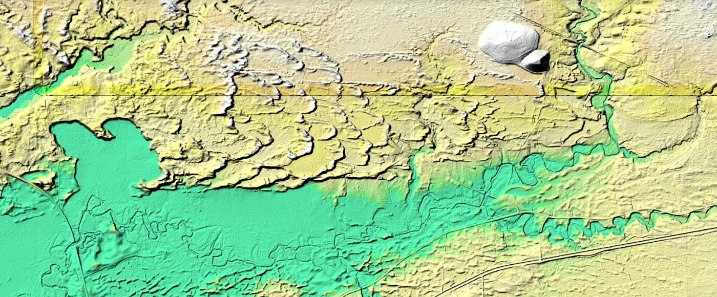
This is a example of how Arthur processed LIDAR data covering the Rome Sand Dunes west of the City of Rome in Oneida County. The landscape ifs a mosaic of sand dunes rising about 50 feet above low peat bogs which lie between the dunes. Processed LIDAR data renders the dunes very clearly. Arthur created this originally by writing a QGIS plugin that queries a shapefile with the LIDAR Digital Terrain Model Bare-Earthindex, then downloads the geotiffs, and finally joining them together to create the hillshade.The plugin itself is in Python and runs in QGIS, while the lidar download/processing script is in php-cli shell script.

The best place to start navigating the website is to open the table of contents link located in the upper right corner of the landing page. The table of contents page then provides additional links products and visuals Andy has created including aerial photos, charts, interactive maps (recommend starting here), and thematic maps to name just a few.   This page also provides more detail on open source components, some specifics on the use of Python and Pandas, a downloadable CSV file listing of web services (WMS, ArcGIS services, etc) used on the blog, and much more.  It’s worth noting that the website also includes non-GIS/geospatial content.

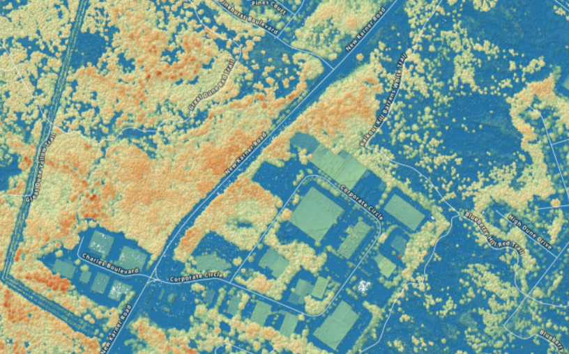
If you need some additional evidence of how much Arther has picked-up on programming, using open source components, and navigating the geospatial landscape in this space,  check out his tutorial on how to create a  Digital Surface Model GeoTIFF Using National Map Downloader, LiDAR Point Clouds and PDAL.  By example, the DSM image above is from a section of the Albany Pine Bush.  For a larger montage of the Albany Pine Bush digital surface model and samples of his code, click here for downloads.

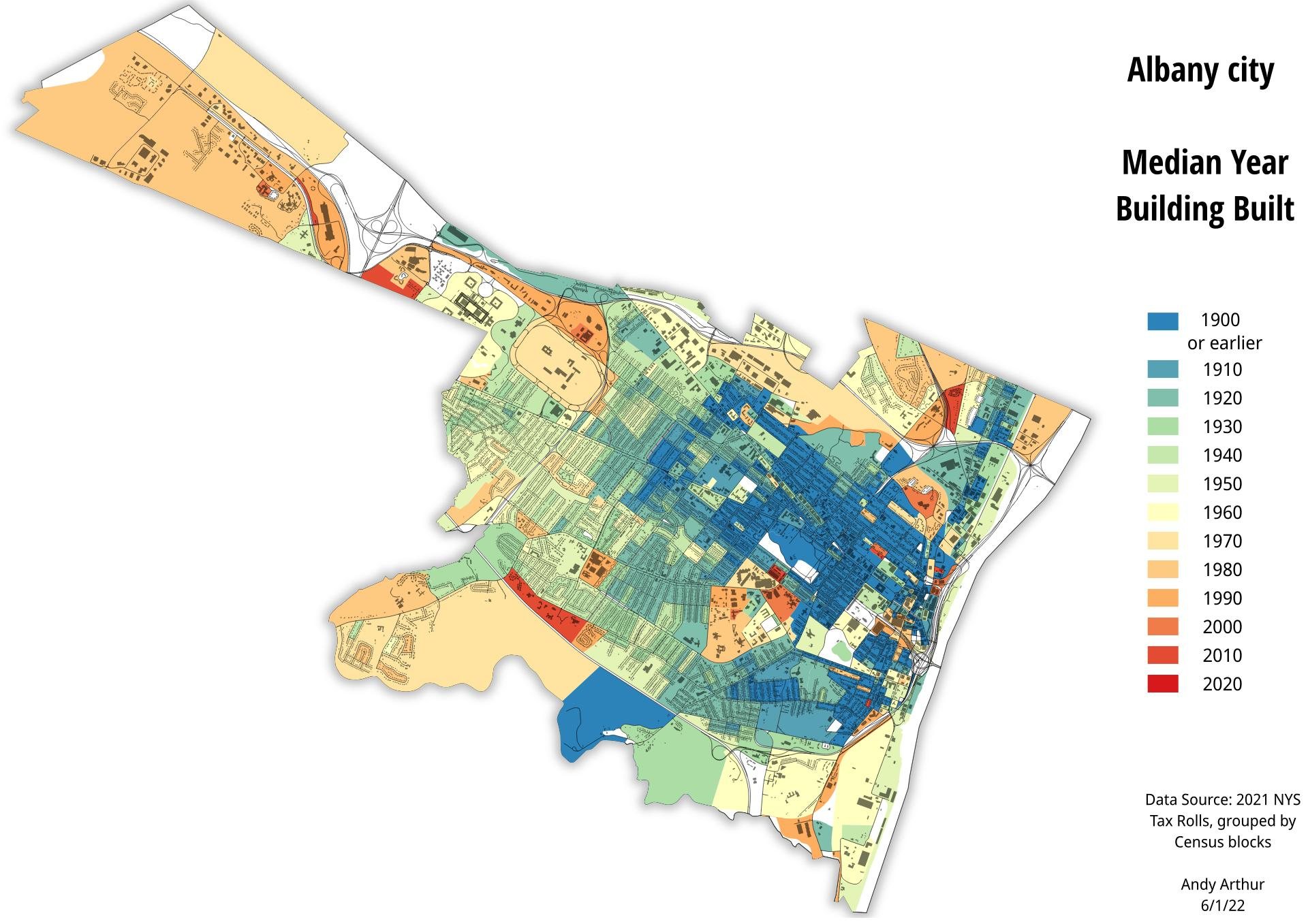
And of course, the old stand-by hardcopy product. Here, a recently created thematic map of the City of Albany median year of housing construction map. He used the NYS Tax Parcel Centroid Points data aggregated down to the parcel level using R code and created a GeoPackage. Which was then used to create the map in QGIS. Additional layers were added for context.

There are many many more examples of geospatial products, maps, and viewers on the website.  Its a great example of how much can come out of the other end when diving into and applying geospatial tools to one’s own personal interests and way of living. 

When you have a few minutes over lunch or a cup of coffee, take a look at his site.  In communicating with Andy over the course of putting this piece together, he would be open to talking with and assisting non-profit or similar community groups on specific GIS/mapping projects.  His contact information is below. 

Contact:

Andy Arthur
www.andyarthur.org
andy@andyarthur.org

10 Questions: Neil Curri

Geospatial technologies are found in so many organizations and on so many levels.
What once was a fledging technology based on desktop client software now
encompasses web technology, mobile and handhelds, increasingly the engineering
software toolbox, and hordes of geospatial data of all types and quality. And yes, the
ageless desktop clients lives on. It’s not often to find someone who is able to navigate
the many pieces of the technology for multiple organizations.

Neil Curri, who lives in the mid-Hudson River Valley community of Lloyd, is involved in a
wide range of geospatial efforts encompassing a diverse number of organizations over
the past several years. While technically currently employed by Partridge Venture
Engineering, Neil also serves as a GIS Academic Computing Consultant at Vassar
College in Poughkeepsie and has served in local government geospatial efforts as well
as the Dutchess County Cornell Cooperative Extension.  We recently communicated to discuss his past and current GIS contributions to the profession.

eSpatiallyNewYork: Let’s go back to the beginning – when and how did you get started
with geospatial technology?

Curri: After working in IT for a few years after college, I decided to go back to school to
refocus my career on something in the environmental field. GIS seemed a logical fit. I
found an Environmental Science M.S. program that also offered a GIS certificate at the
University of New Haven. The summer before I went back to school, I got a hold of a
copy of ArcView 3.2 and made a couple of maps and a website for a local watershed
group. The environmental applications were obvious.

eSpatiallyNewYork: In your capacity at Partridge Venture Engineering (PVE), what kind
of GIS applications or tools do you use?

Curri: Mostly ArcGIS Pro (and ArcMap for legacy projects – still transitioning…), some
GPS, and some limited drone work. We’ve used ArcGIS Online for a handful of projects
where a web mapping application was an appropriate deliverable for the project and
client. I’ve had to build a couple of small databases to organize environmental data
streamlined for mapping. My position is within the company’s Environmental division,
and there’s a need for map figures in every phase of a project – most of our work is site investigation and remediation. Mapping-grade GPS provides enough accuracy for ourpurposes, but we do use differential GPS and post-processing to get the best accuracy we can with our hardware. We’ll collect drone photos when existing aerials are
insufficient or outdated. I’ll either georeference them for any site figures we need, or
occasionally I’ll set up a flight plan and use drone mapping software to get a composite
aerial of a large area or use the 3D capability to estimate soil stockpile volumes or
excavation pit volumes.

eSpatiallyNewYork: You are the GIS Lab Manager at Vassar College. What does this
involve and some of your duties

Curri: My official title at Vassar is GIS Academic Computing Consultant. Duties include
mainly instructional support – advising faculty, staff, and students interested or engaged
in using GIS for teaching and research. For example, students in a Geomorphology
course were recently working on a GIS lab exercise that involves mapping changes in
glacial lake levels and creating an elevation profile to get channel dimensions and
calculate flow volume. This lab is one of several exercises for the course that were
originally written for ArcMap, which I migrated to ArcGIS Pro. I also work with the
college’s IT department staff to maintain GIS hardware, software, and licensing. CIS are
technically the “lab managers”, but we work together to keep things running and provide
capacity as GIS use grows on campus. With an enrollment of about 2,400 students,
Vassar is a small college. But GIS use is reaching the point where I think the
administration will expand licensing campus-wide for the next academic year, which will
significantly reduce the time I spend managing ArcGIS Online accounts.

eSpatiallyNewYork: Any particular area students seem to be most interested in in
applying GIS technology and concepts?

Curri: While the two core GIS courses – Cartography and Spatial Analysis (I
occasionally adjunct instruct either of these) – are taught out of the Geography and
Earth Science department, many students who take the course are Urban Studies
majors, who are very interested in social justice issues. But there are also many
Environmental Studies students who take the courses, and they tend to be interested in
ecological research and conservation. Neither of these courses (nor both of them
together) necessarily prepare students for a career in GIS, but students who take these
courses are sought after by faculty and staff for research and other projects (like the
Poughkeepsie Natural Resource Inventory or research projects at the Collins Field
Station on Vassar Farm) and they are more likely the ones who will pursue GIS as a
career and/or go on to graduate school to study GIS or a GIS-related field.

eSpatiallyNewYork: Tell us something about Vassar GIS students/grads,
YouthMappers, and Society for Conversation GIS

Curri: Hudson Valley Mappers is the Vassar-based chapter of YouthMappers, an
international organization supported by USAID. Two former students, one of whom now
works for USAID supporting YouthMappers, began the chapter in the Fall of 2018.
Students involved in HV Mappers are passionate about using GIS as a resource for
communities, both locally and around the world. The group coordinates local community
mapping events, usually involving some field data collection and partnering with one or
more local organizations, as well as organizing mapathons in which students participate
in Humanitarian OpenStreetMap Team (HOT) mapping projects

eSpatiallyNewYork: What was your geospatial roll and contribution with the City of
Poughkeepsie Natural Resource Inventory?

Curri: I mentored several student workers who assembled the maps created for the
report and online content and I ended up editing some sections of the report with Jen
Rubbo, Director of the Environmental, who led the project. Part of the it involved
inventorying and inspecting Ash trees for impacts by Emerald Ash Borer. I worked with
students and staff using previous tree inventory data by the City’s Shade Tree
Commission as the starting point, set up an ArcGIS Collector project for the field data
collection, and helped organize the information into a public-facing web map. That data
was used by the City to identify trees that presented a potential hazard and remove
them. There’s a short video describing that part of the project on the City’s website.

eSpatiallyNewYork: You worked at Dutchess County Cornell Cooperative Extension
between 2007-2015. What is your involvement there today?

Curri: I was recently asked to serve on an advisory committee for Dutchess County Cornell Cooperative Extension’s pending update of the County’s Natural Resource
Inventory. I worked on the last revision several years ago while at CCEDC, which was
an update of the previous version conducted in 1985 by the County’s Environmental
Management Council. A former intern and a volunteer I mentored there both went on to
graduate school and made careers for themselves in GIS – one is now with the NYS
GIS Program Office and the other is on staff at CCEDC.

eSpatiallyNewYork: You currently serve as Chair of the Town of Lloyd Environmental
Conservation Committee. What’s your sense of the understanding and acceptance of
GIS concepts by citizen and community groups at this level in the Hudson River Valley?

Curri: Though I may not be totally sure, but I think most citizen and community groups
in the Hudson Valley – at least any that have an interest in environmental conservation,
planning, or community development, or anyone volunteering for a town committee or
board – have some sense of what GIS is and that it has value. But there is a lack of
capacity available to citizen and community groups, and consultants like me cost
money, and budgets are limited, so I think exposure to GIS and understanding how it is
or could be useful to them is still limited. Lloyd is one of few towns in the Hudson Valley
with some in-house capability, which predates my involvement.

eSpatiallyNewYork: Some of your community outreach work and involvement has led
to having the DEC Hudson River Estuary Program support an intern on one of their
funded projects. Tell us about how that developed.

Curri: A former student should get some credit for this. While we were finishing up the
Poughkeepsie NRI, she was taking the web mapping class, which is a half-semester
class taught occasionally taught by Prof. Mary Ann Cunningham. Mary Ann connected
her with us, and for her class project the student published the NRI layers to ArcGIS
Online and assembled them in nested web apps to combine functionality. Volunteers
working on NRI’s in two other Hudson Valley towns, Union Vale and Gardiner, saw the
Poughkeepsie online map and wanted one of their own. Interested interns came forwardand used the Poughkeepsie NRI map as a template to assemble those. Based on thesuccess of these, the DEC Hudson River Estuary Program then contacted me to inquireabout assembling maps for the Town of Gardiner’s Community Preservation Plan
(CPP). We found an interested student but it ended up being more simple for PVE to
assume the contract and hire the student. He and I are working on this project now.

eSpatiallyNewYork: What’s been your involvement in statewide GIS activities?

Curri: I’ve been a member of the NYS GIS Association for a few years, but not very
active.I used to attend NEARC regularly before my partner and I started a family five years ago. About two or three years ago, some folks from a few land trusts in the
Hudson Valley started up a local chapter of the Society for Conservation GIS. I have
missed only one or two of these meetings since then. It’s a great group of people and I’dlike to be more involved – after this semester is over!

eSpatiallyNewYork: Have a particular GIS project you worked on or produced that
would like to highlight or brag about just a bit?

I think I’ve already done some of that here, but I’ll mention getting to work with Vassar
Professor Emeritus Dan Peck on the maps for his book, Thomas Cole’s Refrain.

There’s some work for litigation projects at PVE I’d like to highlight but not permitted top
do so. Most of my projects I don’t really consider “produced” by me, as I am often
working with a subject matter expert, a geologist, a professor, or enthusiastic student, a
client, or community partner who’s more or less guiding the project, and I’m just figuring
out what geospatial product or tool fits their needs.

Contact:

Neil Curri, GISP
GIS Analyst, PVE, LLC
Vassar College Academic Computing Consultant
necurri@vassar.edu | 845-437-7708 | 845-664-2100 (mobile)

Mapping a New Economy for Equality and Sustainability

New York City nonprofit uses GIS to help support cooperative and community-led development projects as well as advocacy campaigns

Introduction

Nonprofits are one of my favorite areas to cover in the geospatial space.  More than not their geospatial efforts operating on a shoestring budget, relying mostly on filtering through open data portals and mashing everything together to create visual products with open source software or via discounted vendor supported nonprofit software licensing agreements. Its not uncommon to find the person(s) doing spatial analysis and map making having been self-taught.  A lot gets done with a little.

One such organization is the New Economy Project (NEP) located in New York City.  NEP works with community groups to build a new economy that works for all, based on principles of cooperation, democracy, equity, racial justice, and ecological sustainability.  Their focused campaigns are carried out in concert with community, labor, civil rights and social justice groups on initiatives such as:

  • Public Bank NYC, a municipal public bank campaign rooted in economic and racial justice. Through public banking, NYC can divest from Wall Street banks, reinvest public deposits to support equitable and cooperative development.  
  • Advancing Community Land Trusts, through co-leadership of the NYC Community Land Initiative (NYCCLI) and one-on-one work with community groups seeking to organize community land trusts. 
  • Advancing NYS Community Equity Agenda, calling for transformation of the fundamentally unjust social, political and economic systems. The Equity Agenda puts racial and economic justice front and center and addresses long-standing inequities that play out at neighborhood and regional levels. 
  • Growing NYC’s Cooperative Economy through coalition-building and policy change that supports and brings together community land trusts; worker, housing, financial and food co-ops; and other models of cooperative, community-led development.

GIS and Mapping

Behind all of the mapping at the New Economy Project is Ben Hagen who currently serves as Senior Research and Communications Associate.  “As much of our work focuses financial services, a considerable amount of our data comes from the Federal Deposit Insurance Corporation (FDIC)” Ben notes, “and more specifically from the Summary of Deposits section.”   Ben does all of his mapping and data analysis with ArcMap having learned the craft as part of his graduate work in Urban Planning at New York University.  Other data sources frequently used by NEP include the U.S.Census Bureau, New York State Department of Financial ServicesNew York State Office of Court Administration, and NYC OpenData. 

NEP uses use ESRI’s World Geocoding Service to support most of its address mapping though in the past had also used the city’s LION file. In addition to ArcGIS, the main other data-related software NEP uses is open source software R for cleaning data, especially when preparinfor for mapping. Hagen likes R software because it runs on text-based code and is great for replicating processes with minimal opportunities for introducing errors, as well as for easily sharing with others for a second look at methodology.  

Samples of NEP mapping products include (click image for map download).

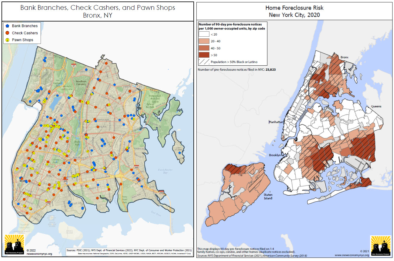
(Left Image): Bank branches are not distributed and made accessible evenly across the city.  This map depict the relative absence of bank branches in  the Bronx, and the resulting concentration of high-cost alternatives such as check cashers and pawn shops. This is a series of maps that NEP updates every year covering most (if not all) of the city’s neighborhoods.  (Right Image): NEP creates maps showing the concentration of residential foreclosure risk in NYC communities of color. This uses data from the NYS Dept. of Financial Services, based on notices that mortgage servicers are required to send to delinquent borrowers 90 days before initiating a foreclosure action. While not all of these notices result in an eventual foreclosure, it provides a good indication of where the risk of home foreclosure is highest in the city.

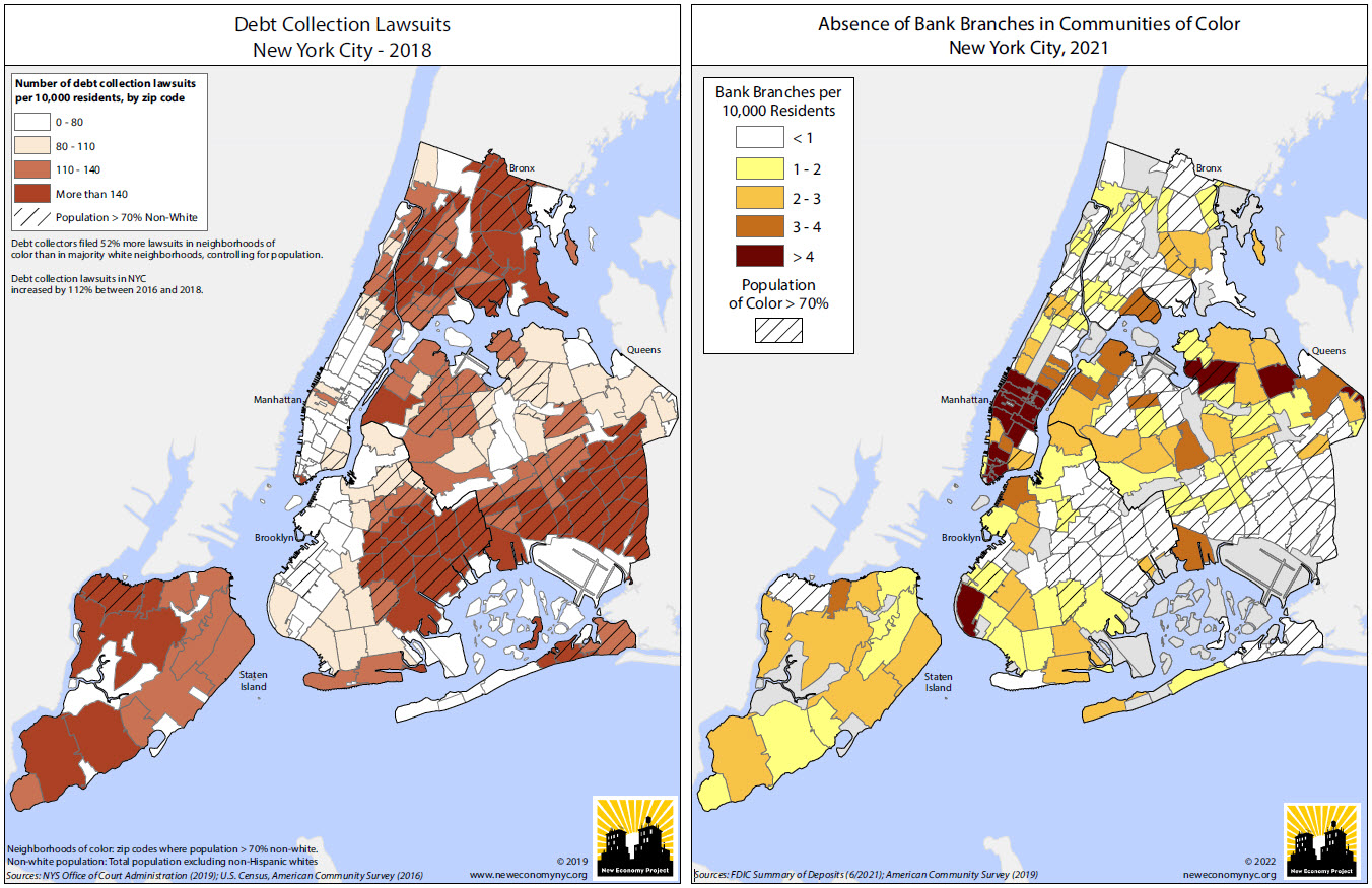
(Left Image): Using data from the NYS Office of Court Administration, this NEP map highlights the concentration of debt collection lawsuits in communities of color and is included in this report prepared for AARP New York.  For additional maps, graphics and YouTube videos on this project visit this web page.  (Right Image):  Another map showing the relative absence of bank branches in NYC’s communities of color. Looking at this annually, one can see changes as gentrifying neighborhoods gain branches, but the overall pattern is a long-standing and remarkably stable one. There are actually six zip codes in the city, ranging in population from about 20,000 to 94,000 and all in communities of color, that have no bank branches at all.

Other examples of NEP research and mapping products can be viewed here.

Summary:

The concept of “place” has always been at the core of how we approach our work” notes Hagen.  “In NYC, people feel very connected to their neighborhoods, and are acutely aware of how much the communities they call home shape their day-to-day lives. There’s no better way than maps to relate to people’s experience of their physical environment, and to help contextualize those environments within the larger, systemic frameworks that we are so often fighting to change.

Clearly, GIS is both an important business and commuication tool for NEP.

Contact:

Ben Hagen
Senior Research and Communications Associate
New Economy Project
121 W. 27th Street #804 | NY, NY 10001
212.680.5100, ext. 221 | neweconomynyc.org


NYC H2O: Advocating Cleaner Water through StoryMaps

NYC-based nonprofit has developed extensive portfolio of educational products for all ages and settings

StoryMaps are such a great communication tool.  Turning geographic and location-based features and concepts into an easy-to-understand medium for the much broader audience which help identify key community resources, assets and experiences that can inform planning and policy-making.  By combining narrative text and other multimedia content with Geographic Information System (GIS) maps and data, story maps serve as an effective means of helping residents and developers visualize and understand projects with greater clarity.  Increasingly becoming an art form unto itself.  Broadly and increasingly used across the geospatial spectrum from the industry-leading ESRI StoryMaps platform  to say the least of the versions being offered by others in the geospatial space including Google Earth, CARTO, or Tableau

I’m sure its not the first time Story Map subject matter has found its way to be included in a more technical oriented conference, but I was nonetheless interested, if not surprised, to see a presentation by NYC H2O at the recent the September 9th New York City Watershed Science and Technical Conference.   A conference historically the home for geospatial-based technical and scientific presentations by engineers, biologists, and others in the water science disciplines, NYC H2O’s presentation was entitled Engaging an Urban Population With Water Engineering Utilizing a Virtual GIS Platform in the Pandemic Era”.

Having received its nonprofit 501(c)(3) designation in May, 2012, such work is not new to NYC H2O as it has built a niche in the environmental education space using the Story Map platform as its primary teaching and outreach tool. Story Maps augment and support their mission to “inspire and educate New Yorkers of all ages to learn about, enjoy and protect their city’s local water ecology.  Since 2009, NYC H2O has offered over 120 educational programs focused on NYC’s water system and ecology to a combined audience of 4,000 people.  Their StoryMaps often incorporate  digitized historic maps, photographs, videos, and social narratives to tell the story of waterrelated  infrastructure.

A couple of NYC H20’s StoryMaps in the water sciences and environmental space include:

Water Systems Overview

I’ve often heard the New York City aqueduct system referred to as the “eight wonder of the world”.   Maybe not as sexy and visible as the Great Pyramid but an incredible engineering marvel nonetheless.  Conceived, designed and built in another era to support the drinking water lifeline of the city

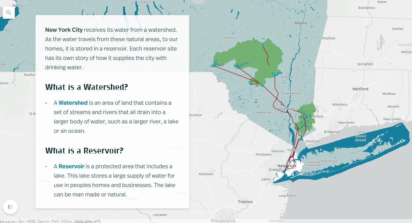
NYC receives 90% of its water from the Delaware and Catskill Watersheds. Aqueducts (red line work) transports the fresh water from a series of reservoirs in the Catskill Mountains over 100-miles from the city.

Fitting that the first StoryMap posted by NYC H2O on their “Hub” website is entitled  Water Systems Overview outlining and showing the many geographies of the system which originates in the Catskills Region.  An interactive StoryMap highlighting the major aqueduct systems (Catskill and Delaware – named for the watersheds where the water is collected), as well as the individual reservoirs both upstate and those in the city.  Household water consumption stats are also included in the StoryMap as well as several interactive learning activities as illustrated in the application toolbar below.  Included in the Site Specific Lessons is a StoryMap just for High Bridge and the Jerome Park Reservoir.

Sewer System and Stormwater Management

This StoryMap, focusing on the relationship between storm water and sanitary sewage, and its overall impact on water quality in the metropolitan region has lots more maps and associated data.

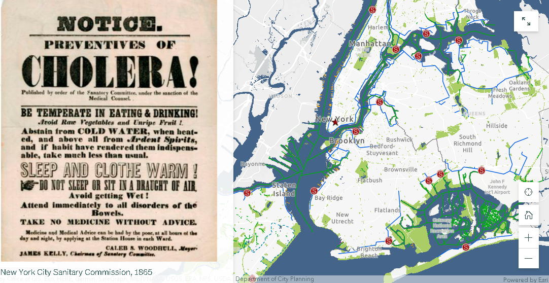
Beginning in 1850, NYC laid 70 miles of sewers, or underground pipes that carried away wastewater.   Today the city has over 7,400 miles of sewer pipes. These pipes move wastewater with the help of 95 pumping stations to 14 sewage treatment plants located in all five boroughs.  Each day, NYC wastewater treatment plants process, or “clean”, a total of 1.3 billion gallons of wastewater.   Produceing about 1,400 tons, or 60 truckloads, of biosolids!

The city maintains 14 sewage treatment plants covering the five boroughs. Treated sewage effluent is discharged into the Hudson and East Rivers and Long Island Sound.

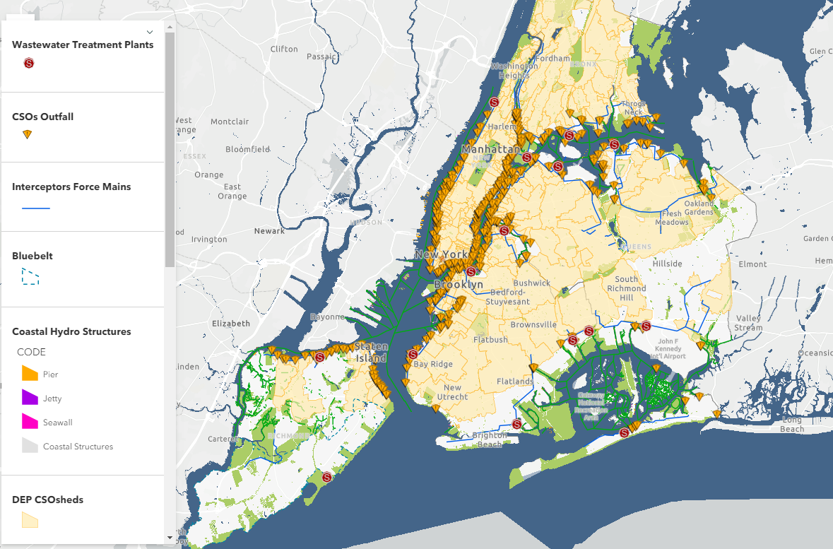
About 60% of New York City’s sewer system is a combined sewer system. This means that one single pipe carries both stormwater runoff AND sewage from city buildings.  During heavy rainstorms, combined sewers systems receive more stormwater runoff and sewage. Wastewater Treatment plants have a capacity, or a limit, to how much water they can clean. When there is more water than the capacity, a mix of stormwater and untreated sewage empties directly into the City’s surrounding waterways. These wet weather events are called combined sewer overflows (CSOs).

The presence of combined sewers are still very prevalent in the metropolitan region with the majority emptying into the East River and the east side of the Hudson River.

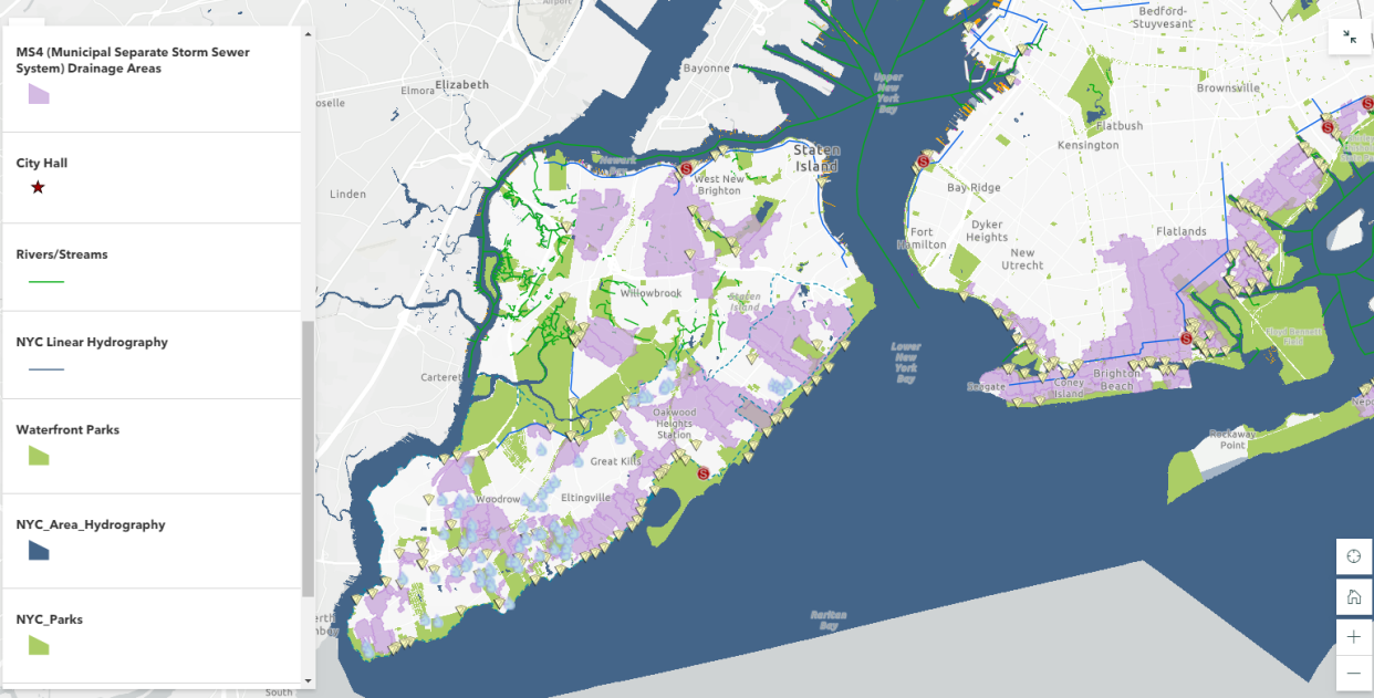
Also central to the long term management of clean water – are government regulated programs entitled Municipal Separate Storm Sewer System (MS4) programs.  In populated areas many neighborhoods, including in New York city, as well as industrial areas along coasts, have deployed MS4 programs.  A MS4 has one set of pipes that transports sewage to sewage treatment plants and another set of pipes that transports stormwater directly to local waterways.   Unfortunately, many pollutants (like oil, trash, pet waste, pesticides, and fertilizers from lawns) are washed into this system when it rains. MS4 helps solve one problem (CSOs and sewage in the local waterways) but causes a similar, although smaller, problem since trash and pollution can still enter the local waterways when it rains.

Currently, only about 40% of the NYC footprint is covered by an MS4.

As it relates to the collection of data for the purposes of monitoring citywide water quality, this StoryMap also includes interesting map displays of both fecal coliform (1985-2017) and dissolved oxygen (1909-2017) testing.

Summary:

It’s nice to see as part of such advocacy efforts the use of open data sets and geographic content as made available by government agencies and data portals.  Much of which is included in many of the 21 StoryMaps listed on the NYC H2O HUB.

StoryMaps allowed us to keep students engaged in learning about their local water issues throughout the challenges of the pandemic. The tool has been so popular with schools that this year we launched a curriculum introducing GIS and StoryMaps to several environmental science and environmental justice in high school classrooms”, notes Kevin Barrett who guides NYC H2O’s mapping instruction.

With regard to the September 9th New York City Watershed Science and Technical Conference, Stalin Espinal, School Program Manager for NYC H2O adds “The conference gave us the opportunity to share our work and programs to a community of our peers. We were delighted to have received such enthusiasm and interest in our work with GIS and StoryMaps.  Even resulting in a new StoryMap collaboration in partnership with the Watershed Agriculture Council (WAC) which works with local farms on and around the upstate New York City watershed to promote Best-Practices and make improvements that help protect the water quality of our drinking water.”

Contact:

Kevin Barnett
GIS Education/Project Manager
kevin@nych2o.org
www.nych2o.org

Hub2Hub: Sharing and Promoting the Geospatial Message

Publishing spatial data content has proven to be great outreach in terms of providing transparency and exposure for many government GIS programs – including here at Westchester County.  Increasingly much easier for geospatial organizations to do courtesy of powerful server technology allowing these same agencies to easily spin together data services based on common thematic features such as environmental, planimetric, business, demographics, cultural, parcels, and aerial photography to name only a few.  Though the data service environment is better understood and leveraged by a specific user community knowing what type of spatial content to look for, there remains even a larger community of geospatial users which navigate data portals to download just individual data sets.  Looking for that individual shapefile, KML, or .dwg file for their own individual project.

And even with all of this good geospatial content available, many publishing organizations – particularly government – struggle with building educational outreach programs for the larger GIS user community.  Tailored programs for users in community and advocacy groups, nonprofits, and even the business sector instructing how to effectively use and leverage our data.  Government GIS programs often do not have the resources or the business model to deliver these types of services outside of their organization.

Enter the emerging roll of “service” Hubs which specialize in leveraging government open data  in ways government programs normally cannot offer. Some are nonprofit in nature or affiliated with academic institutions.  Others, like OpenHub based in the lower Hudson Valley, is a for-profit venture.  The common theme among them is a window offering a wide range of engaging programs increasingly based on government data sets featuring hackathons, workshops and training programs,  application tools, and offering  business tech “round table-type” discussions.  While open source software such as OpenStreetMap, QGIS, Python, and R are commonly used to support their missions (and thus, the easy and affordable entry point for new users), one can see the use of ArcGIS Online and CARTO being offered as well.  Effectively expanding the use and understanding of geospatial concepts and bringing technology to the people.

Third Party “Hubs”

I’ve referenced and written before on the great work of BetaNYC serving in this space.  Particularly with regard to extending content of NYC OpenData  through their numerous programs including the flagship NYC School of Data conference.  While New York City does an incredible job in promoting and maintaining city government’s open data catalog itself, BetaNYC extends the effort by building an entire framework of putting the data into the hands of residents on the streets.

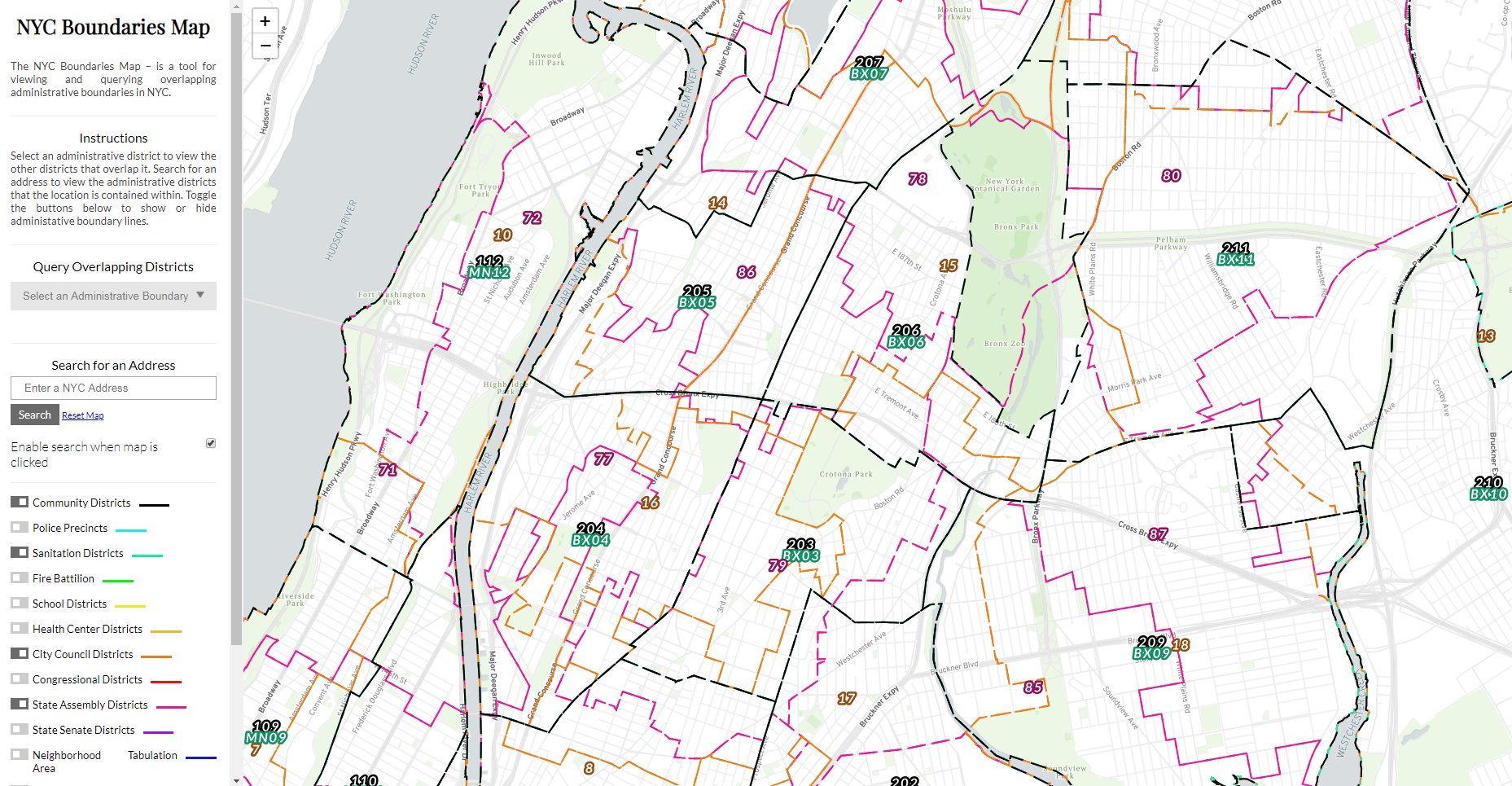
This BetaNYC viewing applications enables user to navigate the numerous political, administrative, and operational districts across New York City

Early in this space in the metro NYC area was the work of Steve Romalewski who started providing mapping services to the nonprofit sector as part of the Community Mapping Assistance Project (CMAP) which at the time was affiliated with New York Public Interest Research Group (NYPIRG).  Since 2006 he has been affiliated with the CUNY Mapping Service as part of the Center for Urban Research, Graduate Center at City University of New York (CUNY).

The Long Island Index was an early and very visible project that the CUNY Mapping helped create.  Another effort affiliated with the Center is the NYC Labor Market Information Service uses federal business and labor data sets.  Be sure to check out their Career Maps infographics and reports.  Similar academic efforts in the city exist at the Spatial Analysis and Visualization Initiative (SAVI) at Pratt Institute and the Center for Spatial Research at Columbia University.

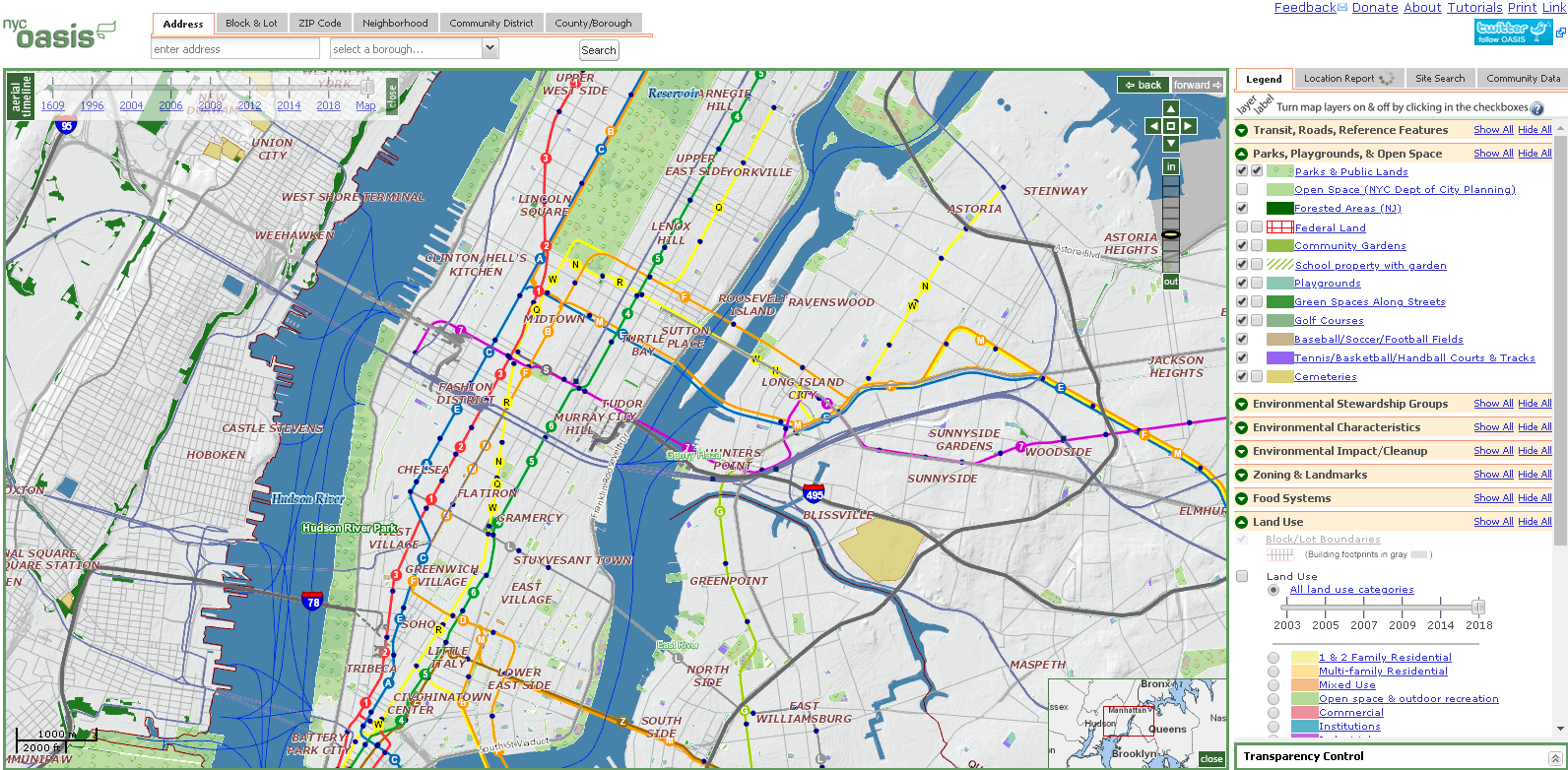
Though originally developed at CMAP, the CUNY Mapping Service now hosts OASIS which is one of the most comprehensive mapping and viewing application covering the New York City footprint. Dozens of government generated datasets are made available in the viewer.

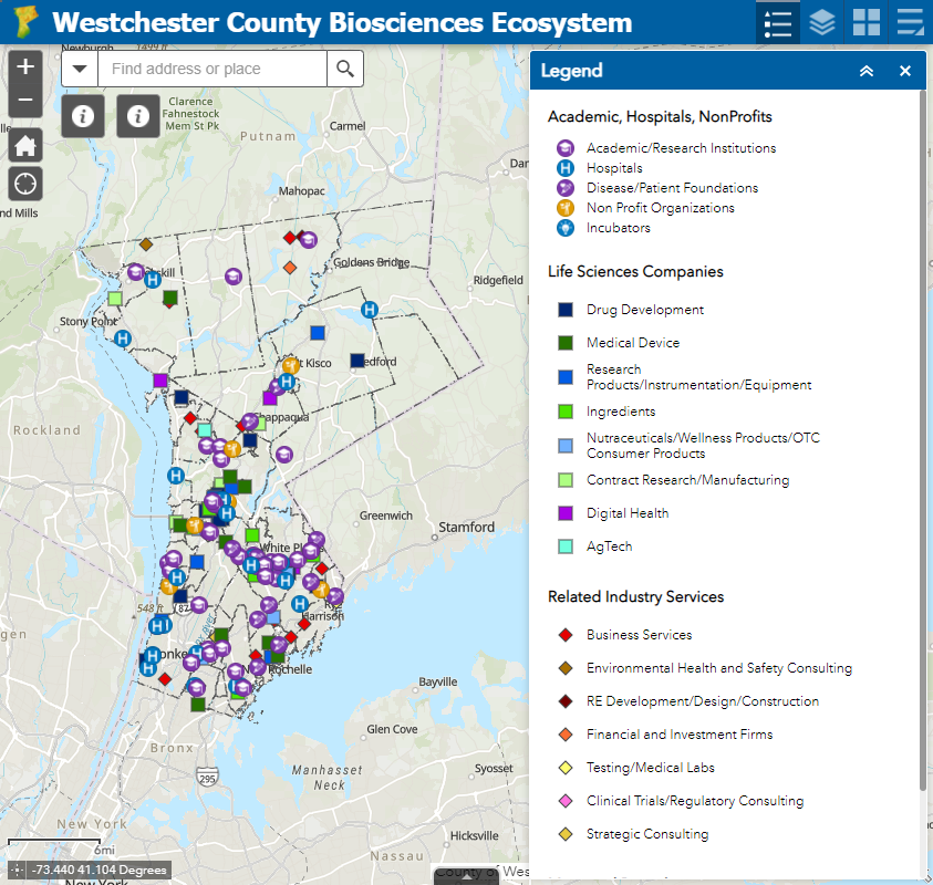
While the OpenHub is only beginning to jump into the geospatial space, its Founder Yulia Ovchinnikova will be highlighting the Westchester County GeoHub as part of the 2021 HV TechFest Conference as an example of open government and open-source data sharing to promote building communities. OpenHub will also be using content from the county’s GeoHub as part of a course project during a current online Data Analytics Bootcamp.  As regional technology and economic development is an important focus to OpenHub’s mission and purpose, our discussion started by focusing on a new web map being published which highlights the emerging BioSciences Ecosystem community in Westchester County.  The County is home to the largest biosciences cluster in New York State, boasting 8,000 jobs and 20 percent of the State’s total biosciences employment. The cluster comprises academic institutes doing basic research, R&D and clinical stage startups, large manufacturers and supply chain participants. OpenHub offers a mixture of both free and fee-based online programs including coding clubs, meetups, programming, and specific events for small businesses and startups. OpenHub is an open ecosystem resource center committed to building a tech-sector in the Hudson Valley and beyond

Government open data and economic development. BioScience business location X,Ys are available for download via ArcGIS Online.

MANY organizations leverage government generated geospatial data to support their own business needs and/or to champion a host of civic needs and issues.  In just one area, such as environmental justice (EJ), a Google search located a document published by the SeaGrant program at SUNY Stony Brook which identifies the numerous individual agencies (largely government and nonprofit) engaged in providing “Environmental Justice Mapping Tools for New York State Communities”.   Child care, social services, public safety, public transportation, sustainability, climate change, and civic issues only scratch the surface of the spaces where advocacy groups are involved in using government geospatial content for the larger public good.

Summary

What differentiates the groups itemized above are that they are more full service, a la carte organizations offering a wider range of products and services.  Staffing and resources to turn government data content into meaningful deliverables such as workshops (online and in-person), hackathon-type events, community events,  training courses, and even bringing the data to civic leaders and administrators in ways which is simply not possible by government publishing agencies.  Such outreach is often very targeted making the data more meaningful and ending up in the hands of those who understand its content the most.  Viewing and using the data at the “micro” as opposed to the “macro” or a larger geographic footprint.  Local is better.

While technically not all “hubs” in name, these groups continue to illustrate the growing benefit of how organizations are adding value and exposure to the government data assets.  In many scenarios, building partnerships with these types of service organizations can be of great value to government publishing agencies.


Green Map 2020: Evolving with Technology and Staying Community Focused

For nearly 30 years, Green Map has been an anchor in the Metro NYC nonprofit mapping community.  Led by its original founder, Wendy Brawer, Green Map’s portfolio of work and advocacy in locally-led mapping and sustainability efforts is quite impressive.  Since the launch of the Green Map System by Wendy Brawer in 1995 and publication of the original Green Map of NYC through her eco-design company, the program’s engagement tools and mapping resources have been adapted by locally-led projects in 65 countries.   Many joined the Green Map network when Greenhouse – their first content-managed website – was activated in 2007.   The site grew to become a rich resource highlighting community developed mapping work in all parts of the world.

While “green” mapping was one of its early defining products and focus,  the organization has expanded its services to include interactive web mapping, education, multimedia, event coordination, workshops, tours, planning and consulting, and creating software development tools.


Community Engagement Maps and Tools

Green Map’s award-winning icons, tools, platform(s) and tutorials help create engaging and visually powerful mapping content used as guides for local nature, culture, community living, social justice and resources for sustainable living. In addition to providing tools and tutorials on making maps, Green Map promotes their mapping efforts as part of Project Stories.  Project Stories are locally written and use tags to categorize the story type, theme, and purpose. Users can  discover how Green Map projects were created, people and organizations involved and about the project’s impact on their community.   Green Map projects are tagged and can be searched as part of the following 11 categories:

Besides its own mapping platform (with version 2 of the Open Green Map now in beta), the program also offers suggestions and tutorials on how to promote the use of the Green Map icons in other interactive mapping platforms such as ArcGIS Online (Story Maps), CARTO, Google Maps, Google Earth, and the Map of Tomorrow.

Continue reading

COVID Era Geospatial Applications to Support Empire State Communities

Here in southeastern New York State, it’s amazing how fast the COVID wave came and went. At first, mid-March to mid-May seemed like an eternity, but now, not so much.  I likened the preparation for COVID to preparing for Super Storm Sandy.  Albeit phenomenally different, the buildup and the anxiety of waiting for it to show up.  Peering out the windows to see the outcome of a completely different kind of damage and suffering  altogether.  Physical and psychological.  Now July, it seems and feels like we can see the first wave of the pandemic in the rear view mirror.  But then as we refocus on the road in front of us, we know there are speed bumps ahead of us.  Not if, but when.

There were a plethora of interesting and meaningful geospatial viewers created across the state during the mid-March to mid-May time frame.  Most included highlighting COVID case numbers by larger units of geography (municipal or zip code boundaries),  generalized heat or pattern maps, impacts to businesses and institutions, as well as  information on hotlines and sources of assistance.  However, its pretty well documented the geospatial community across the state has struggled with being part of providing detailed spatial analysis or mapping support functions at the address level.   Or for that matter, even being asked to participate in this regard.

Personal health related data is uber protected with its use regulated and governed by the Health Insurance Portability and Accountability Act (HIPPA).  HIPPA  regulations reign supreme and contributed to a lesser involvement of GIS analysts in  providing geospatial content, metrics and analytics during the pandemic.  There is also the unspoken reluctance on the part of the public health community to release data sets  which might be difficult to understand or easily misinterpreted by the general public.  Department of Health  professionals often cautious to release data – particularly in new instances such as the COVID pandemic – and leaving analysis/interpretation  to internal professional staff only.  Ultimately though,  releasing some flavor of the data but in a more generalized context.

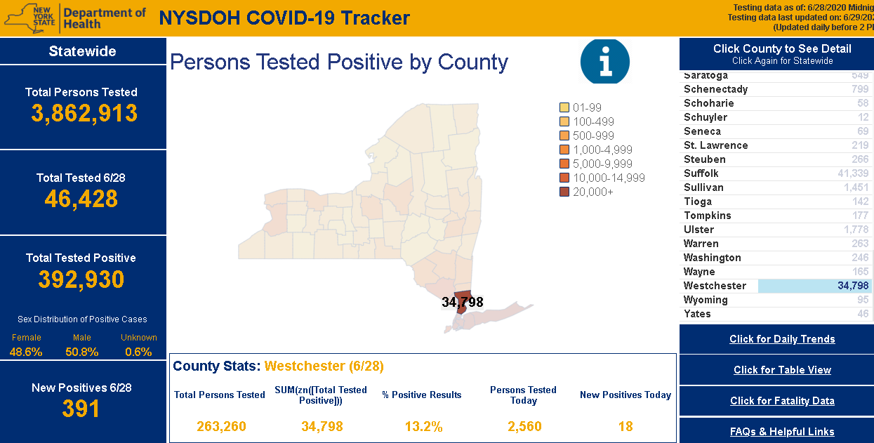
NYS Department of Health (DOH)  COVID-19 reporting has improved dramatically since the pandemic appeared in March.  Though while numbers  are made available only on a county basis, users can access and visualize the data in a variety of ways.  Reporting and posting of the data has become much more timely.  DOH is also now publishing a regional “Early Warning Monitoring Dashboard“.

Continue reading

Mobility for All Abilities Hackathon

While I personally did not attend the September 21st Mobility for All Abilities Hackathon at the  Brooklyn Army Terminal, I had originally intended to put together a short summary article to post on the day’s events and activities after gathering information from BetaNYC staff.  But instead, check out BetaNYC’s own detailed summary here – its quite good.

The event coincided with the 2019 National Day of Civic Hacking and was co-hosted by by BetaNYC and MakerSpace NYC which partnered with  NYC Department of Transportation, NYC Mayor’s Office of People with Disabilities, NYC Mayor’s Office of Data Analytics, and other organizations to setup eight challenges for a day-long map-a-thon and civic hacking to improve mobility equity in New York City.  Incredible results!

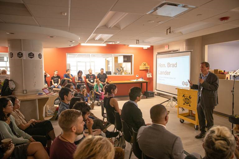
New York City Council Member Brad Lander provided opening remarks at the Mobility for All Abilities Hackathon. Photograph by Charlie Hartwell / CC BY

I’ve written about BetaNYC before and they have presented at the Westchester GIS User Group meeting in the past. They fill a much needed and recognized space in metro NYC towards facilitating these types of technology/geospatial events which can serve as a model for similar civic focused programs across the state.

For more information on their programs and activities, visit the BetaNYC website.


The Geography of Homelessness

Background

The Institute for Children, Poverty, and Homelessness (ICPH) is a New York City-based policy research organization focused on family homelessness in New York City and throughout the United States.

Formerly known as the Institute for Children and Poverty, ICPH was founded in 1990 as federal and state governments looked for ways to address growing rates of family homelessness. Through the examination of empirical, quantifiable data, ICPH seeks to inform and enhance public policy related to homeless families, with an emphasis on the impact on children.  The New York City numbers are staggering with over 12,000 families—including 25,000 children—calling a city shelter their home.  A small city in itself.

And unfortunately, the experience of housing instability and homelessness in New York City’s neighborhoods goes far beyond what shelter numbers alone show. In school year (SY) 2015–16, City schools identified four times as many homeless students as there were children living in shelter, and the current structure of the City’s shelter system is ill-equipped to meet the long-term stability needs of homeless children and families living both in and outside of the City’s family shelters.

ICPH examines the demographics of this growing population, the challenges these families face in becoming self-sufficient, and the programs that are most effective in helping them transition out of homelessness in their reports, research-based books, and policy research commentary.   ICPH’s publications inform government officials, policymakers, other research organizations, advocates, academics, and service providers from across the metropolitan region to promote a robust, evidence-based dialogue.  Central to ICPH’s core work is the intersection of statistical analysis, data visualization, and mapping technologies resulting in a wide range of geospatial-related products and applications.

ICPH Geospatial

ICPH utilizes several mapping, desktop publishing, and statistical software packages in support of publishing online and hardcopy products.  While ICPH actively promotes the use of traditional interactive maps, the increasing use of hybrid products i.e.  maps/charts/tables/graphics (a.k.a. Inforgraphics) are widely used as part of delivering the organization’s message.   Inforgraphics are increasingly being used across the GIS community to provide graphic visual representations of information, data or knowledge intended to present information quickly and clearly.

Managing geospatial applications and development at ICPH is Bronx-native Kristen MacFarlane.  She arrived at ICPH in December 2016 after a stop at the New York Botanical Gardens.   She received her undergraduate degree in Natural Resources from Cornell University and her masters in Geographic Information Science (GISc) from CUNY Lehman College in the Bronx.  Kristen oversees an organizational geospatial tool box which includes a several software packages including Tableau and ESRI.  While most ICPH projects are NYC focused, the reach of the organization’s research and work covers other areas of the country as well.  Projects are funded by foundations, grants, and other contributions and initiated by ICPH professional staff and industry colleagues.  MacFarlane notes that data used in the studies is mostly gathered from open data portals or through Freedom of Information Law (FOIL) requests.  As a primer on her involvement with ICPH, see her November 17, 2017 GIS Day blog post GIS Day: Discovering Family Homelessness Through GIS.

ICPH Geospatial and Data Visualization Applications

Suspension Hubs Interactive Map

In New York City, there are 102 Suspension Hub schools serving nearly 3,500 homeless middle schoolers. These schools suspended more than 6.6% of their students overall in SY 2015–16—nearly three times the city’s rate of 2.5%—and their rate of suspension among homeless middle school students actually increased during the years since SY 2010–11. Understanding where Suspension Hubs are located represents an opportunity to offer these schools more support and resources so that they, too, can turn the tide like the 83% of other schools with declining suspension rates. The Suspension Hubs Interactive Map was developed in Tableau using data generated and analyzed with Stata.  Project data is from NYC Department of Education for SY 2015-2016.

In New York City, there are 102 suspension hub middle schools where students are disciplined at extremely high rates.

Interactive Map and Atlas of Student Homelessness

Unless current trends change, one in seven New York City public school students will be homeless during elementary school. More than 140,000 children attending New York City public schools have experienced homelessness within the past six years.  Visualizing the magnitude of this issue is the updated ICPH application New York City Interactive Map of Student Homelessness as well as On the Map:  The Atlas of Student Homelessness in New York City 2018.  Both products provide a wide range of  data to allow people from different fields to tailor and engage with data on student homelessness in a way that is meaningful to them and the unique needs of their organizations and locales in the city. The Atlas documentation is from Section 1 only of the report which is available for download from this link.  The August 2018 update is more similar to ones that ICPH presents as static publications.  The full report contains maps generated with the ArcGIS client which are exported for inclusion in online and hardcopy publications.  On a larger scale, ICPH created a similar interactive nationwide map – The United States of Homelessness – scale using data from the U.S. Department of Education.

This interactive map provides users with the ability to see what student homelessness looks like in every NYC neighborhood.

Neighborhood Look at Domestic Violence as a Driver of Homelessness in NYC

Family homelessness has many different causes and drivers. One of the more common drivers in NYC are families being pushed into homelessness because of experience with domestic violence. This map demonstrates the rates at which domestic violence is driving family homelessness in neighborhoods across NYC.

Percent of families with children eligible for shelter due to domestic violence by Community District July 2014 – December 2015. Data source: NYC Department of Homeless Services.

Food Insecurity & NYC’s Homeless Children

A household is considered food insecure if there is a lack of access to adequate, healthy food for all household members.    In NYC, students are eligible for free or reduced-price lunches  if their family income is 185% of the Federal Poverty Level or less. Other programs such as the federal Supplemental Nutrition Assistance Program (SNAP) provides food stamps or SNAP benefits to households with incomes 130% of the Federal Poverty Level or less, in addition to employment requirements.  This ICPH interactive map enables users to access localized data on school lunch programs, food insecurity by community district and SNAP benefits.  An excellent User Manual is provided as well.

Data sources for this interactive map include NYC Dept. of Education, Food Bank for NYC, Feeding American, Data2Go.nyc, and U.S. Census Bureau, 2012-2016 American Community Survey estimates.

Summary

While the core focus of ICPH’s research and advocacy continues to be in the New York City region, its work covers the entire United States.  Detailed homelessness related studies have been done in specific metropolitan areas.  Similar the nationwide scope of the United States of Homelessness study referenced above, ICPH released the Student Homelessness and Food Deserts interactive map during Hunger and Homelessness Awareness Week, November 12-16, 2018. Other student-focused homelessness studies have been conducted in California, Georgia, Seattle, and New Jersey.  A wide range of publications and reports compiled by ICPH staff and collaborating organizations focusing on homelessness-related topics such as education, health and well being, housing, and community issues can be accessed  by clicking on the image below and then using the Research tab to browse Reports and Interactive Data.

“Geospatial tools are essential for our organization as we work to give the public a clearer, more informed picture of what child and family homelessness looks like in their community and across the country,” said Kristen MacFarlane, Senior GIS Analyst at ICPH. “Homelessness is a national crisis but a local issue and the specific ways that homelessness varies between localities and even neighborhoods are important to understand in order to develop policy solutions for those experiencing it. GIS software helps ICPH convey the complexities and the scope of this growing crisis.”

Contact:

Kristen MacFarlane
Senior GIS Analyst
Institute for Children, Poverty, and Homelessness
36 Cooper Square, 2nd Floor
New York, New York  10003
KMacFarlane@icphusa.org