Focus on SUNY Campuses and NYS Correctional Facilities
In recent years I had a close college friend incarcerated in the New York State prison system and during this time I became interested in rehabilitation and re-entry programs offered to inmates. Particularly in context of encouraging and helping my friend to focus on a path which would lead him to a better space, a new beginning, and away from the dark past. My friend Bob (not his real name) actually became a shining example of what is possible in context of educational degrees and technical skills that are offered by the state as part of in-prison and reentry programs. The intent of both which are to help incarcerated individuals to a successful transition to personal and community life after being released. Bob became a minister while in prison and then was able to finish up his undergraduate degree and earn a Masters in social work from the City University of New York (CUNY) after his release. Unfortunately these personal educational accomplishments did not change the trajectory of his life as what ultimately followed after prison were years of living in transitional housing and homeless shelters. Never really able to rid himself of the many demons within that had haunted him most of his adult life. Bob died of a heroin overdose four years ago.
Not long after one of my last correspondences with Bob’s family, I came across Mapping the Landscape of Higher Education in New York State Prisons (February 2019) published by the Prisoner Reentry Institute (PRI) at the John Jay College of Criminal Justice in New York City. It’s a noteworthy report with plenty of content and includes an interesting reference which discusses the availability of educational opportunities for inmates which can depend, in part, on the geographic proximity between the locations of State University of New York (SUNY/CUNY) institutions and the statewide network of correctional facilities as administered by the New York State Department of Corrections and Community Supervision (DOCCS). While I was able to establish communication with staff at the PRI, I had hoped to establish more in-depth discussions with staff at the two state departments (SUNY and DOCCS) to further build the story of the campus-prison relationship. It is unfortunate that I did not as there is evidence of mapping products/software in the departments based on graphics in the report which includes a SUNY published interactive online viewer. These products illustrate the issue of geography as a potential factor in the delivery of educational services to the statewide inmate population.
Current Correctional Facilities Landscape
Per the image below, New York State maintains 52 correctional facilities in seven administrative regions across the state with approximately 46,000 individual under custody and another 35,855 parolees under supervision.
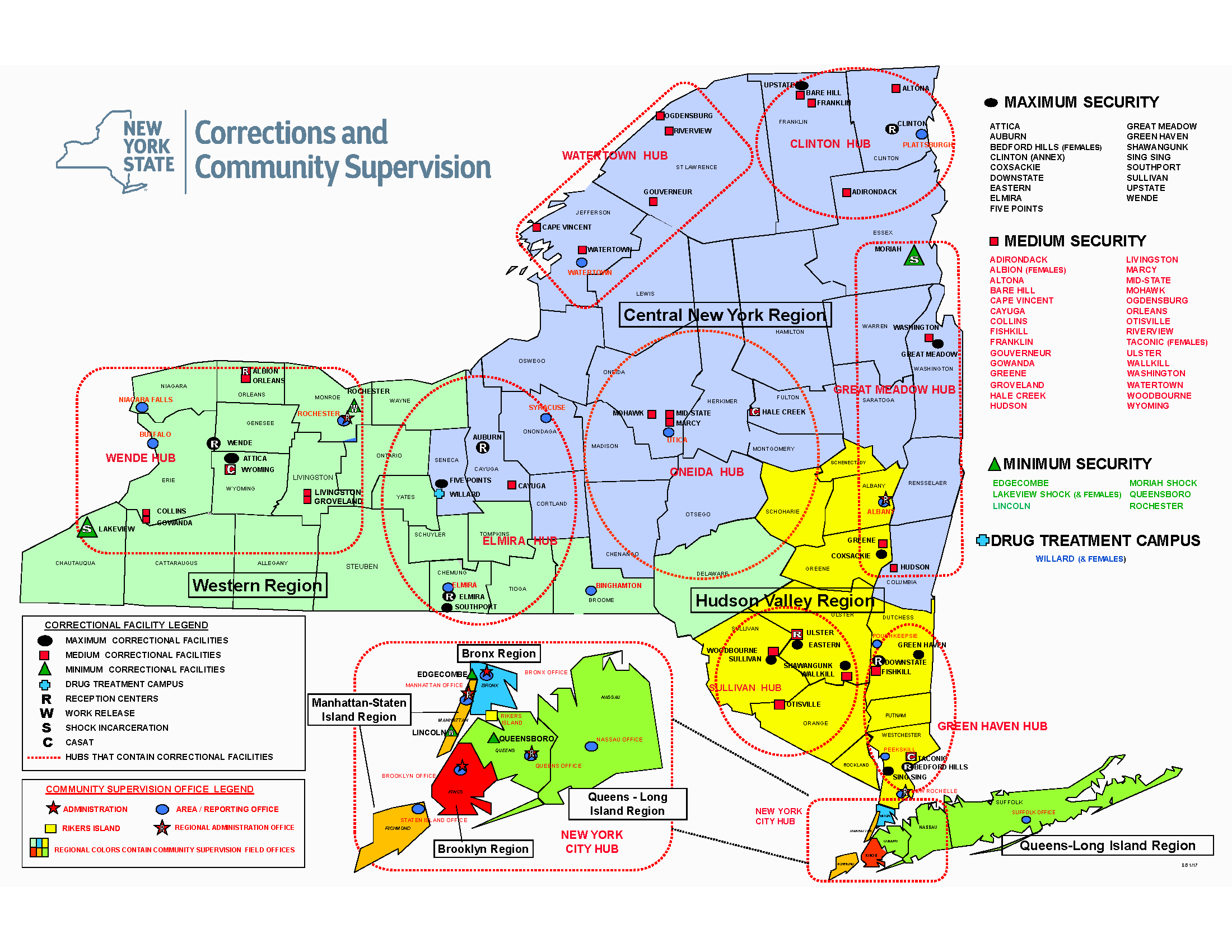
This map is better rendered by downloading the original PDF from DOCCS. Four of the seven administrative regions are in the metro NYC area.
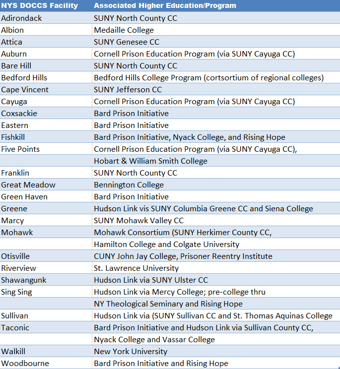
There are now 15 college programs involving over 30 institutions of higher education operating in 25 DOCCS facilities. The report looks into the two systems – higher education and corrections – that are seemingly distinct, yet come together to provide access to college education for incarcerated people. It looks at the challenges, including geography, in meshing these two systems and how both corrections and college staff can work to overcome problems.
Good News Bad News
While the good news is there is generally good geographic proximity between SUNY (including the New York City CUNY system) campuses and statewide correction facilities – particularly in southeastern NYS, there is considerable variation in the operation of college-in-prison programs, including different types of administrative and financial structures, faculty, and pathways to higher education post-incarceration. A detailed description of educational and academic opportunities for inmates is made available on this DOCCS webpage. Of the participating colleges, roughly two-thirds are private institutions and one-third belong to the public sector. Just over half of the maximum and medium security prisons in New York – 25 facilities – host some form of face-to-face college programming. Of the 54 DOCCS facilities, ten out of 16 male maximum security facilities and 12 out of 27 male medium security prisons house college programs. All three of the female prisons – two medium and one maximum – house college programs. The prisons with college education programs are shown in figure below (a clearer version of the map is found on page 27 of the report) and itemized in the following table.
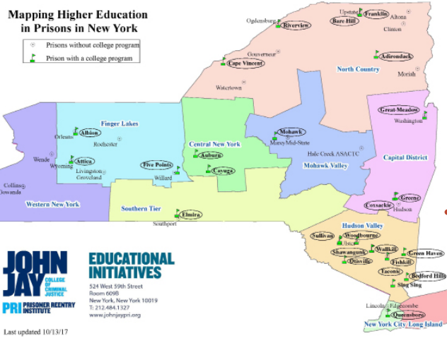
Most of the in-prison college programs are in southeastern New York State with less in the northern and western part of the state. A somewhat clearer version of this image can be downloaded from the report.
Most prisons with college programs are clustered in the Hudson Valley near the New York metropolitan area. The prisons without college programs tend to be further from New York City, likely a function of the fact that incarcerated people in downstate prisons (Bedford Hills and Sing Sing) were leaders in working with community groups and colleges from New York City and its immediate environment, as well as the ability of the colleges and non-profit organizations to generate funding and support for such programs. Moreover, the political environment of these communities was and remains more supportive of college-in-prison programs.
The PRI report (Include report name here) highlights how geography can play towards the delivery of educational services in the statewide correctional system albeit there are many other factors in play. Matt Bond, staff at PRI, reported that currently only about 3% of the 46,000 individuals incarcerated in Empire State prisons are able to take college classes. Geography certainly presents challenges to offering college classes in prisons, but there are numerous other challenges, including:
- Difficulty getting materials approved to bring into prisons,
- The lack of technology (particularly internet access) in prisons,
- Other demands on students’ time (such as working in order to purchase essential items from the prison commissary),
- The fact that incarcerated students can be transferred from one facility to another, which interferes with their educational progress,
- The need for sustained funding to maintain and expand college in prison programs,
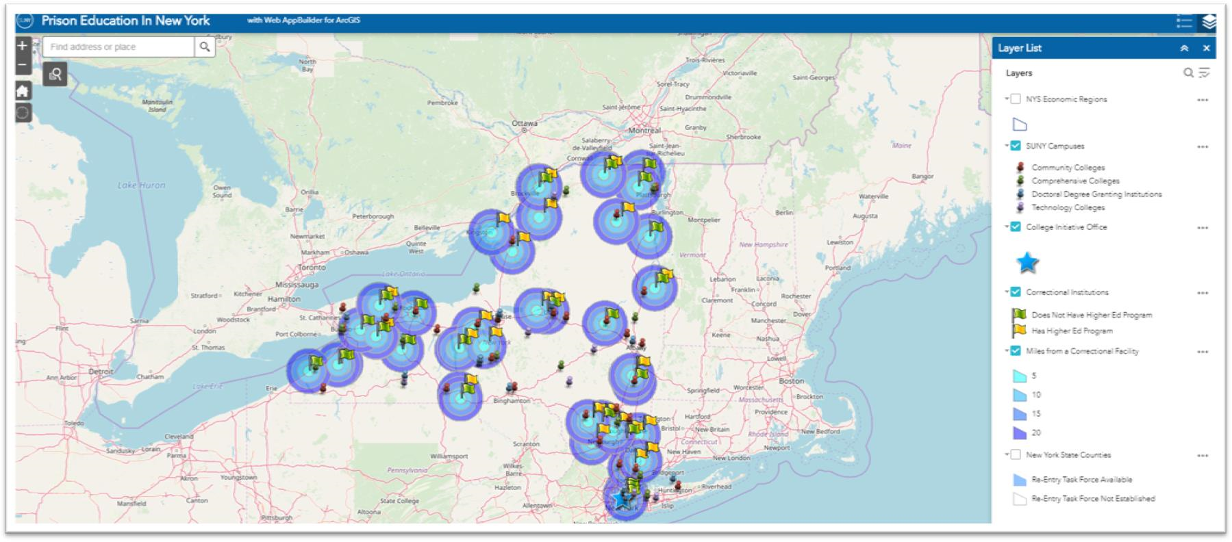
This interactive SUNY published viewer shows the locations of both SUNY/CUNY campuses and NYS Correctional facilities. Rather than clicking the Miles from Correctional Facility box (which makes the make very busy at large scales) simply click on a correctional facility to see the distance to the closest SUNY campus.
Even though both of the institutions in this scenario are state governed and administered, each are largely fixed/physically located assets which dictates how much the delivery of educational opportunities can change albeit there are increasingly more options of offering educational programs remotely. However, technology and internet capacity inside prisons available to inmates continues to be an issue.
But the fact remains today there are thousands of current inmates in the NYS correctional system in 2019 – male and female – who do not have access to the educational opportunities where geography does matter on some level. The PRI report did not provide a specific overview or comparison on the quantity/quality of educational programs in the 5, 10, 15, and 20 mile buffers around each of the correctional facilities which would have spoke more specifically to the geographic issue.
The Geography Factor in other Human Services
While the PRI report did not make reference to any significant “gaps” in the delivery of educational opportunities to inmates, the “gap” issue is becoming more of an issue (or reference) in context of delivering other important public services across the state. Such “gaps” are now being referred to as “deserts”. In New York State, it is not difficult to search for recent references to deserts in the areas of child care, maternity and mental health care, food deserts, and the struggles of rural hospitals disappearing across the U.S. landscape. Significant geographic rural areas of the Empire State are increasingly losing access to essential human services to which the reasons are many.
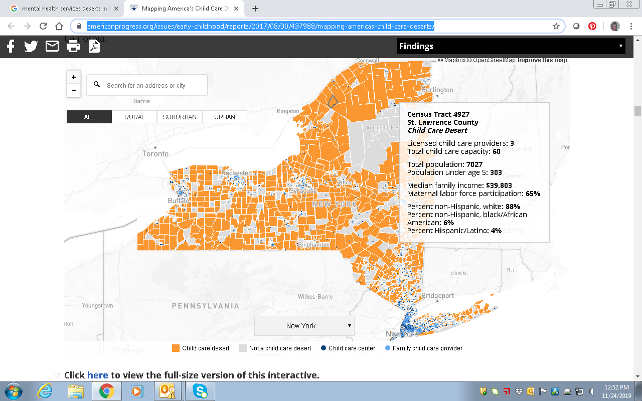
This image is a subset from the larger statewide map published in the article Mapping America’s Child Care Deserts. According to the report California and New York have the largest percentage of people living in child care deserts.
Geospatial technologies can play a central role in helping solve geography issues associated with growing number of health and human service delivery “deserts”. Route GIS-based optimization programs based population centers, road networks, geocoding, and other dependencies. Furthermore, identifying potential temporary or “pop-up” service center locations in areas of greatest need which constantly changing over time. A more mobile service delivery framework which can be leaner and more efficient. Avoiding the need to higher cost fixed and permanent facilities.
There is much that can be done to advance access to a wide range health and human services including educational options for those incarcerated in New York State correctional facilities. We are fortunate there is a strong geospatial technology foundation across the Empire State to build out these opportunities.
Like this:
Like Loading...

 Bergmann is a full service, multi-disciplinary design firm employing a wide range of professionals and practitioners in the geospatial industry. The company represents four decades of a culture built on the work of client-focused experts. Its core business segments include Transportation Systems, Civil Works, Building Design, Land Development, Community Planning & Design, and Program Services. Within these areas, Bergmann’s rich portfolio of work features everything from restoration of historical landmarks, to the comprehensive bridge and highway design, to waterfront master planning. Specific client geospatial support services include:
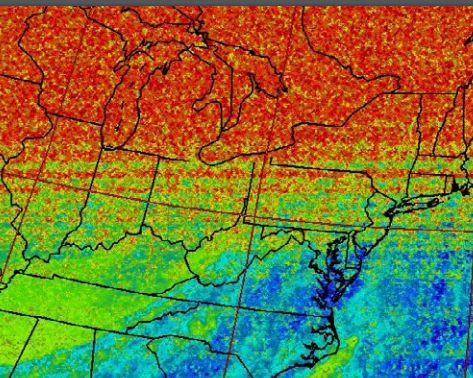
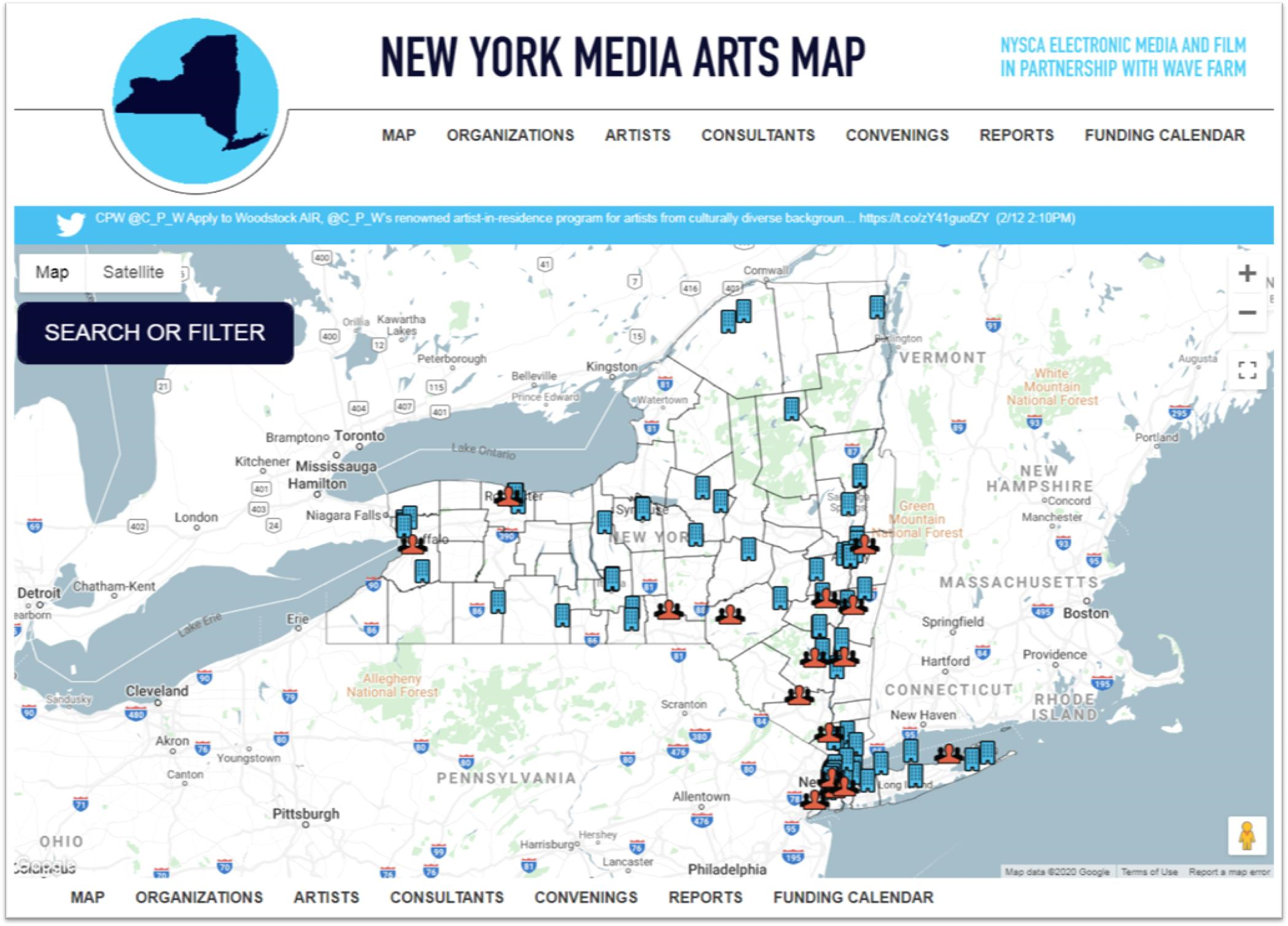
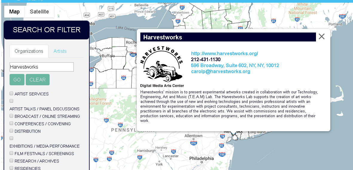
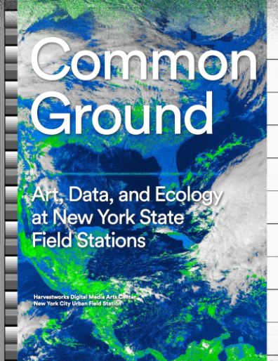 The report was published by the Harvestworks Digital Media Arts Center and
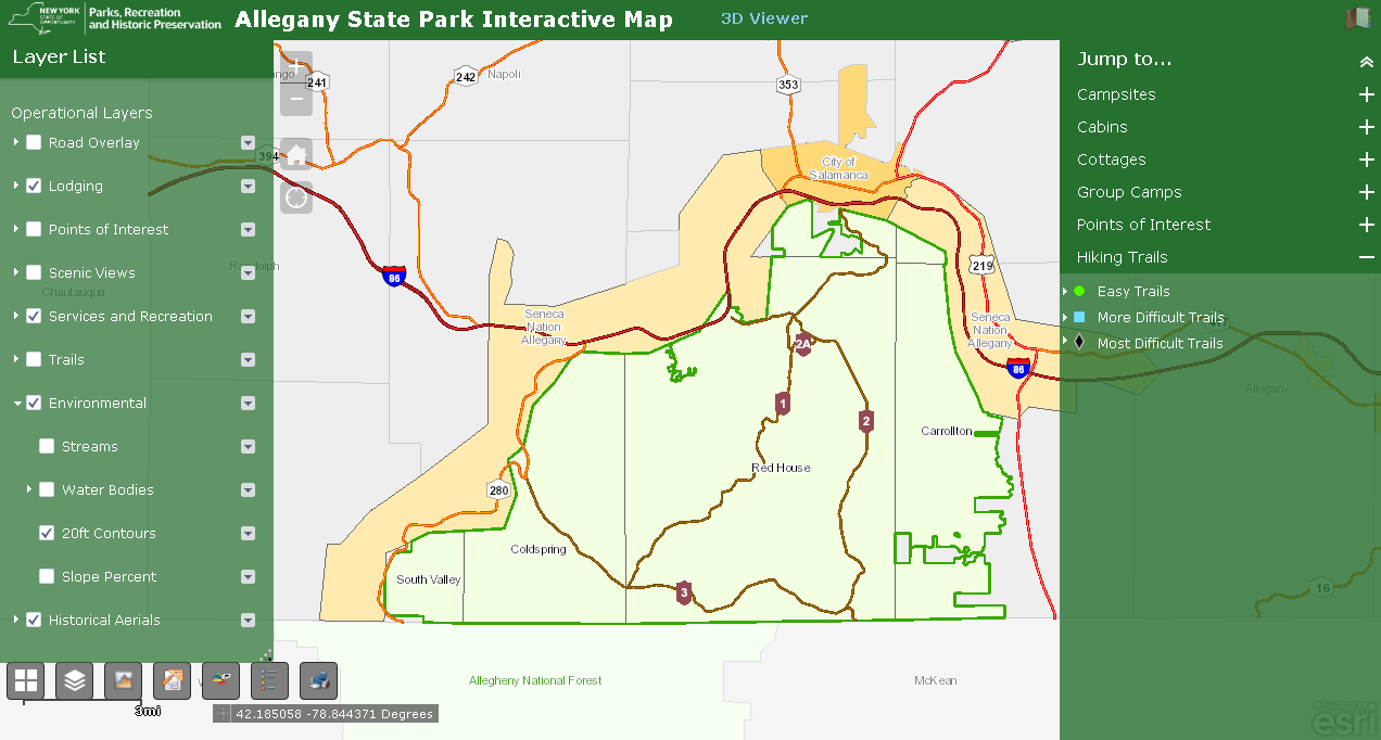
 Founded by Javier de la Torre, CARTO is a diverse and expanding company which includes data scientists, geospatial analysts, cartographers, software developers and engineers, visualization experts, and web designers focusing on Location Intelligence. Most recently in May 2019, CARTO expanded its worldwide professional service portfolio offerings by
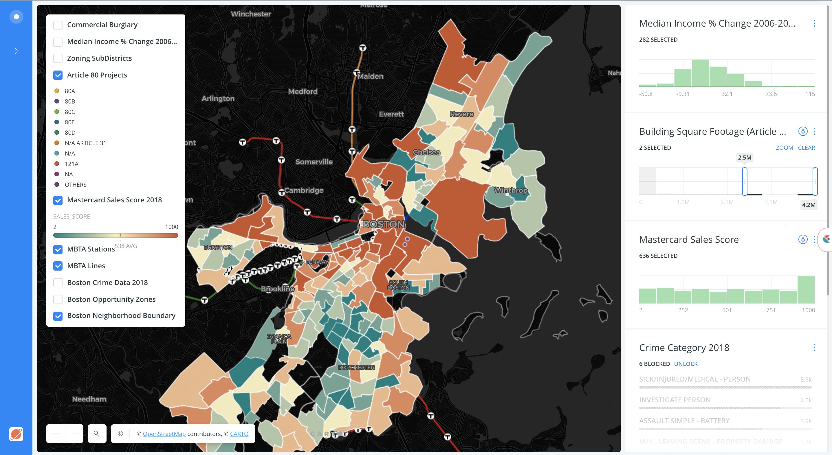
 I had the opportunity to attend the