Google Earth in the Classrooms

Chromebooks, Google Classroom and Google Earth Together Provide a Framework for Teaching Geography and many other subjects in K-12

I actually started drafting an article on Google Earth in the classroom last fall but since then it’s been one thing or another pushing things to the back burner.  Mostly work priorities but then COVID-19 sent everything sideways.  Seemingly pointing us all in a new and uncharted direction.  A new and greater reliance on the internet as many of us found ourselves working remotely.

The remote work force in many of our extended families includes teachers of whom I now have even greater respect after watching what is involved in teaching remotely and online.  The lesson plans, prep work, surgically attached to the computer, and the seemingly endless hours of the encompassing interaction with students – and parents – well beyond the normal eight-hour work day.

In a roundabout way watching this teaching workflow unfold during the COVID lockdown brought me back to the Google Earth article.  Google’s presence in the classroom is ubiquitous built around Google Classroom which I can only imagine will grow immensely as remote K-12 education expands in the future.  Wrapped in with kabillons of lesson plans, templates, covering every education topic, discussion groups, forums, and blogs from around the world – everything built on top of Google technology.  Easily delivered and made available to the masses at all levels of the educational spectrum with the uber cheap and incredibly functional Google Chomebook.  (btw – using one as I type).   And easily accessible within this framework – and bringing me back to the beginning of this article – is the Google Earth product for use in the classroom.  It’s an incredible product to augment K-12 classroom teaching and not just for geography.

Continue reading

Game Time: Mapping Moose in New York State

Introduction

A rare treat in eastern upstate New York, mostly in the Adirondacks, although sometimes in the Taconic Highlands along the Massachusetts and Vermont borders and within the Catskills, is to see moose in the wild.  Moose (Alces alces) are the largest member of the deer family (Cervidae) and the largest land mammal in New York State. Having been absent from the Empire State since the 1860s, the species began to reenter the state on a continuous basis in the 1980s.   While re-establishment of the moose population in New York has been viewed and supported as a positive sign of a healthier, more complete natural ecosystem,  it does not come without a range of potential problems associated with their return and the need for proactive management and monitoring by New York State Department of Environmental Conservation (DEC) wildlife biologists and researchers.

So in 2020 it should come as no surprise that wildlife biologists in New York State – and around the world – are using geospatial technologies to support their work.  In addition to estimating moose population size, New York’s wildlife biologists and scientists also focus on improving moose survival and reproductive rates and to assess their diet and health.  Assisting the DEC’s work towards researching moose habitat and resource requirements is David W. Kramer, Research Scientist, in the Division of Fish and Wildlife.  The toolkit which augments his moose research includes a mixture of GPS, remote sensing imagery, a variety of GIS data layers, and  both ESRI and “R” software.  R being a free, open source software package for statistical computing and graphics commonly used in the research community.

Population Counts and Observations

To date, Mr. Kramer and colleagues have been observing the locations of 26 moose which were collared with either a  Lotek or Telonics GPS unit which can store data “on board” the collar that can then be retrieved by getting the collar back or by getting close enough to the moose to download the data to a receiver. “Uplink” collars can store data on the collar as a backup, but also send daily data uploads via satellite and are then stored online.  Moose are captured (to put the collar on) by a crew which “net-gun” the animal from a helicopter. For their research, DEC staff focuses on female moose (cows) for two reasons:  (1) wanting to track of how many offspring each cow has; the collars facilitate the “following” of the females in the summer to count calves, and (2) male moose (bulls) go through physiological and body changes during the same period that do not make the collaring of males practical or even unsafe.  Data associated with the collars are important in analyzing survival and calving success as well as the geography associated with habitat selection.

Continue reading

The Art of Geospatial Collaboration: Allegany State Park Interactive Viewer

Cattaraugus County and Allegany State Park Share Resources and Vision

While GIS as a shared service as part of Governor Cuomo’s County-Wide Shared Services Initiative (CWSSI) has yet to take hold in a broad context across local governments in the  Empire State,  the statewide GIS community does have a great example to highlight how local governments can collaborate with a state agency in sharing geospatial technology.  Case in point:   The Allegany State Park Interactive Map viewer.

Located in Cattaraugus County in western New York abutting the Pennsylvania state line and  north of the Allegheny National Forest, Allegany State Park was created in 1921 and encompasses nearly 64,800 acres.   A major western New York State tourist attraction – the park averages  1.5 million annually – the park offers a wide range of four-reason recreation activities and lies within the Alleghany Highlands Forests ecoregion.   The idea of a joint effort between  Cattaraugus County and Allegany State Park online map viewer idea goes back as far as 2010 as part of a discussion between Daniel T.  Martonis, who at the time was GIS Manager for the County and Tom Livak who was then Director of Economic Development, Planning & Tourism.

The initial viewer was more emergency services focused with the collection of infrastructure data and intended for use by park staff only – nothing external.  Most of the data was collected by Dan and Tom, including Chris Holewinski – the current Cattaraugus GIS Manager – using various Trimble GPS units as well as utilizing old engineering maps.  The trio even brought out metal detectors to pick up the locations of pipes.   At the time, Dan was building web mapping applications with ArcIMS that Dan mentions was not “people friendly” and was ultimately discontinued by ESRI.  Along the way, though, both Dan and Tom knew they were beginning to frame a web mapping product which would be of great value to both the County and ASP.  ArcGIS Online began to emerge as a more functional and adaptable web mapping platform providing additional opportunities for the two government programs to build upon what had been started.

The ASP viewer represents the ongoing collaboration between Cattaraugus County and Allegany State Park. It provides easy to use access to a facility, environmental, and cultural data including historic aerial photography.

Continue reading

Geography as a Factor in Accessing Educational and Human Services

Focus on SUNY Campuses and NYS Correctional Facilities

In recent years I had a close college friend incarcerated in the New York State prison system and during this time I became interested in rehabilitation and re-entry programs offered to inmates.  Particularly in context of encouraging and helping my friend to focus on a path which would lead him to a better space, a new beginning, and away from the dark past.  My friend Bob (not his real name) actually became a shining example of what is possible in context of educational degrees and technical skills that are offered by the state as part of in-prison and reentry programs.  The intent of both which are to help incarcerated individuals to a successful transition to personal and community life after being released.  Bob became a minister while in prison and then was able to finish up his undergraduate degree and earn a Masters in social work from the City University of New York (CUNY) after his release.  Unfortunately these personal educational accomplishments did not change the trajectory of his life as what ultimately followed after prison were years of living in transitional housing and homeless shelters.  Never really able to rid himself of the many demons within that had haunted him most of his adult life.  Bob died of a heroin overdose four years ago.

Not long after one of my last correspondences with Bob’s family, I came across Mapping the Landscape of Higher Education in New York State Prisons (February 2019) published by the Prisoner Reentry Institute (PRI) at the John Jay College of Criminal Justice in New York City.    It’s a noteworthy report with plenty of content and includes an interesting reference which discusses the availability of educational opportunities for inmates which can depend, in part, on the geographic proximity between the locations of State University of New York (SUNY/CUNY) institutions and the statewide network of correctional facilities as administered by the New York State Department of Corrections and Community Supervision (DOCCS).  While I was able to establish communication with staff at the PRI, I had hoped to establish more in-depth discussions with staff at the two state departments (SUNY and DOCCS) to further build the story of the campus-prison relationship.   It is unfortunate that I did not as there is evidence of mapping products/software in the departments based on graphics in the report which includes a SUNY published interactive online viewer.  These products illustrate the issue of geography as a potential factor in the delivery of educational services to the statewide inmate population.

Current Correctional Facilities Landscape

Per the image below, New York State maintains 52 correctional facilities in seven administrative regions across the state with approximately 46,000 individual under custody and another 35,855 parolees under supervision.

This map is better rendered by downloading the original PDF from DOCCS. Four of the seven administrative regions are in the metro NYC area.

There are now 15 college programs involving over 30 institutions of higher education operating in 25 DOCCS facilities. The report looks into the two systems – higher education and corrections – that are seemingly distinct, yet come together to provide access to college education for incarcerated people. It looks at the challenges, including geography, in meshing these two systems and how both corrections and college staff can work to overcome problems.

Good News Bad News

While the good news is there is generally good geographic proximity between SUNY (including the New York City CUNY system) campuses and statewide correction facilities – particularly in southeastern NYS, there is considerable variation in the operation of college-in-prison programs, including different types of administrative and financial structures, faculty, and pathways to higher education post-incarceration.  A detailed description of educational and academic opportunities for inmates is made available on this DOCCS webpage.   Of the participating colleges, roughly two-thirds are private institutions and one-third belong to the public sector.  Just over half of the maximum and medium security prisons in New York – 25 facilities – host some form of face-to-face college programming. Of the 54 DOCCS facilities, ten out of 16 male maximum security facilities and 12 out of 27 male medium security prisons house college programs. All three of the female prisons – two medium and one maximum – house college programs. The prisons with college education programs are shown in figure below (a clearer version of the map is found on page 27 of the report) and itemized in the following table.

Most of the in-prison college programs are in southeastern New York State with less in the northern and western part of the state. A somewhat clearer version of this image can be downloaded from the report.

Most prisons with college programs are clustered in the Hudson Valley near the New York metropolitan area. The prisons without college programs tend to be further from New York City, likely a function of the fact that incarcerated people in downstate prisons (Bedford Hills and Sing Sing) were leaders in working with community groups and colleges from New York City and its immediate environment, as well as the ability of the colleges and non-profit organizations to generate funding and support for such programs. Moreover, the political environment of these communities was and remains more supportive of college-in-prison programs.

The PRI report (Include report name here) highlights how geography can play towards the delivery of educational services in the statewide correctional system albeit there are many other factors in play.  Matt Bond, staff at PRI, reported that currently only about 3% of the 46,000 individuals incarcerated in Empire State prisons are able to take college classes. Geography certainly presents challenges to offering college classes in prisons, but there are numerous other challenges, including:

  • Difficulty getting materials approved to bring into prisons,
  • The lack of technology (particularly internet access) in prisons,
  • Other demands on students’ time (such as working in order to purchase essential items from the prison commissary),
  • The fact that incarcerated students can be transferred from one facility to another, which interferes with their educational progress,
  • The need for sustained funding to maintain and expand college in prison programs,

This interactive SUNY published viewer shows the locations of both SUNY/CUNY campuses and NYS Correctional facilities. Rather than clicking the Miles from Correctional Facility box (which makes the make very busy at large scales) simply click on a correctional facility to see the distance to the closest SUNY campus.

Even though both of the institutions in this scenario are state governed and administered, each are largely fixed/physically located assets which dictates how much the delivery of educational opportunities can change albeit there are increasingly more options of offering educational programs remotely.  However, technology and internet capacity inside prisons available to inmates continues to be an issue.

But the fact remains today there are thousands of current inmates in the NYS correctional system in 2019 – male and female – who do not have access to the educational opportunities where geography does matter on some level.  The PRI report did not provide a specific overview or comparison on the quantity/quality of educational programs in the 5, 10, 15, and 20 mile buffers around each of the correctional facilities which would have spoke more specifically to the geographic issue.

The Geography Factor in other Human Services

While the PRI report did not make reference to any significant “gaps” in the delivery of educational opportunities to inmates, the “gap” issue is becoming more of an issue (or reference) in context of delivering other important public services across the state.  Such “gaps” are now being referred to as “deserts”.  In New York State, it is not difficult to search for recent references to deserts in the areas of  child care, maternity and mental health care, food deserts, and the struggles of rural hospitals disappearing across the U.S. landscape.  Significant geographic rural areas of the Empire State  are increasingly losing access to essential human services to which the reasons are many.

This image is a subset from the larger statewide map published in the article Mapping America’s Child Care Deserts. According to the report California and New York have the largest percentage of people living in child care deserts.

Geospatial technologies can play a central role in helping solve geography issues associated with growing number of health and human service delivery “deserts”.  Route GIS-based optimization programs based population centers, road networks, geocoding, and other dependencies. Furthermore, identifying potential temporary or “pop-up” service center locations in areas of greatest need which constantly changing over time.  A more mobile service delivery framework which can be leaner and more efficient.  Avoiding the need to higher cost fixed and permanent facilities.

There is much that can be done to advance access to a wide range health and human services including educational options for those incarcerated in New York State correctional facilities.  We are fortunate there is a strong geospatial technology foundation across the Empire State to build out these opportunities.

Spatial Data Science Conference 2019

I had the opportunity to attend the 2019 Spatial Data Science Conference (SDSC) at Columbia University on October 16th.  Hosted by NYC-based Carto, the event was attended by over 500 people from government, nonprofits, industry and business, and academia.  The day-long conference was highlighted by a variety of presentations and lightning talks from data scientists and program managers representing organizations from around the world including Uber, Airbnb, Datarobot, Waze, Instacart, MIT, Sidewalk Labs, Two Sigma, and Facebook among others.  All of the presenters use Carto’s Software as a Service (SaaS) platform which provides GIS functionality, web mapping, and spatial data science tools.

Data Science

Founded in 2017, SDSC  brings together organizations who are pushing the boundaries of spatial data modelling – ranging from large enterprise, to cities and government, as well as thought leaders from academic institutions.  Shown through the use of geospatial applications and organizational project initiatives, there was no doubt the common denominator and focus of those attending:  Data. It was definitely worth the trip.  SDSC is similar, but a very different kind of a “geospatial conference” for those of us who have spent a career running in traditional government geospatial circles.  Attendees and presenters are largely a completely different make-up from those normally attending the annual New York State GIS conferences.  (Of the 500+ preconference registrants, nearly 55% were from the private sector).   The day’s event included high quality presentations on the latest in modelling techniques, data science and analytics, visualization practices, and new data streams.  This later issue an increasingly important and interesting one across the statewide geospatial community as the day’s conversation clearly illustrated both the growing number of online geospatial data sources  (for example, numerous references were made to U.S. Census Bureau American Community Survey) and related data access tools.  Speakers noted both the importance and benefits of open data portals though not without the caveat that it was not uncommon to have to clean and often normalize the data prior to using in applications.  Numerous references to popular sites such as GitHub, Leaflet, OpenStreetMap, and Elastic (which presented at the event) were made with regard to supporting the open source ecosystem.

Mudit Srivastav from Australia-based Origin Energy, presented on the use of spatial data to support the increase sales of residential roof top solar panels. Note the many types of data the company is using to better define growth areas.

Data for the Social Good

Another common theme throughout the day was the use of geospatial data for the social good.  Interesting to hear the point being made not only from nonprofits and academia, but from the private sector as well.  Way far away from the normal Albany GIS crowd, Stuart Lynn made a presentation focusing on how Two Sigma, an investment management firm located in New York City, provides spatial analysis support through the company’s Data Clinic program to nonprofits, academic institutions, and government organizations.  Their focus:  Enabling and promoting social impact through data driven predictive models while funding breakthrough research, education and a wide range of charities and foundations.    The image below identifies some of their recent projects.  Great stuff and I’m already planning on a more in-depth article with Stuart in the future.

Enabling Social Impact Organizations with Spatial Analysis Techniques

Stuart’s talk, as well as others during the day, made reference to the  The Data for Good movement which was a social media movement first started by DataKind to highlight how data science could be used to help address a range of humanitarian issues. DataKind is a collaborative network of organizations that work together with data scientists to leverage the science of data for social impact.  DataKind’s afternoon presentation “Spatial Data Science for Social Good:  Improving Access to Dignified Sanitation in Haiti” was excellent.  The video for this session and all of the day’s presentations are now available online at the Spatial Data Science Conference website.

Arguably, the demand for “data scientists” will increasingly intersect and expand in government geospatial programs in areas such as the health and human services, climate change, public safety, sustainability and resiliency,  and social and environmental justice to name only a few.   As the universe of geospatial data continues to expand and be integrated with both new artificial intelligence (AI) and machine reading technologies, as well as combined with the availability of more powerful GIS software, it is easy to see where the demand for data scientists focusing on locational and predictive analytics is headed.

I asked Javier de la Torre, Carto founder and SDSC organizer, what his impressions were of the day’s presentations and content.  He replied:

“First, moving the data discussion from WHERE to Why. Time to move to analyzing data using maps opposed to just seeing data in maps.  Second, the rise of the Spatial Data Scientist and/or where advance GIS is emerging as a new platform. And third, identifying the need for better data marketplaces which provides interactive solutions resulting in increased performance to users”

Links to the 2017 and 2018 presentations are also available on the SDSC website.

Mobility for All Abilities Hackathon

While I personally did not attend the September 21st Mobility for All Abilities Hackathon at the  Brooklyn Army Terminal, I had originally intended to put together a short summary article to post on the day’s events and activities after gathering information from BetaNYC staff.  But instead, check out BetaNYC’s own detailed summary here – its quite good.

The event coincided with the 2019 National Day of Civic Hacking and was co-hosted by by BetaNYC and MakerSpace NYC which partnered with  NYC Department of Transportation, NYC Mayor’s Office of People with Disabilities, NYC Mayor’s Office of Data Analytics, and other organizations to setup eight challenges for a day-long map-a-thon and civic hacking to improve mobility equity in New York City.  Incredible results!

New York City Council Member Brad Lander provided opening remarks at the Mobility for All Abilities Hackathon. Photograph by Charlie Hartwell / CC BY

I’ve written about BetaNYC before and they have presented at the Westchester GIS User Group meeting in the past. They fill a much needed and recognized space in metro NYC towards facilitating these types of technology/geospatial events which can serve as a model for similar civic focused programs across the state.

For more information on their programs and activities, visit the BetaNYC website.


The Essential New York Climate Change Science Clearinghouse

There is no lack of geographic information these days on Climate Change and its increasing impacts across the Empire State in the areas of sea level rise, rising heat indexes, more frequent and intense storms, changes to the natural environment and critical habitats, and its influence on a broad range of public health issues to name only a few.  And we see geospatial technologies at the core of sciences being used to analyze, respond, and prepare for future consequences.

Whether it be policymakers, planners, business and industry, residents or community groups, New York State is fortunate to have its own geocentric one-stop website on climate change issues as part of the New York Climate Change Science Clearinghouse (NYCCSC).   Hosted by NESCAUM (Northeast States for Coordinated Air Use Management) , NYCCSC contains documents, data, websites, tools, and maps relevant to climate change adaptation and mitigation across New York State. The goal of the NYCCSC is to support scientifically sound and cost-effective decision-making. It was developed to provide a framework where users can find information in multiple ways, including through interactive tools that use data from different sources.

Established in 2015, the site today contains nearly 2100 resources including over 200 web maps and viewers and an assortment of data products and datasets and is curated by Ingrid H. H. Zabel, Ph.D.  Initially the site was populated by resources that had been referenced in the 2011 ClimAID Report and several other key documents, as well as resources identified by groups of sector experts.  Today, the site curator continues to seek out new content from a variety of sources to keep the site current and fresh.  Submissions to the Clearinghouse are welcome though each are reviewed based on relevance, utility, credibility, and accessibility as described in the site’s Business Rules.   The underlying mission of the site is to provide resources that are relevant to communities of many different sizes around New York State, are focused on practical, applied science and that are open access as much as possible.

Dr. Zabel is assisted by a Content Team and Sector Expert Groups consisting of individuals originally involved in the development of the site, from Cornell’s Northeast Regional Climate Center, the Paleontological Research Institution,  , Northeast States for Coordinated Air Use Management (NESCAUM), Frontier Spatial, and New York State Energy and Research Development Authority (NYSERDA). The sector experts were identified by NYSERDA, NYS Department of Environmental Conservation, and the NYCCSC team, and include individuals from New York state agencies, academia, and nonprofits such as (New England Interstate Water Pollution Control Commission (NEIWPCC),  , and the New York State Floodplain and Stormwater Managers Association (NYSFSMA).

Users can explore and mine through the site via ad hoc interactive mapping, topic specific web maps, data charts, and for published documents and reports.  In addition to offering advanced search tools, site content is also grouped thematically in categories such as Climate and Weather, Sea Level, Energy, Flooding, Plants and Animals, Social and Economic, among others.

Some options on the user interface to dive in and start searching for data include:

Interactive Mapping and Web Maps

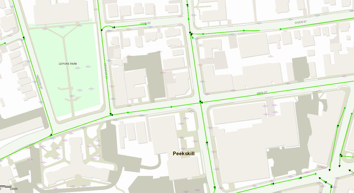
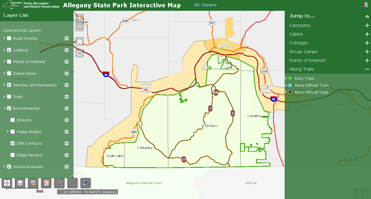
One of the focal points of the website is an interactive map of climate change and related data for New York State.   Users can select data layers to display from a menu, filter layers by sector, vary parameters within certain layers, and select from a variety of base layers and regional boundaries. For each layer, links are available to metadata and the original source. Data being made available in the viewer has been curated through more of a group effort, with the NYCCSC team getting requests and feedback from a variety of places, including project managers (NESCAUM) and sponsor (NYSERDA).

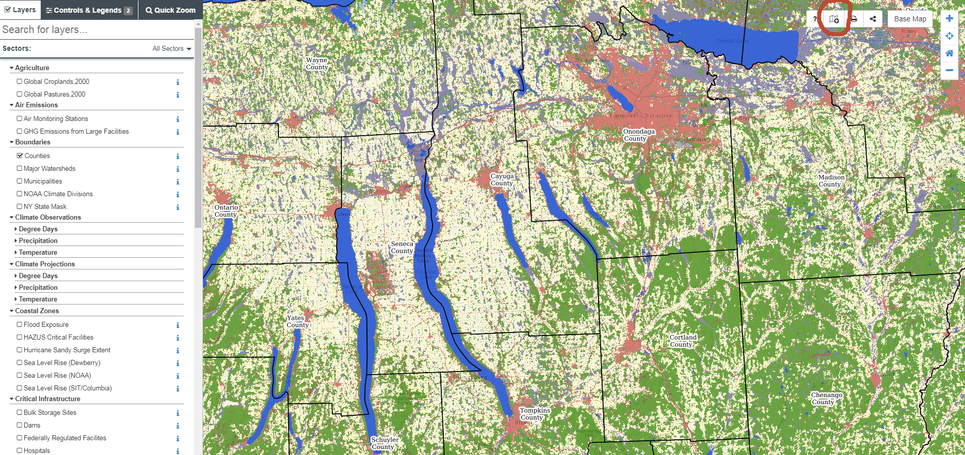
The NYCCSC interactive mapper also leverages map services from authoritative sources. For example, this GAP Land Cover Dataset is a service being published by the USGS. Users can click the ‘i’ icon for a given layer which provides metadata on relevant URLs. The interactive mapper also includes a function for the user to add a map layer of their own using the Layer Import button found along the toolbar in the upper right hand corner of the viewer (circled in red). Imported layers do not get added to the map permanently, but rather are a means to temporarily “mash-up” local data with the permanent collection of content in the application

The site is built almost exclusively with open source products and largely supported by Steve Signell at Frontier Spatial.  PostgreSQL is the geodatabase used to store and manage map layers and metadata.  A combination of Geoserver and Leaflet are used to create and manage the web services and support the user interface. Javascript and CSS coding was used to create the custom UI and map functions.

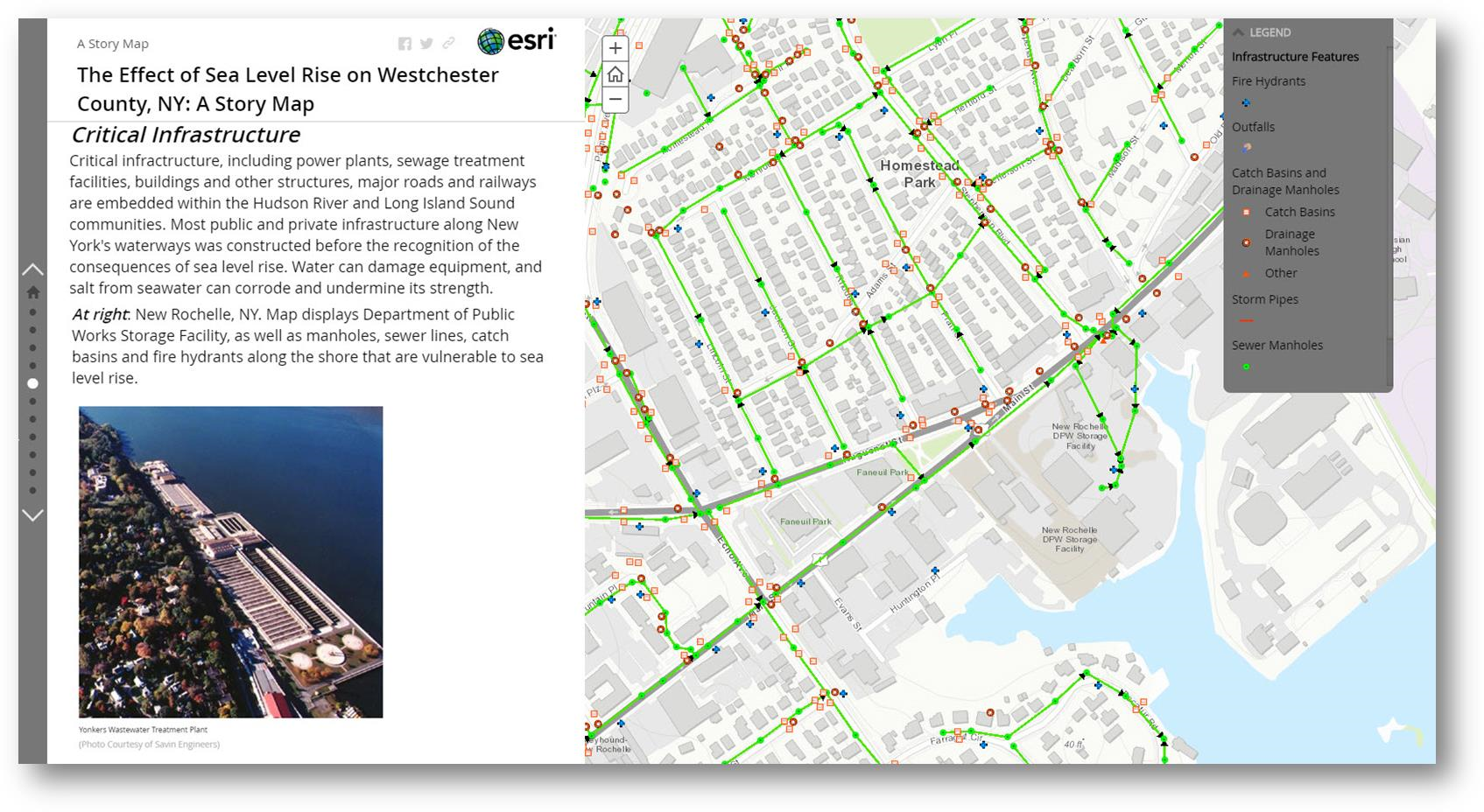
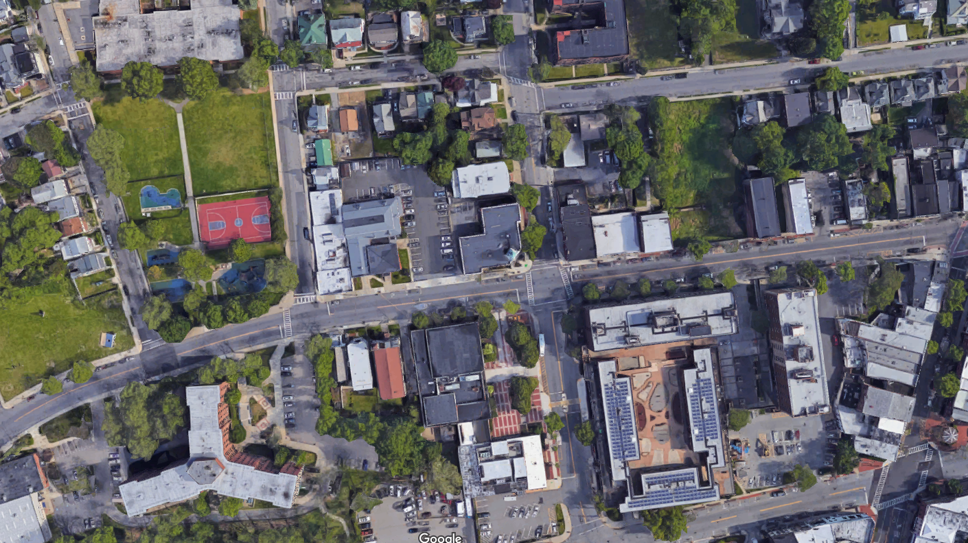
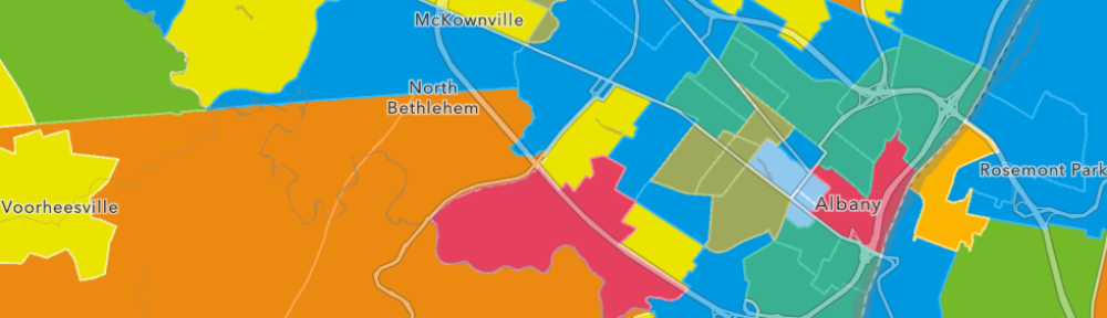
If you’re looking for standalone web and story maps for specific Empire State climate change issues – look no further. As the date of publication of this article, the site listed 203 separate maps from a wide variety of contributors including this one from Westchester County focusing on the potential impacts of sea level rise on critical infrastructure assets.

Among the many great offerings, sites found in the catalog of interest include The Natural Resources Navigator (The Nature Conservancy), New York State Geographic Information Gateway (NYS Department of State), Surging Seas Risk Zone Map:  New York (Climate Central), Environmental Justice Screening and Mapping Tool (U.S. Environmental Protect Agency), and Trees for Tribs Statewide Data Explorer (New York Natural Heritage Program) to name only a few.

Climate Data Grapher

User-generated time series graphs of climate data, both observed and projected (future and historical.)  The data grapher provides access to climate data which can be summarized by the user according to various geographic units such as counties. The same summaries are used in the maps & GIS viewer to attribute the corresponding map layers for county and watershed boundaries.  Both user interfaces (Interactive Mapping and Data Grapher) draw on the same raw data sources but offer different capabilities for query, summary and visualization.

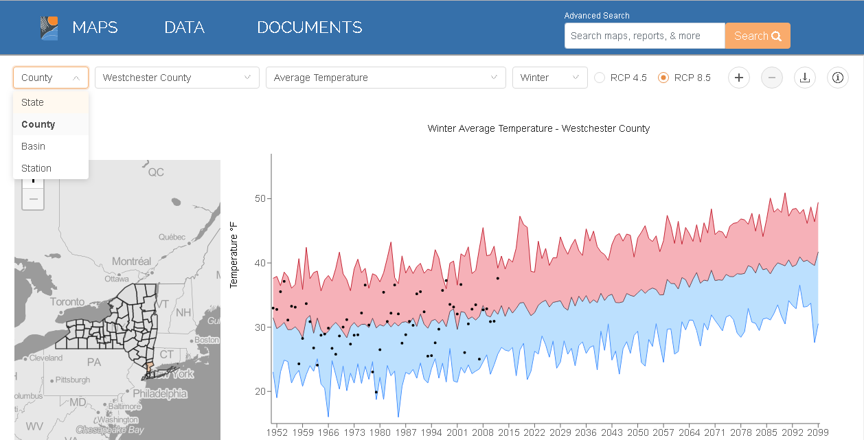
I used the interactive graphing tool to plot Westchester’s Winter Average Temperature. It’s one of
19 types of climate related data which can be charted by either geographic area: state, county, or river basin. (Upper left hand corner pull-down). Other datasets area available by gauging and/or weather stations. The chart renders different results depending on which RCP radio button (4.5 or 8.5) is selected. RCP (Representative Concentration Pathway) 4.5 and 8.5 are scenarios of future climate change based on varying degrees of societal progress in reducing human contributions to greenhouse warming.

Documents

A wide range of documents and reports on statewide climate change issues including the author(s) or publishing agency, a pdf download option and where available a corresponding website URL. The first document itemized –  a document central to the launch of the site – is  Responding to Climate Change In New York State: The ClimAID Integrated Assessment for Effective Climate Change Adaptation in New York State: Final Report (2011) which provided information on climate change impacts and adaptation for eight sectors in New York State: water resources, coastal zones, ecosystems, agriculture, energy, transportation, telecommunications, and public health.

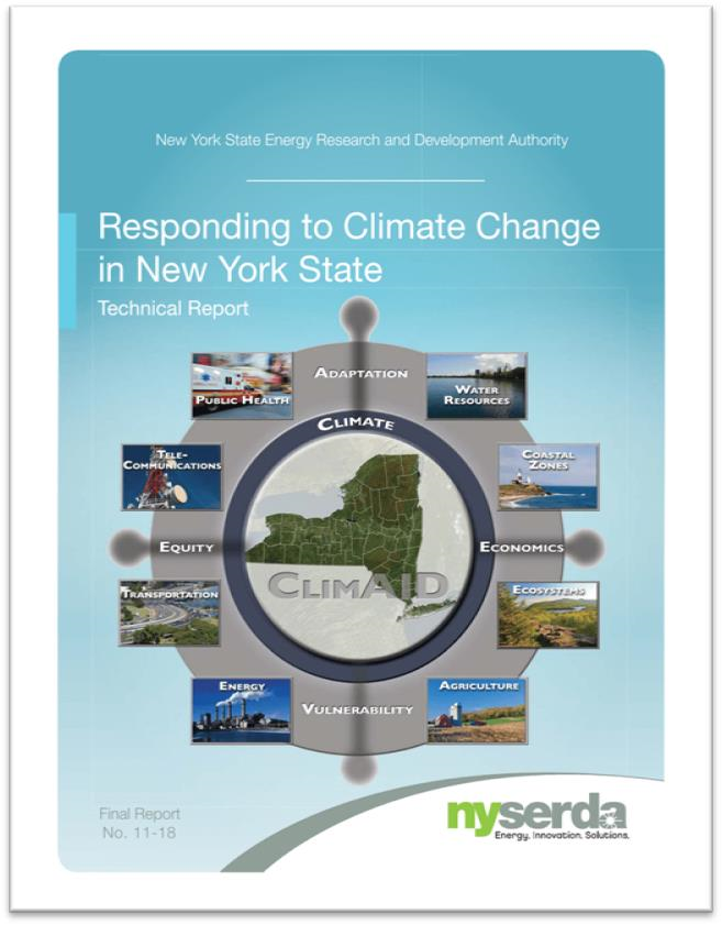
The 2011 ClimAID report is one of the first comprehensive and definitive compilations on the many challenges on impacts of climate change across New York State.

Summary

NYCCSC is a huge repository of geospatial and other content focusing on the ongoing and constantly evolving Empire State climate change issue being made available by a wide range of publishers including governments, academia, nonprofits, and industry.     And whereas much New York State climate change focus in recent years has concentrated on the impacts to our coastal communities (i.e., due to sea level rise, hurricanes/severe weather events, storm surges –  much of which is included in the repository), NYCCSC offers content and case studies covering the entire New York State footprint.   Sometimes, however, the scale of the data associated with individual sites can be an issue when looking at issues at the local level.   But nonetheless the data is there.  Itemized websites are always a good starting point for metadata, individual dataset downloads or access to public facing REST endpoints.  .

It takes a considerable amount of effort and oversight to keep such online clearinghouses up-to-date and to this end NYCCSC is fortunate to have an ongoing relationship with NYSERDA for continued support of the project.  NYCCSC continues to welcome submissions but does not accept every resource that is submitted. At the bottom of the site landing page there is a button labeled “Propose Content” which provides access to a form in which content can be proposed.

Contact:

Ingrid H. H. Zabel, Ph.D.
Climate Change Education Manager and Curator, New York Climate Change Science Clearinghouse
Paleontological Research Institution, Affiliated with Cornell University
(607) 273-6623, ext. 122
info@nyclimatescience.org
nyclimatescience.org

Belated News Flash: Empire State GIS Web Maps Got Juice!!

Maybe a bit of yesterday’s news, but apparently many of us in the statewide GIS/geospatial circles were asleep at the wheel this past December when Governor Cuomo signed Senate Bill 9061 amending section 4511 of the Civil Laws and Practices Rules (CLPR).  In laymen terms, the bill “gives Google Maps and other global imaging websites the presumption of accuracy when they are used as evidence in New York courts.   Information taken from similar sites (web mapping services, etc) to Google Maps would be presumed accurate unless “credible and reliable evidence” is presented showing that it is not.”   The bill was introduced by Senator Michael Gianaris (D-Queens) earlier in 2018 and approved on June 15, 2018.  I reached out to Senator Gianaris’s office to inquire regarding his interest and/or constituent support in this space, but my emails were not answered.  If you are so inclined, the full grownup version of the bill can be found here.

This downtown Peekskill, New York Google Maps image is a staple in context of submitting “imagery” as evidence in New York State courts. Though readily available and easy to access by litigants, other government-based web mapping programs across the state often contain more detailed information and are available for increased use in court cases.

The reasons for the lack of notice, or interest for that matter, are probably for a myriad of reasons.  Could be there was simply a lack of attention because the statewide geospatial community was still dizzy from excitement by passage of the National Geospatial Data Act of 2018 last fall and its anticipated benefits to government and business GIS programs across the Empire State.  (Btw – if you are keeping a GDA scorecard, here is a May 2019 presentation on how the Act is moving forward on behalf of your GIS program.)

Though having received little attention and discussion across the GIS/geospatial communication channels and/or social media, the approved S9061 2018 legislation actually received a fair amount of dialogue in New York State law journals and blogs (i.e., Bleakley & Platt, Neufeld, O’Leary & Giusto, and Sahn Ward Coschignano among others).  With no real formal monitoring process or legislative agenda to effectively influence legislation on behalf of the statewide “profession”, legislation such as S9061 may continue to go unnoticed.  By comparison in contrast to the legislative agendas and committees of aligned Empire State geospatial professions such as surveying and engineering.

While Google internet mapping content will continue to be a norm, this legislation provides the opportunity for expanded credibility on the value of government and public facing internet web mapping sites to the legal community and in support of the  judicial process.   And by extension, one of the primary reasons in passage of S9061 – cost savings – as the new law should save litigants significant time and money and speed up trails.  In some instances, litigants have had to pay for companies to fly over a desired area and photograph it at a high cost, so that a witness would be available to authenticate the picture. Passage of S9061 also represents yet another way in which New York State legal rules are changing for the better to accommodate new technology. Notes Adam Rodriguez, Esq., attorney at Bleakley & Platt in White Plains, “This is a very practical amendment to the C.P.L.R. that will promote efficiency by saving time”

Using approximately the same Peekskill footprint as the image above, this Westchester County web mapping application renders completely different data including planimetrics, utility poles, and a sanitary sewer network. Increased outreach from government GIS programs to the legal community can illustrate the detail and richness of data which can be obtained from online web mapping programs.

Of course while the legislation gives the legal community more freedom in the use of online mapping content, it still recognizes that it may not be entirely correct and gives relief to opposing parties to challenge admis­sion of the web map content through “credible and reliable evidence that the image, map, location, distance, calcula­tion, or other information” does not “fairly and accurately portray that which it is being offered to prove.”  As such, expanded use and access to online web mapping content will increasingly require attorneys to better understand both the accuracy and limitations of the geospatial products (particularly hardcopy products generated from online applications) being submitted as evidence.

Post-World War II (1947) imagery of the same Peekskill footprint. While the Westchester County 1947 photography is of outstanding quality, conversion of such panchromatic photography to digital format can often introduce various types of errors and distortions. As such, not all “online content” is always correct and the legal community will need to continue to be cautious – and educated – about using “as is” online web mapping products.

The bill will make New York State practice consistent with Federal practice, which allows courts to take judicial notice of Google Map images because they “can be accurately and readily determined from sources whose accuracy cannot reasonably be questioned” under Federal Rule of Evidence 201.

Another plus for our tax payer funded geospatial products.  Albeit not on a day-to-day basis, but nonetheless, providing cost efficiencies in the judicial system and a little more something for the GIS program return-on-investment (ROI).

Talk to your government attorneys or firms which represent your GIS program about Senate Bill S9061.

BuildingFootprintUSA: Setting the Foundation in Albany

Somewhat fitting a new geospatial start-up would emerge in the Albany area.   The region being home to MapInfo, an early player in the desktop GIS software market appearing at number 23 in Inc. Magazine’s annual list of the 500 fastest-growing private companies in the U.S. in 1992.   While the software product is still around, the company has since been acquired by Pitney Bowes.  Across the Empire State geospatial landscape it’s not uncommon to bump into someone working in the GIS space with ties to MapInfo.

Case in point, in 2016 four ex-MapInfo colleagues, each with over 25-years of experience in the geospatial space focusing largely on data development, went out on their own and launched BuildingFootprintUSA with the intent of providing to the geospatial industry spatially accurate and attribute rich building footprints covering the United States.  Their initial focus has to been to provide data to the location based advertising, insurance, and telecommunications industries.  In January of this year, Geoawesomeness included BuildingfootprintsUSA (BFUSA) in the 2019 Top 100 Geospatial Companies and Startups List.

BuildingFootprintUSA’s 3D model of Albany including the Empire State Plaza. Buildings are commonly attributed with addresses and assessment data.

Given that the company is only three years old and has only a handful of full-time employees, BFUSA might be considered a typical tech start-up.  However, co-owner Scott Robinson notes that the company is in the midst of significant growth with a growing list of clients nationwide.  The company is an ESRI Emerging Business Partner and is part of the START-UP NY Program in a partnership with SUNY Albany.

The fast-growing company’s catalog already includes over 90 million footprints covering 75% of the US population, several large clients and to date has not required any external funding.  Using an addressed building footprint as the foundation of their product line, BFUSA routinely connects a wide range of attribute data to the footprint including, but not limited to, census designations and demographics, assessment files, property and facility information, and business characteristics such as category and size of company.  For residential structures, detailed demographics (i.e. age, race, income, education, etc) and household profiles on consumer behavior and lifestyles are also available.  Structure height (z-value) is also included in the footprint dataset which is derived from available LIDAR databases as well generated from their own photogrammetry or other BFUSA business partners.

We are committed to data integrity”, notes co-owner Scott Robinson, “our work is essentially a  huge data curation effort – blending and harmonizing data from many different sources including open data portals, government websites, and commercial data services”.   Specific and very detailed attention is given to the spatial/positional accuracy of the footprint as well as the numerous data fields associated with the footprint.  Robinson points out that not all building footprints are created alike noting that many “single” footprints can be comprised of several offices or living spaces such commercial buildings and/or condominiums and apartment buildings.  Similarly the same footprint can have different heights (z-value) which factors into line-of-sight analyses and wireless signal studies.  He continues “It’s not uncommon to find at least 25% of the building footprints we receive from others to be off at least 100 feet”.

Specific examples of how BuildingFootprintUSA products and services are used include:

Insurance

In assessing structural risks in designated flood plains, using building footprints versus parcel centroids provides a more informed evaluation. In this example, dots represent parcel centroids. In some instances where parcel centroids are located in the flood plain, associated parcel structures may/may not be (orange and yellow) vulnerable to flooding. Both a red dot and red footprint indicate a more vulnerable property while both a green dot and green footprint imply major property assets are not subject to flooding.

Telecom

A Telco company uses BuildingFootprintUSA data to understand optimal placement of 5G network towers in NYC; based identifying what buildings the signal can reach and what are the characteristics of the building itself. In this picture residential buildings are shaded by affluence of the residents.

Location Based Advertising (AdTech)

Detailed business data attributed to building footprints can then be integrated with consumer movement data generated by mobile devices. Buffers around specific buildings can support a variety of pattern analyses which provides a very educated guess on where a mobile device has been over a period of time. Using both store visit insights and foot-traffic data, building footprint data empowers retail analytics firms and real estate asset managers to conduct live trade area analysis and give retailers insights on the characteristics of these people, and know the reasons that are drawing people to those locations.

BuildingFootprintUSA data products are currently available via ESRI Shapefiles and geodatabase (GDB) and MapInfo TAB in Coordinate System WGS84.  Later in 2019 the company plans to offer data via an API. Datasets are typically sold as nationwide coverages though smaller geographic footprint are available as well.  Data is offered by annual license with quarterly updates.

Summary

Refreshing to see a geospatial start-up emerge in Albany only minutes from the Empire State Plaza.  With the UAV technology well recognized and established from Syracuse into the Mohawk Valley Region, we can be optimistic that BuildingFootprintUSA’s success – and perhaps by extension its association with START-UP NY – will be recognized and brought to the attention of the state’s elected officials.  Highlighting both the company’s contribution to the local and state economy and illustrate how geospatial marketplace commodities are routinely produced and made available by industry.

Perhaps a start to similar industry growth in the greater Albany and Hudson River Valley region.

Contact:

Scott Robinson, VP Strategy
scott@buildingfootprintusa.com
BuildingFootprintUSA
200 Great Oaks Blvd, Suite 214
Albany, NY 12203
518-218-4444

2019 Westchester GIS User Group Meeting

Making it the largest annual event to date, nearly 200 individuals attended the 2019 Westchester GIS User Group Meeting May 16th at Purchase College. The annual event included a diverse mixture of user presentations and demonstrations for attendees representing local and county government, utilities, nonprofits,  business and industry, and academia (both college and high school programs). Faculty and facility support from the College’s Environmental Studies program and sponsorship from twelve vendors again helped enable the Westchester County GIS community to meet and discuss the countywide geospatial agenda.  And by virtue of the venue, promoting SUNY GIS educational opportunities as well.   It was a great GIS day for all attending and participating.

As the day progressed, nearly 200 registrants assembled as part of the 2019 Westchester GIS User Group Meeting at Purchase College. The main lecture auditorium was filled to capacity with standing room only by mid-morning.

2019 Agenda and Speakers

While the 2018 agenda had a specific theme, this year’s agenda was intended to be more diverse covering a wide range of topics including health and human services, pavement management systems, oblique imagery applications, training workshops, forestry inventories, public safety, mapping and visualizing the human brain, the 2020 Census, and a special presentation by ESRI focusing on accessing the County’s new planimetric datasets via web services.

Session I:  Allison McSpedon and Jeff Worden from the Westchester County Continuum of Care Partnership for the Homeless led the day off with a presentation focusing on the use of mobile technology as part of the annual Homeless Point in Time (PIT) Count taken in January 2019.  This was followed by Nancy Birnbaum, Manager of Software Architecture, Westchester County Dept. of Information Technology who presented the new Westchester County Online Community Mental Health Directory.

Managers from the Continuum of Care Partnership for the Homeless detailed the pros and cons on the use of mobile data collection technology as part of the January 2019 count. They anticipate even better results and ease of use when deployed in the next count.

Andrew Reinmann, Advanced Science Research Center, Graduate Center of CUNY and Department of Geography, Hunter College followed with the use of geospatial tools as part of the Westchester County Forestry Inventory: Mapping and Ecosystem Services Assessment.  The morning session ended with a series of lightning talks highlighting the use of the County’s new oblique imagery.

Session II: After intermission, VHB and staff from Westchester County Dept. of Public Works and Transportation discussed the new Smart Asset Management and Inventory System (SAMIS) application which was followed by an excellent demonstration on the use of Laser Scanning technology by the Westchester County Police Forensic Investigations Unit.  Patrick Gahagan, Technical Analyst at ESRI finished the morning session discussing advancements in civil engineering and surveying integration between the Autodesk and ESRI platforms.

Detectives from the County Police Forensic Unit captivated the audience on the use of laser scanning in crime scene investigations. GIS staff is now working with the Forensic Unit on integrating laser scanning data into the enterprise GIS environment.

Session III:  After lunch – and an audience participation session of GeoJeopardy – Jonathan A. N. Fisher, Ph.D., Director of the nearby Neurosensory Engineering Lab at the  New York Medical College in Valhalla provided an overview of his project called Neurodome which centers on the mapping of the human brain with an assortment of technology and visualization tools.   Daniel Wickens, Solution Engineer from ESRI then gave two overviews on “What’s New with ArcGIS Field Apps and ArcGIS Online.”  Concurrently in separate locations training classes were offered on how to use the new online CONNECTExplorer oblique imagery viewer and the ESRI “Explore Future Climate Change” tutorial.

Session IV:  The last section of the agenda was brief and included an update on mapping efforts association with the 2020 Census by Margaret Baker, Geographer, from the U.S. Census Bureau Manhattan office.  The final presentation by Westchester County GIS staff included the latest developments and anticipated upgrades to the Westchester County GIS website including the scheduled launch of the Westchester GIS Geospatial Gateway

Individual meeting presentations can be accessed and downloaded using this link.

The U.S. Census Bureau is ramping up for the 2020 Census and has a variety of mapping and geospatial products in their toolbox. GIS technology is essential in helping identify areas which have had low counts and responses.

Little Things Make it Work

I’ve written before about the small details which we believe enable the Annual Westchester GIS User Group Meeting to continue to be successful – and we’re the first to admit there is always the element of luck.  Even the weather matters.  To the extent possible, elements such as keeping the content and speakers “Westchester” focused, minimal –  if any –  registration fees, lots of time for interaction with the sponsors on the exhibit floor, and the centrally located venue at Purchase College – all matter. One of the ironies, and downsides, of having the show on a college campus in mid-to-late May is that spring semester is already over and students have fled campus.  However,  there is normally a handful attending looking for summer or full-time work and passing out resumes.    The naturally lighted vendor area in the Natural Sciences Building, albeit small, adds to the personal “feel” of the show.    Easy access and plenty of parking is also essential.  And don’t forget lots of proactive outreach to the professional organizations and societies  we work with on a day-to-day basis:  police/fire, engineering, surveying, public works, assessors, nonprofits, and the planning community.   The added message here is to encourage consultants which are supporting local governments across the county – to attend the meeting.  To learn more about accessing and leveraging Westchester County GIS products and services and how this improves service and cost efficiencies to municipalities they serve.   Individually, any of these items listed above may seem trivial,  but they all add up in delivering a show that will bring the same people back next year.

The exhibit floor was busy (and loud!) during breaks with all vendors noting interaction with attendees was good and productive. All attendees can complete a Vendor Bingo Card and be eligible for a raffle prize at the end of the day. This year’s prize was a vendor donated iPad!

Summary

Over the next couple weeks, conference organizers will be sending out a survey to both attendees and vendors to gather more detailed information on the various elements (presentations, speakers, refreshments/breaks, vendor interaction/feedback, facility issues and the like) of the show.  This information will help guide decisions about content and any changes that may need to be made, if any, about the structure of the show.

Staff will take a few months off and begin planning for the 2020 show in the fall of this year.  In doing so, we look forward to the continued relevance and position of the Westchester GIS User Group Meeting in promoting countywide geospatial development and use.